UX and research · Intermediate · 15 min
Review a booking flow for cognitive load
By Padding · Updated 18 Nov 2026
Screenshots or a prototype of your flow, any annotation tool and a spreadsheet · November 2026
You will have an annotated booking flow that marks every point where someone has to remember, calculate, decide under time pressure or decode jargon, and a ranked list of fixes for each one.
On this page
Most accessibility checks look at what is on the screen: contrast, text size, labels, focus order. A flow can pass all of them and still be hard to finish, because the difficulty is not visual. It sits in what the person has to hold in their head. They have to remember a six-digit patient number from a letter, work out what "in 3 days" means as a date, pick a slot while a timer counts down, or guess whether they need a "review" or a "follow-up".
That mental work is cognitive load. Everyone has a limit, and the limit drops when someone is tired, unwell, anxious, distracted, using a second language, or living with a cognitive or learning disability. A booking flow for a clinic meets all of those people, often on a bad day.
This tutorial uses Larkfield Clinic, a fictional community clinic, and its appointment booking app: Home, Choose a service, Pick a time, Your details, Confirm and Booked. Run the same review on your own flow. You will walk it as one specific person, put a marker on every element that makes them remember, calculate, decide under pressure or interpret, and turn each marker into a fix you can rank. It is an expert review, so it finds likely problems; testing with people confirms them.
Step 1 · Lay out the flow and the review sheet
Put every screen of the flow side by side in the order a person meets them, including the states that only appear sometimes: the error after a wrong code, the "no times this week" message, the screen after a session expires. Use screenshots of your app, frames in your design file, or printouts taped to a wall. Number the screens left to right.
Then make a spreadsheet with these columns:
- ID: the marker, such as R1 or C2 (you will create these in the next steps)
- Screen: the screen number and name
- Element: the exact field, label, message or control
- Type: Remember, Calculate, Decide or Interpret
- What the person has to do in their head: one sentence
- Who it hurts most: a person or situation, not "users"
- Fix: left blank for now
- Impact and Effort: left blank for now
Keep one sheet per flow. If you review two flows, make two sheets, because the fixes will be ranked against each other later.
Check it worked
Every screen and state of the flow is laid out in order with a number, and the spreadsheet has the nine column headings and no rows yet. If you cannot find a design for a state you know exists (a timeout, a failed payment), add a blank labelled placeholder for it, because a missing state is itself a finding.
Step 2 · Pick the person and the conditions
A review done as "a user" finds little, because you fill the gaps with your own knowledge of the product. Write a short scenario for someone who is likely to struggle and is still a real customer. For Larkfield Clinic:
Ade is booking a blood test for his mother, who does not use the app. He is on his phone at a bus stop, has her letter in his bag, and the bus is due in six minutes. English is his second language.
Add two conditions you will impose while walking the flow:
- One interruption. Halfway through, stop for two minutes and do something else, then come back. Note what you had to rebuild in your head.
- No outside help. No tooltips you know are coming, no knowing what an internal term means, no switching to another tab to look something up unless the flow tells you to.
Write the scenario and the two conditions at the top of the sheet.
Check it worked
The top of your sheet holds a scenario that names one person, the device, the place, and at least one source of pressure (time, worry, language, distraction), plus the interruption and no-help conditions. If your scenario would describe your own team on a good day, rewrite it.
Step 3 · Mark everything the person has to remember
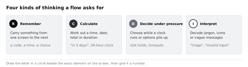
Walk the flow as your person, one screen at a time. On each screen, ask: what does this screen expect them to carry in from somewhere else, and what will they have to carry out?
Mark an R next to each element where the answer is not "nothing". Typical ones in a booking flow:
- A field asking for a number the person only has on paper or in another app: patient number, booking reference, insurance number.
- A one-time code sent by text or email that has to be read in one place and typed in another, especially if the field blocks pasting. WCAG 2.2 criterion 3.3.8, Accessible Authentication (Minimum), asks that sign-in steps do not depend on remembering or transcribing like this unless help such as paste or a password manager is allowed.
- Information already given earlier in the flow and asked for again. WCAG 2.2 criterion 3.3.7, Redundant Entry, covers this within one process.
- A choice made on an earlier screen that the current screen no longer shows. On Larkfield's Your details screen, the chosen time disappears, so Ade has to remember whether he picked 13:40 or 14:20 while typing his mother's details.
- Anything lost after the interruption: a half-filled form that reset, or a screen that no longer says what step this is.
For each marker, add a row: give it an ID (R1, R2...), name the element, and write what the person has to hold in their head in plain words, such as "Hold the chosen time while filling five fields".
Check it worked
Each R marker on the screens has a matching row in the sheet with the same ID, and every row names a single element rather than a whole screen. Look at the screen you came back to after the interruption: it has at least one R marker or a note in the sheet saying why nothing had to be rebuilt.
Step 4 · Mark every sum, conversion and comparison
Go through the flow again looking for arithmetic. Mark a C wherever the person has to work something out that the product already knows. Look for:
- Relative dates and times: "in 3 days", "next available: 2 days", "arrive 15 minutes before your appointment".
- Formats people have to convert: 24-hour times for an audience that thinks in am and pm, dates without the weekday, durations in minutes when they need an end time.
- Totals and comparisons: prices split across lines, a price per session when they need the total for a course, two slot lists on different days that have to be compared from memory.
- Counts the product could do: "you have 2 of 3 free appointments left this year" when the person needs to know whether this one is free.
Write the sum in the sheet as the person would do it: "13:40 minus 15 minutes, convert to pm, so leave home by...". If writing the sum out takes more than one line, that marker is likely to cause errors as well as effort.
Check it worked
Each C marker has a row with the sum written out step by step. Re-read Pick a time and Confirm (or your equivalents): every date shown either has a weekday and a calendar date, or carries a C marker.
Step 5 · Mark decisions made under pressure
Now look for places where the person has to choose while something pushes them. Mark a D on:
- Countdowns and holds: a slot reserved for five minutes, a session that expires, a page that reloads. WCAG 2.2 criterion 2.2.1, Timing Adjustable, expects most time limits to be turned off, adjusted or extended by the user, with some exceptions such as real-time events.
- Long option lists with no way to narrow them, such as 40 time slots on one screen or 12 services with similar names.
- Choices with consequences that are not shown until later: a cancellation fee mentioned only on Confirm, or a "Book" button that books and charges with no review step.
- Choices where the safe option is not the default, or where the two buttons look the same ("Cancel" the booking or "Cancel" this dialog).
Run the interruption test here too. If the slot timer kept running while you were away, the marker is a D, and the row should say what the person lost when it expired.
Check it worked
Every timer, hold or expiry in the flow has a D marker and a row that says how long it lasts and what happens when it runs out. Every screen with more than about seven options to choose from either has a way to filter them or carries a D marker.
Step 6 · Mark every term the person has to decode
Read every word on every screen out loud as your person. Mark an I wherever they would have to stop and work out what it means. This includes:
- Internal or professional terms: "triage", "review", "practitioner", "phlebotomy". Larkfield lists "Review" and "Follow-up" as separate services, and nothing says which one Ade's mother needs.
- Error messages that state a rule without saying what to do: "Invalid input", "Format not recognised", "Error 409".
- Icons without text, especially ones that mean different things in different apps.
- Instructions that rely on sight, layout or colour: "the green slots are available", "tap the button on the right".
- Figures of speech and idioms that a person reading in a second language may take literally.
In the sheet, write the term and what the person might think it means, as well as what it actually means. The gap between the two is the problem.
Check it worked
Every error message in the flow appears in the sheet, either with an I marker or with a note that it says what went wrong and what to do next. Each I row shows two meanings side by side: the likely reading and the intended one.
Step 7 · Write a fix for each marker and rank them
Fill in the Fix column. A good fix removes the mental work rather than explaining it. Some patterns that fit each type:
- Remember: show earlier choices on later screens, carry data forward, allow paste and code autofill, look records up from details people know (name and date of birth) instead of numbers they have to find.
- Calculate: do the sum for them. Show "Thursday 21 November, 1:40pm", the end time, the total and "leave by" when it matters.
- Decide: remove or lengthen timers, or warn before expiry and let people extend; group and filter long lists; show consequences on the screen where the choice is made; make the safe option the default.
- Interpret: name services by the person's problem, not the clinic's process; rewrite errors to say what happened and what to do; label icons; replace idioms with plain words.
Then rate Impact from 1 to 3 (3 if the load could stop someone finishing the booking or make them book the wrong thing) and Effort from 1 to 3 (3 if it needs back-end or policy changes). Sort by impact, highest first, then by effort, lowest first. Mark any row that maps to a WCAG criterion you have to meet, because those are not optional.
Check it worked
Every row has a fix written as a change to the product ("Show the chosen slot at the top of Your details"), not as advice ("make it clearer"). The sheet is sorted, and the top five rows include every marker you rated impact 3.
Step 8 · Put the fixes back on the flow
Go back to the laid-out screens and make the review readable for someone who was not there. Next to each marker, add a short note with its ID and the fix in a few words. Keep the markers on the exact element, not floating near the screen title, so a designer can find what to change without opening the sheet.
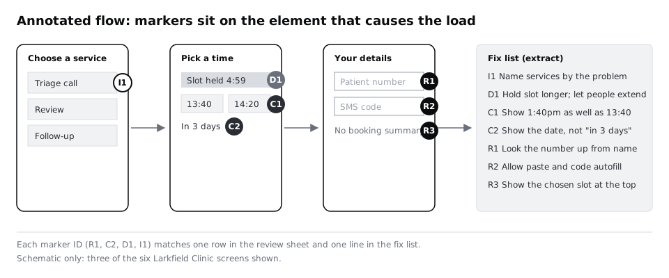
Add a short summary above the flow: how many markers of each type you found, the five fixes at the top of your sorted sheet, and which findings you want to confirm with real people in a usability test. Load you predicted is not load you watched someone struggle with, so say so.
Check it worked
Someone who has not seen your sheet can pick any marker on the annotated flow, read its ID and find the matching row. The summary gives a count per type (for example "R 6, C 4, D 3, I 7"), the top five fixes, and at least one finding marked for testing.
Next steps
- Add the fixes that map to WCAG criteria to the brief for the next version with Add accessibility requirements to a design brief.
- Review the same flow against general usability principles with Run a heuristic evaluation of an existing app.
- Confirm your highest-impact markers with people using Run a five-person usability test.
- Turn the confirmed problems into ratings the team can plan around with Rate usability problems by severity.
Part of these paths
Related tutorials
- Add accessibility requirements to a design briefYou will add an accessibility section to a design brief that names who could be shut out, sets a WCAG 2.2 target and lists testable requirements with how and when each one is checked.
- Run a heuristic evaluation of an existing appYou will have one merged list of usability problems in an existing booking flow, found by two evaluators working apart, with each problem tied to a heuristic, a screen and a severity rating.
Need this done for you?
Padding does this work for growing companies, from the first diagnosis to a system that keeps working.
Get new tutorials