Figma and design tools · Beginner · 12 min
Build a button with auto layout
By Padding · Updated 18 Nov 2026
Figma (web) · November 2026
You will have a Figma button whose padding, gap and alignment come from auto layout, so it resizes by itself for "Book" and "Book an appointment" and can show an icon on either side.
On this page
A button looks like the simplest thing in an interface, and it is the first place a hand-drawn design breaks. If you draw a rectangle and type a word on top of it, the rectangle has no idea the word is there. Change "Book" to "Book an appointment" and the text spills over the edge, so you resize the rectangle by eye, and the space on each side ends up a few pixels different every time.
Auto layout fixes this by making the button frame measure what is inside it. You set the space around the label (padding), the space between the label and any icons (gap), and how the contents line up (alignment), and Figma works out the size. This tutorial builds one button that way and then tests it with a short label, a long label, hidden icons and a full-width layout.
The numbers used here (16 px text on a 24 px line, 12 px top and bottom padding, 20 px side padding, an 8 px gap) give a 48 px tall button, which is a comfortable touch target. Use your own values later; the method does not change.
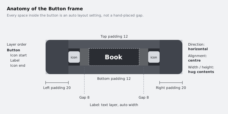
Step 1 · Write the label first
Start with the text, not the rectangle. In a new Design file, pick the Text tool (T), click on an empty part of the canvas and type Book. Press Escape to leave text editing with the layer still selected.
In the right sidebar, set the typeface you plan to use (any sans serif is fine), the size to 16 and the line height to 24. Setting the line height to a number, rather than leaving it on Auto, makes the button height predictable: it will always be the line height plus the top and bottom padding.
Check the text resizing option in the text section of the right sidebar. It should be auto width, the setting where the text box grows sideways as you type. A newly clicked text layer uses it by default; a text box you dragged out does not.
Rename the layer to Label by double-clicking its name in the layers panel.
Check it worked
The layers panel shows one text layer called Label. With it selected, the height in the right sidebar reads 24. Type a few extra letters on the end and the selection box widens to fit them, then delete them again.
Step 2 · Wrap the label in auto layout
With Label selected, press Shift A. Figma puts the text inside a new frame and turns on auto layout for that frame. You can also do this from the right-click menu or from the auto layout section of the right sidebar if you prefer not to use the shortcut.
Rename the new frame to Button. In the auto layout section of the right sidebar, make sure the direction is horizontal (items placed left to right). A single text layer looks the same either way, but the icons you add later need to sit beside the label, not above it.
Check it worked
The layers panel shows Button with Label nested under it. When Button is selected, the right sidebar has an auto layout section with direction, gap, padding and alignment controls. Drag Label inside the frame and it snaps straight back into place, because auto layout now positions it.
Step 3 · Set padding, fill and corner radius
Select Button. In the auto layout section, set the horizontal padding to 20 and the vertical padding to 12. If your sidebar shows padding as separate fields for each side, enter 20 for left and right and 12 for top and bottom.
Give the frame a fill so it reads as a button: a dark grey such as #2A2D33. Select Label and change its text colour to white. Back on Button, set the corner radius to 8.
Now look at the width and height of Button. Both should be set to hug contents, which means the frame takes its size from what is inside plus the padding. Shift A normally sets this for you. If either one says Fixed, change it to hug.
Check it worked
Button is 48 tall (24 line height plus 12 plus 12). Its width is the width of the word "Book" plus 40. Select Label and look at its position inside Button: it starts 20 from the left edge and 12 from the top. If the height is not 48, check that the line height on Label is 24 and not Auto.
Step 4 · Add an icon on each side
Real buttons often carry an icon: a calendar before the label, an arrow after it. Draw a stand-in for now so you can see how the layout treats it.
- Press F for the Frame tool and draw a small frame anywhere on the canvas. Set it to 16 by 16 in the right sidebar and name it
Icon start. - Inside it, draw a 16 by 16 rectangle or circle with a light grey fill so the icon is visible against the dark button.
- Duplicate the frame (Ctrl D on Windows, Command D on Mac) and rename the copy
Icon end. - Drag Icon start into Button in the layers panel so it sits above Label. Drag Icon end in so it sits below Label.
In a horizontal auto layout frame, the layer order in the panel is the left-to-right order on the canvas: the top layer is placed first. If an icon lands on the wrong side, drag it up or down in the layers panel.
Select Button and set the gap between items to 8.
Check it worked
On the canvas the button reads icon, Book, icon, with the same visible space between each icon and the word. Button is still 48 tall, because the 16 px icons are shorter than the 24 px text line. The width has grown by 16 + 8 on each side.
Step 5 · Centre the contents
Select Button and find the alignment control in the auto layout section, a small grid of dots. Click the centre dot. This centres the items on both axes, so the icons line up with the middle of the text line instead of its top edge.
For a hugging button, the horizontal part of this setting makes no visible difference yet, because there is no spare width to distribute. It matters in the last step, when the button is made wider than its contents.
Check it worked
Zoom in on the button (Shift 2 zooms to the selection). Each icon sits halfway down the button: select Icon start and the right sidebar shows its top edge 16 from the top of Button, since (48 minus 16) divided by 2 is 16. Before you centred, it was 12.
Step 6 · Test it with a long label
Select Button and duplicate it. Place the copy below the original. Double-click into the copy's Label and change the text to Book an appointment.
The copy grows wider as you type. You did not resize anything; the frame recalculated its width from the new label, keeping 20 at each end and 8 on each side of the text.
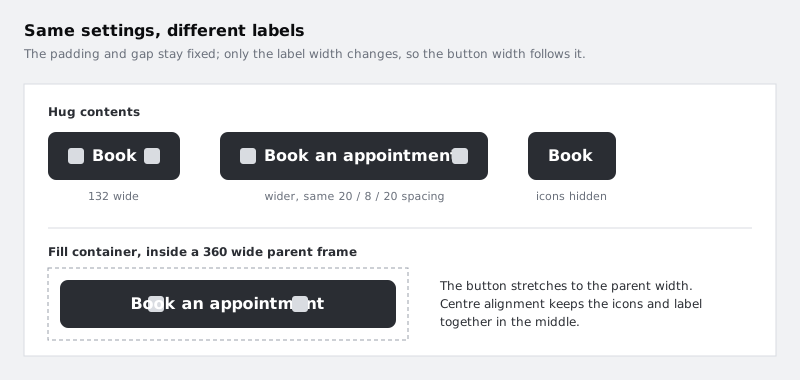
If the long label wraps onto two lines instead of widening the button, the text layer is not on auto width. Select Label and switch its resizing back to auto width.
Check it worked
Both buttons are 48 tall. Select the Label inside each one in turn: in both, Label is the same distance from Icon start, and the right padding inside each Button matches the left. The two buttons are different widths, and neither has text touching or crossing an edge.
Step 7 · Hide an icon and watch the gap close
Not every button needs both icons. Select Icon end in the long button and hide it, either with the eye icon next to its name in the layers panel or with Ctrl Shift H (Command Shift H on Mac).
A hidden layer inside auto layout takes no space and gets no gap, so the button shrinks to fit what is left. Hide Icon start as well and you have a plain text button with the same padding. This is why you can build one button with both icons and switch them on and off, rather than drawing three separate buttons.
Check it worked
With one icon hidden, the long button is 24 narrower than before (the 16 px icon plus its 8 px gap). With both hidden, it is the width of the label plus 40, the same as the button you had at the end of the padding step. Unhide both icons before moving on.
Step 8 · Make a full-width version
On a phone screen, the main action is often as wide as the screen. Auto layout handles that too.
- Draw a frame 360 wide and 72 tall and name it
Footer. Select it and press Shift A to give it auto layout, with 12 padding all round. - Drag a copy of the long button into Footer.
- Select that button and, in the right sidebar, change its width from hug contents to fill container. It stretches to the inside width of Footer.
Because you centred the contents earlier, the icons and label stay together in the middle of the wide button instead of sliding to the left edge.
A short label in a hugging button can look cramped. If you want a lower limit, open the width setting on the original Button and add a minimum width, for example 96. The button still hugs longer labels but never gets narrower than that.
Check it worked
The button inside Footer is 336 wide (360 minus 12 on each side) and 48 tall. Change Footer's width to 300 and the button follows, becoming 276 wide, with the label still centred. Change the label back to Book and the button stays full width, because its width now comes from Footer, not from the text.
Next steps
You now have one button frame where every space is a setting you can read and change, which is what a reusable component needs underneath it.
- Turn this frame into a component with primary, secondary and disabled styles in /tutorials/build-a-button-component-with-variants.
- Use the same padding, gap and fill-container ideas on a larger object in /tutorials/build-a-responsive-card-with-auto-layout.
- If your file is getting crowded with test buttons, tidy it with /tutorials/organise-a-figma-file-with-pages-frames-and-layers.
Part of these paths
Related tutorials
- Build a responsive card with auto layoutYou will have an appointment card in Figma, with a photo, a stack of text and a button, that keeps its layout at any width from 280 to 600 pixels because every layer has the right hug, fill or fixed setting.
- Turn a button into a component with variantsYou will have a Figma button component set with Type, Size and State properties, so a teammate can place one button and switch it between primary, secondary, large, small and disabled from the right sidebar.
Need this done for you?
Padding does this work for growing companies, from the first diagnosis to a system that keeps working.
Get new tutorials