Figma and design tools · Beginner · 14 min
Turn a button into a component with variants
By Padding · Updated 18 Nov 2026
Figma (web) · November 2026
You will have a Figma button component set with Type, Size and State properties, so a teammate can place one button and switch it between primary, secondary, large, small and disabled from the right sidebar.
On this page
A button rarely comes in one version. A booking screen has a main action ("Book") and a quieter one ("Back"), a compact size for tight rows, and a greyed-out version while a form is incomplete. If each of those is a separate frame, someone eventually copies the wrong one, restyles a copy by hand, or cannot find the small secondary button because it is named Button copy 4.
Variants solve this by grouping every version of the button into one component set. A teammate places a single button and picks its version from a few labelled controls in the right sidebar. The set only stays usable if those controls are named well, so most of the advice here is about naming: what to call each property, what to call its values, and how to add a new property later without breaking the ones people already use.
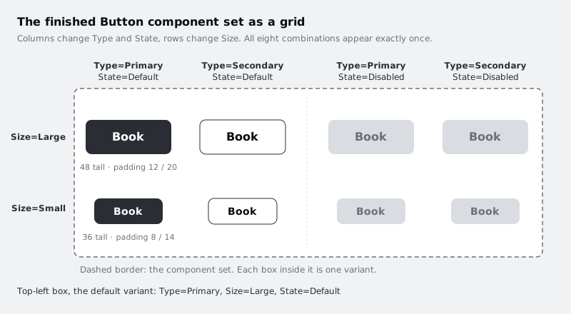
You start from the auto layout button built in /tutorials/build-a-button-with-auto-layout: a dark frame, 48 tall, with 12 padding top and bottom, 20 at the sides, a 16 px label on a 24 px line, and two optional icons. You end with eight variants: two types, two sizes and two states.
Step 1 · Make the button a component
Open the file with your auto layout button. Hide both icon layers for now so you can see the label clearly; they still exist and will be available in every variant later.
Select the Button frame (the frame itself, not the Label inside it) and press Ctrl Alt K on Windows or Command Option K on Mac. You can also use the create component button in the toolbar at the top of the canvas, or right-click the frame and choose to create a component. The frame becomes a main component: the one source every copy of the button will follow.
Keep the layer name Button. That name is what people type when they search the assets panel, so a plain noun beats anything clever such as CTA or Btn-new.
Check it worked
In the layers panel, the icon next to Button has changed from the frame symbol to the component symbol (four small diamonds), and the name is shown in the component colour. On the canvas, the label above the frame also shows the component symbol. The button is still 48 tall and still hugs its label.
Step 2 · Add a second variant
With the Button component selected, look in the right sidebar for the component section. It has a button to add a variant, shown as a plus. Click it.
Figma does three things at once. It wraps your component in a component set, which appears on the canvas with a dashed border. It places a copy of the button inside the set, below or beside the original. And it creates a variant property with a placeholder name such as Property 1, with values such as Default and Variant2.
If you already had two separate button components, you could select both and use the option in the right sidebar to combine them as variants instead. The result is the same kind of set.
Check it worked
The layers panel shows a parent called Button with the component set symbol, and two children under it. Their names follow a pattern like Property 1=Default and Property 1=Variant2. On the canvas both buttons sit inside one dashed border. Drag the set around and both buttons move together.
Step 3 · Name the Type property and style the secondary button
The placeholder names would reach every teammate who uses the button, so fix them before going further.
Select the component set (click the dashed border, or the Button parent in the layers panel). The right sidebar now lists the set's properties. Click Property 1 to rename it and type Type. Then rename its values: Default becomes Primary and Variant2 becomes Secondary. You can rename a value from the set's property list, or by selecting a single variant and editing the value in its own property field.
Now give the secondary variant its own look. Select only that variant and change:
- Fill: white (
#FFFFFF) - Stroke: 1 px, dark grey (
#2A2D33), positioned inside so the button does not change size - Label colour: near black (
#0B0C0E)
Leave the padding, corner radius and text style alone. Variants work best when they differ only where they have to; anything left identical stays easy to change in one go later.
Check it worked
The layer names now read Type=Primary and Type=Secondary. On the canvas you see a dark button and a white outlined button of exactly the same size. Select the Secondary variant and confirm its height in the right sidebar is still 48.
Step 4 · Add a Size property
A second property gives the set its second axis. Select the component set. In the properties area of the right sidebar there is a plus for adding a property; choose a variant property, name it Size and give it the value Large. Both existing variants now carry Size=Large.
Next, make the small versions:
- Select both variants inside the set and duplicate them (Ctrl D on Windows, Command D on Mac). The copies land inside the set.
- Select the two copies only. In the right sidebar, change their Size value from
LargetoSmall. Typing a new value creates it. - Restyle the copies. Set the label to 14 px on a 20 px line, the vertical padding to 8 and the horizontal padding to 14.
That gives a 36 px tall button (20 plus 8 plus 8). Small buttons suit dense lists and toolbars; keep Large as the default for main actions on touch screens.
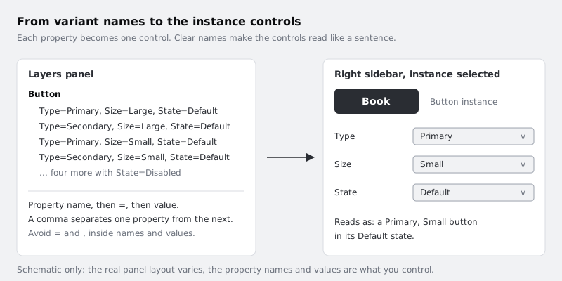
If you prefer typing to clicking, you can also rename a variant layer directly, for example to Type=Secondary, Size=Small. Figma reads the text before each = as the property name and the text after it as the value, with commas between properties.
Check it worked
The set holds four variants and the layers panel shows four names, each with both properties: Type=Primary, Size=Large, Type=Secondary, Size=Large, Type=Primary, Size=Small and Type=Secondary, Size=Small. Select each Small variant and its height reads 36. No two layer names are identical.
Step 5 · Lay the set out as a grid
Figma does not care where variants sit inside the set, but people do. A set arranged as a table is far quicker to scan and makes a missing combination obvious.
Arrange the variants so that each column is one Type and each row is one Size: Primary on the left, Secondary on the right, Large on top, Small underneath. Leave at least 24 of space between buttons and 24 between the buttons and the dashed border, so a reader can tell where one variant ends and the next begins.
Order matters too. Put the most common value first in each direction (Primary before Secondary, Large before Small). The variant in the top-left corner of the set is the default a teammate gets when they drag the button in from the assets panel, so make sure that corner holds the one you want people to start with. The order of the layers in the layers panel does not decide this; position on the canvas does.
Check it worked
Read the grid aloud: across the top row you should say "Primary large, secondary large", and down the left column "Primary large, primary small". If any button breaks that pattern, select it and check its layer name, which is the source of truth. Click the top-left button on the canvas: the right sidebar shows Type Primary and Size Large. The instance test in the last step confirms this is the default.
Step 6 · Check every property name against four rules
This is the step that keeps the set usable when it has thirty variants instead of four. Check each property and value against these rules, and rename anything that fails.
One property, one decision. Each property should answer a single question: "Which kind?", "How big?", "Is it usable right now?". A property called Style with values Primary Large and Secondary Small mixes two decisions, so adding a third size means inventing a new value for every type. Splitting them into Type and Size means a new size is one new value.
Name the question, not the answer. The property name describes what is being chosen (Type, Size, State); the values are the choices (Primary, Small, Disabled). Avoid names like Primary? or Big, which only make sense for one value.
Keep values in the same form. Within a property, use one style: all words (Small, Large) or all sizes in pixels (36, 48), not a mix such as Small and 48. Use the same capitalisation everywhere. Pick words your developers already use in code if you know them; a design property called Type that maps to a variant prop in code is a translation everyone has to remember, so agree a shared word if you can.
Leave the separators alone. Do not put = or , inside a property name or value. Figma uses those characters to build the layer names, and stray ones make names hard to read and easy to break when someone renames layers by hand.
Write the result down somewhere your team can see it. A short text layer next to the set on the canvas is enough:
Button
  Type:  Primary | Secondary
  Size:  Large | Small
State: Default | Disabled (added next)Check it worked
Your text note lists every property and value, and it matches the layer names in the layers panel exactly, including capitalisation. Each property name is a single noun. No value contains = or ,. If you can read any layer name as a plain phrase ("a Secondary, Small button") without explaining it, the names pass.
Step 7 · Add a State property for disabled buttons
Growing a set is where poor naming starts to hurt, so add the third property with the rules in mind.
Select the component set and add another variant property named State with the value Default. All four variants now carry State=Default.
Select the two Large variants, duplicate them, and set the copies' State to Disabled. Do the same for the two Small variants. You now have eight variants. On each Disabled copy, set the fill to light grey (#D9DCE1), remove the stroke on the secondary versions, and set the label colour to mid grey (#6A707B). Leave size and padding unchanged, so a button can switch to disabled without the layout around it jumping.
Lay the disabled variants out to the right of the existing grid, keeping the same row for each size. Your grid is now four columns wide: Primary, Secondary, Primary disabled, Secondary disabled.
Why State and not a property called Disabled with values true and false? Figma shows a property whose values are true and false (or yes and no, on and off) as a toggle on instances, which is tidy for one condition. But buttons usually gain more states later (hover, pressed, loading), and a toggle cannot hold those. A property named State with a list of values can.
Check it worked
The set holds eight variants. Every layer name has three parts, for example Type=Secondary, Size=Small, State=Disabled, and all eight names are different. Each disabled variant is the same height as its default twin: 48 for Large, 36 for Small. Update your text note so the State line no longer says "added next".
Step 8 · Use the set the way a teammate will
Test the set from the point of view of someone who did not build it.
Open the assets panel (the tab beside Layers in the left sidebar), find Button and drag it onto an empty part of the canvas, outside the set. This is an instance. With it selected, the right sidebar shows one control for each property: Type, Size and State.
- Change Type to Secondary. The instance turns white with an outline.
- Change Size to Small. It shrinks to 36 tall.
- Double-click the label and change it to
Back. Then change State to Disabled. The label staysBack, because Figma keeps text overrides when you switch between variants that share the same layer structure. - Change everything back to Primary, Large, Default.
If a control is missing or a value will not switch, the usual cause is a variant whose layer name has a typo, such as size=Small with a lower-case s. Figma can read that as a different property from Size, so the set no longer lines up. Fix the layer name and the control reappears.
Check it worked
You can reach all eight combinations on one instance using only the three controls in the right sidebar, without opening the component set. The label you typed survives every switch. The instance dropped in from the assets panel started as Primary, Large, Default, which confirms your top-left variant is the default.
Next steps
You have a button set that a teammate can place and change without reading any documentation, and naming rules that let it grow without turning into a list of one-off variants.
- Add a text property for the label and booleans for the icons, so teammates can switch them without digging into layers, in /tutorials/add-component-properties-in-figma. It starts from the eight variants you have now (Type, Size and State) and connects each property across all eight.
- If components are new to you, see how main components and instances relate on a larger object in /tutorials/make-your-first-figma-component.
- Revisit the padding and hug settings that every variant depends on in /tutorials/build-a-button-with-auto-layout.
Part of these paths
Related tutorials
- Make your first component and use its instancesYou will have one appointment card component in the Larkfield Clinic file, with instances on three screens that all change when you edit the main component.
- Add text, boolean and instance-swap properties to a componentYou will have a button component set whose label, icon visibility and icon choice are component properties rather than variants, so the eight variants from the previous tutorial cover what would otherwise take thirty-two.
- Build a button with auto layoutYou will have a Figma button whose padding, gap and alignment come from auto layout, so it resizes by itself for "Book" and "Book an appointment" and can show an icon on either side.
Need this done for you?
Padding does this work for growing companies, from the first diagnosis to a system that keeps working.
Get new tutorials