Figma and design tools · Intermediate · 14 min
Add text, boolean and instance-swap properties to a component
By Padding · Updated 18 Nov 2026
Figma (web) · November 2026
You will have a button component set whose label, icon visibility and icon choice are component properties rather than variants, so the eight variants from the previous tutorial cover what would otherwise take thirty-two.
On this page
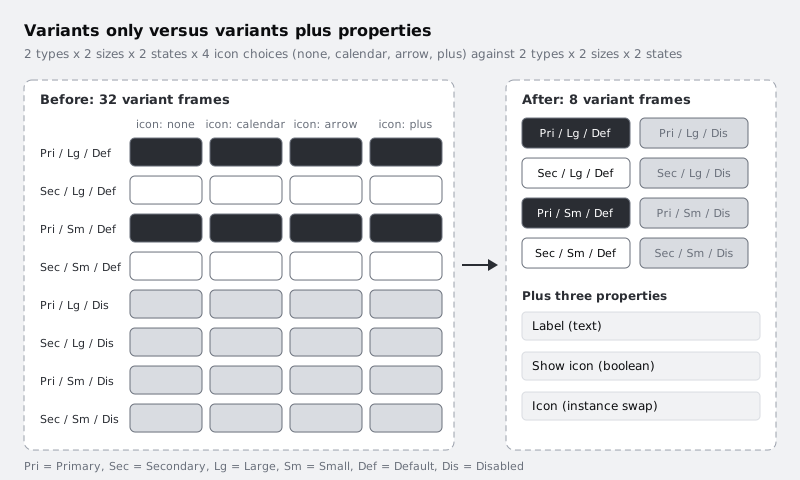
Variants are good at one thing: describing versions of a component that look different in several ways at once. A secondary button has a different fill, a different stroke and a different text colour from a primary one, so Type is a sensible variant. Trouble starts when every other choice also becomes a variant. Add "Icon: yes / no" and the set doubles. Add "Icon: calendar / arrow / plus" and it multiplies again. Two types, two sizes and two states, multiplied by four icon choices (none, calendar, arrow, plus), comes to thirty-two near-identical frames, and every new icon adds eight more.
Component properties fix this for choices that are about content, not appearance. A text property lets anyone type the label straight into the right sidebar. A boolean property shows or hides a layer. An instance-swap property picks which component sits in a slot. None of them adds frames to the set.
This tutorial starts from the button set built in /tutorials/build-a-button-component-with-variants, with eight variants (Type × Size × State), and adds all three property types without adding a single frame. Along the way it gives you a test for deciding which kind of choice a new option should be.
Step 1 · Sort your options into variants and properties
Before touching Figma, list every way a button can differ. Write the list in a comment, a note or on the canvas next to the set. For a typical button it looks like this:
- Type: Primary, Secondary
- Size: Large, Small
- State: Default, Disabled
- Label: any text
- Icon shown: yes or no
- Which icon: calendar, arrow, plus, and more later
Now ask one question of each line: does choosing a different value change the styling of more than one layer, or does it only change what one layer contains or whether it is visible?
- Type changes the fill, stroke and label colour. That is styling across several layers, so it stays a variant.
- Size changes padding, text size and line height together. It stays a variant.
- State changes the fill, stroke and label colour for disabled buttons. It stays a variant.
- Label changes the characters in one text layer. That is a text property.
- Icon shown toggles one layer. That is a boolean property.
- Which icon replaces one nested instance with another. That is an instance-swap property.
A useful second test: if the list of values is open-ended (any text, any icon from a growing library), it cannot be a variant without the set growing forever.
Check it worked
Your list has every option labelled either variant or property, with exactly three variant properties (Type, Size, State) and three content properties (Label, Icon shown, Which icon). State is the Disabled variant you already added in the previous tutorial, and it passes the same test: Disabled changes fill and text colour together, so it stays a variant. If you have another option, such as a loading spinner, decide it with the same question.
Step 2 · Make the icons components
An instance-swap property can only swap one component instance for another, so each icon must be a component first.
On the same page as your button set, or on a separate Icons page, draw three simple 16 × 16 icons: a calendar, a right arrow and a plus. Wrap each in a 16 × 16 frame so they are all the same size, then select each frame and make it a component (Ctrl Alt K, or Command Option K on Mac). Name them with a shared prefix so they sort together in the assets list, for example Icon / Calendar, Icon / Arrow right and Icon / Plus.
Then go into your button set and do the following in each of the eight variants:
- Drag an instance of
Icon / Calendarfrom the Assets panel into the button, and in the layers panel drop it directly above theIcon startplaceholder frame. - Delete the old
Icon startframe, then rename the new instanceIcon start. - Make sure the new
Icon startis visible. The previous tutorial hid both icon frames; if the eye in the layers panel is crossed out, click it. A hidden layer here would stay hidden even when the boolean property you add later is set to true. - Delete
Icon end. This tutorial only uses an icon before the label. If you would rather keep it for later, leave it hidden and do not connect any of the properties below to it.
Using the same layer name in each variant matters: Figma matches layers across variants by name and position when you switch variants on an instance.
Check it worked
The Assets panel lists three components under Icon. Expand any button variant in the layers panel and you see a layer called Icon start with the component instance symbol next to it, followed by Label, and no visible Icon end. All eight variants show the calendar before the label.
Step 3 · Add a text property for the label
Select the component set itself (the dashed outline around all eight variants), not one variant. In the right sidebar, find the properties section that already lists Type, Size and State, and use its add (+) control to create a new property. Choose Text, name it Label and give it a default value of Book.
The property exists now, but nothing is connected to it yet. Select the Label text layer in each of the eight variants: click Label in the first variant, then Shift-click Label in each of the other seven in the layers panel. With all eight selected, look in the right sidebar for the text section's control to apply a component property (a small property icon beside the section heading) and pick Label.
Connecting all eight at once is the habit to build. If you connect only one variant, the label typed into an instance is lost when someone switches that instance to a variant you missed.
Check it worked
Click each Label layer in turn. In the right sidebar, every one shows that it is bound to Label rather than showing free text. Drag an instance of the button onto the canvas outside the set. Its right sidebar now has a Label field. Type Book an appointment and the button grows to fit, because auto layout is still hugging the text.
Step 4 · Add a boolean property to show or hide the icon
With the component set selected again, add another property, choose Boolean, name it Show icon and set the default to true.
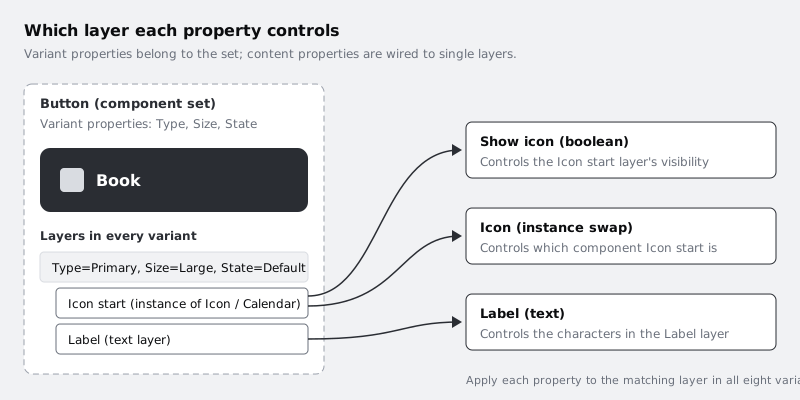
Select the Icon start layer in all eight variants (click, then Shift-click in the layers panel). In the right sidebar, the layer section has a control to apply a boolean property to the layer's visibility. Pick Show icon.
Because the button uses auto layout, a hidden icon takes no space, so the button closes up around the label with no leftover gap. That is what makes a boolean property safe here. In a frame without auto layout the hidden icon would leave a hole.
Check it worked
On your test instance, the right sidebar now shows a Show icon toggle. Turn it off: the icon disappears and the button gets narrower by the icon width plus the gap (16 + 8 = 24 if you used the auto layout tutorial's numbers, which the Large and Small variants share). Turn it on and the icon returns in the same place.
Step 5 · Add an instance-swap property to choose the icon
Add one more property to the set. Choose Instance swap, name it Icon, and pick Icon / Calendar as the default value.
In the same dialog, or afterwards by editing the property, set the preferred values: add Icon / Calendar, Icon / Arrow right and Icon / Plus. Preferred values are the short list an instance's dropdown shows first, so people choose a button icon rather than searching the whole library and picking a logo or an illustration by mistake.
Select the Icon start layer in all eight variants once more and, in the right sidebar section for the selected instance, apply the Icon property to it. The same layer now carries two properties: Show icon controls whether it is visible and Icon controls which component it is. That pairing is normal and is the reason you set them up as separate properties.
Check it worked
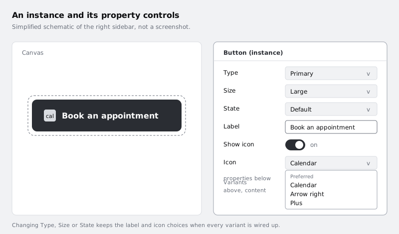
Your test instance shows a third control, Icon, with a dropdown. Open it and the three icons appear at the top as preferred values. Pick the arrow: the button now shows an arrow before the label. Turn Show icon off and on again and the arrow comes back, not the calendar, because the swap is remembered on the instance.
Step 6 · Test every combination from one instance
Place three instances of the button side by side and set them up as three real uses:
- Type Primary, Size Large, State Default, Label
Book an appointment, Show icon on, Icon Calendar. - Type Secondary, Size Small, State Default, Label
Back, Show icon off. - Type Primary, Size Small, State Disabled, Label
Add a reminder, Show icon on, Icon Plus.
Then switch the first one to Type Secondary and back, and to State Disabled and back. Its label and icon should survive the switch. If the label resets to Book or the icon resets to the calendar, the property is not connected in one of the variants. Go back to the set, select that variant's layer and apply the property.
Check it worked
All three instances look different, yet the component set on the canvas still holds exactly eight variants. Count the frames inside the dashed outline to confirm. Switching Type, Size or State on any instance keeps its label, icon visibility and icon choice.
Step 7 · Write the rules down next to the set
Properties are only useful if teammates know which ones to reach for. Put a short text note beside the component set, or in the component's description field in the right sidebar, saying:
- Use Type, Size and State for appearance. Add a new variant only when the styling changes.
- Use Label for the text. Do not detach the instance to edit it.
- Use Show icon and Icon for icons. To make a new icon available, publish it as an
Icon /component and add it to the preferred values.
This is also where you record the decision test from the first step, so the next person who wants a "with arrow" variant adds a preferred value instead.
Check it worked
Select the component set and the description (or the note beside it) mentions all six properties and says when to add a variant. Someone opening the file for the first time can read which control to use for each change without asking you.
Next steps
You now have a button set with eight variants and three content properties, and a test for sorting future options into one or the other.
- If you have not built the Type, Size and State variants yet, or want to tighten their naming, work through /tutorials/build-a-button-component-with-variants.
- Add hover and pressed behaviour to the same set with /tutorials/build-interactive-components-for-prototypes.
- If the button's padding or icon spacing looks off when the icon is hidden, revisit the auto layout settings in /tutorials/build-a-button-with-auto-layout.
Part of these paths
Related tutorials
- Turn a button into a component with variantsYou will have a Figma button component set with Type, Size and State properties, so a teammate can place one button and switch it between primary, secondary, large, small and disabled from the right sidebar.
- Make components respond to hover and tap with interactive componentsYou will have a time-slot chip that toggles when tapped and a button that shows hover and pressed states, wired once inside their component sets so every instance in every prototype behaves the same way.
Need this done for you?
Padding does this work for growing companies, from the first diagnosis to a system that keeps working.
Get new tutorials