Figma and design tools · Intermediate · 13 min
Make components respond to hover and tap with interactive components
By Padding · Updated 18 Nov 2026
Figma (web) · November 2026
You will have a time-slot chip that toggles when tapped and a button that shows hover and pressed states, wired once inside their component sets so every instance in every prototype behaves the same way.
On this page
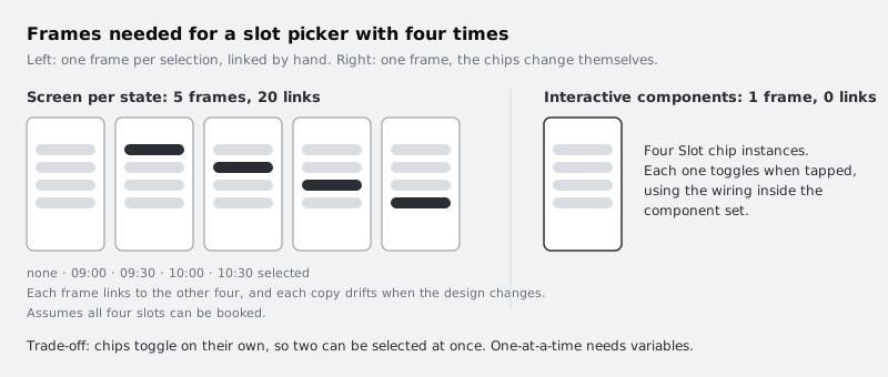
A prototype that shows a booking flow usually needs the reader to pick a time. Without interactive components, that means one frame with nothing selected, one frame with 09:00 selected, one with 09:30 selected, and so on, each linked to the others by hand. Four bookable time slots cost five frames and twenty connections. Change the chip's corner radius and you change it in five places.
Interactive components move that wiring into the component itself. You draw the interaction once, from one variant to another inside the component set, and every instance you place anywhere in the file carries it. The booking screen shrinks to one frame, and the chips change state on their own when tapped.
You will build two of these: a time-slot chip that toggles between available and selected, and a button that darkens on hover and shrinks slightly while pressed. Then you will place both on a screen, add a screen-level link to the button without losing its pressed state, and check where the technique stops being enough.
Step 1 · Build the Slot chip component set
Draw a frame 112 wide and 44 tall with auto layout, 22 corner radius, a white fill and a 1.5 px dark grey stroke (#2A2D33) set to inside. Put one text layer in it, 09:30, 15 px bold, centred. Name the frame Slot chip and make it a component with Ctrl Alt K on Windows or Command Option K on Mac.
With the component selected, add a variant from the component section of the right sidebar, then add one more so the set has three. Rename the property to State and the values to Available, Selected and Unavailable. Style them:
- Selected: fill
#2A2D33, no stroke, text white - Unavailable: fill
#F1F2F4, stroke#D9DCE1, text#9BA1AC
Keep the text layer name identical in all three variants (for example Time). Figma matches layers by name when it animates between variants, and a renamed layer in one variant is treated as a different object.
Check it worked
The layers panel shows a component set called Slot chip with three children named State=Available, State=Selected and State=Unavailable. Each child contains a text layer with the same name. Select the Slot chip component set itself and the right sidebar lists a State property with those three values.
Step 2 · Wire the chip to toggle when tapped
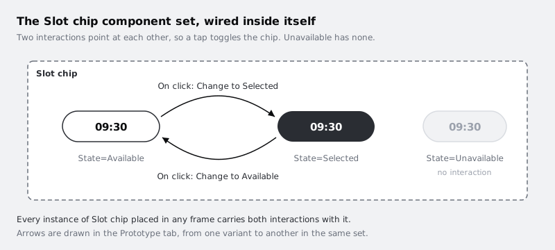
Switch the right sidebar to the Prototype tab. Select the State=Available variant inside the set (click it once in the layers panel so you have the variant, not the whole set). Hover over its edge and drag the round connection handle onto the State=Selected variant.
An interaction panel opens. Set:
- Trigger: On click
- Action: Change to, with the destination
State=Selected(Figma fills this in from the variant you dropped on) - Animation: Instant for now
Now do the reverse: select State=Selected and drag its handle back to State=Available, with the same trigger and action. Leave State=Unavailable with no interaction at all. A tap on a slot nobody can book should do nothing, which is what a real app would do.
When you drag between variants of the same set, Figma offers Change to rather than Navigate to. If you see Navigate to, the destination is outside the set: you probably dropped the handle on a frame or a different component.
Check it worked
In the Prototype tab, with the component set selected, you see two connection arrows inside the dashed border, one each way between Available and Selected, and none leaving Unavailable. Select State=Available and the right sidebar's interaction list shows one entry reading something like "On click, Change to State=Selected".
Step 3 · Add hover and pressed states to the button
Open your button component set. If it has a State property with only Default and Disabled, add two values for the primary large button: Hover and Pressed.
- Hover: fill one step darker,
#0B0C0E - Pressed: fill
#6A707B, and reduce the frame to 44 tall by taking 2 px off the top and bottom padding, so the change shows without relying on colour alone
The 4 px shrink is a deliberate trade-off. It breaks the usual rule of keeping size fixed across states, so in an auto layout screen anything below the button moves up 4 px while it is held down. If that jump bothers you, keep the outer frame at 48 and shrink an inner layer instead, such as a nested frame that holds the fill and label. Note too that you are adding Hover and Pressed only to Type=Primary, Size=Large; Secondary and Small instances will not have these states unless you repeat the work for them.
Now wire them in the Prototype tab:
- From
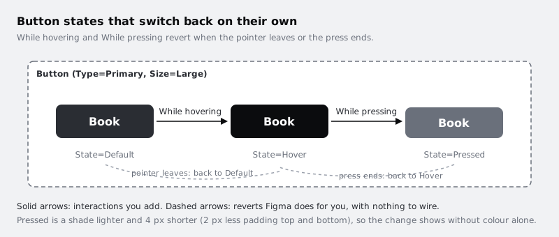
State=Default, drag toState=Hover. Trigger: While hovering. Action: Change to. - From
State=Hover, drag toState=Pressed. Trigger: While pressing. Action: Change to.
You do not need arrows going back. While hovering and While pressing both reverse themselves: when the pointer leaves, the button returns to Default, and when the press ends, it returns to Hover. Drawing return arrows by hand with Mouse leave or Mouse up is possible, but it doubles the wiring and is easy to get out of step.
As wired, Pressed can only be reached from Hover, so you will see it with a mouse or trackpad. Test the button in a desktop browser rather than on a phone.
Check it worked
With the button set selected in the Prototype tab, you see exactly two arrows: Default to Hover and Hover to Pressed. The Disabled variant has no arrow, so a disabled button ignores the pointer. Select State=Pressed and confirm it is 44 tall in the right sidebar while the other variants are 48.
Step 4 · Give the state changes a short animation
Instant changes feel abrupt on a button. Open each of the four interactions you drew and change the animation:
- Chip toggle, both directions: Smart animate, Ease out, 150 ms
- Button Default to Hover: Dissolve, 100 ms
- Button Hover to Pressed: Smart animate, Ease out, 80 ms
Smart animate interpolates the fill and the padding change, so the pressed button visibly shrinks rather than snapping. It only works because the layers inside each variant share names, which you set up in the first step. Keep durations short: these are feedback, not transitions between screens, and anything much over 200 ms starts to feel like lag when a tester taps quickly.
Check it worked
Each interaction in the Prototype tab now names an animation other than Instant, and the durations match the list above. If you open the State=Pressed variant and rename its text layer to something else, the interaction panel still works but the label will fade instead of moving; rename it back so all variants agree.
Step 5 · Place the components on one screen and try them
Make a mobile frame (for example 390 by 844) for a booking screen. Add a heading, then four Slot chip instances in a horizontal auto layout row with 8 gap: 09:00, 09:30, 10:00 and 10:30. Set the 10:00 chip to Unavailable in its State dropdown. Below them, place one Button instance with the label Continue.
Do not add any interactions to the frame. Select the frame and present it with the play button at the top right of the Figma window.
In the presented prototype:
- Click 09:00. It turns dark. Click again and it returns to white.
- Click 10:00. Nothing happens.
- Move the pointer onto Continue and it darkens. Press and hold, and it shrinks and greys. Release, then move away, and it returns to Default.
The comparison below counts frames as if all four slots could be booked; your screen has 10:00 unavailable, which would only make the hand-linked version smaller, not simpler.
Check it worked
Your file has one booking frame, not five. The frame itself has no outgoing connections in the Prototype tab, yet in presentation the chips toggle and the button responds to hover and press. If a chip does nothing, check that the instance on the screen is in the Available state and that the interaction was drawn on the variant, not on the text layer inside it.
Step 6 · Link the button to the next screen without losing its states
The button now has its own While hovering and While pressing interactions. It still needs to take the tester to the next screen.
Create a second frame, Your details. Select the Continue instance on the booking frame (the instance, not the main component) and drag its connection handle to the new frame. Set Trigger: On click, Action: Navigate to, Animation: Instant or a short slide.
An interaction on an instance takes priority over one on the main component only when they share a trigger. Your instance uses On click; the component uses While hovering and While pressing. So all three run: the button darkens, shrinks while pressed, and on release the prototype moves to Your details.
Avoid putting On click on both the instance and the component's Default variant. The instance wins, so the component's On click would silently stop working on that one button.
Check it worked
Present the booking frame again. Hover Continue, press it and release. You see the hover colour, then the pressed state, then the Your details frame. In the Prototype tab, the Continue instance shows one arrow leaving the booking frame, and the component set still shows its two internal arrows.
Step 7 · Know where interactive components stop
Go back to the presented booking screen and click 09:00, then 09:30. Both are now selected. Each chip only knows about itself, so nothing tells 09:00 to deselect when 09:30 is picked.
For a usability test that is often fine: tell testers to pick one slot, or keep the screen to a single chip row where it does not matter. When the test depends on single selection, or on the Continue button staying disabled until a slot is chosen, the logic belongs to the screen rather than the chip. That needs variables and conditional actions, covered in /tutorials/prototype-with-variables-and-conditions.
Write a one-line note on the booking frame (a text layer or a comment) saying "Chips toggle independently; select one" so anyone running the test knows the limit.
Check it worked
Your booking frame has a visible note or comment about independent selection. You can say, for each behaviour in your flow, whether it lives in a component (the chip toggle, the button press) or would need screen-level logic (one-at-a-time selection, enabling Continue).
Next steps
- Expose the chip's time label as a text property so people change it without opening layers: /tutorials/add-component-properties-in-figma
- Animate between whole screens, not just component states: /tutorials/animate-between-screens-with-smart-animate
- Make the slot picker single-select and enable Continue only after a choice: /tutorials/prototype-with-variables-and-conditions
- Revisit how the button's Type, Size and State properties are named: /tutorials/build-a-button-component-with-variants
Part of these paths
Related tutorials
- Add text, boolean and instance-swap properties to a componentYou will have a button component set whose label, icon visibility and icon choice are component properties rather than variants, so the eight variants from the previous tutorial cover what would otherwise take thirty-two.
- Animate between screens with Smart animateYou will have the Larkfield Clinic appointment card growing smoothly into a details view and shrinking back again, driven by matched layer names and an easing and duration you chose by comparing them.
- Turn a button into a component with variantsYou will have a Figma button component set with Type, Size and State properties, so a teammate can place one button and switch it between primary, secondary, large, small and disabled from the right sidebar.
Need this done for you?
Padding does this work for growing companies, from the first diagnosis to a system that keeps working.
Get new tutorials