Figma and design tools · Intermediate · 15 min
Animate between screens with Smart animate
By Padding · Updated 18 Nov 2026
Figma (web) · November 2026
You will have the Larkfield Clinic appointment card growing smoothly into a details view and shrinking back again, driven by matched layer names and an easing and duration you chose by comparing them.
On this page
Your Larkfield Clinic prototype now moves from screen to screen, with overlays, back navigation and transitions that suit a phone. Every one of those transitions treats a screen as one flat picture: the old one slides, dissolves or is pushed away, and the new one takes its place. That is right for moving between steps of a flow. It is wrong when the patient taps something and expects that same thing to open up in front of them.
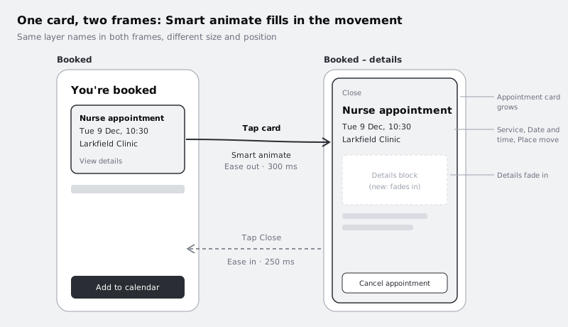
The Booked screen can have that moment. Since part 3 it has shown a heading, a summary of the appointment, a line saying a text has been sent and an Add to calendar button. In this part you turn that summary into a small tappable card with the service, time and place. A patient who taps it wants more: who they are seeing, what to bring, how to cancel. With a normal transition the card vanishes and a new screen appears. With Smart animate the card itself grows to fill the screen, the text inside it slides to its new place, and the extra details fade in. The patient sees the card they tapped turn into the details, so they never wonder where they are.
Smart animate does not let you draw a path or set keyframes. It compares two frames, pairs up layers that have the same name in the same place in the layer tree, and animates whatever differs between each pair. That makes the layers panel the real work in this part. Most broken Smart animate transitions are naming problems, not animation problems, so you will spend more time comparing layer trees than choosing curves.
Part 6 listed the selected style of a time slot on Pick a time as a job for this part. A change inside one element like that is better handled with interactive components, which switch between variants of a component without extra frames; Make components respond to hover and tap with interactive components covers it. This part is about the bigger change: one element opening into a new view.
Step 1 · Decide what moves, what changes and what appears
Before you touch Figma, write down the two states of the card. Open the page that holds your high-fidelity screens and prototype, find the Booked frame, and add a sticky note or a text layer beside it with three short lists:
- Moves or resizes: the card's background grows from a small panel to almost the full frame; the service name gets larger and moves up; the date and time line and the place line move up with it.
- Changes appearance: the card background may change colour or corner radius in the expanded state; a small "View details" hint, which you add in the next step, becomes a "Close" link.
- Appears or disappears: in the details view, a block with the clinician (
Nurse Okafor), what to bring (Your red book, if this is for a child), the address (14 Mill Lane) and aCancel appointmentbutton. On the Booked screen, the headingYou're bookedandAdd to calendarbutton are covered or pushed away.
This list is the brief for the animation. Every item in the first two lists must be a layer that exists in both frames with the same name. Items in the third list exist in only one frame, and Smart animate will fade them in or out. That is fine for genuinely new content, and a fade is often the calmest way to bring it in. It is not fine for the card, which must move rather than fade, or the whole effect is lost.
Check it worked
Next to your Booked frame there is a note with three labelled lists. Every part of the appointment summary (service, date and time, place, plus the hint you are about to add) appears in either the first or second list, and nothing in the third list is part of the card you want the patient to see moving.
Step 2 · Turn the summary into a card and name its layers
Work in the Booked frame. The series so far has given Booked a summary of the appointment but no card around it, so make one now:
- Select the service, date and time, and place text layers of the summary, and wrap them in a frame (Ctrl Alt G on Windows, Command Option G on Mac). Give the frame a light fill, a little padding and rounded corners so it reads as a card.
- Inside that frame, below the place line, add a small text layer that reads
View details. It tells the patient the card can be tapped.
Default names cause two kinds of trouble. A name like Frame 12 tells you nothing when you compare trees, and a name like Text may be used by several layers, so you cannot be sure which one Figma will pair with which. Give every layer a unique, plain name before you change anything. Expand the card in the layers panel and rename (double-click the name, or select the layer and press Ctrl R or Command R):
- the screen title above the card (
You're booked):Heading - the new card frame:
Appointment card - its background shape, if it has one separate from the frame:
Card background - the service text:
Service - the date and time text:
Date and time - the place text:
Place - the
View detailstext:Card action - the button below:
Add to calendar, if it is not already called that
Name the hint Card action rather than View details, because its text will change to Close in the details view. The layer name describes the job, which stays the same; the text describes the state, which does not.
Do all of this before you make the second frame. The copy you make in the next step inherits these names, so you rename once.
Check it worked
In Booked, the service, date and time, and place sit inside a frame called Appointment card with a View details line at the bottom. Each layer inside the card has a meaningful name, no name repeats inside the card, and Heading and Add to calendar sit outside the card at the top level of Booked.
Step 3 · Make the details frame by duplicating Booked
Smart animate works best when the destination starts as an exact copy of the source, because a copy has the same names and the same tree. Do not draw the details view from scratch.
Select the Booked frame and duplicate it (Ctrl D on Windows, Command D on Mac). Drag the copy to the right of Booked, outside any prototype flow arrows, and rename it Booked – details. From now on, leave the original Booked frame as it is: the next parts of the series test and revise the booking flow, and they need Booked to keep working as the last screen.
If the Booked frame has interactions on it, the copy carries them too. That is harmless for now; you will set the connections you need in a later step.
Check it worked
The canvas shows Booked and Booked – details side by side and identical. Expand both in the layers panel: the trees match line for line, with the same nesting and the same names you set in the previous step, and the prototype still opens on Home and ends on Booked when you play it.
Step 4 · Build the expanded card by changing layers, not replacing them
Work only in Booked – details. The rule for this step is to change properties of existing layers and to add new layers only for content in your "appears" list. Never delete a card layer and draw a new one, and never cut it out and paste it somewhere else in the tree.
- Select
Appointment cardand resize it to fill the frame, leaving a small margin (for example 12 px on each side, with the top just below the status bar area). If the card is an auto layout frame, change its width and height to fixed values for this state or let its height hug the larger content; both animate. - Change the type size of
Serviceup a step, for example to your heading style. Its position moves with the layout. - Change the text of
Card actiontoCloseand, if you like, move it to the top right of the card. - Give
Card backgrounda slightly different fill if your design calls for it. Smart animate blends fill colour as well as size and position. A change of corner radius usually animates too, but Figma's Smart animate article does not list radius among the properties it blends, so check it in the slowed-down preview later. - Add the details block inside
Appointment card, belowPlace: the clinician, what to bring, the address and aCancel appointmentbutton. Group them in one frame calledDetails, so they fade in as one piece.
Leave Heading and Add to calendar where they are. The expanded card covers them, which reads as the card opening over the page. If you would rather they slide away, move them out of the frame (above or below its bounds) instead of deleting them, and they will animate out.
Avoid one common slip at this point. Wrapping Date and time and Place in a new auto layout frame to line them up feels like tidying, but it changes their parent. The layer called Date and time is no longer at the same path, so Figma cannot match it and fades it instead of moving it. Align the existing layers in place, or make the same wrapper in both frames.
Check it worked
Booked – details shows the card filling the screen with Close, the larger service name, the date and time, the place and the new details block. In the layers panel, every name you set on the card still exists under Appointment card at the same depth, and the only new layer inside the card is Details.
Step 5 · Compare the two layer trees
Do this before you build the connection. Finding a mismatch now takes a minute; finding it from a stuttering preview takes much longer.
Collapse every layer in the layers panel, then expand Appointment card in Booked and in Booked – details. Read the two trees side by side, line by line. For each layer in Booked, check that a layer with exactly the same name, spelling and capitals exists in Booked – details, under parents with the same names.
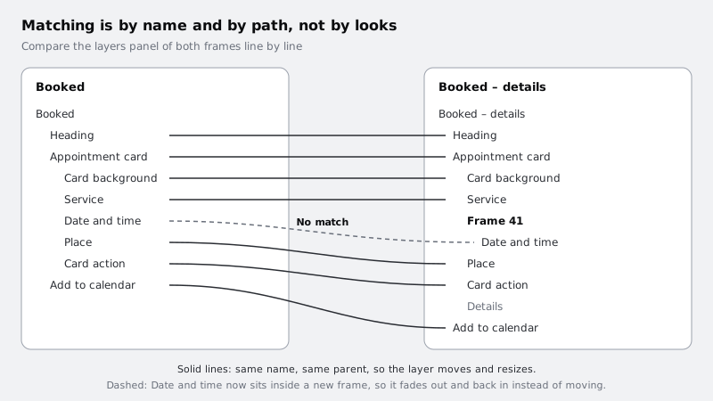
The usual causes of a mismatch:
- A rename on one side only, for example
Date & timeagainstDate and time, or a trailing space. - A new parent, such as an auto layout wrapper or a group added in one frame.
- A detached or swapped instance. If the card is a component instance in one frame and a detached frame in the other, the layers inside may still match by name, but it is safer to keep it an instance in both or detached in both.
- Duplicate names inside the card, which leave the pairing to layer order and make it unpredictable.
Fix each mismatch in Booked – details, so Booked stays as the series left it.
Check it worked
Every layer in Booked's card has a twin in Booked – details with an identical name and identical parent names, apart from Details, which exists only in the details frame and is meant to fade in. You can point to each pair in the two panels.
Step 6 · Connect the card with Smart animate
Switch the right sidebar to the Prototype tab.
- In Booked, select
Appointment card. Drag the connection handle ontoBooked – details. - In the interaction settings, keep the trigger as On tap (or On click), set the action to Navigate to
Booked – details, and set the animation to Smart animate. - Leave the easing and duration at their defaults for now. You will tune them in the last step.
- In
Booked – details, selectCard action(the Close link) and connect it back to Booked, again with Navigate to and Smart animate.
Use Navigate to Booked for the return rather than a Back action. Back returns to whichever frame came before, which is fine for the flow so far, but an explicit target keeps the return predictable when testers arrive at the details view in an unusual way.
Then present the prototype from the start of the flow and book an appointment, or add a temporary flow starting point on Booked so you do not have to book every time (remove it when you are done). Tap the card, then tap Close.
Check it worked
When you tap the card, the card grows into the full view instead of the whole screen dissolving; the service, date and place lines slide to their new positions; the details block fades in. Tapping Close shrinks the card back to its place on Booked, and the original Booked layout is underneath, unchanged.
Step 7 · Slow it down to find what jumps or fades
At normal speed a broken pair is easy to miss. Temporarily set the duration on the card's interaction to 1500 ms and present the prototype again. Watch one layer at a time.
What you see tells you what to fix:
- A layer fades out and back in instead of moving: its name or parent differs between the frames. Go back to the tree comparison.
- A layer jumps to its end position at the start or end: usually a layer that changed parent or a layer whose visibility you toggled. Moving a layer out of the frame works better than hiding it.
- Text looks squashed or blurs mid-way: the text box changed shape between frames as well as its size. Set the text layer to grow in the same direction (for example auto height) in both frames.
- Two things cross over each other awkwardly: check layer order. A layer above the card in one frame and below it in the other swaps places during the move.
Changed text, such as View details becoming Close, will crossfade rather than morph. That is expected; keep words that change short.
Check it worked
At 1500 ms, every layer from your "moves or resizes" list travels smoothly from start to end, only Details (and Card action, whose words change) fades, and nothing jumps. Write any fixes you made in the note beside Booked.
Step 8 · Tune easing and duration
Now set the speed for real. Smart animate gives you easing curves (Linear, Ease in, Ease out, Ease in and out, and versions with a slight overshoot) and spring presets (Gentle, Quick, Bouncy, Slow, or a custom spring). With a spring, the spring settings rather than a duration field decide how long the movement lasts.
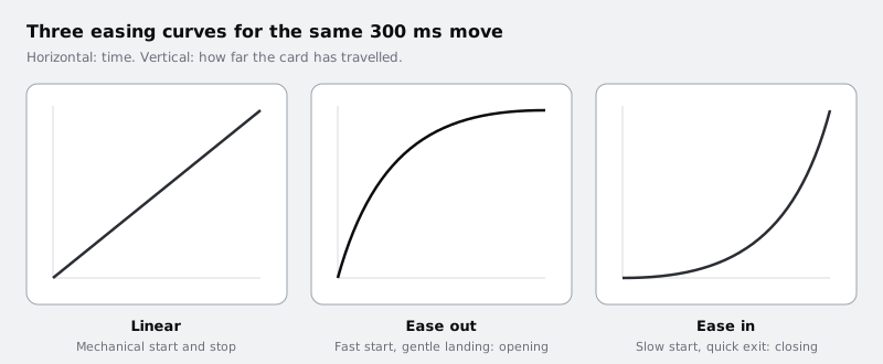
Try three versions of the opening interaction and present each one:
- Ease out, 300 ms.
- Ease in and out, 400 ms.
- The Gentle spring.
A sensible starting point for a card opening on a phone is Ease out at around 250 to 350 ms: it responds the moment the finger lifts and settles calmly. Ease in and out at 400 ms often feels slow when you are the one tapping. A bouncy spring draws attention to itself, which suits a celebration, not a medical appointment. For the Close interaction, a slightly shorter Ease in (around 200 to 250 ms) makes dismissing feel quicker than opening, which is usually what people want.
Some patients find movement uncomfortable, and Figma's prototyping help does not describe any way for a prototype to switch to a reduced version when a device has reduce motion turned on, so assume yours will always play the full movement. Keep the distance and duration modest, and avoid springs that overshoot. Note in your handoff that the built app should replace the movement with a short fade when reduced motion is on.
Set both interactions to your choice, and record it beside the frames: Open: Ease out, 300 ms. Close: Ease in, 250 ms. (or whatever you chose).
Check it worked
Both interactions are set back from the 1500 ms debugging value to your chosen values. Presenting the prototype, tapping the card opens it without a delay you notice, and Close returns you to Booked a little faster than it opened. The note beside Booked records the easing and duration for each direction, ready for whoever builds it.
Next steps
You now have one transition where the screen responds to what the patient touched, built on two frames whose layers line up exactly. The same method, duplicate, rename, change properties, compare trees, works for any element that grows, moves or changes state.
- Add overlays, transitions and scroll behaviour to a prototype is the previous part, if you want to review how the rest of the flow moves.
- Make components respond to hover and tap with interactive components uses Smart animate between variants, so a button or the selected time slot on Pick a time can change state without extra frames.
- Get a prototype ready for a usability test is the next part: checking every task path, including this new details view, before you put it in front of patients.
- Prototype a booking form with variables and conditional logic goes further, letting one frame remember what the tester chose.
Part of these paths
Related tutorials
- Add overlays, transitions and scroll behaviour to a prototypeYou will have a Larkfield Clinic booking prototype that moves like a phone app, with push transitions forward, working back controls, a date picker that slides up as an overlay and a header that stays put while the time slots scroll.
- Make components respond to hover and tap with interactive componentsYou will have a time-slot chip that toggles when tapped and a button that shows hover and pressed states, wired once inside their component sets so every instance in every prototype behaves the same way.
Need this done for you?
Padding does this work for growing companies, from the first diagnosis to a system that keeps working.
Get new tutorials