Figma and design tools · Beginner · 14 min
Add overlays, transitions and scroll behaviour to a prototype
By Padding · Updated 18 Nov 2026
Figma (web) · November 2026
You will have a Larkfield Clinic booking prototype that moves like a phone app, with push transitions forward, working back controls, a date picker that slides up as an overlay and a header that stays put while the time slots scroll.
On this page
At the end of part 5 the Larkfield Clinic prototype works: a tester can tap from Home to Booked and every button goes somewhere. It still does not feel like an app. Screens snap from one to the next with no sense of direction, the back arrow in the header is either dead or wired to a fixed screen, there is no way to change the day on Pick a time, and the time slots are cropped at the bottom of the phone because the frame does not scroll.
Testers notice all of that, even when they cannot name it. A snap cut makes people unsure whether they moved forward or sideways. A back arrow that goes to the wrong place makes them distrust every other control. When the prototype misbehaves in ways the real app will not, your test results fill up with problems that are about Figma rather than the design.
This part fixes the movement, not the look. You will give every connection a transition that matches what phone apps do, make the back controls behave like a real back button, add a date picker that slides up from the bottom as an overlay, and let Pick a time scroll under a header that stays in place. Part 7 then handles the finer animation inside screens with smart animate.
Step 1 · Write a movement plan before touching the prototype
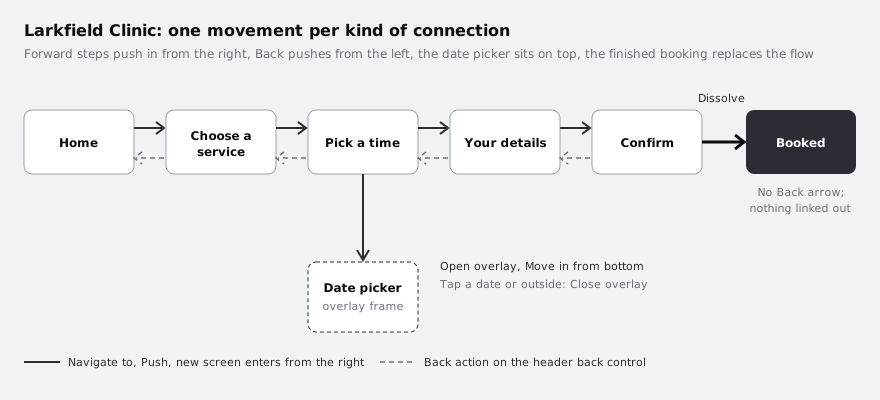
Decide what each connection should do before you change anything. Without a plan you end up with a different transition on every arrow, and that inconsistency is exactly what makes a prototype feel stitched together.
Open your Larkfield Clinic file and go to the page that holds the high-fidelity screens you linked in part 5. Next to the frames, add a text layer called Movement plan and write one line per kind of connection. Base each line on what booking apps on iOS and Android do, not on what looks interesting:
- Forward through the flow (Home to Choose a service, through to Confirm): the new screen pushes in from the right and the old one moves off to the left. Both phone platforms use a horizontal movement for going deeper, so testers read it as "next".
- Back (the arrow in each header): the reverse, the current screen leaves to the right and the previous one pushes in from the left. It always goes to whichever screen the tester came from.
- Choosing a date (new on Pick a time): a sheet slides up from the bottom over the screen, which dims behind it. The tester has not left Pick a time; they are making a choice on it.
- Finishing the booking (Confirm to Booked): a quick dissolve rather than a push. The booking is done, so Booked replaces the flow instead of becoming one more step in it, and Booked has no back arrow.
Add to calendaron Booked stays unlinked, as it was in part 5.
Keep transitions short. Something around 300 milliseconds with an ease-out curve (fast at the start, settling at the end) feels responsive. Much longer, and testers start waiting for the prototype.
Check it worked
There is a text layer named Movement plan on the page with four lines, one each for forward, back, choosing a date and finishing the booking. Every connection that already exists in your prototype fits one of those four lines. If one does not, add a line for it now rather than deciding later.
Step 2 · Give the forward connections a push
Switch the right sidebar to the Prototype tab. The connections from part 5 appear as blue arrows on the canvas. Click Book an appointment on Home, then click its interaction in the Prototype tab to open the interaction details. The action should already be Navigate to with Choose a service as the destination; leave those alone.
In the animation part of the interaction details, change the animation from instant to Push, and choose the direction that brings the new screen in from the right edge, so the screens move leftwards. Set the curve to ease out and the duration to about 300 ms.
Repeat for every forward connection: the Choose a time button on Choose a service, Continue on Pick a time and Continue on Your details. Then open the Book appointment connection on Confirm and set it to Dissolve, again around 300 ms, as the plan says.
Do not touch the back arrows yet; they get a different action in the next step.
Check it worked
Press the play button at the top of the right sidebar to open the prototype, start from Home and tap forward to Booked. Every step from Home to Confirm slides the new screen in from the right. Confirm to Booked fades rather than slides. Back on the canvas, click any forward connection and the interaction details show Navigate to, Push and the same duration as the others.
Step 3 · Make the back arrows go back
A back arrow wired with Navigate to always goes to the same screen. That is wrong as soon as there is more than one way to reach a screen. The Back action has no destination: it returns to whichever screen the tester came from, the way a real back button does.
The header with the back control is a component from part 3, so you can wire it once. Go to the Wireframe kit page (or wherever your restyled components live after part 4), select the back control inside the main Header component and add an interaction: On tap, action Back. In its animation settings choose Push, in the direction that brings the previous screen in from the left edge, with the same ease out curve and about 300 ms as the forward connections. An interaction added inside a main component normally carries through to its instances, which saves wiring the same arrow on five screens.
Then go back to the screens and look at Booked. Following the plan, it should not offer a way back into a finished booking. If its header shows a back arrow, hide that layer on the Booked instance only. Leave Add to calendar unlinked: wiring it to Home would teach testers that the calendar button ends the booking.
Check it worked
Play the prototype from Home and go forward to Your details. Tap the header's back arrow twice: you land on Pick a time, then Choose a service, and each time the screen leaves to the right while the previous one comes in from the left. If a screen's back arrow does nothing, select that instance on the canvas and check the Prototype tab: if it shows no interaction, add On tap, Back with the same Push to it directly. Booked shows no back arrow, and the canvas shows no arrow leaving Booked.
Step 4 · Build the date picker as its own frame
An overlay in Figma is an ordinary top-level frame that the prototype opens on top of the current screen. Build it first, then wire it.
On Pick a time, add one line under the screen's reminder of the chosen service: Showing Tue 9 Dec with a Change date link next to it. Style it with your Body text style from part 4, with the link in colour/accent. This is the control that will open the picker.
Then create a new frame beside Pick a time on the canvas, not inside it. Give it the same width as your phone frames and roughly 360 tall, and name it Date picker. Lay it out as a bottom sheet:
- a short grey drag handle centred at the top, which tells people the panel can be dismissed
- a heading
Choose a datein yourHeading/Mstyle - a row of five day chips,
Mon 8,Tue 9,Wed 10,Thu 11andFri 12, withTue 9in the selected style you used for time slots - a secondary button
Cancelat the bottom
Round only the top two corners of the frame, about 16, and give it the white background of your screens. Keep the frame's background solid: the dimming behind it comes from the overlay settings in the next step, not from a dark rectangle you draw.
Check it worked
The layers panel shows Date picker as a top-level frame at the same level as Home and Pick a time, not nested inside any screen. Pick a time has a Showing Tue 9 Dec line with a Change date link under the reminder of the chosen service. The sheet's width matches the phone frames exactly; select both and compare the W values in the right sidebar.
Step 5 · Open the date picker as an overlay
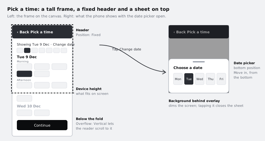
Back on Pick a time, select the Change date link and add an interaction: On tap, action Open overlay, destination Date picker. The overlay settings appear in the interaction details:
- Position: pick the bottom-centre option from the position choices, so the sheet sits on the bottom edge of the phone. Figma offers several fixed positions and a manual one; bottom-centre is the one that behaves like a sheet.
- Close when clicking outside: turn it on. On a phone, tapping the dimmed area above a sheet closes it, and testers will try.
- Add background behind overlay: turn it on and use black at around 40 percent. The dimmed screen says "you are still here, finish this first".
- Animation: Move in, from the bottom, ease out, about 300 ms. Push would move the screen behind it too, which is wrong for a sheet.
Now give the sheet ways to close. Select each day chip in Date picker and add On tap, action Close overlay. Do the same for Cancel. The chosen date will not yet change the Showing Tue 9 Dec line; showing a real choice needs variables, which /tutorials/prototype-with-variables-and-conditions covers. For testing whether people find and understand the picker, closing it is enough.
Check it worked
Play the prototype and go to Pick a time. Tapping Change date slides the sheet up from the bottom while the screen behind it stays still and dims. Tapping a day closes the sheet, tapping Cancel closes it, and tapping the dimmed area above it closes it. After closing, you are still on Pick a time, and the header's back arrow still takes you to Choose a service.
Step 6 · Let Pick a time scroll under a fixed header
A real Pick a time screen has more slots than fit on a phone. If the frame is cut to phone height, testers never see the afternoon slots or the Continue button sits on top of slots. Make the frame as long as its content and let the prototype scroll it.
Select the Pick a time frame and drag its bottom edge down until the Morning and Afternoon slots and the Continue button fit, with your usual 32 above the button. If the screen does not yet run past the phone height, add a second day group under the afternoon slots, Wed 10 Dec, with two or three slots. The content has to be taller than the device for scrolling to do anything.
With the frame selected, open the Prototype tab and set its overflow to vertical scrolling. Then select the header instance at the top of Pick a time and, in the same tab, set its position to Fixed. Figma moves fixed layers above the rest of the frame in the Layers panel, which is what you want: content slides under the header, never over it. If the position setting is not available for the header, check that it is a direct child of the screen frame and not inside the content stack you built in part 3.
Leave Continue at the end of the list where the reader reaches it after scanning the times. That is how many booking apps place it, and it also tests whether people scroll at all.
Check it worked
In the Layers panel, Pick a time shows the header separated from the other layers and labelled as fixed. Play the prototype, go to Pick a time and scroll with the trackpad or mouse wheel: the Afternoon slots (and the Wed 10 Dec group, if you added one) move up while the header with Back and Pick a time stays at the top, and Continue appears at the bottom of the list. Open the date picker with the screen scrolled down: the sheet still rises from the bottom edge of the phone.
Step 7 · Play the flow on a phone and list what still gives it away
Transitions and scrolling feel different at arm's length than on a laptop. Open the prototype link you shared in part 5 on your phone's browser and go through the whole flow twice: once straight to Booked, once using every back arrow and opening and closing the date picker.
While you do, keep a short list in a text layer on the page called Still feels fake. Typical entries at this stage:
- the time slot does not change to the selected style when tapped (part 7 points to interactive components for this)
- the date picker does not change the date shown (needs variables)
- the form fields on Your details cannot be typed into
- some transition is slower or faster than the rest
Fix anything that contradicts the movement plan now. Leave the rest on the list: part 7 uses it, and part 8 decides which of the remaining gaps matter for the test you are about to run. Do not delete the Date picker frame or the Movement plan note; the later parts build on both.
Check it worked
You have played the full flow on a phone at least once. Every forward step slides in from the right, every back arrow returns to the previous screen, the date picker opens from the bottom and closes three ways, and Pick a time scrolls under a header that does not move. The Still feels fake note on the page lists at least two items, each marked either "part 7", "part 8" or "not needed for testing".
Next steps
Your prototype now moves the way the finished app will, which keeps testers focused on the booking rather than on the prototype.
- Animate between screens with smart animate is part 7: it makes the selected time slot and other in-screen changes animate smoothly.
- Build a click-through prototype in Figma is part 5, if you need to recheck the connections and starting point.
- Prototype a booking form with variables and conditional logic shows how to make the chosen date and time carry through to the confirmation.
- Get a prototype ready for testing is part 8, where your
Still feels fakelist becomes a decision about what to fix before the test.
Part of these paths
Related tutorials
- Build a click-through prototype in FigmaYou will have the six high-fidelity Larkfield Clinic screens linked into a named Figma flow that plays from Home to Booked on a phone-sized device, with a link you can send to a colleague.
- Animate between screens with Smart animateYou will have the Larkfield Clinic appointment card growing smoothly into a details view and shrinking back again, driven by matched layer names and an easing and duration you chose by comparing them.
Need this done for you?
Padding does this work for growing companies, from the first diagnosis to a system that keeps working.
Get new tutorials