Figma and design tools · Beginner · 12 min
Build a click-through prototype in Figma
By Padding · Updated 18 Nov 2026
Figma (web) · November 2026
You will have the six high-fidelity Larkfield Clinic screens linked into a named Figma flow that plays from Home to Booked on a phone-sized device, with a link you can send to a colleague.
On this page
A set of polished screens still hides one question: can someone get from the first screen to the last without being told where to tap? You cannot answer that by looking at six frames laid out in a row, because your eye already knows the order. A click-through prototype makes the order something a person has to find. They see one screen at a time, tap what they think comes next, and either move on or get stuck.
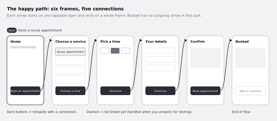
This is part 5 of the series that takes the Larkfield Clinic booking app from paper to a tested prototype. In part 4 you finished the high-fidelity screens on the 04 High fidelity page. Here you link them, and only with taps: each primary button moves to the next screen, with no animation, no overlays and no back navigation. That restraint is deliberate. The first thing to prove is that the happy path (Home, Choose a service, Pick a time, Your details, Confirm, Booked) holds together. Transitions and overlays arrive in part 6, and the state frames you drew in part 3 and styled in part 4 stay unlinked; part 8 decides which extra links the test tasks need.
Step 1 · Write the tap map before you touch the Prototype tab
Decide the five taps on paper or in a text layer first. Dragging arrows without a plan is how prototypes end up with a Continue button that jumps two screens ahead.
Go to the 04 High fidelity page. Next to the row of six screens, add a text layer called Tap map and write one line per connection, in the form "on this screen, this layer, goes to this screen":
- Home:
Book an appointmentbutton → Choose a service - Choose a service:
Choose a timebutton → Pick a time - Pick a time:
Continuebutton → Your details - Your details:
Continuebutton → Confirm - Confirm:
Book appointmentbutton → Booked
Two decisions are hiding in that list. First, the tester does not choose a service or a time in this prototype; the flow assumes Nurse appointment, the service named on Pick a time, and Pick a time already shows a selected time chip, as you drew it. A tester taps Continue past a choice that is already made. That is fine for checking the order of screens, and it is the limit of a click-only prototype. Making the choice real needs interactive components or variables, which /tutorials/prototype-with-variables-and-conditions covers. Second, anything not in the list stays unlinked for now: the Change links on Confirm, Add to calendar on Booked, and the four state frames under the screens (Pick a time / No times this week and the others). Write them under the map as "Not linked in part 5" so nobody mistakes them for a bug.
Check it worked
Your 04 High fidelity page has a Tap map text layer with five lines, each naming a starting screen, a layer and a destination screen that exist on the page with exactly those names. A second short list names what is deliberately left unlinked. Every destination is one of the six screens, never a state frame.
Step 2 · Set the device so the prototype looks like a phone
Before connecting anything, tell Figma what the prototype runs on. The device setting decides the frame around the screens and how they scale in presentation, so testers judge the app at phone size instead of a giant screen floating in a browser window.
Press Shift E, or click the Prototype tab at the top of the right sidebar. Click an empty area of the canvas so nothing is selected: the Prototype tab now shows settings for the whole page, including Device and Model. Choose a phone whose screen matches the size of your frames. Part 4 asked for every frame to be the same phone size, such as 390 by 844, so pick the device that lists that size. If none matches exactly, pick the closest phone and check in the next steps that nothing is cut off at the bottom.
Leave the background as it is. It only shows around the device in presentation view.
Check it worked
With nothing selected and the Prototype tab open, the device field shows a phone model, not None or a desktop size. Your six screen frames are all the same width and height: select each in turn and compare the W and H values in the Design tab.
Step 3 · Make the first connection from Home
Stay on the Prototype tab. On the Home frame, click the Book an appointment button. Make sure you have selected the button instance itself, not the text layer inside it: the layers panel should highlight the instance (diamond icon), and the selection box should wrap the whole button. If your click lands on the label, press Shift Enter to select the parent, or pick the instance in the layers panel. A connection from the text layer works, but only the text is tappable, which on a phone is a smaller target than the button you drew.
With the button selected, hover over it and a small circle appears on its edge. Drag from that circle to the Choose a service frame and let go when the whole frame highlights. Drop on the frame, not on a layer inside it: the destination for this kind of link is a top-level frame.
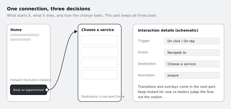
Figma opens the interaction details for the new connection. It should read something like: trigger On click (the same trigger is a tap on a phone), action Navigate to, destination Choose a service, animation Instant. If the trigger or action is different, change it to those. Keep the animation on Instant for this part. You want testers to react to where they land, not to how they got there.
Because this is the first connection on the page, Figma also adds a flow starting point to Home. You see it on the canvas as a small blue marker with a name such as Flow 1 above the frame.
Check it worked
A blue arrow runs from the Home button to the Choose a service frame. Clicking the button shows one interaction in the right sidebar with Navigate to and Choose a service. A flow starting point label sits above Home, and no other frame has one.
Step 4 · Link the rest of the happy path
Work through the remaining four lines of the tap map in the same way: select the button instance on the screen, drag from its connection circle to the next frame, and check the interaction details. Do it in flow order so the arrows build up left to right and you notice a mistake as soon as it happens.
Make each connection on the button instance on the screen, not on the main component on your components area. The same Continue button appears on two screens and goes somewhere different on each, so the link belongs to the screen, not the component.
Two things go wrong often at this stage:
- An arrow lands on a state frame. The state frames sit right under the screens, so a short drag can drop onto
Pick a time / Time goneinstead of Pick a time. Read the destination in the interaction details, not the arrow on the canvas. - A connection sits on a hidden or overlapped layer. If a button has a text layer or icon on top that is not part of the instance, taps on that part do nothing. Select what is on top and check it belongs to the button.
When you are done, select each frame in turn. Only the frame's own primary button should show a connection; nothing should point backwards.
Check it worked
With the Prototype tab open, the canvas shows exactly five arrows, each from a button to the next screen in the order of your tap map. Booked has no outgoing arrow. None of the four state frames has an arrow coming in or going out. Selecting each button shows one interaction, Navigate to the expected screen, with Instant animation.
Step 5 · Name the flow and describe it
Flow 1 tells a colleague nothing. A flow name and description are what a tester or reviewer sees first, so name it after the task, not the screens.
Select the Home frame. In the Prototype tab, find the Flow starting point section and rename the flow to Book a nurse appointment. You can also double-click the name on the canvas. Then use Edit description next to the name and add two or three lines, for example:
"Happy path only. A patient books a 15-minute nurse appointment at Larkfield Clinic and sees the confirmation. Service and time are pre-selected; Change links, Add to calendar and error states are not linked yet."
That last sentence saves you from feedback such as "the Change link is broken" from people who were never meant to test it.
Check it worked
The marker above Home reads Book a nurse appointment. With nothing selected, the Prototype tab's Flows section lists one flow with that name. Selecting Home and opening the description shows your text, including the sentence about what is not linked.
Step 6 · Play the flow from start to finish
Now go through it as a patient would. Click an empty area of the canvas, find your flow in the Flows section of the Prototype tab, hover over it and choose Preview, or click the blue preview icon on the starting point. Figma opens the prototype inside the editor. For a full-window view, use Present in the right sidebar instead; the flow name then appears in the left sidebar of presentation view.
Play it twice:
- As the designer. Tap through all five buttons and check each screen arrives in the right order, fits the device without being cut off and has nothing left over from editing, such as a stray selection colour or a layer that should be hidden.
- As a stranger. Restart from Home and, on each screen, before you tap, say out loud what you expect to happen. If you hesitate over which thing to tap, note it. If you click somewhere that is not linked, Figma may briefly highlight the places that are, which tells you something a tester will see too.
Write what you find in a short list next to the tap map, one line per issue, with the screen it happened on. Fix the ones that are wiring mistakes now (a wrong destination, a too-small hotspot). Leave design questions, such as whether Choose a time is the right label, for the test in part 9.
Check it worked
You can go from Home to Booked in exactly five taps without leaving presentation or preview, and every screen appears the right way up at full phone width, with nothing cut off at the bottom. Your issues list has at least one line, even if it is "no wiring problems found on 18 November".
Step 7 · Share a view-only link and test it from outside
The brief for this part ends with a prototype someone else can open. In presentation view, click Share prototype, check the link access settings and choose who can open it, then use Copy link. Linking straight to the flow also works: select Home, and in the Prototype tab use Copy link next to the Flow starting point heading.
Before sending it to anyone, open the link in a private browser window, or on your phone, where you are not signed in as yourself. That shows you what a colleague sees. Two things to know:
- Sharing the prototype is meant to let people view it without editing the file, but depending on your plan a viewer may still be able to open the design file from the prototype view. Check this before sharing with anyone outside the team. On the Starter plan, Figma's help says viewers can.
- The link always shows the current file. If you keep editing, people with the link see the changes. Part 8 covers freezing what testers see and making the link open exactly where a test should start.
Leave every frame, connection and the flow in place. Part 6 adds transitions and overlays to these exact connections, and part 8 adds the missing links.
Check it worked
A link opened in a private window shows the prototype starting on Home, inside the phone device, with the flow name Book a nurse appointment visible in presentation view. Tapping through reaches Booked in five taps. If the private window asks you to sign in, or shows the wrong page, adjust the link access and try again.
Next steps
You now have the Larkfield happy path as a playable prototype, and a list of what it does not yet do. Carry on with the series:
- Add overlays, transitions and scroll behaviour to a prototype is part 6: a date-picker overlay, back navigation and transitions that feel like a phone app.
- Get a prototype ready for a usability test is part 8, where the links the test tasks need get connected and the share link is prepared for testers.
- Prototype a booking form with variables and conditional logic shows how to make the service and time choices real instead of pre-selected.
- Turn a mid-fidelity layout into a high-fidelity design is part 4, if you need to rebuild or adjust the screens you linked here.
Part of these paths
Related tutorials
- Turn a mid-fidelity layout into a high-fidelity designYou will have high-fidelity Larkfield Clinic booking screens in Figma, coloured, typeset, with icons and one photo, every text and colour pair checked for contrast and ready to wire into a prototype.
- Add overlays, transitions and scroll behaviour to a prototypeYou will have a Larkfield Clinic booking prototype that moves like a phone app, with push transitions forward, working back controls, a date picker that slides up as an overlay and a header that stays put while the time slots scroll.
Need this done for you?
Padding does this work for growing companies, from the first diagnosis to a system that keeps working.
Get new tutorials