Figma and design tools · Intermediate · 20 min
Turn a mid-fidelity layout into a high-fidelity design
By Padding · Updated 18 Nov 2026
Figma (web) · November 2026
You will have high-fidelity Larkfield Clinic booking screens in Figma, coloured, typeset, with icons and one photo, every text and colour pair checked for contrast and ready to wire into a prototype.
On this page
A mid-fidelity screen answers "does the flow make sense and do the words work". A high-fidelity screen has to answer a different question: "does this look like a clinic I would trust with my appointment". The layout should barely move between the two. What changes is the surface: colour, type, icons, imagery, and the small visual signals that tell people what is selected, what went wrong and what to tap next.
This is part 4 of the series that takes the Larkfield Clinic booking app from paper to tested prototype. In part 3 you finished six greyscale screens (Home, Choose a service, Pick a time, Your details, Confirm, Booked) on the Mid-fi page, four state frames under them for the awkward moments such as no times left, four text styles, and five wireframe components on the Wireframe kit page. The state frames are still greyscale; in this part they get colour and icons. Here you do not invent a visual style. Larkfield already has a small one: one accent colour, a few neutrals, two status colours and one typeface. Your job is to apply that set to the flow with discipline, so that every colour and text size on the screens comes from it, and to check contrast before anything ships to a prototype.
The order matters. You check the palette's contrast first, then restyle components, then type, then imagery, then states. Doing it the other way round means fixing the same failing grey on forty layers instead of one variable.
Step 1 · Copy the screens to a new page and leave mid-fi alone
Open the Larkfield file. In the left sidebar, add a page called 04 High fidelity. Go to the Mid-fi page, select the six screen frames and the four state frames under them, copy them, and paste them on the new page. Leave the Wireframe kit page where it is: the pasted buttons, fields and slots stay instances of the same components, which is what you want.
Keep the Mid-fi page exactly as it is. Part 9 tests the prototype with patients, and if a test shows that a content problem was hidden by the polish, the greyscale version is where you compare. Rename the six pasted screens so they read in flow order and say what they are; the four state frames keep the names part 3 gave them:
Home,Choose a service,Pick a time,Your details,Confirm,BookedPick a time / No times this week,Pick a time / Time gone,Your details / Errors,Confirm / Could not book
Lay them out in one row for the six screens, with each state under the screen it belongs to, as on your paper flow sheet.
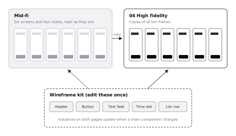
There is one catch to know now. Because both pages use the same components and text styles, restyling a component or editing a style in a later step also changes the Mid-fi page. If you want a frozen greyscale record, select the ten Mid-fi frames, export them as PNG at 2x into the larkfield-sketches folder from part 1 before you go on, and name the files mid-fi-01-home.png and so on.
Check it worked
Your file has a 04 High fidelity page with ten frames named as above (six screens and four state frames), and the layers panel shows the buttons and fields inside them as instances (the diamond icon), not detached groups. If you chose to freeze the greyscale version, the ten mid-fi PNGs are in your sketches folder.
Step 2 · Add the Larkfield colour variables and text styles
The clinic's style set is small on purpose. Create a variable collection called Larkfield and add these colour variables. The slash in each name groups them in the variables panel.
colour/text: #1B1F24, headings and body textcolour/text-muted: #5A6270, hints, secondary lines, durationscolour/text-placeholder: #9AA0A8, placeholder text in fieldscolour/surface: #FFFFFF, cards, fields, sheetscolour/canvas: #F6F7F8, screen backgroundcolour/line: #D5D9DF, dividers between rowscolour/accent: #0F5E5A, main buttons, selected items, linkscolour/accent-tint: #E3F0EE, selected backgrounds, the Booked bannercolour/on-accent: #FFFFFF, text on accent buttonscolour/danger: #B42318, error text and error borderscolour/danger-tint: #FDECEA, error message backgroundcolour/notice: #8A5A00, notice text such as "that time has gone"colour/notice-tint: #FFF4DC, notice background
Then turn part 3's four text styles into Larkfield's five. Do not create new ones alongside them: edit the existing styles, because editing a style updates every text layer that uses it, so the mid-fi text on all your frames moves to the new sizes without reselecting anything. Click empty canvas, find the style in the text styles list in the right sidebar, open its edit settings (right-click the style), and change the name and properties. Larkfield keeps Inter from part 3:
HeadingbecomesHeading/L: Inter Semi Bold, 28, line height 34SubheadingbecomesHeading/M: Inter Semi Bold, 20, line height 26BodystaysBody: Inter Regular, 16, line height 24CaptionbecomesBody/Small: Inter Regular, 14, line height 20Labelis new: Inter Semi Bold, 14, line height 20. Set up a text layer with those values, select it, and create a style from the Typography section of the right sidebar.
If your part 3 file has any other text style left over, reapply its layers to one of the five and delete it.
Text styles do not store colour, so a muted hint is Body/Small with colour/text-muted as its fill. Keeping size and colour separate is why five styles cover the whole app.
If you have not made variables before, Create colour variables with light and dark modes walks through the panel in detail. You only need one mode here.
Check it worked
Open the variables panel: the Larkfield collection lists thirteen colour variables under one colour group. The next step changes two of them. Click empty canvas and look at the text styles in the right sidebar: you see exactly five, grouped as Heading (two), Body (two) and Label, with no Subheading or Caption left. Click a mid-fi heading on any frame: the Typography section shows Heading/L at 28.
Step 3 · Check contrast before you paint anything
Contrast is cheaper to fix in a table than on a screen. List every pair of foreground and background the app will use, and run each through the contrast checker. WCAG 2.2 asks for at least 4.5:1 for normal text, 3:1 for large text (24 px and up, or about 19 px bold), and 3:1 for the visible edge of a control such as a field border or an unselected time slot.
Write the results in a short note next to the screens (a text layer on the canvas is fine) so the decisions travel with the file:
textonsurface: 16.56:1, needs 4.5:1, passtext-mutedoncanvas: 5.73:1, needs 4.5:1, passon-accentonaccent: 7.58:1, needs 4.5:1, passaccentonaccent-tint: 6.49:1, needs 4.5:1, passdangerondanger-tint: 5.75:1, needs 4.5:1, passnoticeonnotice-tint: 5.43:1, needs 4.5:1, passtext-placeholderonsurface: 2.64:1, needs 4.5:1, faillineas a field border onsurface: 1.42:1, needs 3:1, fail
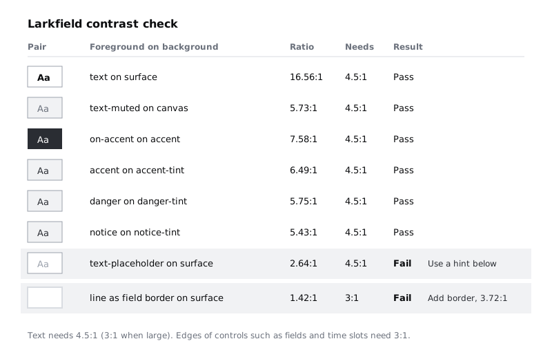
Two pairs fail, and both are common. Fix them in the style set, not on the screens:
- Placeholder text. Do not darken the placeholder until it passes; it would then look like a filled-in value. Stop relying on placeholders instead. On Your details, put the format hint ("For example 07700 900123") under the field as
Body/Smallintext-muted, which passes, and leave the field empty. Deletecolour/text-placeholderfrom the collection so nobody reaches for it later. - Field and time slot borders.
linestays for row dividers, which are decorative. Add a new variable,colour/borderat #7D8592, for the edges of fields, unselected time slots and secondary buttons. It reaches 3.72:1 on white.
Check it worked
Your canvas note lists at least eight pairs, each with a ratio and a result. No pair marked pass is below its threshold, the two failing pairs each have a written fix, and the Larkfield collection now has colour/border and no colour/text-placeholder.
Step 4 · Restyle the components once
Go to the Wireframe kit page and the five components you built in part 3: Header, Button, Text field, Time slot and List row. If yours are named differently, match them by job. Edit the main component of each, not the instances on the screens. Apply variables to every fill and stroke, and text styles to every text layer:
- Button: the primary version gets fill
accent, labelLabelinon-accent, corner radius 8, height 48. Restyle the secondary version you made in part 3, not a new one: fillsurface, a 1 pxborderstroke andLabelinaccent, same radius and height. - Text field: fill
surface, 1 pxborderstroke, label above inLabelandtext, value inBodyandtext, hint below inBody/Smallandtext-muted. Restyle part 3's error version rather than adding another: its 2 px outline becomesdanger, and itsError:line becomesBody/Smallindanger. - List row (the service rows on Choose a service): fill
surface, a 1 pxlinedivider at the bottom, service name inBody, duration inBody/Smallandtext-muted. - Time slot: unselected has fill
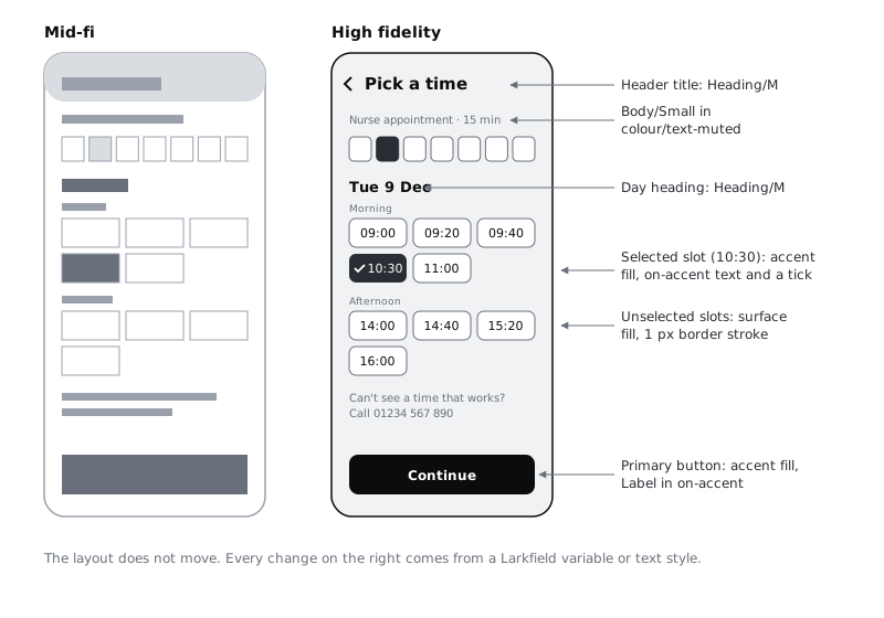
surface, 1 pxborderstroke, time inLabelandtext. Part 3's selected version has fillaccentand time inon-accent, plus a tick icon (added in the imagery step). Selection must not depend on colour alone, so the tick matters. - Header: title in
Heading/M, a back control on the left at least 44 by 44 px so it is easy to tap.
Height and radius changes can push content in an auto layout frame; if a screen reflows badly, fix the screen's spacing, not the component.
Check it worked
Look at the 04 High fidelity page without touching it: every button, field, list row, time slot and header on all ten frames has changed to the new style. Select any instance and check the right sidebar: its fills show variable names, not raw hex codes, and its text shows a style name.
Step 5 · Apply the text styles to everything else
Components cover maybe half the text. The rest is headings, intro lines, summary lines on Confirm and the large time on Booked. Work through the screens in flow order and give every text layer one of the five styles and one colour variable:
- Screen titles that are not in the header, such as
Larkfield Clinicon Home:Heading/L. - Section headings, the text part 3 set in
Subheading: the day heading (Tue 9 Dec) on Pick a time and "Your appointment" on Confirm. They areHeading/Malready, because you edited the style. - Sentences people read:
Body. Secondary facts (duration, address line, "You can change this later"):Body/Smallintext-muted. - The appointment time on Booked:
Heading/L, because it is the one thing the patient must remember.
Set every screen frame's fill to canvas, and cards or sheets on top of it to surface. Resist adding a sixth text size for one special case. If something does not fit the five styles, it is usually a hierarchy problem in the layout, and the mid-fi screen will show you where.
Check it worked
Select each frame in turn and look at Selection colors in the right sidebar: every entry is a Larkfield variable, with no raw hex values. For text, go frame by frame and click each text layer that is not inside a component (Shift-click to take several at once): the Typography section shows one of the five style names, never loose settings such as size 15 or 17. If a multi-selection shows mixed values, click the layers one at a time to find the odd one out.
Step 6 · Add icons and one photo
Larkfield uses a few line icons and one photograph, no more. Take icons from a set that publishes SVG files, and read that set's licence before you use it in client work. You need about six: back arrow, calendar, clock, location pin, tick and alert. Paste each SVG into the file, set its stroke to a colour variable, wrap it in a 24 by 24 frame and make it a component called Icon / Calendar and so on. Then the Time slot and Header components can use icon instances, and you can swap one icon for another from the right sidebar.
Place icons where they carry meaning, never as decoration:
- Back arrow in the
Header. - Calendar and clock beside the date and time lines on Confirm and Booked.
- Tick inside the selected time slot, and on the Booked banner.
- Alert at the start of each error and notice message.
For the photograph, Home gets one image of the clinic's front entrance or reception, so patients recognise the building. Use a photo the clinic owns, or a stock image with a licence that allows it. Draw a rectangle 16:9 across the top of the Home content, and use it as an image fill so you can choose Fill or Crop and reposition without changing the rectangle. Add a short caption under it in Body/Small: "Larkfield Clinic, 14 Mill Lane". Write the alt text you would want a developer to use in a comment on the image, such as "The front entrance of Larkfield Clinic with a ramp to the left of the door".
Check it worked
Your file has an Icon group of six components, each 24 by 24 with its stroke set to a variable. Every icon on the screens is an instance of one of them. Home has one photo in a 16:9 frame with a caption below it and an alt text comment pinned to it.
Step 7 · Make every state readable without colour
Now the four state frames you copied from Mid-fi. Keep the words part 3 wrote, and give each one colour and an icon as well, so that someone who cannot tell red from green, or is looking at a phone in sunlight, still knows what happened:
- Pick a time / No times this week: a
surfacecard with the calendar icon around theBodytext "No free times this week" and the secondary button "See next week" that part 3 put in place of the time slots. The phone fallback line stays. - Pick a time / Time gone: turn part 3's message above the slots into a
notice-tintbanner with the alert icon innoticeandBody/Smalltext innotice: "10:30 was just taken. These times are still free." The eight times still free keep their normal unselected style; do not invent a highlighted slot that is not in the component. - Your details / Errors: the mobile field is already the error version, so it picked up the
dangeroutline when you restyled the component. Keep part 3's text, "Error: Enter a mobile number with 11 digits, such as 07700 900123", and add the alert icon before it. It says what to do, not just "Invalid". - Confirm / Could not book: turn part 3's message above the button, "We could not book this time. Your details are saved.", into a
danger-tintbanner with the alert icon. The button keeps part 3's label, "Try again".
Do the same for the happy-path end: on Booked, put the You're booked heading in a full-width accent-tint banner with the tick icon, set in Heading/M and accent.
Then do a squint test. Set a temporary layer blur, or zoom out until the text is unreadable, and look at each screen. The thing a patient should do next (the primary button, or the selected time) should be the darkest, strongest shape. If two shapes compete, take weight away from the one that is not the action.
Check it worked
Each of the four state frames has an icon, a message in words, and a colour from the status pair it belongs to. Turn the screens greyscale in your head, or with a desaturate layer on top: you can still tell selected from unselected time slots, and each error or notice from normal content.
Step 8 · Compare against mid-fi and get the screens ready for part 5
Put each high-fidelity screen next to its mid-fidelity version and look for drift. Polishing invites small layout changes: a button that grew, a hint that went missing, a heading that got shorter to look neater. Each of those changes what part 3 tested for content. Undo any you cannot defend in one sentence, and note any you keep on the canvas next to the contrast table.
Finally, prepare for prototyping:
- Every frame is the same device size (for example 390 by 844) and named as in the first step, because part 5 links them by name.
- Buttons that will become prototype hotspots are component instances, not flattened groups, so one connection setup carries across.
- The primary button on each screen is labelled with the destination in mind. Relabel two of them:
Continueon Choose a service becomes "Choose a time", andConfirm bookingon Confirm becomes "Book appointment". "Continue" stays on Pick a time and Your details.
Check it worked
You have ten high-fidelity frames on the 04 High fidelity page, all the same size, named in flow order, with no detached components. Your canvas notes hold the contrast table and a short list of any layout changes from mid-fi, each with a reason. Every colour and text size on the page traces back to the Larkfield variables and five text styles.
Next steps
Your screens are ready to link. In Build a click-through prototype in Figma, part 5 of this series, you connect them from Home to Booked and play the happy path.
If you skipped part 3, Take a wireframe from low to mid fidelity builds the greyscale screens and components this part restyles. To give the same palette a dark mode later, see Create colour variables with light and dark modes, and if components are new to you, Make your first Figma component covers main components and instances.
Part of these paths
Related tutorials
- Take a wireframe from low to mid fidelityYou will have the six Larkfield Clinic booking screens and four state frames at mid fidelity in Figma, still greyscale but with real copy, four text styles, one spacing scale and a small kit of reusable wireframe components, ready to test for content and flow.
- Build a click-through prototype in FigmaYou will have the six high-fidelity Larkfield Clinic screens linked into a named Figma flow that plays from Home to Booked on a phone-sized device, with a link you can send to a colleague.
- Create colour variables with light and dark modesYou will have a Figma screen whose every colour comes from variables, so switching one setting on the frame turns it from light to dark and back.
Need this done for you?
Padding does this work for growing companies, from the first diagnosis to a system that keeps working.
Get new tutorials