Figma and design tools · Intermediate · 16 min
Create colour variables with light and dark modes
By Padding · Updated 18 Nov 2026
Figma (web) · November 2026
You will have a Figma screen whose every colour comes from variables, so switching one setting on the frame turns it from light to dark and back.
On this page
A dark theme drawn by hand is a second copy of every screen with every colour retyped. It drifts the first week: someone changes a button blue in light and forgets dark. Figma variables remove the copy. You give each colour a job (background, text, accent), store a light value and a dark value for that job, and paint layers with the job rather than the hex code. The frame decides which value it shows.
Developers already work this way. A stylesheet that supports dark mode defines custom properties such as --bg and --text once, gives each a light and a dark value, and every rule uses var(--bg). This tutorial builds the same structure in Figma, with the same names, so the file and the code describe colour in the same words. The companion tutorial Add dark mode with CSS variables is the code side.
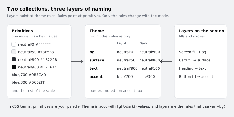
You will build two collections:
- Primitives: the raw palette, hex values only, one mode. Nothing on the canvas uses these directly.
- Theme: seven role variables with a Light and a Dark mode. Each value points at a primitive.
Step 1 · Write down the colour roles first
Before you open Figma, list the jobs colour does on your screen. Keep the list short: every role you add is one more decision for every future screen. Seven covers most simple products:
| Role | Used for |
| --- | --- |
| bg | The screen background |
| surface | Cards, sheets and input fields that sit on the background |
| border | Dividers and outlines |
| text | Headings and body text |
| muted | Secondary text, hints, timestamps |
| accent | Primary buttons and links |
| on-accent | Text and icons placed on top of accent |
The names are the CSS custom property names without the two dashes. Use lowercase and hyphens, because that is what a developer will type, and avoid names that describe a colour (blue, light-grey). A role called blue is wrong the day the brand changes, and it reads strangely in dark mode where the value is a different blue.
Write this table in your notes or on a page of the file called "Colour roles". It is the contract between you and whoever builds the screen.
Check it worked
You have a list of seven roles, each with one sentence saying where it is used. No role name contains a colour word.
Step 2 · Create the Primitives collection
Primitives hold the actual colours. They exist so the Theme collection can refer to a named colour instead of repeating hex codes.
- Click an empty area of the canvas so nothing is selected.
- In the right sidebar, find the variables section and open the variables window.
- Create a new collection and rename it
Primitives. - Create a colour variable. Name it
neutral/0and set its value to#FFFFFF. The slash puts the variable in a group calledneutral, which keeps the list tidy. - Add the rest of the palette the same way:
| Variable | Value |
| --- | --- |
| neutral/0 | #FFFFFF |
| neutral/50 | #F3F5F8 |
| neutral/100 | #E6E9EE |
| neutral/300 | #C4CCD6 |
| neutral/400 | #A3ADB8 |
| neutral/600 | #57606A |
| neutral/700 | #3A4552 |
| neutral/800 | #1B222B |
| neutral/900 | #12161C |
| blue/300 | #6CB2FF |
| blue/700 | #0B5CAD |
These are example values. They match the companion CSS tutorial's palette closely but not exactly: its light --text is #1B1F24 and its dark --on-accent is #0B1118, where this file uses neutral/900 for both. Use your brand palette if you have one, but keep the numbering: lower numbers are lighter, which makes the Theme step easier to read.
Leave this collection with a single mode. A primitive is a fixed colour; it should never change with the theme.
Check it worked
The variables window shows a Primitives collection with two groups, neutral (nine variables) and blue (two), and one value column. Each variable's swatch matches its hex code.
Step 3 · Create the Theme collection with two modes
- Create a second collection and rename it
Theme. - Rename its first mode from the default name to
Light. Double-click the column header to rename it. - Add a mode with the plus control next to the mode headers and name it
Dark.
If Figma will not let you add the second mode, check your plan. On the Starter plan each collection has one mode; paid plans allow more. Figma's help page on modes lists the current limit for each plan.
Now create the seven role variables from step 1 in this collection, all of type colour: bg, surface, border, text, muted, accent, on-accent. Do not type hex values yet.
Check it worked
The Theme collection shows seven variables and two value columns, headed Light and Dark.
Step 4 · Point each role at a primitive in both modes
Instead of typing a colour into a Theme cell, link it to a primitive. Figma calls this an alias. Click a value cell in the Light column, switch from the custom colour to the list of variables, and choose the primitive. The cell then shows the primitive's name, not a hex code.
Fill both columns like this:
| Role | Light | Dark |
| --- | --- | --- |
| bg | neutral/0 | neutral/900 |
| surface | neutral/50 | neutral/800 |
| border | neutral/300 | neutral/700 |
| text | neutral/900 | neutral/100 |
| muted | neutral/600 | neutral/400 |
| accent | blue/700 | blue/300 |
| on-accent | neutral/0 | neutral/900 |
Two things in the table are deliberate. Dark mode does not use pure black for bg; a very dark grey lets surface sit one step lighter so cards stay visible without shadows. And accent gets lighter in dark mode, because the darker blue fails contrast on a dark background. That second change is why on-accent flips too: dark text on the light blue reads better than white.
Aliasing is what makes a palette change cheap later. If the brand blue moves, you edit blue/700 once and every role and every screen that uses it follows.
Check it worked
Every cell in the Theme collection shows a primitive name, not a hex code. Hovering or clicking a cell shows the colour it resolves to. No two cells in the same row point at the same primitive.
Step 5 · Limit where each role can be used and add code names
Two settings on each Theme variable make the file harder to misuse and easier to hand off. Open a variable's edit settings from the variables window (select it, then open its edit options) to find both.
Scoping controls which colour pickers offer the variable. Restrict the text roles so they only appear for text, and the background roles so they do not:
| Role | Show in |
| --- | --- |
| bg, surface | Frame and shape fills |
| border | Strokes |
| text, muted, on-accent | Text fills |
| accent | Frame and shape fills, and text fills (for links) |
With scoping set, a designer filling a rectangle no longer sees text in the list, which removes a whole class of mistakes.
Code syntax stores the name a developer uses for the variable. Add a web code syntax to each role that matches the CSS custom property, for example --bg for bg and --muted for muted, written the way your codebase writes it. Dev Mode then shows the code name next to the colour, so a developer inspecting the screen reads --accent instead of a hex value they would have to match by hand.
Also hide the primitives from the colour picker: set the scope of every Primitives variable so it is not offered for fills, strokes or text. They remain available as alias targets inside the Theme collection.
Check it worked
Select a text layer and open its fill's variable list: you see text, muted, on-accent and accent, and no primitives. Select a rectangle: text is not offered. Open a Theme variable's settings and the web code syntax field shows its CSS name.
Step 6 · Paint a screen with the roles
Take one screen, such as an appointment confirmation with a heading, a card of details and a Confirm button. Replace every colour on it with a Theme variable:
- Select the screen frame. In the Fill section of the right sidebar, open the variable list for the fill and choose
bg. - Select the card and apply
surfaceto its fill andborderto its stroke. - Apply
textto the heading and the card title, andmutedto secondary lines such as the time and room. - Apply
accentto the button fill andon-accentto the button label.
Work layer by layer rather than selecting everything at once, so nothing keeps an old hex value by accident. A fill linked to a variable shows the variable name in the Fill section instead of a hex code.
To find stragglers, select the whole frame and look at the selection colours in the right sidebar. Every entry should be a variable name. A hex code in that list is a layer still holding a raw colour; click into it to find and fix the layer.
Check it worked
With the whole screen frame selected, the selection colours list only Theme variable names. There are no hex codes and no primitive names.
Step 7 · Switch the frame to Dark and compare
- Duplicate the screen frame and place the copy to the right of the original.
- Select the copy. In the right sidebar, find the variable mode control for the frame (it appears once the file has a collection with more than one mode) and set
ThemetoDark. - Leave the original frame on its default. A frame left on Auto inherits its mode from its parent, which for a top-level frame is the collection's first mode,
Light.
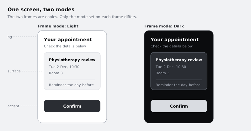
Now compare the two frames for things variables cannot fix on their own:
- Images and illustrations with white backgrounds glow on a dark screen. Note them; they need a dark version or a transparent background.
- Shadows almost disappear on dark backgrounds. Rely on
surfaceandborderfor separation instead. - Contrast of
mutedand ofon-accentonaccent. Run a contrast checker plugin on both frames, or measure the pairs by hand, and aim for at least 4.5:1 for body text.
If a fix is needed, change the alias in the Theme collection, not the layer. Both frames update.
Check it worked
The two frames sit side by side and show the same layers in different colours. Switching the copy's mode back to Light makes it identical to the original. Changing accent in the Dark column to another primitive changes the dark frame's button and leaves the light frame alone; then set it back to blue/300, because the next step relies on it.
Step 8 · Prove the system with one change
The point of the setup is that one edit reaches everywhere it should and nowhere else. Test it:
- In
Primitives, changeblue/700to a different blue, for example#1F4FA8. - Look at both frames. The light frame's button changes. The dark frame's button does not, because dark
accentpoints atblue/300. - Change
blue/700back.
Then add a third screen, from scratch, using only Theme variables. It should switch modes correctly with no extra work, which is the real test that a new designer can follow the system.
When you hand the file over, share the Colour roles table from step 1 with the developer. With matching names and code syntax, their :root block and your Theme collection list the same roles under the same names; check the values against each other once, because a stylesheet written separately (like the companion tutorial's) can differ by a shade.
Check it worked
Editing one primitive changed only the layers whose role points at it, in only the mode that uses it. A new screen built with Theme variables switches between Light and Dark from the frame's mode control alone.
Next steps
- Use number variables for spacing and corner radius applies the same idea to gaps, padding and corners.
- Add dark mode with CSS variables builds the matching
--bg,--textand--accentproperties in a stylesheet. - Make your first Figma component turns the Confirm button into a component, so its variables travel with every instance.
Part of these paths
Related tutorials
- Use number variables for spacing and corner radiusYou will have a card and a list screen in Figma whose gaps, padding and corner radius all come from number variables, so changing one value in the variables table restyles every card at once.
- How to Add Dark Mode to a Website with CSS VariablesYou will define your colours once as CSS custom properties, switch them with light-dark() and the user's system setting, add a toggle button that remembers the choice without a flash on reload, and check the text contrast of both themes with a short script.
Need this done for you?
Padding does this work for growing companies, from the first diagnosis to a system that keeps working.
Get new tutorials