Figma and design tools · Beginner · 12 min
Make your first component and use its instances
By Padding · Updated 18 Nov 2026
Figma (web) · November 2026
You will have one appointment card component in the Larkfield Clinic file, with instances on three screens that all change when you edit the main component.
On this page
The Larkfield Clinic booking app shows the same appointment card in several places: on Home as "your next appointment", on Pick a time as a summary of what you are booking, and on Booked as the confirmation. If each of those is a separate copy, every change has to be made three times, and sooner or later one copy is missed and the screens disagree.
A component solves this. You turn the card into a main component, the single source of truth, and place instances of it on each screen. An instance is a live copy: it draws itself from the main component, so a change to the main component shows up everywhere it is used. You can still change some things on one instance, such as the appointment time, without affecting the rest.
This tutorial makes that relationship visible by changing the main component on purpose and watching the screens update. By the end, the Larkfield file has one card component used on three screens.
If you finished /tutorials/build-a-responsive-card-with-auto-layout, its last step already turned Appointment card into a main component and placed two test instances. Delete those two instances now, keep the main component, and in the second step below only confirm the component icon and add a description. Everything else applies as written.
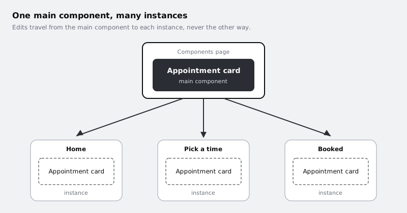
Step 1 · Get the card ready to become a component
Open your Larkfield Clinic file and find the appointment card. Tidy it first, because the layer names on the main component are the names every instance inherits and the names you will see when overriding text later. If your card is already a main component, make these edits on it directly; renaming layers in a main component renames them in its instances too.
Select the card's outer frame and check it is one frame holding everything: the photo, the service name, the clinician, the date and time, and the button. If the card is a loose group of layers, select them all and wrap them in a frame (Ctrl Alt G on Windows, Option Command G on Mac) so the card has one parent.
The auto layout card tutorial left you with these names: Appointment card, holding Photo, Details (with the Service, Clinician and Note text layers) and Footer (with the Time text and the Manage button frame). Keep them, with two deliberate renames that the rest of this series relies on:
TimebecomesWhen, because on later screens it holds a date as well as a timeManage buttonbecomesAction, because you will change the button's label in this tutorial and a name tied to one label would then be wrong
If you drew your own card instead, give it the same structure of names: Appointment card for the outer frame, Service for the service name, Clinician for the person seeing the patient, When for the date and time, and Action for the button.
If your card has spare layers you no longer use (an old background rectangle, a hidden duplicate label), delete them now. Anything inside the card when you make it a component will appear in every instance.
Check it worked
In the layers panel, the card is a single top-level frame called Appointment card. Expand it and you see Photo, Details and Footer; inside them, Service, Clinician, Note, When and Action. No layer reads "Frame 12" or "Rectangle 3".
Step 2 · Turn the card into a main component
If your card already shows the four-diamond component icon in the layers panel, it is a main component already: skip to adding the description below.
Otherwise, select the Appointment card frame, not a layer inside it. Then create the component in one of these ways:
- right-click the frame and choose the create component option from the menu
- use the create component action at the top of the right sidebar, which appears while the frame is selected
- Ctrl Alt K on Windows, Option Command K on Mac
Nothing moves on the canvas, but three things change. The layer icon in the layers panel becomes the component icon (four small diamonds), the layer and its outline on the canvas turn purple, and the right sidebar now has a component section where you can add a description. Add one sentence there, such as "Shows one booked appointment. Use on Home, Pick a time and Booked." Anyone who finds the component later learns where it belongs without asking you.
The card you started from is now the main component. Keep that in mind: from here on, every edit you make to this exact layer is an edit to all of its future instances.
Check it worked
The Appointment card layer has the four-diamond icon and shows in purple in the layers panel. Click on it and the right sidebar shows a component section with your description in it.
Step 3 · Give the main component its own page
A main component sitting on one of your screens is easy to edit by accident while you are working on that screen. Move it somewhere deliberate.
In the pages list at the top of the left sidebar, add a page and name it Components. Go back to the screen where the card lives, select the main component, cut it (Ctrl X or Command X), switch to the Components page and paste it (Ctrl V or Command V). Place it near the top left with some empty canvas around it, because more components will join it later.
The screen you cut it from now has a gap where the card was. That is fine; you will fill it with an instance in the next step.
Check it worked
The pages list has a Components page. On it, the Appointment card sits alone with its purple outline. The screen you moved it from no longer has a card on it.
Step 4 · Place instances on three screens
Go to the page with your screens: Home, Choose a service, Pick a time, Your details, Confirm and Booked. You will put the card on Home, Pick a time and Booked.
Open the Assets tab at the top of the left sidebar. Your Appointment card is listed under the components in this file. Drag it from the Assets tab onto the Home frame and drop it where the "your next appointment" area should be. Do the same for Pick a time and for Booked.
There is a second way, useful once the main component is next to your work: hold Alt (Option on Mac) and drag the main component to make a copy. A copy of a main component is an instance, not a second main component. Copying an instance and pasting it also gives you another instance.
If your screens use auto layout, drop the instance inside the frame that stacks the content, and it will take its place in the stack rather than float on top.
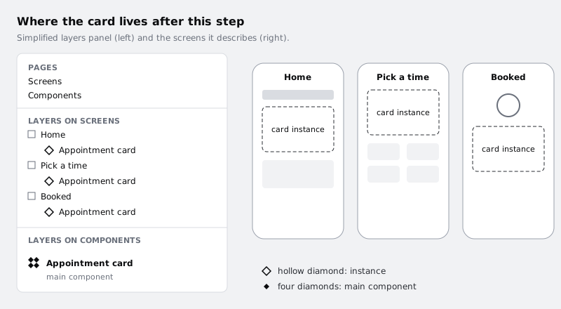
Check it worked
Each of the three screens has an Appointment card layer with a single hollow diamond icon, the instance icon. Select one and the right sidebar shows an instance section naming Appointment card as its component. Your Components page still has exactly one main component.
Step 5 · Change the main component on purpose
Now prove the link works. Arrange your view so you can see at least one screen while you edit: either zoom out on the screens page and keep the Components page open in a second browser tab of the same file, or temporarily drag the main component back next to the screens and return it afterwards.
Make three edits to the main component, one at a time, and look at the instances after each:
- Shape. Select the main Appointment card and change its corner radius, for example from 12 to 16.
- Colour. Change the fill of the card or the colour of the Service text.
- Structure. Add a new text layer called
Location, reading "Larkfield Clinic, ground floor", inside Details under Clinician. Details uses auto layout, so the card grows to fit; if your own card does not, make room by hand.
Each edit appears on Home, Pick a time and Booked at once. You did not touch the screens, and they changed anyway. That is the whole point of a main component: the screens hold references to it, not copies of it.
Try the opposite direction once. Select the Location layer inside the instance on Home and try to delete it. Figma's help centre states that layers cannot be deleted from an instance, only hidden. The structure belongs to the main component.
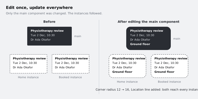
Check it worked
All three screens show the rounder corners, the new colour and the Location line, even though you only edited the card on the Components page. After your delete attempt, the Location layer is still listed inside the Home instance in the layers panel (hide it with the eye icon if a screen needs it gone).
Step 6 · Give one instance its own text
A real booking app does not show the same appointment on every screen. On Booked, the card should show the slot the patient has just chosen.
Double-click into the Booked instance until the When text is selected, and change it to "Thu 11 Dec · 14:15". This is an override: a change stored on that one instance. The other two instances still show the main component's text.
Now go back to the main component and change something else, such as the Action button label from "Manage" to "View details". The Booked instance picks up the new button label and keeps its own date. Figma keeps an instance's overrides when the main component changes, as long as the layer you overrode is still there.
Which overrides survive which kinds of change, and when to reset them, is a topic of its own; see /tutorials/override-component-instances-safely before you rely on overrides across a whole file.
Check it worked
Booked shows "Thu 11 Dec · 14:15" while Home and Pick a time show the original date. All three show the new View details button label.
Step 7 · Learn the way back to the main component
When you are working on a screen and want to change the card, edit the main component, not the instance. From any instance you can jump there: select the instance and use the option in its section of the right sidebar that takes you to the main component (it is also in the right-click menu). Figma switches to the Components page and selects the main Appointment card.
Two things to avoid while you are learning:
- Detaching an instance. Detach turns an instance back into a plain frame and cuts the link. The card will look the same, but it will stop receiving changes, which puts you back where you started with copies that drift. If you need a different kind of card, the answer is usually variants or a second component, not a detached copy.
- Deleting the main component. The instances keep showing the card, but there is nothing to edit centrally. If it happens, undo straight away, or select an instance and look in its right sidebar section for the option to restore the component.
Check it worked
Select the instance on Pick a time and use the go to main component option. You land on the Components page with the main Appointment card selected. In the layers panel, none of the three cards on your screens has turned into a plain frame icon.
Next steps
You now have one component with three instances, and you have seen both directions of the link: changes flow from the main component to instances, and overrides stay on the instance that holds them.
- Make your button a component with primary and secondary versions in /tutorials/build-a-button-component-with-variants.
- Learn which instance changes are safe and which break on update in /tutorials/override-component-instances-safely.
- If your card does not resize well when its text changes, rebuild it with /tutorials/build-a-responsive-card-with-auto-layout before turning more things into components.
Part of these paths
Related tutorials
- Turn a button into a component with variantsYou will have a Figma button component set with Type, Size and State properties, so a teammate can place one button and switch it between primary, secondary, large, small and disabled from the right sidebar.
- Override instances without breaking the main componentYou will have Larkfield Clinic screens whose appointment cards carry their own text, colour and nested-instance overrides yet still pick up every other change from the main component, and you will know when to reset and why not to detach.
Need this done for you?
Padding does this work for growing companies, from the first diagnosis to a system that keeps working.
Get new tutorials