Figma and design tools · Intermediate · 14 min
Make layouts wrap and stretch with auto layout min and max sizes
By Padding · Updated 18 Nov 2026
Figma (web) · November 2026
You will have one Figma frame for a time-slot picker that reflows from a 360 wide phone layout to a desktop layout by itself, using wrap, minimum and maximum widths and the grid flow, with no separate frame for each size.
On this page
A list of appointment times is a classic place where design files multiply. On a phone the slots sit four to a row. On a tablet there is room for six. On a desktop the list should stop growing before the buttons turn into long bars. The old answer was three frames, one per breakpoint, which then drift apart every time someone changes a label.
Auto layout can do that reflow inside one frame. Three settings carry most of the work: wrap, which starts a new row when the current one is full; min width, which tells each slot how narrow it is allowed to get, and so how many fit on a row; and max width, which stops a slot or a whole section from stretching too far. For the parts that should not reflow, such as the seven days of a week, the grid flow keeps a fixed number of columns and shares the width between them.
You will build a "Pick a time" screen for a booking app: a week strip across the top and twelve time slots under it. By the end, dragging the screen frame from 360 wide to 1024 wide changes the layout correctly at every width in between.
Step 1 · Build one time slot
Create a new Design file. Pick the Text tool (T), click on the canvas and type 09:00. Set the text to 16 size with a 24 line height, and leave its resizing on auto width.
With the text selected, press Shift A to wrap it in an auto layout frame. Rename the frame Slot and set:
- Direction: horizontal
- Vertical padding 12, horizontal padding 8
- Alignment: centre (the middle dot in the alignment control)
- A light fill such as
#F1F2F4, a 1 px stroke in#D9DCE1and a corner radius of 8
Leave the width on hug contents for now. You change it once the slot sits inside a wrapping parent, because fill container only means something when there is a parent to fill.
Check it worked
The layers panel shows Slot with one text layer inside. Slot is 48 tall (24 plus 12 plus 12). Select the text and look at its position: it sits 8 from the left of Slot and 12 from the top.
Step 2 · Put twelve slots in a wrapping frame
Duplicate Slot until you have twelve (Ctrl D on Windows, Command D on Mac). Change the labels so they run 09:00, 09:30, 10:00 and so on to 14:30. Select all twelve and press Shift A. Rename the new frame Slots.
Set Slots to a horizontal direction, then turn on wrap in the auto layout section of the right sidebar. Set the gap between slots to 8. With wrap on, there is also spacing between rows; set that to 8 as well, so the space between slots is the same across and down. Set padding to 0.
Change the width of Slots from hug contents to fixed and type 328. That is a 360 wide phone screen minus 16 on each side, which is where Slots will end up.
Check it worked
The twelve slots now sit in several rows inside a 328 wide frame instead of one long line. Drag the right edge of Slots wider and more slots move up onto the first row. Drag it narrower and they drop down. Set the width back to 328 when you are done.
Step 3 · Let the slots stretch, between a minimum and a maximum
At the moment each slot hugs its label, so the right end of every row is ragged. You want the slots in a row to share the row's width, without getting so narrow that the time is cramped or so wide that they stop looking like buttons.
Select all twelve slots (click the first in the layers panel, then Shift-click the last). In the right sidebar:
- Set the width to fill container.
- Open the width menu and add a min width of 72.
- Open it again and add a max width of 120.
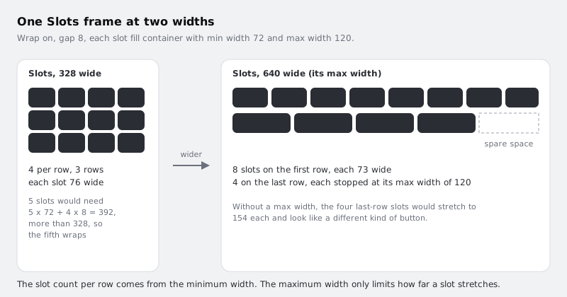
Wrap and min width work together. A row holds as many slots as fit at their minimum width, then the slots on that row grow to share any space left over. At 328 wide, four slots need 4 x 72 + 3 x 8 = 312, which fits. Five would need 392, which does not, so the fifth slot starts a new row. The four slots then share the 328 equally.
If you are building with a slot component, set these sizes on the main component's frame rather than on each copy, so every instance starts the same way.
Check it worked
Slots shows three rows of four. Select any slot: the right sidebar shows its width as 76 ((328 minus three 8 px gaps) divided by 4), set to fill container, with a minimum of 72 and maximum of 120. The right edge of every row lines up with the right edge of Slots.
Step 4 · Build the week strip with the grid flow
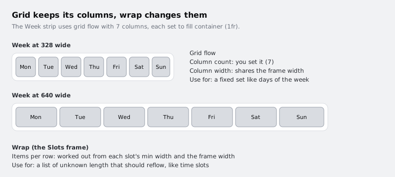
The days of the week behave differently from the slots. There are always seven, and they should stay in one row at every width, getting wider or narrower as a set. That is a job for the grid flow, not wrap.
Make a small frame for one day: a text layer Mon at 14 size, wrapped in auto layout with 8 padding all round, centre alignment, a #D9DCE1 fill and a corner radius of 8. Name it Day. Duplicate it to seven and change the labels to Tue through Sun.
Select the seven Day frames, press Shift A and name the new frame Week. In the auto layout section, change its flow to grid. In the grid picker, set 7 columns and 1 row. Then set the column sizing so each column fills the container; typing Auto into a column size gives 1fr, an equal share. Set the gap between columns to 4.
Last, select all seven Day frames and set their width to fill container, so each one fills its cell instead of hugging its label.
Check it worked
Week shows Mon to Sun in one row of equal cells. Select Week and drag its right edge wider and narrower: the cells change width but there are always seven columns in one row. A Day frame that is still on hug will look narrower than its cell, which tells you the fill container step was missed.
Step 5 · Assemble the screen so both parts stretch
Now put both parts in a screen that drives their width.
- Select Week and Slots and press Shift A. Name the new frame
Pick a time. - Set it to a vertical direction, a gap of 16 and padding of 16 on every side, with a white fill.
- Set its width to fixed, 360.
- Select Week and set its width to fill container. Do the same for Slots, which replaces the fixed 328 you typed earlier.
- With Slots still selected, add a max width of 640.
Week and Slots now take their width from Pick a time. The max width on Slots is the desktop cap: past 640, the time list stops growing. Leave Week without a maximum so the days still span the screen.
Select Pick a time and set its alignment to top centre, so that once Slots reaches its maximum it sits in the middle of the screen instead of hugging the left edge.
Check it worked
At 360 wide, Week and Slots are both 328 wide (360 minus 16 on each side) and Slots still shows three rows of four. In the layers panel the order is Pick a time, then Week, then Slots, each with its own children. Nothing inside Pick a time is set to a fixed width except the individual text layers.
Step 6 · Test the one frame at three widths
This is where you find out whether the settings hold. Do not duplicate the screen; resize the same frame and read the result each time.
- 360 wide (phone). Three rows of four slots, each 76 wide. Seven day cells across the top.
- 520 wide (small tablet). Slots is 488 wide. Six slots fit at 72 (6 x 72 + 5 x 8 = 472) and seven do not (552), so you get two full rows of six.
- 1024 wide (desktop). Week stretches to 992. Slots stops at 640 and sits centred. Eight slots fit on the first row (8 x 72 + 7 x 8 = 632), so the twelve split into a row of eight and a row of four. The four on the last row would each stretch to 154 without a limit; the max width of 120 holds them at 120 and leaves the rest of the row empty.
If a count comes out differently, read the numbers in the right sidebar before changing anything. The usual causes are a gap that is not 8, a slot whose min width did not take, or padding left on Slots.
Check it worked
Write down the three slot counts per row from your own file: you should have 4, 6 and 8. At every width, no slot is narrower than 72 or wider than 120, and the week strip always shows seven days in one row. Set Pick a time back to 360 when you finish.
Step 7 · Fix the three most common breakages
Most problems with this kind of layout come from one setting on the wrong layer. Try each of these on purpose so you recognise them later, then undo.
- Slots on hug instead of fill. Set Slots back to hug contents. It grows to fit all twelve slots on one row and stops reflowing, because a hugging frame never runs out of width to wrap at. Figma also cannot let a frame hug while its children fill, so it switches one of them for you. Put Slots back on fill container.
- No min width on the slots. Remove the min and max from the slots (the width menu has an option to remove min and max). With fill and no minimum, nothing tells Figma when a row is full, so the slots squeeze rather than wrap. Add the 72 and 120 back.
- Min width too small for the label. Set the min width to 40 and resize Pick a time to 360. More slots fit on a row, and the times are pressed against the edges or clipped. The minimum should be at least the widest label plus its padding.
Check it worked
After undoing each test, Pick a time at 360 wide is back to three rows of four slots, 76 wide each, and the right sidebar for any slot shows fill container with a minimum of 72 and a maximum of 120.
Next steps
You now have a screen where the reflow lives in the settings rather than in extra frames, so a change to a slot label or a new time appears at every width at once.
- Use the same nested approach for a full scrolling list in /tutorials/build-a-list-screen-with-nested-auto-layout.
- For layers that sit outside auto layout, such as a floating button or a badge, see /tutorials/pin-layers-with-constraints-in-figma.
- Go back over padding, gap and fill container on a single object in /tutorials/build-a-button-with-auto-layout.
Part of these paths
Related tutorials
- Build a list screen with nested auto layoutYou will have a full Upcoming appointments phone screen built from nested auto layout frames, where duplicating a card moves everything below it and a floating button stays pinned to the corner.
- Keep layers in place with constraints when a frame resizesYou will have a phone screen in Figma whose header and bottom bar hold together when you resize it from 320 pixels wide to tablet width, and you will know when constraints apply and when auto layout takes over.
Need this done for you?
Padding does this work for growing companies, from the first diagnosis to a system that keeps working.
Get new tutorials