Figma and design tools · Intermediate · 16 min
Build a list screen with nested auto layout
By Padding · Updated 18 Nov 2026
Figma (web) · November 2026
You will have a full Upcoming appointments phone screen built from nested auto layout frames, where duplicating a card moves everything below it and a floating button stays pinned to the corner.
On this page
A single card with auto layout is easy to get right. A whole screen is harder, because a screen is frames inside frames inside frames, and each level has to know whether it hugs its content, fills its parent or keeps a fixed size. Get one level wrong and the screen looks fine until someone adds a fourth card, and then the bottom bar slides off the frame or a chip row squashes.
In this tutorial you build an Upcoming appointments screen for a clinic booking app. It has a header, a row of filter chips, a list of appointment cards, a bottom tab bar and a round "new appointment" button that floats over the list. The part most tutorials skip comes first: you plan the nesting on paper before you draw anything, so every frame has a job and a resizing rule before it exists.
You finish with a screen where duplicating a card is the whole job. The list grows, the other cards move down, and the bottom bar and floating button stay where they belong.
Step 1 · Plan the nesting before you draw
Look at the screen you want and draw boxes around things that line up in one direction. Each box becomes one auto layout frame. For this screen the plan is:
- Screen: vertical. Holds Header, Filters, List and Bottom bar, top to bottom.
- Header: vertical. A small date line above a large "Upcoming" title.
- Filters: horizontal. Three chips: All, This week, Past.
- List: vertical. One card per appointment.
- Card: horizontal. A date block, a details column and a chevron.
- Details: vertical. Service name, time and room, clinician.
- Bottom bar: horizontal. Three tabs, each a vertical stack of icon and label.
- New button: a child of Screen that ignores auto layout, so it can float.
Next to each box, write how it should size on each axis. Use three words only: fixed, hug or fill. Screen is fixed (390 by 844). Header, Filters, List and Bottom bar fill the width. List also fills the height, so it takes whatever space the header and bottom bar leave. Cards fill the width and hug their height. Chips hug both ways.
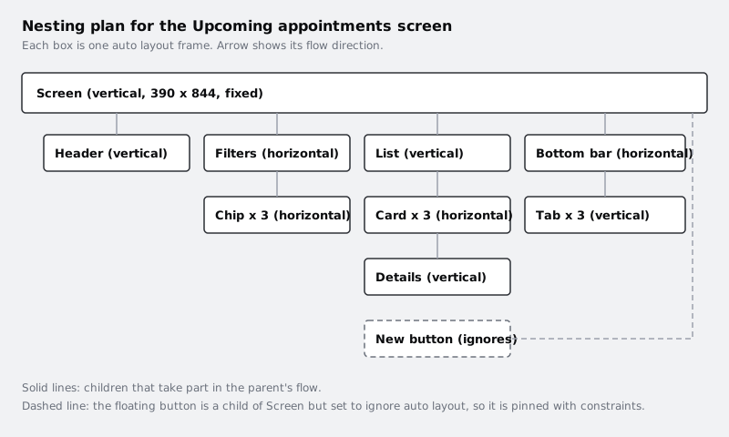
The rule of thumb: a box whose children sit side by side is horizontal; a box whose children stack is vertical. If a box has both, it needs another box inside it.
Check it worked
Your plan lists eight frames (counting Card and Details once each), and every one has a direction plus a sizing word for width and height. If any box has children going in two directions at once, split it before moving on.
Step 2 · Build the smallest pieces first
Build from the inside out. Inner frames are quick to get right, and once they behave, wrapping them is one shortcut.
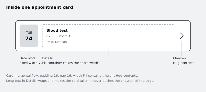
Start with one card. Create a text layer for the day ("TUE") and one for the date number ("24"). Select both and press Shift+A to wrap them in an auto layout frame. Set it to vertical, centre the contents with the alignment box in the right sidebar, give it a light fill and set its width to a fixed 72. Name it Date.
Make three text layers for the details: "Blood test", "09:30 · Room 4" and "Dr A. Mensah". Select them, press Shift+A, make the frame vertical with a gap of 4 and name it Details.
Add a chevron icon (any small vector or an icon from your library). Shift+A orders the new frame's children by where they sit on the canvas, not by the order you click them, so first arrange Date, Details and the chevron left to right. Then select all three, press Shift+A and make the new frame horizontal, with a gap of 16, padding of 16, a corner radius of 12 and a white fill. Name it Card.
If the order still comes out wrong, drag a layer to its place inside the frame or nudge it with the arrow keys. Now fix the one setting that makes the card work: select Details and set its width to Fill container. Leave the chevron on Hug contents.
Check it worked
Drag the card's right edge wider and narrower. The date block stays 72 wide, the chevron stays against the right padding, and only the details column changes width. In the Layers panel, Card contains exactly three children: Date, Details and the chevron.
Step 3 · Make the card survive real content
Placeholder text is always the right length. Real data is not. Before you copy the card, test it with something awkward.
Change "Blood test" to "Follow-up appointment for blood pressure review". With Details on Fill container, the text needs to wrap rather than run past the card. Select the text layer and, in the type settings in the right sidebar, set it to auto height with its width filling the container. The card's height is Hug contents, so it grows to fit the extra line.
Check it worked
The long service name wraps onto two lines, the card is taller than before and the chevron is still inside the card's right padding. Put the short name back afterwards, or keep one long-named card for the next steps as a test case.
Step 4 · Assemble the list and the chips
Duplicate the card twice with Ctrl+D (Cmd+D on a Mac) and change the text in each copy so you can tell them apart. Select all three cards, press Shift+A, and set the new frame to vertical with a gap of 12 and padding of 16 on the left and right. Name it List. Now that the cards have an auto layout parent, select each card and set its width to Fill container.
For the filters, make one chip: a text layer wrapped with Shift+A, horizontal, padding 8 top and bottom and 14 left and right, fully rounded corners and a line-coloured stroke. Duplicate it twice, change the labels to "This week" and "Past", select all three and press Shift+A. Make this frame horizontal with a gap of 8 and padding of 16 on the left and right, and name it Filters. Give the "All" chip a dark fill and white text so it reads as selected.
Build the Header the same way: a small date line and a large "Upcoming" title, wrapped in a vertical frame with a gap of 4 and padding of 16.
Check it worked
Retype "This week" as "Next 7 days". The chip widens and the "Past" chip slides right, with the gap still 8. In List, the three cards are evenly spaced 12 apart and all the same width.
Step 5 · Wrap everything into the screen
Build the bottom bar: three tabs, each a vertical frame holding an icon and a label ("Appointments", "Messages", "Profile"). Wrap the tabs in a horizontal frame, set its gap to Auto so the tabs spread across the width, give it padding of 12 and a top stroke, and name it Bottom bar.
Arrange Header, Filters, List and Bottom bar in a column on the canvas, top to bottom in that order, because Shift+A stacks them by canvas position. Select all four and press Shift+A; if one lands in the wrong place, drag it into position in the Layers panel or move it with the arrow keys. Set the new frame to vertical with a gap of 0, then set its size to a fixed 390 by 844. Name it Screen.
Now apply the sizing from your plan to each direct child of Screen:
- Header, Filters, List and Bottom bar: width Fill container.
- List: height Fill container as well.
- Header, Filters and Bottom bar: height Hug contents.
List filling the height is what keeps the bottom bar at the bottom of the frame. Header and Filters take what they need, Bottom bar takes what it needs, and List gets the rest.
Check it worked
Bottom bar sits against the bottom edge of Screen, not straight under the last card. Change Screen's height from 844 to 700 and back: the bottom bar follows the bottom edge each time, and the gap above it shrinks and grows.
Step 6 · Float the new appointment button
Draw a 56 by 56 circle with a plus icon, wrap it in a frame if you want padding around the icon, and name it New button. Drag it into the Screen frame.
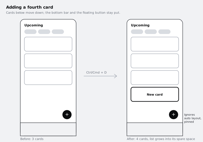
Auto layout immediately puts it in the flow wherever you drop it, pushing other frames aside. To take it out, keep it selected and turn on Ignore auto layout in the Position section of the right sidebar. The button now sits on top of the screen at whatever position you give it, and the other frames close up as if it were not there.
Place it 16 from the right edge and 16 above the bottom bar. Then set its constraints, in the same Position section, to Right and Bottom. Constraints are what an ignoring child uses instead of the flow: when Screen changes size, the button keeps its distance from those two edges.
If the button is hidden under the list or the bottom bar, its layer order is the cause. Move the New button layer in the Layers panel so it draws above the others, or check the canvas stacking setting in the Screen frame's auto layout settings, which decides whether the first or last child draws on top.
Check it worked
Change Screen's height to 700 again. The button stays 16 from the right edge and the same distance above the bottom bar. In the Layers panel, New button is a direct child of Screen, and no other layer has moved to make room for it.
Step 7 · Add a card and test the whole screen
This is the test the plan was for. Select the last card in List and press Ctrl+D (Cmd+D). The new card appears below it, spaced 12 from the card above, and fills the width.
Keep duplicating. Once the cards outrun List's height, they overflow it. Turn on Clip content on List so the overflow is hidden behind the bottom bar, the way a scrolling list looks on a phone. To see the whole list at once, for a handoff or a review, duplicate Screen and set the copy's height to Hug contents: the copy grows to show every card, and its bottom bar moves down below the last one. Use a copy rather than the original, because a child cannot fill on an axis where its parent hugs, so Figma takes List off Fill container in that frame. If you did change the original, set Screen back to 844 and set List's height to Fill container again.
Finish with a quick rename pass. Every frame in your plan should carry the name you gave it on paper, so a developer inspecting the screen sees Screen, Header, Filters, List, Card and Bottom bar rather than Frame 1 to Frame 14.
Check it worked
With four cards in List and Screen back at a fixed 844, the cards are evenly spaced, the bottom bar is at the bottom edge and the button floats in its corner. Delete one card and the gap closes on its own. The Layers panel tree matches the plan you drew in the first step.
Next steps
You now have a screen that behaves like a real list, not a picture of one. The natural next moves:
- Turn Card into a reusable component so each appointment is an instance: /tutorials/make-your-first-figma-component
- Make chips wrap onto a second line and set minimum and maximum widths on cards: /tutorials/make-layouts-wrap-and-stretch-with-auto-layout
- Go back to the card on its own and build it responsive from scratch: /tutorials/build-a-responsive-card-with-auto-layout
- Learn how constraints work on layers outside auto layout: /tutorials/pin-layers-with-constraints-in-figma
Part of these paths
Related tutorials
- Build a responsive card with auto layoutYou will have an appointment card in Figma, with a photo, a stack of text and a button, that keeps its layout at any width from 280 to 600 pixels because every layer has the right hug, fill or fixed setting.
- Make layouts wrap and stretch with auto layout min and max sizesYou will have one Figma frame for a time-slot picker that reflows from a 360 wide phone layout to a desktop layout by itself, using wrap, minimum and maximum widths and the grid flow, with no separate frame for each size.
Need this done for you?
Padding does this work for growing companies, from the first diagnosis to a system that keeps working.
Get new tutorials