Figma and design tools · Beginner · 14 min
Build a responsive card with auto layout
By Padding · Updated 18 Nov 2026
Figma (web) · November 2026
You will have an appointment card in Figma, with a photo, a stack of text and a button, that keeps its layout at any width from 280 to 600 pixels because every layer has the right hug, fill or fixed setting.
On this page
A card is the smallest layout that still has every resizing problem in it. It holds a picture that should get wider, text that should wrap, a button that should stay the size of its label, and a box around all of them that should grow taller when the text needs more room. Draw it with loose rectangles and it looks right at exactly one width. Build it with auto layout and the right sizing on each layer, and you can drag it from phone width to tablet width without touching anything inside.
Every layer in auto layout answers two questions: how wide am I, and how tall am I? There are three answers to each:
- Hug contents: as small as the content allows. A button hugs its label.
- Fill container: whatever space the parent has left. A text block fills the card's width.
- Fixed: the number you type. A photo might be 160 pixels tall at every width.
In this tutorial you build an appointment card for a clinic booking app, give each layer one of those answers on purpose, then stretch the card yourself to see each answer at work. Once you understand it on a card, the same reasoning works for whole screens.
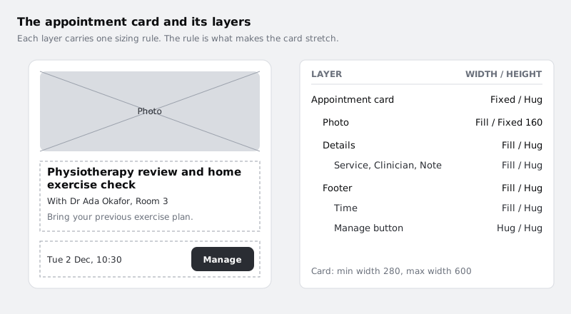
Step 1 · Make the card frame
Create a new page in your file called Card practice, so the experiments stay out of your real screens.
Press F (or pick the frame tool from the toolbar) and draw a frame roughly 360 by 400. Rename it Appointment card. Give it a white fill, a 1 pixel light grey stroke and a corner radius of 12, so you can see its edges against the canvas.
Now press Shift+A with the frame selected to add auto layout. In the Layout section of the right sidebar, set:
- direction: vertical, so children stack top to bottom
- gap between items: 12
- padding: 16 on all sides
The frame may shrink to a small square, because an empty auto layout frame has nothing to hug. That is expected. Type 360 into the width field so you have a fixed starting width to work with. Then open the dropdown on the height field and choose Hug contents. A frame you drew first can keep its drawn height of 400 after auto layout is added, and the card only grows with its text if the height hugs.
Check it worked
With Appointment card selected, the right sidebar shows a Layout section with the vertical direction chosen, a gap of 12 and padding of 16. The width field reads 360 and the height field shows Hug.
Step 2 · Add the photo
Draw a rectangle inside the card and name it Photo. If you have an image to hand (a clinic room, a doctor's desk, anything landscape), drag it onto the rectangle to use it as an image fill. A plain grey fill works just as well for this tutorial.
The photo should always span the card from padding edge to padding edge, but it should not get taller when the card gets wider, or a wide card turns into a poster. So give it different answers for each direction:
- width: Fill container
- height: Fixed, 160
You change these from the width and height fields in the right sidebar. Each has a dropdown that lists the resizing options available for that layer. Set the corner radius to 8 so the photo sits neatly inside the card's rounded corners.
Check it worked
Photo spans the card exactly, with 16 pixels of white on the left and right. Its width field shows Fill and its height shows 160. Change the card's width to 300 and back to 360: the photo follows each time and stays 160 tall.
Step 3 · Build the text stack
Under the photo, add three text layers:
- Service: "Physiotherapy review and home exercise check", 18, bold
- Clinician: "With Dr Ada Okafor, Room 3", 14, regular
- Note: "Bring your previous exercise plan.", 14, regular, in a mid grey
Select the three text layers and press Shift+A. Figma wraps them in a new auto layout frame. Name it Details, make it vertical with a gap of 4, and no padding. The small gap keeps the three lines reading as one group, while the card's gap of 12 separates the group from the photo.
Now the sizing, which is where most cards go wrong. Set Details to fill width and hug height. Then select each of the three text layers in turn and set its width to Fill container. Leave each text layer's height on Hug.
Text that is left on auto width keeps growing sideways on one line and pushes out of the card. Text set to a fixed size stops resizing completely and overlaps whatever is below it. Fill width with hug height is the combination that wraps: the line breaks wherever the card ends, and the layer grows downwards to fit.
Check it worked
In the Layers panel, Appointment card contains Photo and Details, in that order, and Details contains the three text layers. At 360 wide the service name already breaks onto two lines. Select any text layer: its width shows Fill and its height shows Hug. Type a much longer clinician name, such as "With Dr Ada Okafor and the physiotherapy team, Room 3": the line wraps inside the card instead of running out of it, and the card gets taller. Undo the change afterwards.
Step 4 · Add the footer row with a button
The footer shows the appointment time on the left and a button on the right.
Add a text layer with "Tue 2 Dec, 10:30" and name it Time. Then make a button: a text layer reading "Manage", wrapped in its own auto layout frame (Shift+A) with horizontal direction, padding of 8 top and bottom and 16 left and right, a dark fill and white text. Name the frame Manage button. If you have already built a button component, place an instance of it instead.
Select Time and Manage button together and press Shift+A. Make the new frame horizontal, name it Footer, set its gap to 12, and align its children to the vertical centre using the alignment control in the Layout section.
Then decide the sizes:
- Footer: fill width, hug height
- Time: fill width, hug height
- Manage button: hug width, hug height
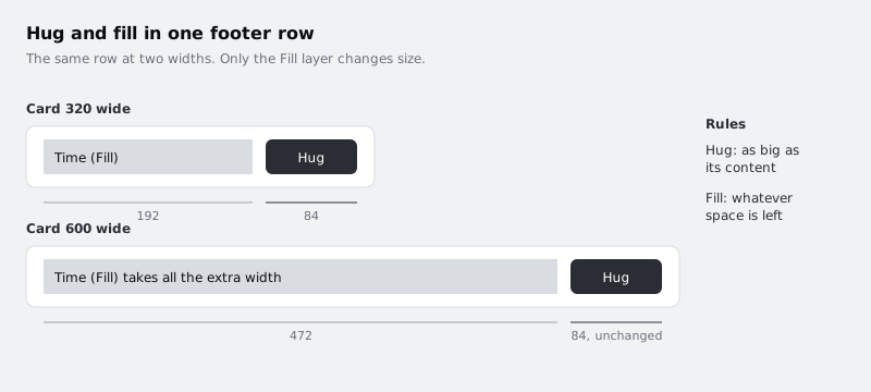
This is the row where hug and fill meet. The button only ever needs to be as wide as "Manage" plus its padding. Time takes all the space that is left, so the button is always pushed to the right edge without you adding a spacer or using space-between.
Check it worked
The Manage button sits against the card's right padding, and Time starts at the left padding. Select Manage button: both its width and height show Hug. Change the card's width to 500: Time gets wider, the button keeps the same width and stays on the right.
Step 5 · Set a minimum and maximum width
The card now adapts to any width you give it, including widths where it looks broken. Below about 280 the Manage button squeezes Time to a sliver; above about 600 the line lengths become hard to read and the photo becomes a thin strip. Tell Figma the range the card is designed for.
Select Appointment card. Open the dropdown on its width field and add a min width of 280, then open it again and add a max width of 600. The card stays fixed at 360 for now; the limits only apply when something resizes it, such as you dragging its edge or a parent frame filling it.
Rename the card's layers if any still have default names (Frame 4, Rectangle 2). The names you see in the Layers panel are what a developer reads in handoff, and they also make the next step easier to follow.
Check it worked
With Appointment card selected, the width dropdown or the field beneath it shows the min of 280 and the max of 600. Every layer inside the card has a name that says what it is.
Step 6 · Stretch the card and watch each rule
Now resize the card by dragging its right edge on the canvas, slowly, from wide to narrow. Watch one layer at a time rather than the whole card.
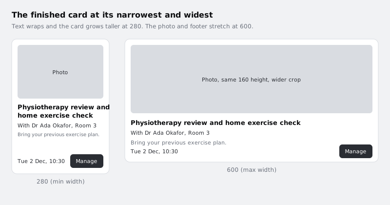
- Drag right as far as you can. The card stops at 600. The photo gets wider but stays 160 tall, the text lines get longer, and Time absorbs the extra width in the footer.
- Drag left. Somewhere around 430 to 450 (the exact point depends on your font) the service name breaks onto a second line, and the card gets taller by itself because its height hugs its content.
- Keep dragging. The card stops at 280. Nothing overlaps and nothing runs outside the card.
Dragging the edge sets the card's width to Fixed at whatever width you release it at. That is fine: the min and max limits stay in place, and the layers inside keep their own rules.
Check it worked
At 280 the service name sits on two lines and the bottom of the card has moved down, with the full 16 pixels of padding still below the footer. At 600 the card refuses to get wider. At no width between them does any text overlap another layer or cross the card's edge.
Step 7 · Break it on purpose, then fix it
Seeing each rule fail is the fastest way to remember why it is there. Try these one at a time, resize the card to 300, look, and undo.
- Set the Photo's width to Fixed, 328. At 300 the photo pokes out past the card's right padding, because a fixed width ignores the card around it.
- Set the Service text to auto width. At 300 the long service name stays on one line and runs past the card's edge instead of wrapping.
- Set Manage button's width to Fill container. Now Time and the button share the leftover width, the button stretches, and the time no longer has the room it needs.
- Set the card's height to Fixed, 300. The content needs more room than that, so the footer is pushed past the bottom of the card, where it is clipped or spills out depending on the frame's clip content setting. It gets worse at 280, where the service name takes two lines.
Undo each change before you try the next one. If you end up somewhere unexpected, compare every layer against the list in the first image in this tutorial.
Check it worked
You have seen all four failures and undone them. Your card behaves exactly as it did at the end of the previous step: hugging height, min 280, max 600, with Photo, Details, Footer and Manage button on the sizes in the first image.
Step 8 · Turn the card into a component
You will reuse this card in lists and screens, so make it a component now. Select Appointment card and create a component from it, using the component button in the toolbar or the right-click menu, or Option+Cmd+K (Ctrl+Alt+K on Windows).
Place two instances of it side by side. Set one to 280 and the other to 600, and change the service name in the 600 instance to something shorter, such as "Blood test". Both instances keep the sizing rules you set on the main component.
Check it worked
The Layers panel shows Appointment card with the component icon, and two instances on the canvas. The 280 instance has a two-line service name and a taller height, the 600 instance is shorter and wider, and you did not adjust anything inside either one by hand.
Next steps
You now have a card that fits from 280 to 600 pixels without any changes inside it. The next tutorials build on it:
- Build a list screen with nested auto layout stacks this card into an upcoming appointments screen with a header and a bottom bar.
- Build a button with auto layout covers the button in more detail, with icons, padding and a full-width version.
- Name and group layers so others can work in your file helps you keep the card's layer names readable as it grows.
Part of these paths
Related tutorials
- Build a button with auto layoutYou will have a Figma button whose padding, gap and alignment come from auto layout, so it resizes by itself for "Book" and "Book an appointment" and can show an icon on either side.
- Build a list screen with nested auto layoutYou will have a full Upcoming appointments phone screen built from nested auto layout frames, where duplicating a card moves everything below it and a floating button stays pinned to the corner.
Need this done for you?
Padding does this work for growing companies, from the first diagnosis to a system that keeps working.
Get new tutorials