Figma and design tools · Beginner · 13 min
Name and group layers so others can work in your file
By Padding · Updated 18 Nov 2026
Figma (web) · November 2026
You will turn a messy Figma screen into one whose Layers panel another designer or developer can read at a glance, with clear names, frames where they belong and no hidden leftovers.
On this page
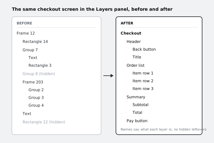
Open almost any first-draft Figma file and the Layers panel reads like a stock list: Frame 12, Rectangle 14, Group 7, Text, Text, Text. The screen looks fine on the canvas, but nobody else can find anything in it. A developer inspecting it has to click every layer to learn what it is. Another designer copies a "card" and gets half of it. And a prototype animation that matches layers by name will pick the wrong ones.
In this tutorial you clean up one screen, working from the outside in. You read what is there, delete what should not be there, decide which boxes are frames and which are groups, put layers in reading order, and then name everything. Naming comes last on purpose: once the structure is right, each layer's name is obvious.
The example is a checkout screen with a header, three item rows, a price summary and a pay button. Use your own screen if you have one; the steps are the same for any screen.
Step 1 · Read the screen you have
Select the top-level frame of your screen on the canvas. In the Layers panel on the left, use the Collapse layers control in the top-right corner of the panel so that only the top level shows, then expand one level at a time.
As you go, write a short list of what you find, in a note or a text layer off to the side of the canvas:
- layers still using default names (Frame 203, Rectangle 3, Group 2)
- layers shown dimmed in the panel, which means they are hidden
- groups that hold a background rectangle plus content (a card faked with a rectangle)
- anything that sits outside the section it belongs to, such as a price text that is a direct child of the screen instead of inside the summary
- empty groups or frames
Do not fix anything yet. The list tells you how much work there is and stops you renaming a layer you are about to delete.
Check it worked
You have a written list with at least one entry under each heading that applies to your screen, and you can say how many top-level children the screen frame has.
Step 2 · Remove hidden and leftover layers
Hidden layers are the most common reason a file confuses other people. A developer sees a layer in the panel, cannot see it on the canvas, and has to ask whether it ships.
Go through your list of dimmed layers one by one. For each, show it with Shift+Cmd+H (Shift+Ctrl+H on Windows) or the eye icon that appears when you hover the row, and decide:
- An old version or an abandoned idea: delete it. If you want to keep it, move it to an archive page instead of hiding it in the live screen.
- A state the screen really has, such as an error message or an empty basket: take it out of this screen and make it its own frame next to it, named for the state (Checkout, Checkout – empty basket). Hidden states inside one frame are invisible in handoff.
- Something you need temporarily: keep it, but you should be able to say why in one sentence.
Then delete empty groups and frames, and any shape with no fill, no stroke and no purpose that is left over from an earlier layout.
Check it worked
Expand every level of the screen in the Layers panel. No row is dimmed, unless you can give the one-sentence reason for it. The canvas looks exactly as it did before you started.
Step 3 · Decide which boxes are frames and which are groups
This is the choice that decides how easy the screen is to work with later, so make it on purpose.
A group is only a way of selecting several layers together. It has no size of its own: its bounds are always the combined bounds of its children. It cannot have a fill, a corner radius, padding or auto layout.
A frame is a real box. It has a size you set, its own fills, strokes, corner radius and effects, it can clip what is inside it, and it can use auto layout, constraints and layout grids. Components are built from frames too.
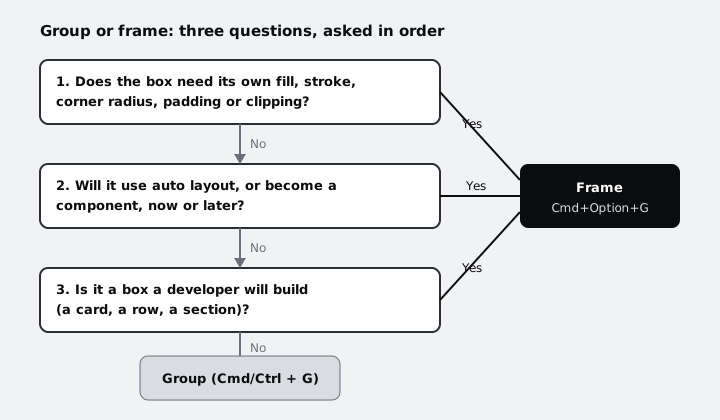
On a typical screen, the result looks like this:
- Frames: the header bar, each item row, the summary card, the pay button. Each is a box with a background or padding, each will probably get auto layout, and each is something a developer builds as one element.
- Groups: an icon made of several vector shapes, or a label and a small badge that move together but have no box around them.
The common mistake is a group containing a rectangle that acts as the background. It looks like a card, but you cannot add padding or auto layout to it, and when the text grows, the rectangle does not. Mark every one of these on your list as "should be a frame".
Check it worked
Each item on your list from step 1 that is a group now carries a note: "stays a group" or "should be a frame", with one of the three questions as the reason.
Step 4 · Turn fake cards into frames and group what belongs together
Work through the "should be a frame" notes. For a group that holds a background rectangle plus content:
- Select the group and ungroup it with Shift+Cmd+G (Shift+Ctrl+G on Windows). Its layers stay selected.
- Press Cmd+Option+G (Ctrl+Alt+G on Windows) to wrap the selection in a new frame. The frame takes the size of the selection.
- Select the background rectangle inside the frame. Note its fill, stroke and corner radius in the right sidebar, apply the same values to the frame itself, then delete the rectangle.
The frame now is the card. Its size no longer depends on a loose rectangle, and adding auto layout later is one click instead of a rebuild.
Next, fix layers that sit at the wrong level. If the subtotal and total texts are direct children of the screen, select them together with the frame that should hold them and drag them into it in the Layers panel, or select the loose layers and wrap them with Cmd+Option+G to create the section frame they were missing.
Aim for a screen whose direct children are its main sections, with the details nested one or two levels below. Very deep nesting (a group inside a group inside a group with nothing else in it) is as hard to read as none at all: ungroup any wrapper that holds only one child.
Check it worked
Collapse the Layers panel and expand only the screen frame. You see a short list of sections, roughly four to eight on a mobile screen, and none of them is a group that contains a background rectangle. Select one card frame and look at the right sidebar: it shows a fill and corner radius on the frame itself.
Step 5 · Put layers in reading order
The Layers panel is also the stacking order: a layer higher in the list is drawn on top of layers below it inside the same parent. For layers that overlap, such as a badge on top of an image, that order is about what you see, and it must stay as it is.
For sections that do not overlap, the order in the panel does not change the picture, so set it to match the order a person reads the screen: header first, then content, then the actions at the bottom. Drag rows in the Layers panel to reorder them.
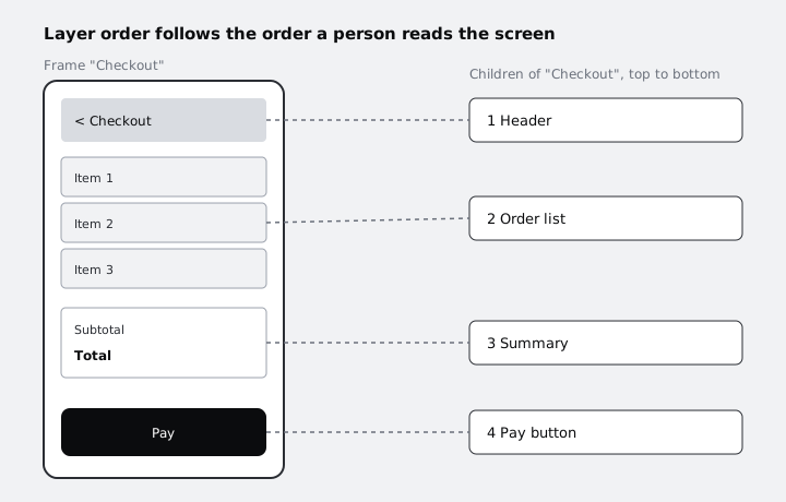
Do the same inside each section: the item rows in the order they appear, the back button before the title in the header.
This pays off later. Once a frame has auto layout, the order of its children in the Layers panel is the order they flow in, so a panel already in reading order needs no rework. A developer writing markup from top to bottom also meets the layers in the order they expect.
Check it worked
Read the top-level rows of the screen frame from the top of the panel down, and then look at the canvas from the top of the screen down. The two orders match. Any exceptions are overlapping layers, and for each of those the layer that should be visible is higher in the list.
Step 6 · Name every layer
Now that each layer is in the right place, name it for what it is, not what it looks like. "Pay button" survives a colour change; "Blue rectangle" does not.
To rename one layer, double-click its name in the Layers panel, type the new name and press Enter.
A small set of habits keeps names consistent across the file:
- Sections and boxes get a noun for their role: Header, Order list, Summary, Pay button.
- Repeated items share a name and a number: Item row 1, Item row 2, Item row 3.
- Text layers that hold content can keep their text as the name. Text layers with a role (a heading, a price) are named for the role: Title, Total.
- Icons are named for their meaning, not their shape: Back, not Arrow left.
- Use the same capitalisation everywhere. Sentence case (Pay button, not Pay Button) is common and matches most product copy.
For repeated items, use bulk rename:
- Select the three item rows in the Layers panel.
- Press Cmd+R (Ctrl+R on Windows), or right-click one of them and choose Rename.
- Leave Match empty so the whole name is replaced. In Rename to, type
Item row ` and insert the ascending number from the counter buttons below the field (it shows as `$n). - Look at the preview on the left of the dialog. If the numbers run the wrong way, use the descending counter instead, then click Rename.
If your plan includes Figma AI, it can suggest names for you. It only renames layers that still have default names, and it skips hidden layers, locked layers and anything inside an instance. Treat its names as a first draft and correct them against your habits above.
Check it worked
Expand every level of the screen. Search your Layers panel by eye for "Frame", "Group", "Rectangle", "Ellipse", "Vector" or a bare "Text" followed by a number: none is left, apart from shapes inside a group icon, where the group itself has a meaningful name.
Step 7 · Test the file on someone else
The final check is whether the file works for a person who did not build it. Share the file with a colleague or a friend, or duplicate the screen and come back to it the next day, and ask them to:
- Find the total price by using only the Layers panel, without clicking on the canvas.
- Copy one item row to another file and confirm the whole row comes with it, background included.
- Say which layer they would turn into a component first.
If they hesitate on any of these, the hesitation points at a layer that needs a better name or a different place in the tree. Fix it and ask again.
This matters beyond tidiness. Layer names are what developers see when they inspect the screen during handoff, and prototype animations between screens match layers by name and position in the tree, so two screens named the same way animate as you expect.
Check it worked
Your tester found the total in the Layers panel within a few seconds, the copied item row arrived complete with its background, and they named a sensible first component (most often the item row or the pay button). You have a short note of anything they hesitated on and what you changed.
Next steps
- Set up the pages, sections and archive that this screen lives in: Organise a Figma file with pages, frames and layers.
- Your item rows and pay button are now frames, ready for auto layout: Build a button with auto layout.
- Hand the cleaned-up screen to a developer: Hand off a design with Figma Dev Mode.
Part of these paths
Related tutorials
- Organise a Figma file with pages, frames and layersYou will have a Figma file for the Larkfield Clinic booking app with a cover, a page for each stage of work, named mobile and desktop frames for all six screens, and sections that group them.
- Hand off a design with Figma Dev ModeYou will have the Larkfield Clinic booking screens cleaned up, grouped in one section, checked from the developer's side in Dev Mode, marked ready for dev and sent with a short note that lets a developer build without a handoff meeting.
Need this done for you?
Padding does this work for growing companies, from the first diagnosis to a system that keeps working.
Get new tutorials