Figma and design tools · Beginner · 12 min
Organise a Figma file with pages, frames and layers
By Padding · Updated 18 Nov 2026
Figma (web) · November 2026
You will have a Figma file for the Larkfield Clinic booking app with a cover, a page for each stage of work, named mobile and desktop frames for all six screens, and sections that group them.
On this page
A design file gets messy in a predictable way. The first screens go on the first page, then research notes land beside them, then a second version of the home screen sits on top of the first, and three weeks later nobody can say which frame is current. The fix is cheap if you do it before the first screen is drawn: decide where each kind of work lives, and give every screen a size and a name from the start.
This tutorial sets up that structure for the running example used across the product design series: Larkfield Clinic, a fictional community clinic, and its appointment booking app. A patient chooses a service, picks a time, enters their details, confirms and gets a reminder. The app has six screens: Home, Choose a service, Pick a time, Your details, Confirm and Booked.
Figma gives you three levels to organise with. Pages split the file into separate canvases, listed in the left sidebar. Frames are the screens themselves, with a fixed size. Sections are labelled areas on a canvas that hold related frames. Layers are everything inside those, shown as a tree in the left sidebar. You will use all four, and nothing in this tutorial needs a plugin.
Step 1 · Create the file and name it
From your Figma file browser, create a new design file. It opens as "Untitled". Click the file name at the top of the left sidebar and rename it:
Larkfield Clinic – Booking appPut the client or product first and the piece of work second. When you have ten files for the same client, they sort together and still say which is which.
If you work in a team, move the file out of your drafts and into the team project where the rest of the Larkfield work will live, so that the people you share it with later can find it without a link.
Check it worked
The file name at the top of the left sidebar reads "Larkfield Clinic – Booking app", and the file appears under that name in your file browser, not as "Untitled".
Step 2 · Add a page for each stage of work
A new file has one page, called "Page 1". Find the page list at the top of the left sidebar. Double-click "Page 1" and rename it Cover. Then add four more pages with the add button beside the page list, naming each as you create it:
Cover: the file's front door, built in the next step.Research: interview notes, the user flow, sketches photographed from paper.Wireframes: grey-box screens, low and mid fidelity.Designs: finished, high-fidelity screens that developers build from.Archive: anything you replace but do not want to delete.
Drag the pages into that order. The order follows the work: left to right through the project, top to bottom in the list.
The Archive page matters more than it looks. When you redo a screen, move the old frame to Archive rather than leaving it beside the new one. The Designs page then only ever holds the current version, and nobody builds from a stale frame.
On the Starter plan, team files are limited to three pages. If that is you, use three pages, Cover, Work and Archive, and make Research, Wireframes and Designs into three sections on the Work page instead. The rest of this tutorial works the same way, one level down.
On a paid plan you can also add a divider to the list: create a blank page and start its name with a hyphen. A divider between Designs and Archive makes the line between current and old work visible at a glance. This is optional.
Check it worked
The page list shows five pages in this order: Cover, Research, Wireframes, Designs, Archive (or Cover, Work, Archive on the Starter plan). There is no page called "Page 1" or "Page 2" left over.
Step 3 · Build a cover and set it as the thumbnail
Figma uses the contents of the first page as the file's thumbnail in the file browser. A deliberate cover makes the file recognisable and tells anyone who opens it where to look.
Go to the Cover page. Press F to pick the Frame tool, click once on the canvas, then set the size in the right sidebar: type 1920 in W and 1080 in H. That is the size Figma recommends for a thumbnail. Double-click the frame's name in the layers list and call it Cover.
Inside the frame, add three lines of text with the Text tool (T):
Larkfield Clinic
Appointment booking app
Status: wireframes in progress
Make the first line large, the second medium and the status line small. The status line is the one you will edit most; update it whenever the file moves to a new stage, so someone scrolling the file browser can see where the project stands without opening it.
Now right-click the frame on the canvas and choose Set as thumbnail. Figma marks the frame with a small thumbnail icon. If you change your mind later, the same right-click menu has Restore default thumbnail.
Check it worked
Go back to your file browser. The Larkfield file's thumbnail shows your three lines of text, not a blank or zoomed-out canvas. In the file, the Cover frame shows a thumbnail icon next to its name.
Step 4 · Draw the six mobile frames on the Wireframes page
Go to the Wireframes page. Press F. The right sidebar lists frame presets grouped by device; Phone sizes change as new handsets come out, so set the size yourself instead. Click once on the canvas, then type 390 in W and 844 in H. That is a common modern phone viewport and a good default when you are not designing for one specific device.
Rename the frame 01 Home. With it selected, press Cmd+D (Mac) or Ctrl+D (Windows) to duplicate it five times. Rename the copies in flow order:
01 Home
02 Choose a service
03 Pick a time
04 Your details
05 Confirm
06 Booked
The two-digit number does two jobs. It keeps the layers list in flow order, and it gives everyone a short way to refer to a screen in comments ("the date picker on 03").
Line the frames up in a single row from left to right, with the same gap between each. Select one frame and nudge it with Shift plus the arrow keys, which moves it 10 pixels at a time, until each gap is 80 pixels. Read the gap off the red measurement that appears when you hold Alt (Windows) or Option (Mac) and hover over the neighbouring frame.
Leave the frames empty. Drawing the screens is the job of the wireframing tutorials; this step only gives them somewhere to go.
Check it worked
Click each frame and read the right sidebar: every one is W 390, H 844. The layers list shows six top-level frames named 01 to 06, with no "Frame 1" or "Frame 7" among them, and on the canvas the six sit in one row with even gaps.
Step 5 · Add the desktop frames
The clinic's patients will also book from a laptop at work or on a library computer, so the same flow needs a desktop size.
Below the mobile row, leave a clear gap of at least 200 pixels, then create a frame of 1440 by 1024. 1440 pixels wide is a common laptop width to design at; the height only needs to be enough to show a full screen, because a desktop page can scroll.
Name it 01 Home and duplicate it five times as before, renaming the copies with the same six names. The desktop and mobile frames share names on purpose: the section they sit in, added in the next step, says which platform they belong to. Space the desktop frames 80 pixels apart in one row.
Check it worked
The Wireframes page has two rows: six narrow frames on top and six wide frames below. Each desktop frame reads W 1440, H 1024 in the right sidebar, and every frame name in the bottom row matches the one above it.
Step 6 · Group the frames with sections
Twelve top-level frames is already a long, flat layers list, and two of each name makes it confusing. Sections fix both.
Drag a selection box around the six mobile frames, right-click any of them and choose Wrap in new section. Figma draws a labelled area around them. Double-click the section's title on the canvas and rename it Mobile flow. Do the same for the desktop row and name it Desktop flow.
Sections are their own kind of layer. They sit on the canvas at the top level and can hold frames, but a section cannot go inside a frame. That makes them the right tool for this job: they group whole screens without changing the screens.
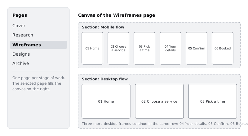
Now repeat the pattern on the Designs page so it is ready when the high-fidelity work starts. You can copy both sections from Wireframes and paste them onto Designs: the frames come with them. On Research, create one empty section with the Section tool (Shift+S) and call it User flow, ready for the flow diagram.
Check it worked
On the Wireframes page, collapse everything in the layers list. You see exactly two top-level entries, Mobile flow and Desktop flow, and nothing else. Expand Mobile flow: it holds the six mobile frames, 01 to 06, in order. The Designs page shows the same two sections, and Research has one section called User flow.
Step 7 · Read the structure in the layers panel and set house rules
Open the layers list for the Wireframes page and look at it as a newcomer would. It should read as a short outline: platform, then screen, then (later) the content of each screen.
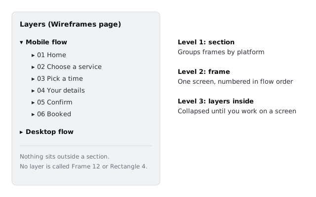
The structure only holds if everyone who opens the file keeps to it. Write the rules where people will see them: add a small text block to the Cover frame, below the status line, with something like this:
How this file works
- One page per stage. Current work only; old frames go to Archive.
- Screens are numbered in flow order: 01 Home to 06 Booked.
- Mobile 390 × 844, desktop 1440 × 1024.
- Every frame sits inside a section. Nothing loose on the canvas.
Naming and grouping the layers inside each screen is a separate habit with its own tutorial; for now, the rule is that nothing on the top level of any page is left unnamed.
Check it worked
Click through every page. On each one, the top level of the layers list holds only named sections (or, on Cover, the Cover frame). No page has a loose rectangle, text layer or frame outside a section, and the Cover frame carries the four house rules.
Next steps
The Larkfield file is now ready for screens. The tutorials that follow fill it in:
- Name and group layers so others can work in your file takes the same discipline down into each screen.
- Find your way around the Figma canvas is the place to go back to if any of the panels in this tutorial were unfamiliar.
- Build a low-fidelity wireframe in Figma draws the first Larkfield screens into the Mobile flow section you just made.
Part of these paths
Related tutorials
- Find your way around the Figma canvasYou will have a Figma file with one phone-sized frame holding a heading, a card and an avatar, and you will know which part of the screen controls each of them.
- Name and group layers so others can work in your fileYou will turn a messy Figma screen into one whose Layers panel another designer or developer can read at a glance, with clear names, frames where they belong and no hidden leftovers.
Need this done for you?
Padding does this work for growing companies, from the first diagnosis to a system that keeps working.
Get new tutorials