Figma and design tools · Beginner · 16 min
Build a low-fidelity wireframe in Figma
By Padding · Updated 18 Nov 2026
Figma (web) · November 2026
You will have five grey-box wireframes in Figma for the Larkfield Clinic booking flow, drawn from your paper sketches with rectangles, lines and plain text only, and a written list of what you chose to leave out.
On this page
A low-fidelity wireframe answers one question: is the right stuff on each screen, in a sensible order? It does not answer whether the screen looks good, and it should not invite anyone to try. The moment a wireframe has a brand colour or a stock photo, reviewers start commenting on those, and the structural problems you most need to hear about go unsaid.
This part of the series takes the paper sketches from part 1 and redraws them in Figma as grey boxes. You will use three tools only: rectangles, lines and text. The screens are the five that make up the Larkfield Clinic booking task: Choose a service, Pick a time, Your details, Confirm and Booked. The Home screen is the app's front door rather than part of the task, so it gets one placeholder button and nothing more for now.
The tutorial is as much about what you leave out as what you draw. Each step names the things that do not belong yet, and the last step turns those into a written list you keep with the file. Later parts of the series add them back on purpose, one layer of detail at a time.
Step 1 · Put the sketches next to empty phone frames
If you worked through Organise a Figma file with pages, frames and layers, open the Larkfield Clinic file, go to the Wireframes page and find the Mobile flow section. It already holds six empty frames, 390 by 844, named 01 Home to 06 Booked.
If you are starting fresh, create a design file called Larkfield Clinic – Booking app, add a page called Wireframes, and make six frames with the Frame tool (F). Set each to W 390 and H 844 in the right sidebar and name them:
01 Home
02 Choose a service
03 Pick a time
04 Your details
05 Confirm
06 Booked
Line them up left to right with an even gap of about 80 pixels.
Now bring in your sketches. Drag the photos from your computer straight onto the canvas and place each one above the frame it belongs to, scaled down so it is roughly the same width as the frame. Select all the photos and lock them with Cmd+Shift+L (Mac) or Ctrl+Shift+L (Windows), so you cannot nudge them by accident while drawing.
Keep the photos outside the frames. Anything inside a frame becomes part of the screen; the sketches are reference, not content, and the next part of the series still wants them beside the frames for comparison.
Check it worked
Each of the six frames reads W 390, H 844 in the right sidebar, and above each one sits the sketch for that screen. In the layers panel, the photos show a lock icon and sit at the top level of the section, not inside any frame.
Step 2 · Set yourself a grey-only kit
Before drawing anything, decide the handful of styles you are allowed to use. Writing them down stops you reaching for the colour picker halfway through. Make a small frame to the left of 01 Home, call it Kit, and put these samples in it:
- Three greys. A light grey block (
#E6E6E6) for images, maps and anything that is "a thing goes here". A mid grey (#BDBDBD) for outlines of inputs and dividers. A dark grey (#333333) for text and for the one main button on each screen. - One typeface at three sizes. Use Figma's default font. 24 for screen titles, 16 for labels, body text and buttons, 13 for small print and notes. No bold except for titles.
- One image placeholder. A light grey rectangle with two thin lines drawn corner to corner, so it reads as "picture" without being one.
That is the whole kit. There are no icons in it: where a screen needs one, you will draw a small grey square and write what it is ("back", "tick") in 13-point text beside or inside it.
Check it worked
The Kit frame holds three grey swatches labelled with their hex values, three text samples labelled 24, 16 and 13, and one crossed-out image box. Open the fill of every swatch: each hex value has equal red, green and blue parts, so none of them has any colour.
Step 3 · Add a layout guide and block out the shared parts
Every screen in the booking task shares the same skeleton, so build it once on 02 Choose a service and copy it.
Select the frame and, in the right sidebar, add a layout guide from the Layout guide section. Change it to columns: 4 columns, a margin of 16 and a gutter of 16. Press Shift+G to show or hide it while you work. The margins matter more than the columns here; they stop text running into the screen edge, which is the most common thing that makes a grey-box wireframe look wrong for the wrong reason.
Now draw the skeleton with rectangles (R) and text (T):
- Top bar. A light grey rectangle across the top, full width, 56 pixels high. Inside it on the left, a 24 by 24 mid-grey square with the word
backin 13-point text under it. Next to it, the screen title in 24-point text:Choose a service. - Progress line. Below the bar, 13-point text:
Step 1 of 4. Booked is not a step, so the count runs from Choose a service to Confirm. - Main button. At the bottom, a dark grey rectangle 358 wide and 48 high, inside the 16-pixel margins and 24 pixels above the bottom edge. Centre white 16-point text on it:
Continue.
Leave the middle empty for now. That is the part each screen does differently.
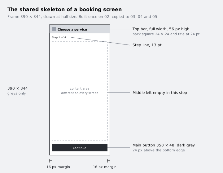
Select the top bar, progress line and button together, copy them, and paste them into 03 Pick a time, 04 Your details and 05 Confirm, selecting each frame before you paste. Because the frames are the same size, the pasted layers should land in the same position; if one does not, set its X and Y in the right sidebar to match frame 02. Change the title and step number on each: Step 2 of 4, Step 3 of 4, Step 4 of 4. On Confirm, change the button text to Confirm booking.
Check it worked
Frames 02 to 05 each show the same top bar, step line and dark button in exactly the same place; click the button on any of them and the right sidebar reads W 358, H 48. Each title matches its frame name, and the step numbers run 1 to 4. Frame 06 is still empty.
Step 4 · Draw Choose a service and Pick a time
These two screens are about choosing, so their middles are lists.
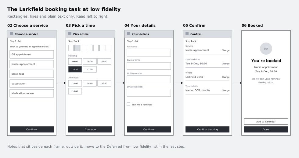
02 Choose a service. Under the step line, write one sentence of 16-point text: What do you need an appointment for? Below it, draw five rows, each a rectangle with a mid-grey outline, no fill, full content width, 64 pixels high, with 16 pixels between rows. Write a real service name in each:
GP appointment
Nurse appointment
Blood test
Vaccination
Medication review
Use real words, not "Service 1" or lorem ipsum. The list of services is a structural decision: if the clinic offers twelve, this screen needs scrolling or grouping, and you want that question asked now. Leave out descriptions, prices, icons and any "most popular" badge.
03 Pick a time. Under the step line, draw a row of seven small outlined boxes for the days of the week, each holding a short date (Mon 8, Tue 9 and so on), with Tue 9 filled light grey to show it is selected. Below that, a 13-point label Morning followed by a grid of outlined time slots, three across, then Afternoon and a second grid:
Morning     09:00  09:20  09:40  10:30  11:00
Afternoon   14:00  14:40  15:20  16:00
Draw the 10:30 slot filled dark grey with white text to show the chosen time. Leave the gaps in the times as they are; real clinics do not have every slot free, and a wireframe with a perfectly full grid hides the question of how a patient finds the next free day.
Compare each screen with its sketch above it as you go. If you find yourself improving the layout, that is fine, but write the change in a note beside the frame (13-point text, outside the frame) so the decision is not lost.
Check it worked
On 02 you can read five real service names in five same-sized rows. On 03 there is a row of seven days with one selected, two labelled groups of time slots, and exactly one slot in dark grey. Neither frame contains a colour, an icon or a photo, and any layout change you made from the sketch has a note beside the frame.
Step 5 · Draw Your details, Confirm and Booked
These three screens are about checking and finishing, so their middles are fields and summaries.
04 Your details. Draw four inputs. Each is a 13-point label above a mid-grey outlined rectangle, full content width, 48 pixels high:
Full name
Date of birth
Mobile number
Email (optional)
Below them, a small 20 by 20 outlined square with 16-point text beside it: Text me a reminder the day before. That checkbox is where the reminder in the Larkfield brief lives, so it must appear on this screen in some form. Leave out placeholder text inside the fields, validation messages and help text; note them beside the frame as things to design later.
05 Confirm. Draw a summary as four rows, each with a 13-point label on top and the value in 16-point text underneath, separated by mid-grey lines drawn with the Line tool (L):
Service        Nurse appointment
Date and time  Tuesday 9 December, 10:30
Where          Larkfield Clinic, main entrance
Your details   Name, date of birth and mobile number
Put a 13-point Change link on the right of each row. Whether a patient can edit from here, or has to go back, is a real flow question, and drawing the link makes the team answer it.
06 Booked. This screen ends the task, so it has no back square, no step line and no Continue. At the top, a 64 by 64 light grey circle with the Ellipse tool (O) and the word tick inside it. Under it, a 24-point title You're booked, then two lines of 16-point text with the service and the date and time. Then the reminder: We will text you a reminder the day before. At the bottom, in the same position as the Continue button on the other screens, a dark button Done and above it an outlined button Add to calendar.
Finally, on 01 Home, draw one 24-point line Larkfield Clinic and a single dark button Book an appointment. Nothing else goes on Home at this stage.
Check it worked
Zoom out until you can see all six frames. Read them left to right as if you were a patient: you can tell from text alone which service you picked, which time, what details you gave and how you will be reminded. Frames 04 and 06 both mention the text reminder. Every main button sits at the same height on every frame from 02 to 06.
Step 6 · Strip out anything that is not structure
Go through each frame and look for detail that crept in. These are the rules for low fidelity, with the reason each one exists:
- No colour. Not even a hint of the clinic's blue. Colour starts a conversation about brand that belongs in part 4.
- No icons or illustrations. A labelled square says "something goes here" without anyone judging the drawing.
- No photos. Use the crossed box from your kit. A photo makes reviewers react to the photo.
- No shadows, gradients or rounded corners. They are visual polish, and leaving every corner square keeps the wireframe from looking finished.
- No more than three text sizes. A fourth size is usually a hierarchy decision you are not ready to make.
- No error, empty or loading states yet. They are real work, but they come after the main path is agreed. Note them beside the frame instead.
- Real words for labels and buttons, no lorem ipsum. Copy is structure: a button that says
Continueand one that saysConfirm bookingdo different jobs.
Fix anything that breaks a rule. If you find you want something the rules do not allow, such as a map on the Confirm screen, draw the crossed image box and label it map?. The question mark tells reviewers it is an idea, not a decision.
Check it worked
Select all six frames and look at the list of colours used in the selection, which the right sidebar shows when several layers are selected. The only values in it are white, #E6E6E6, #BDBDBD and #333333. Click a few text layers at random: each is 13, 16 or 24 points. No frame contains a rounded rectangle or an effect.
Step 7 · Write down what you left out
The things you left out are not forgotten; they are deferred. Write them down so the next stage picks them up rather than rediscovering them.
Below the Mobile flow section, add a text box headed Deferred from low fidelity and list what you noted beside each frame. Group them by screen, for example:
Deferred from low fidelity
02  Service descriptions? What if there are more than 8 services?
03  No free slots this week. Next free day shortcut?
04  Field help text and error messages. Date of birth format.
05  Map of the entrance? Does Change go back or edit in place?
06  Calendar file format. Reminder by email as well as text?
All Colour, type and icons. Error, empty and loading states.
Then add one line at the top of the list saying what kind of feedback you want: Comment on order, content and missing steps. Not on looks. Anyone you share the file with reads that before they read the screens.
Keep the notes beside the frames as well as in this list. The next part of the series works through them one by one.
Check it worked
Under the Mobile flow section there is a Deferred from low fidelity list with at least one entry for each of the five booking screens, and a first line telling reviewers what to comment on. Your six frames, the sketches and the Kit frame are all still on the Wireframes page.
Next steps
You now have the Larkfield booking flow as five low-fidelity screens and a list of open questions to carry forward.
- Take a wireframe from low to mid fidelity is the next part of the series. It works through your deferred list and adds real spacing, type and copy to these same frames.
- Sketch wireframes on paper before opening Figma is the previous part, if you skipped the sketches and want to see where these layouts came from.
- Organise a Figma file with pages, frames and layers sets up the pages and sections this tutorial assumes.
- Find your way around the Figma canvas covers the panels and tools if any step here felt unfamiliar.
Part of these paths
Related tutorials
- Sketch wireframes on paper before opening FigmaYou will have a photographed set of paper sketches for every screen and state in the Larkfield Clinic booking flow, each one chosen from several rough layouts drawn against the clock.
- Take a wireframe from low to mid fidelityYou will have the six Larkfield Clinic booking screens and four state frames at mid fidelity in Figma, still greyscale but with real copy, four text styles, one spacing scale and a small kit of reusable wireframe components, ready to test for content and flow.
- Organise a Figma file with pages, frames and layersYou will have a Figma file for the Larkfield Clinic booking app with a cover, a page for each stage of work, named mobile and desktop frames for all six screens, and sections that group them.
Need this done for you?
Padding does this work for growing companies, from the first diagnosis to a system that keeps working.
Get new tutorials