Figma and design tools · Beginner · 14 min
Sketch wireframes on paper before opening Figma
By Padding · Updated 18 Nov 2026
Paper, a fine black pen, a thick marker and a phone camera · November 2026
You will have a photographed set of paper sketches for every screen and state in the Larkfield Clinic booking flow, each one chosen from several rough layouts drawn against the clock.
On this page
The first layout you think of for a screen is rarely the best one. It is usually the one you saw most recently in another app. Paper fixes that cheaply: in eight minutes you can draw six different answers to the same screen, compare them side by side and throw five away without regret. In Figma, the same eight minutes buys you one tidy rectangle with rounded corners and a strong attachment to it.
This is part 1 of a ten-part series that takes one small product from sketch to tested prototype. The product is the appointment booking app for Larkfield Clinic, a fictional community clinic. A patient chooses a service, picks a time, gives their details, confirms and gets a reminder. The six screens are Home, Choose a service, Pick a time, Your details, Confirm and Booked, plus four states found while drawing the user flow: no times this week, that time has gone, your details with errors, and could not book.
You will use the six-up method: one sheet per screen, six phone-sized boxes on it, one different layout in each box, drawn against a timer. Then you choose one sketch per screen, redraw the winners in flow order, and photograph them so part 2 can rebuild them in Figma. You need no drawing skill. Boxes, lines and a few words are enough.
Step 1 · Decide which screens get a full six-up
Put your screen list from the user flow in front of you. If you do not have one, write the ten Larkfield items down the left side of a sheet: the six screens, then the four states under the screen each belongs to.
Not every screen deserves six ideas. Spend your effort where the layout decision is open and the screen carries the task. Mark each item with one of three labels:
- Six-up: the screen has several plausible layouts and a wrong choice would slow people down. For Larkfield, that is Pick a time, Your details and Confirm.
- Three-up: the layout matters but the options are fewer. Home, Choose a service and Booked.
- Variant: a state of another screen. Sketch it later as a changed copy of the chosen screen, not from scratch. All four states are variants.
Next to each six-up and three-up screen, copy its "Must show" note from the screen list. For Pick a time, that is "free times by day, a way to change week". This line is what you will judge the sketches against, so it has to be on the sheet before you start drawing.
Check it worked
Every item on your list has exactly one label. You have three six-up screens, three three-up screens and four variants, and every six-up and three-up screen has a "Must show" line written next to it.
Step 2 · Set up a six-up sheet
Take one sheet per six-up screen. Fold it in half lengthways and then in three across, unfold it, and you have six equal panels. Alternatively, rule the lines with a straight edge.
In each panel, draw a phone outline with the thick marker: a tall rectangle with rounded corners, roughly 1 wide to 2 tall, the same size in all six panels. Same-size outlines stop you cheating by giving one idea more room. Number the panels 1 to 6.
Across the top margin, write three things: the screen name, its job in one line, and the timer length. The job is the "Must show" note put as a sentence, such as "Choose a free slot for a new patient check."
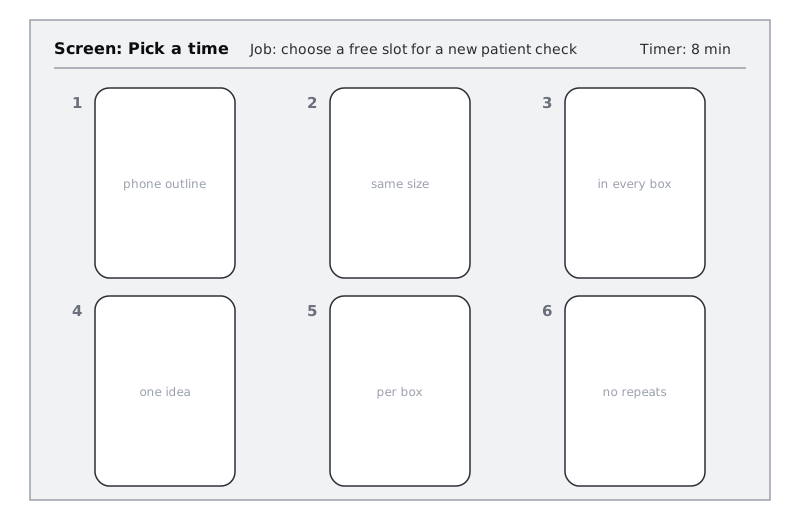
For the three-up screens, fold one sheet into three panels instead, or use the top half of a six-up sheet. Prepare all the sheets now, before the timer starts, so you are never drawing outlines on the clock.
Check it worked
You have three six-up sheets and three three-up sheets (or halves). Every panel holds an empty phone outline of the same size, every panel is numbered, and every sheet has a screen name, a one-line job and a timer length across the top.
Step 3 · Sketch six layouts for Pick a time in eight minutes
Start with the hardest screen, because you have the most energy now. For Larkfield, that is Pick a time. Set the timer for eight minutes, which works out at a little over a minute per panel, and start.
Rules for every panel:
- Draw structure, not decoration. Boxes for areas, filled boxes for buttons, wavy lines for body text, a crossed box for an image.
- Write the words that matter. Button labels, headings and field labels in real words ("Book this", "Next free"), because the words change the layout. Long text stays a wavy line.
- One idea per panel. If two panels differ only in button colour or the order of two items, they are the same idea. Cross one out and try something else.
- No erasing. A wrong line gets a second line drawn over it. Erasing is time spent on neatness.
When you stall after three panels, and most people do, push from a different angle. Change what the screen leads with (the next free time, a calendar, a list of days). Change how much it shows at once (one day, one week, a month). Change who does the work (the person browses, or the app suggests). Here is one round for Pick a time:
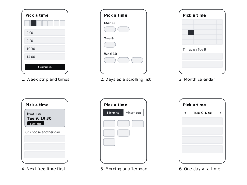
Stop when the timer goes, even mid-line. An unfinished panel is still an idea.
Check it worked
Your Pick a time sheet has something in all six panels, and no two panels share the same main idea. Read the six aloud as one-line descriptions ("week strip", "month calendar", and so on). If two descriptions sound the same, redraw one before moving on.
Step 4 · Run the same round for the other screens
Repeat the round for Your details and Confirm with eight minutes each, then for Home, Choose a service and Booked with four minutes and three panels each. Take a short break between sheets; the second sheet is always weaker if you go straight into it.
Ideas to push each Larkfield screen past its first draft:
- Your details: one long form, the form split across two short screens, fields grouped under headings, a "Have you been here before?" question first that hides fields new patients do not need.
- Confirm: a summary list, a card that looks like an appointment slip, each line with its own "Change" link, the booking button pinned to the bottom of the screen.
- Home: one large booking button, the next free time shown straight away, a list of services as the first thing people see.
- Booked: a confirmation with the time large, a short "what to bring" list, a reminder note with a way to add it to a calendar.
Keep each sheet's "Must show" line in view while you draw. It stops you sketching a beautiful Confirm screen that leaves out the time.
Check it worked
You have six sheets: three with six filled panels and three with three filled panels. Each sheet has at least one sketch you would not have drawn if you had only drawn one.
Step 5 · Choose one sketch per screen
Leave the sheets for a few minutes, then lay all six out on a table in flow order. Judge each sheet against its "Must show" line and two plain questions:
- Can a first-time patient finish the job on this screen without help? Imagine someone using the app one-handed on a bus.
- Does it suit the screens either side? A month calendar on Pick a time may be fine alone but makes the flow feel heavy after a short service list.
Put a star next to the winning panel on each sheet. Combining is allowed and often best: for Larkfield, panel 4 (next free time first) is quick for most patients, but panel 1's week strip is better for anyone who needs a particular day. Star both and write "4 + week strip from 1" in the margin.
Under each star, write one line saying why it won, such as "Most patients take the first free slot; week strip covers the rest." Those reasons are what you will defend when someone questions the design in later parts, so write them now while you remember.
If you can, show the starred sheets to one other person for five minutes. Ask them to point at where they would tap to book. If they hesitate, look at your second choice.
Check it worked
Every sheet has exactly one star, or one star plus a written "combine with" note, and every star has a one-line reason under it. Nothing is starred only because it looks tidy.
Step 6 · Redraw the winners in flow order, with their states
Take a fresh sheet, landscape, and draw six phone outlines in a row. Redraw each starred sketch in its place, in flow order: Home, Choose a service, Pick a time, Your details, Confirm, Booked. Draw slightly more carefully than in the six-up rounds, still in pen, and write every button label in full. Add an arrow between each pair of screens, starting from the button that leads on.
Under the screen each belongs to, draw the four states as small, quick variants. Copy only what changes:
- Pick a time, no times this week: the times area replaced by a short message and the next free date.
- Pick a time, that time has gone: a message at the top saying what happened, with nearby free times highlighted.
- Your details, with errors: one field outlined, with a line of error text under it.
- Confirm, could not book: a message above the button saying what failed, with the button now reading "Try again".
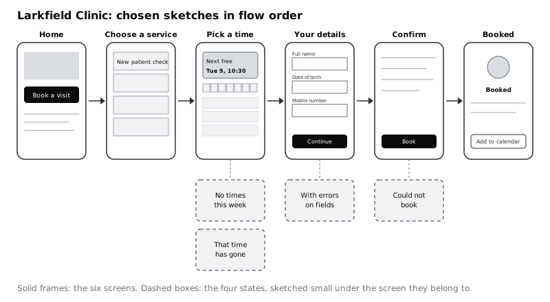
Hold the sheet at arm's length and follow the arrows. Look for jumps that do not make sense, such as a button on one screen whose label does not match the heading on the next.
Check it worked
Your flow sheet has six screens in order with an arrow from a named button on each one to the next, and four dashed state sketches under the right screens. Every button label on the sheet is in real words, and following the arrows from Home reaches Booked without a gap.
Step 7 · Photograph and file the sketches
Part 2 rebuilds these sketches in Figma, so you need photos that are easy to read on screen. Before you take them, go over the key lines of the flow sheet and the starred panels with the thick marker if they look faint. Pencil and light pen often disappear in photos.
Photograph in daylight or under an even ceiling light, with the phone held flat above the paper so the outlines stay rectangular. Turn off the flash, which bleaches the centre of the page. If your phone's notes or files app has a document scanning mode, use it; it straightens the page and boosts contrast for you.
Make a folder called larkfield-sketches on the computer where you will use Figma, and name the files so they sort in flow order:
00-flow.jpgfor the flow sheet01-home.jpg,02-choose-a-service.jpg,03-pick-a-time.jpg,04-your-details.jpg,05-confirm.jpg,06-booked.jpgfor the six-up and three-up sheets
Keep the paper too. Later parts come back to the rejected panels when a test shows the chosen layout is not working, and a second-best sketch is the fastest place to start a fix.
Check it worked
Your larkfield-sketches folder holds seven files, named so they list in flow order. Open 00-flow.jpg at full screen on your computer: you can read every button label and every state name without zooming in.
Next steps
Your sketches are ready to become wireframes. In Build a low-fidelity wireframe in Figma, part 2 of this series, you rebuild the flow sheet as grey-box frames using only rectangles, lines and plain text.
If your screen list felt thin while sketching, go back to Draw a user flow for one task and walk the error branches again. If you are new to Figma, Tour the Figma canvas shows you the tools before part 2 asks you to use them.
Part of these paths
Related tutorials
- Draw a user flow for one taskYou will have a user flow for booking a first appointment that shows every screen, decision and error path, and a screen list taken from it that tells you exactly what to wireframe.
- Build a low-fidelity wireframe in FigmaYou will have five grey-box wireframes in Figma for the Larkfield Clinic booking flow, drawn from your paper sketches with rectangles, lines and plain text only, and a written list of what you chose to leave out.
Need this done for you?
Padding does this work for growing companies, from the first diagnosis to a system that keeps working.
Get new tutorials