Figma and design tools · Intermediate · 16 min
Build and publish a one-page site in Framer
By Padding · Updated 18 Nov 2026
Framer (web) · November 2026
You will have a live one-page site for Larkfield Clinic, built with stacks, adjusted for phone and tablet, with a working contact link and a custom domain.
On this page
Most design tools stop at a picture of a website. Framer does not: the canvas you lay out is the site, and the Publish button puts it on the web. That makes it a good fit when a small organisation needs one clear page and nobody is going to write code for it.
In this tutorial you build that page for Larkfield Clinic, a fictional community clinic. The page tells visitors what the clinic offers, where it is, when it is open and how to get in touch. You lay it out with stacks so it resizes on its own, fix the phone version with breakpoint overrides, add a contact link, publish it to a free Framer address and then connect a domain of your own.
Framer's interface changes often. Where this tutorial names a panel or button, it is one Framer documents; where the exact label may move, the goal is described instead, so look for the control in the right-hand properties panel.
Step 1 · Plan the page before you open Framer
A one-page site lives or dies on its order of sections. Write the content first, in any notes app, so you are not inventing copy on the canvas. For Larkfield Clinic use five sections, top to bottom:
- Header: the clinic name on the left, a "Book a visit" link on the right.
- Hero: one heading ("Care close to home, six days a week"), one sentence underneath and one button.
- Services: three cards, each with a name and a short line: GP visit, Blood test, Vaccination.
- Visit us: address, opening hours and the contact link.
- Footer: a short line with the clinic name and the year.
Keep each block of text short. A visitor on a phone should reach the opening hours in two or three swipes.
Check it worked
Your notes have five headings in the order above, and every heading has its final text under it. Nothing reads "lorem ipsum" or "TBC".
Step 2 · Build the page as a stack of sections
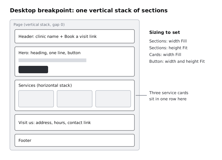
Create a new blank project in Framer. It opens with a Desktop breakpoint frame, which is your page. Select it and, in the right-hand panel, give its layout a vertical stack with no gap and no padding. Every section you add now drops into place one under another.
Add five frames inside the page, one per section, and name them Header, Hero, Services, Visit us and Footer in the layers panel. For each section:
- Set its width to Fill, so it stretches with the page, and its height to Fit, so it grows with its content.
- Turn it into a stack too. Header is a horizontal stack with space between its two items; Hero and Visit us are vertical stacks; Services is a horizontal stack that holds the cards.
- Give it padding (for example 64 on top and bottom, 32 on the sides) so text never touches the edges.
Inside Services, make one card as a vertical stack with a name and a line of text, set its width to Fill, then duplicate it twice and change the text.
Check it worked
Make the canvas preview wider and narrower by dragging the breakpoint's edge. The sections stay full width, the three cards share the space equally, and no text overlaps or spills out of a section. In the layers panel, the page has exactly five children with the names you gave them.
Step 3 · Set type and colour once
Before you style text by hand, define what repeats. In the assets panel, create text styles for a page heading, a section heading and body text, and colour styles for text, background and the button. Apply them to every text layer and fill on the page.
Pick colours with enough contrast. Body text on the background should reach a contrast ratio of at least 4.5 to 1; a dark grey on white passes easily, light grey on white often does not. Use any contrast checker to confirm your pair.
Styles matter more here than in a mock-up: the published site uses them, so one change later updates every heading on the live page.
Check it worked
Select any text layer on the page. The text panel shows a named style rather than loose values. Change the colour of the body text style once and watch every paragraph on the page update together, then change it back.
Step 4 · Fix the layout for tablet and phone
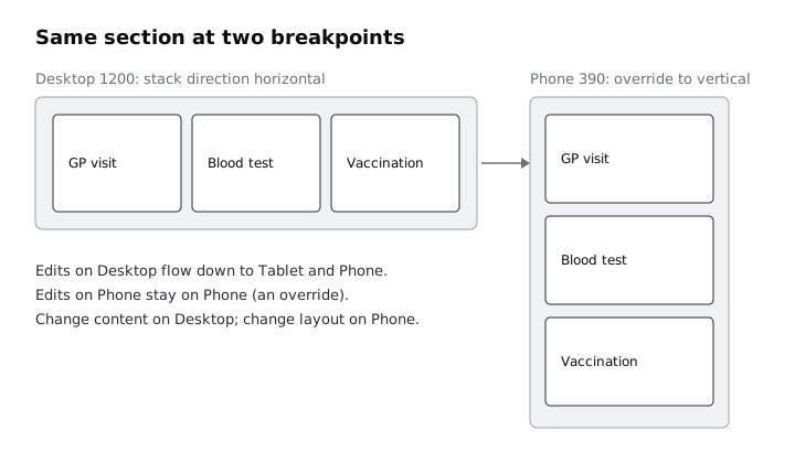
Add the Tablet and Phone breakpoints from the breakpoint controls above the canvas if they are not there already. Framer copies the Desktop layout into each and keeps them linked: anything you change on Desktop flows down, and anything you change on a smaller breakpoint stays there as an override.
On Phone, three cards side by side are too narrow. Select the Services stack on the Phone breakpoint and change its direction to vertical. Then reduce the section padding on Phone (for example 40 on top and bottom, 20 on the sides) and drop the page heading to a smaller size.
Make content changes, such as fixing a typo, on Desktop. Make layout changes, such as direction, padding and size, on the breakpoint that needs them. That way the copy never drifts apart between versions.
Check it worked
Look at the Phone breakpoint. The service cards are stacked, every line of text fits without being cut off, and the heading wraps onto no more than three lines. Switch back to Desktop: the cards are still in a row. Edit a word in the hero sentence on Desktop and confirm it changed on Phone too.
Step 5 · Add the contact and booking links
Visitors need one obvious way to act. Select the "Book a visit" text in the header and the hero button, and in the link settings point them at the Visit us section on the same page, so a click scrolls down to the address and hours.
In Visit us, add two lines, "Call reception" and "Email the clinic", and link each one outward. Framer's link field accepts a full web address; for a phone call use a tel: link and for email a mailto: link, for example tel:+440000000000 or mailto:hello@larkfield.example. Replace both with the clinic's real details before you publish.
Give the hero button a hover state with a slightly darker fill so it reads as clickable, and make sure the button's width and height are set to Fit so it hugs its label on every breakpoint.
Check it worked
Open the preview (the play icon at the top right of the editor) and click "Book a visit". The page scrolls to Visit us. Click the email link: your mail app opens a new message addressed to the clinic. Hover over the hero button and its fill darkens. On the Phone preview, the call link is large enough to tap with a thumb without hitting the line above it.
Step 6 · Publish to a free Framer address
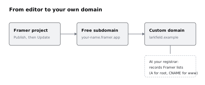
Click Publish in the top-right corner of the editor. The first time, Framer gives the site a free address on framer.app and publishes the current version there. Open the address in a new tab.
Before you share it, open the site settings and fill in the page title, the description and a social preview image. These are what search results and link previews show.
From now on, edits in the editor do not go live by themselves. When you change something, the button reads Update; click it to push the new version.
Check it worked
Open the framer.app address on your phone, not only on your computer. The phone shows the stacked Phone layout, the links work, and the browser tab shows the page title you set. Make a small text change in the editor, click Update, refresh the live page and see the change.
Step 7 · Connect a domain you own
A clinic should not send patients to a framer.app address. Connecting your own domain needs a paid Framer site plan; check the current plans on Framer's pricing page before you start.
In the site settings, open the hosting and domains section and choose to connect a domain you own. Enter the domain. Framer then lists the DNS records to add at your registrar, typically A records for the root domain and a CNAME for www. Copy them exactly as Framer shows them, and remove any other A or AAAA records for the same name, because old ones can send visitors to the wrong server.
If you have not edited DNS before, follow Point a domain at your website for the registrar side, then come back. DNS changes are often live within minutes, but Framer warns they can take up to 48 hours.
Check it worked
The domains section in Framer's site settings shows your domain as connected, with no warning next to it. Open both https:// with your root domain and with www. in front: both load the Larkfield Clinic page over HTTPS, and the address bar keeps your domain.
Next steps
You now have a live, responsive page that the design team can change and republish without a developer. Keep the edit-then-Update habit, and preview Phone before every update.
- If you are still deciding whether Framer is the right tool for a project, read Choose a design tool: Figma, Penpot, Framer or Canva.
- For more on records, propagation and checking DNS from the command line, see Point a domain at your website.
Part of these paths
Related tutorials
- Choose between Figma, Sketch, Adobe XD, Penpot, Framer and CanvaYou will have a one-page decision sheet that picks a design tool for three real jobs, with the reasons written down so you can defend each choice to a client or a team.
- How to Point a Domain Name at Your WebsiteYou will connect a domain you own to a website on any host by adding the right A, AAAA and CNAME records at your DNS provider, test the site before DNS changes, and check with dig that the change has reached the world.
Need this done for you?
Padding does this work for growing companies, from the first diagnosis to a system that keeps working.
Get new tutorials