Figma and design tools · Beginner · 14 min
Find your way around the Figma canvas
By Padding · Updated 18 Nov 2026
Figma (web) · November 2026
You will have a Figma file with one phone-sized frame holding a heading, a card and an avatar, and you will know which part of the screen controls each of them.
On this page
A new Figma file is a blank grey canvas with panels around it, and most beginners lose their first hour clicking around to work out which panel does what. This tutorial teaches the layout by asking you to build something small. Each step uses one area of the screen for a real job, so by the end you have touched every area once and have a frame to show for it.
You will make a phone-sized frame called Phone and put three things inside it: a text heading, a grey card and a round avatar. Along the way you will move around the canvas, read the layers panel, change properties in the right sidebar, and look at the same frame in the Prototype tab.
Figma updates its interface often. Recent versions added a vertical navigation bar on the far left, and the File and Assets tabs moved into it. If a label in your file differs slightly from the one here, look in the same area of the screen; the jobs each area does have stayed the same.
Step 1 · Open a new Design file and name the five areas
From the Figma file browser, create a new Design file (not FigJam, Slides or another file type). Give it a name you will recognise later by clicking the file name at the top of the left sidebar and typing "Canvas tour".
Before you draw anything, find these five areas on your screen:
- Navigation bar: the narrow vertical strip on the far left. Its icons switch what the left sidebar shows, such as the File tab, Assets and Variables.
- Left sidebar: next to it. With the File tab selected it lists your pages at the top and your layers below.
- Canvas: the large central area where you draw. The current zoom level is shown in the top right.
- Right sidebar: the panel on the right. With edit access it has two tabs, Design and Prototype. Its contents change with whatever you have selected.
- Toolbar: the floating bar at the bottom of the canvas, holding the move, frame, shape and text tools, plus a switcher between file modes.
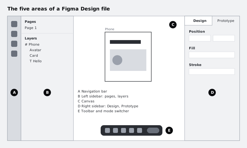
If a file is shared with you as view-only, the right sidebar shows Comment and Properties tabs instead of Design and Prototype, and the toolbar has fewer tools. Ask the owner for edit access if you want to follow along in someone else's file.
Check it worked
Your browser tab and the top of the left sidebar both show "Canvas tour". With nothing selected, you can point to each of the five areas on your own screen, and the right sidebar shows a Design tab and a Prototype tab.
Step 2 · Draw a frame with the toolbar
A frame is a container that works like a screen or an artboard. Everything in this tutorial goes inside one.
Press F, or pick the frame tool in the toolbar. While the frame tool is active, the right sidebar shows a list of preset sizes grouped by device type. Choose any phone preset. Figma drops a frame of that size on the canvas and selects it.
Now rename it. In the left sidebar, double-click the new layer (it is named after the device preset you chose), type Phone, and press Enter.
Check it worked
The layers panel shows exactly one layer, called Phone, with a frame icon (a hash-like symbol) beside it. On the canvas, the word Phone appears just above the top-left corner of a white rectangle.
Step 3 · Move around the canvas
You will spend more time moving around the canvas than drawing on it, so learn the four moves now:
- Pan: hold Space and drag, or slide two fingers on a trackpad.
- Zoom: hold Ctrl (Windows) or Command (Mac) and scroll, or pinch on a trackpad.
- Zoom to fit everything: press Shift 1.
- Zoom to the selected layer: select a layer and press Shift 2.
Try them in this order: zoom out until the Phone frame is a small rectangle, pan it to the bottom-right corner of the canvas, then press Shift 1 to bring it back to the centre. Click Phone in the layers panel and press Shift 2.
The zoom level in the top right of the screen is also a menu. Open it to see the same zoom commands, plus view options such as showing rulers and layout guides.
Check it worked
After Shift 1, the whole Phone frame fills most of the canvas, centred. The zoom percentage in the top right changed each time you zoomed, and after Shift 2 it shows a value that fits the frame on screen.
Step 4 · Add a heading, a card and an avatar
Now use three more tools from the toolbar. Click inside the frame for each, so the new layer lands inside Phone rather than on the bare canvas.
- Press T for the text tool, click near the top of the frame, type
Hello, then press Escape to leave text editing. - Press R for the rectangle tool and drag a wide box below the heading. This is your card.
- Press O for the ellipse tool, hold Shift and drag a small circle on the left side of the card. Holding Shift keeps it a perfect circle. This is your avatar.
Rename the rectangle to Card and the ellipse to Avatar in the layers panel, the same way you renamed the frame. Text layers take their name from what you typed, so the heading is already called Hello.
Then draw one more rectangle somewhere outside the frame, on the empty grey canvas. Leave its name as it is. You will use it in the next step.
Check it worked
Inside the Phone frame you can see the word Hello, a rectangle and a circle overlapping the rectangle. A fourth shape sits on the canvas outside the frame.
Step 5 · Read the layers panel
The layers panel tells you two things the canvas does not: what is inside what, and what is drawn on top of what.
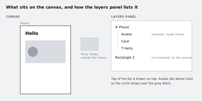
Look at your own panel:
- Nesting: Hello, Card and Avatar are indented under Phone because they are its children. The stray rectangle is not indented, because it sits directly on the canvas. Click the small arrow beside Phone to collapse and expand its children.
- Stacking: the higher a layer is in the list, the further in front it is drawn. Avatar was drawn last, so it is at the top and the circle shows over the card.
Test the stacking order. Drag Card above Avatar in the layers panel. The circle disappears behind the card. Drag it back below Avatar.
Then move the stray rectangle into the frame: drag its layer in the panel and drop it onto Phone, or drag the shape on the canvas into the frame. Delete it afterwards with Backspace or Delete, since you do not need it.
Check it worked
Your layers panel shows Phone with exactly three children: Avatar, Card and Hello, with Avatar above Card. Nothing is left outside the frame, and the circle is visible on top of the card.
Step 6 · Change properties in the Design tab
Select Card. The Design tab of the right sidebar now shows Card's properties, grouped into sections such as position and size, fill, stroke and effects. Select Hello and the sections change: typography controls appear for font, size and line height. The panel only shows what applies to the layer you selected.
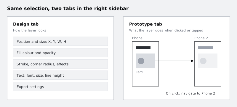
Make three changes, one per layer:
- Select Card. In the position and size fields, set the width so the card is narrower than the frame, then centre it: either set X to half of the leftover space (for a 375 wide frame and a 335 wide card, X is 20), or use the align horizontal centres control at the top of the Design tab, which centres a single layer inside its frame. Then give it a corner radius of 12.
- Select Avatar. In the fill section, click the colour swatch and choose a darker grey.
- Select Hello. In the typography section, set the font size to 32 and the weight to bold.
You can also type into any number field and press Up or Down to nudge the value, which is quicker than retyping.
Check it worked
The card has visibly rounded corners and sits centred in the frame. The avatar is darker than the card. The heading is larger and bold. When you select each layer, the right sidebar shows the values you typed: 12 for the card's radius, 32 for the heading's size.
Step 7 · Look at the same frame in the Prototype tab
Design and prototype are not separate files in Figma. They are two views of the same layers, switched by the tabs at the top of the right sidebar.
Select Phone, then duplicate it with Ctrl+D (Windows) or Command+D (Mac) and rename the copy Phone 2. Select Card in the first frame and switch the right sidebar to the Prototype tab. Hover over the card on the canvas and a small round handle appears on its edge. Drag from that handle onto Phone 2. Figma draws an arrow between them and adds an interaction to the Prototype tab, set by default to navigate to Phone 2 on click.
Switch back to the Design tab. The arrow disappears from the canvas, because connections are only drawn while the Prototype tab is open. The interaction is still there.
You will also see a mode switcher in the toolbar. It moves the whole file into Dev Mode, a view built for developers inspecting measurements and code. You do not need it yet; switch back to design if you open it.
Check it worked
With the Prototype tab open, an arrow runs from Card in Phone to the Phone 2 frame, and the Prototype tab lists one interaction for Card. With the Design tab open, the arrow is hidden.
Step 8 · Hide the panels and reopen them
When you want to judge a design without the interface around it, hide the panels. Use the hide UI shortcut, Ctrl+\ (Windows) or Command+\ (Mac), and press it again to bring everything back. Figma also lets you minimise the side panels on their own, which keeps the toolbar visible.
Use the clean view to look at your Phone frame as a whole: is the gap around the card even, and does the heading feel like the most important thing on the screen? Then restore the panels.
Check it worked
With the UI hidden, you see only the canvas and your two frames. After pressing the shortcut again, the navigation bar, both sidebars and the toolbar are back where they were, and Phone is still selected if you had it selected before.
Next steps
You now have one file with two frames, a short prototype link and a habit of looking in the right area for each job. Next:
- Split work into pages, frames and well-named layers in Organise a Figma file with pages, frames and layers.
- Learn layer naming conventions that survive handoff in Name and structure Figma layers.
- Turn the card into something that resizes with its content in Build a button with auto layout.
- If you are still deciding on a tool, compare options in Choose a design tool: Figma, Penpot, Framer or Canva.
Part of these paths
Related tutorials
- Organise a Figma file with pages, frames and layersYou will have a Figma file for the Larkfield Clinic booking app with a cover, a page for each stage of work, named mobile and desktop frames for all six screens, and sections that group them.
- Choose between Figma, Sketch, Adobe XD, Penpot, Framer and CanvaYou will have a one-page decision sheet that picks a design tool for three real jobs, with the reasons written down so you can defend each choice to a client or a team.
Need this done for you?
Padding does this work for growing companies, from the first diagnosis to a system that keeps working.
Get new tutorials