Figma and design tools · Beginner · 14 min
Build your first screen in Penpot
By Padding · Updated 18 Nov 2026
Penpot (web) · November 2026
You will have a finished Pick a time screen for the Larkfield Clinic booking app in Penpot, built from a board, a flex layout and a reusable time slot component, and you will have read its CSS in the Inspect tab.
On this page
Penpot is an open-source design tool that runs in the browser. Its source is public, you can use the hosted version at penpot.app or run your own copy on a server, and its files describe layouts in terms close to CSS. Teams pick it when they need to own their design files, keep them on their own infrastructure, or avoid being tied to one vendor.
In this tutorial you build one real screen: Pick a time, from the booking app of Larkfield Clinic, a fictional community clinic. Patients choose a service, pick a time, enter their details, confirm and get a reminder. Your screen shows the chosen service, a date, three available slots and a Continue button. Along the way you use the four ideas that carry most Penpot work: boards, flex layout, components and the Inspect tab. If you already use Figma, the last step lists where Penpot behaves differently.
Step 1 · Get into Penpot and create a file
You have two routes.
- Hosted: go to penpot.app, create an account with your email, and confirm it from the email Penpot sends. This is the quickest way to follow along.
- Self-hosted: if your team runs its own instance, sign in there instead. Penpot's technical guide covers installing it with Docker Compose or a Kubernetes Helm chart; that is a job for whoever looks after your servers, not a step in this tutorial.
Once you are in, you land on the dashboard, which groups files into projects. Create a new project called Larkfield Clinic, then create a new file inside it and rename it Booking app. Open the file. You see the canvas in the middle, layers and pages on the left, and the design properties on the right.
Rename the first page to Screens by double-clicking its name in the left sidebar.
Check it worked
Go back to the dashboard. You see a project called Larkfield Clinic containing one file called Booking app. Open it again: the left sidebar shows one page called Screens and an empty layer list.
Step 2 · Draw a phone-sized board
A board in Penpot is a container with its own size, fill and clipping, and it is the thing that becomes a screen in a prototype or an export. Figma calls the same idea a frame.
Press B to pick the Board tool. Before you draw, the right sidebar offers preset sizes grouped by device; search for a phone size, or click once on the canvas and type the size yourself. Set the board to 390 wide by 844 tall, a common modern phone size.
Name the board Pick a time by double-clicking it in the layers list. Give it a white fill. Leave clip content on, so anything you drag past the edge is hidden, the way a real screen would hide it.
Check it worked
Select the board. The right sidebar shows width 390 and height 844, and the layers list shows one board called Pick a time. The board's name appears above it on the canvas.
Step 3 · Turn the board into a flex layout
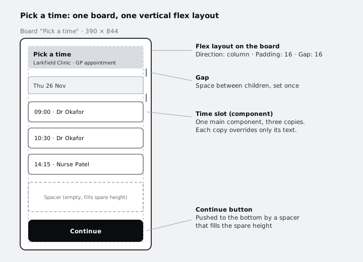
Flex layout makes the board place its children for you, in a row or a column, with a fixed gap and padding. It follows the same model as CSS flexbox, so what you set here is what a developer will write.
With the board selected, press Shift + A, or add a flex layout from the layout section of the right sidebar. Then set:
- Direction: column, so children stack top to bottom
- Padding: 16 on all four sides
- Gap: 16 between rows
- Alignment: children start at the top and stretch to the board's width where your version offers that option
Now add the content as children of the board, in this order. Draw each one inside the board so it lands in the layout:
- A text layer:
Pick a time, 22px, bold. - A text layer under it:
Larkfield Clinic · GP appointment, 14px, in a mid grey. - A date row, built as a small board rather than a rectangle with text on top. Inside a flex layout every new layer becomes its own child, so text drawn over a rectangle would stack below it instead. Press
Band draw a board 358 wide and 40 tall inside Pick a time, give it a light grey fill and 8px corners, and name itDate. Add a flex layout to it withShift + A, set direction to row and padding 12, then add a text layerThu 26 Novinside it.
You do not position any of these by hand. Penpot places them, and if you change their order in the layers list, the canvas reorders to match. Depending on your Penpot version, the layers list may show flex children in the same order as the canvas or in reverse, with the first child at the bottom; either is fine.
Check it worked
Select the board and change the gap from 16 to 32. Every child moves apart evenly at once. Set it back to 16. Drag Date past the title in the layers list, so the two swap places in the list: on the canvas, Date now sits above the title. Drag it back.
Step 4 · Make a time slot component
A time slot appears three times on this screen and many more times across the app, so build it once as a component.
Outside the board, on the empty canvas, build one slot:
- Press
Band draw a small board 358 wide and 48 tall. Give it a white fill, a 1px dark grey stroke and an 8px corner radius. A board, not a rectangle, because a board can hold children and a layout. - Add a text layer inside it:
09:00 · Dr Okafor, 16px. - Select the small board, add a flex layout with
Shift + A, set direction to row, padding 12 on the left and right, and align items to the centre. The text now sits neatly inside the slot.
Name the layer Time slot. With it selected, press Ctrl/Cmd + K, or right-click and choose Create component. This layer is now the main component: the source of truth for every copy. Open the Assets tab in the left sidebar and you will find Time slot under Components.
Check it worked
The layer has a component icon in the layers list, and the main component shows a title header on the canvas. In the Assets tab, Time slot appears under Components with a thumbnail.
Step 5 · Place three copies and override their text
Drag Time slot from the Assets tab into the Pick a time board, three times, below Date. Each one is a copy: linked to the main, so a change to the main reaches every copy, while edits you make to a copy (its text, for example) stay on that copy as an override.
Change the text in each copy:
09:00 · Dr Okafor10:30 · Dr Okafor14:15 · Nurse Patel
Now test the link. Go to the main component outside the board and change its corner radius from 8 to 12. Watch the three copies change too, while their text stays as you set it.
If a copy goes wrong, right-click it and choose Reset overrides to put it back to match the main.
Check it worked
The three copies inside the board show three different times, and all three have 12px corners after your change to the main. Right-click one copy and choose Show main component: Penpot selects the main outside the board.
Step 6 · Add the Continue button and finish the screen
The last child is the primary action. Build a button the same way as the slot, as the last child of the screen board:
- Draw a board 358 by 48 inside the Pick a time board, with a near-black fill and 8px corners. Name it
Continue. - Add white text inside it:
Continue, 16px, bold. - Give the Continue board a flex layout with items centred both ways.
On a phone screen the button belongs at the bottom, not straight after the last slot. Two ways to get it there:
- Add an empty rectangle with no fill between the last slot and the button, and let it grow to fill the spare height using the child's sizing options in the right sidebar.
- Or, if you only need a quick mock-up, raise the gap or the board's bottom padding until it sits where you want.
The first way keeps working when you add or remove slots, so prefer it.
Finally, give every layer a meaningful name if you have not already. Names carry through to the Inspect tab and to anyone who opens your file after you.
Check it worked
The layers list for the board shows the title, the subtitle, Date, three Time slot copies, a spacer and Continue, in the same order as the canvas or the exact reverse. Delete one Time slot copy: if you used the spacer, the button stays at the bottom. Undo with Ctrl/Cmd + Z.
Step 7 · Read your screen as code in the Inspect tab
Penpot shows the code for any layer, generated from what you drew. It is a reference for a developer, not a finished front end, but it is a quick way to see whether your design maps cleanly to CSS.
Select one Time slot copy. In the right sidebar, switch from Design to Inspect. Inspect is a view-only mode, so you cannot move anything by accident while you look. It has two parts:
- Info: size, position, fills, strokes, radius, typography and layout settings for the selected layer, with export options at the bottom.
- Code: markup as SVG or HTML, and styles as CSS.
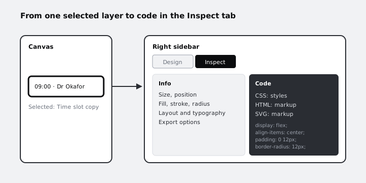
Now select the board itself and open the CSS. Because you used flex layout rather than placing things by hand, the styles describe a column flex container with a gap and padding, which is close to what a developer would write from scratch.
Check it worked
With a Time slot copy selected, the CSS in the Code view includes a border-radius of 12px and flex properties. With the board selected, the CSS includes display: flex, a column direction and a 16px gap. Switch back to Design before you continue editing.
Step 8 · Note where Penpot differs from Figma
If you or your team come from Figma, these are the differences you will meet first. Write them into a text layer on a second page called Notes, so the file carries them for the next person.
- Words: Penpot's board is Figma's frame; Penpot's main component and copy are Figma's main component and instance.
- Layout model: Penpot's flex and grid layouts follow CSS flexbox and CSS grid directly, and the Inspect code reflects that. Figma's auto layout covers similar ground with its own model.
- Ownership: Penpot is open source and can be self-hosted, so your files can live on your own servers. Figma runs as a service that Figma hosts.
- Files and formats: Penpot can export a file and import it again, so moving a file between a hosted and a self-hosted instance is an export and an import.
- Plugins and ecosystem: Penpot has a plugin system, but its catalogue is younger and smaller than Figma's Community plugins. Check that any plugin you depend on exists before you move a team over.
Check it worked
Your file has two pages: Screens, holding the finished Pick a time board, and Notes, holding at least four differences in your own words. Share the file link with a colleague, or open it in a private browser window after signing in, and confirm the screen looks the same.
Next steps
- If you are still deciding which tool to use for a project, read /tutorials/choose-a-design-tool-figma-penpot-framer-canva.
- To sketch the rest of the booking flow quickly before you style it, follow /tutorials/build-a-low-fidelity-wireframe-in-figma; the same structure carries over to Penpot boards.
- Build the next screen, Your details, on a new board on the Screens page and reuse the Continue button by turning it into a component too.
Part of these paths
Related tutorials
- Choose between Figma, Sketch, Adobe XD, Penpot, Framer and CanvaYou will have a one-page decision sheet that picks a design tool for three real jobs, with the reasons written down so you can defend each choice to a client or a team.
- Build a low-fidelity wireframe in FigmaYou will have five grey-box wireframes in Figma for the Larkfield Clinic booking flow, drawn from your paper sketches with rectangles, lines and plain text only, and a written list of what you chose to leave out.
Need this done for you?
Padding does this work for growing companies, from the first diagnosis to a system that keeps working.
Get new tutorials