Figma and design tools · Beginner · 14 min
Wireframe with real content instead of placeholder text
By Padding · Updated 18 Nov 2026
Figma (web) · November 2026
You will have Larkfield Clinic booking wireframes filled with real names, service descriptions, error messages and translated labels, with every layout that broke under that content fixed and a short list of content rules for developers.
On this page
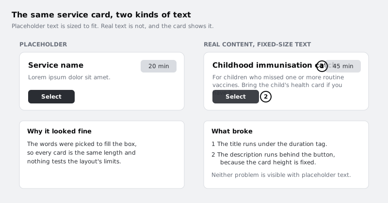
Placeholder text lies about your layout. "Service name" and a line of lorem ipsum are picked to fit the box, so every card on the screen is the same length and nothing ever overflows. Then the real service list arrives, one name runs to four words, and the card it sits in breaks in a way nobody saw during review.
This tutorial is about finding those breaks while they are still cheap to fix. You will collect the real content for a booking flow, including the awkward cases, paste it into the wireframes, and repair each layout that fails. The wireframes stay grey and plain. The only thing that changes is the words, and how the boxes around them behave.
The running example is the booking app for Larkfield Clinic, a fictional community clinic. Its screens are Home, Choose a service, Pick a time, Your details, Confirm and Booked. If you are working on your own product, swap in your screens: the method is the same.
Step 1 · Build a content inventory
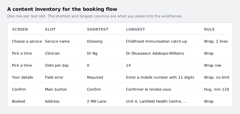
Before you touch Figma, list every piece of text the flow shows. Open a spreadsheet and make five columns: Screen, Slot, Shortest, Longest, Rule. Leave Rule empty for now.
Go through the screens in order and add one row per text slot: a heading, a button label, a list item title, a field label, an error message, a date. A slot that repeats, such as each service card, gets one row, not one per card.
Fill the Shortest and Longest columns with real values where you can get them. Good sources:
- The clinic's own material. Service lists, leaflets, the current website, the reception desk's appointment types. Copy them word for word, including the long official names.
- Staff lists. Clinician names vary far more than "Dr Name Surname" suggests. Include the shortest you can find and the longest, with hyphenated surnames and titles.
- Anything the system says back. Validation errors, "no slots left today", "this service needs a referral". If nobody has written these yet, write a plain first draft yourself. A draft is closer to the truth than a grey bar.
- Counts. How many services, how many slots in a busy day and in a quiet one. Zero counts too.
Where you cannot get real data, write a realistic stand-in and mark it in the sheet so you replace it later. Do not make the longest value tidy: if the real longest service name is "Childhood immunisation catch-up", use that, not "Vaccinations".
Check it worked
Your sheet has at least one row for each of the six screens, and every row has both a Shortest and a Longest value. At least one row is an error message and at least one is a count. Rows with invented values are marked.
Step 2 · Add translated and stretched versions
If the clinic serves people in more than one language, or might later, the English text is not the longest version of your interface. Translated text usually takes more room, and W3C's internationalisation guidance notes that short strings such as button labels grow proportionally the most, because a two-word English label can need a whole phrase elsewhere.
Add a Translated column to the sheet for the slots most likely to break: buttons, tabs, headings and field labels. Ask a speaker of a language your users read, or use a translation tool for a rough version and say so in the sheet. For Larkfield, French is a useful test: "Confirm booking" becomes something like "Confirmer le rendez-vous", which is noticeably longer.
If you have no second language to hand, make a stretched copy instead: take each short label and pad it to about twice its length with a repeated word, such as "Confirm booking booking". It is crude, but it shows you which boxes have room to grow and which do not.
Check it worked
Every button label and heading in your sheet has a translated or stretched version next to it. The longest of those is at least half as long again as its English original.
Step 3 · Make a page for content testing
Keep your clean wireframes untouched and test on copies. In the Pages list in the left sidebar, add a page called Content test. Copy your six screens onto it.
Arrange them in three rows:
- Row 1, typical: the content you expect most days.
- Row 2, longest: every slot set to its Longest or Translated value.
- Row 3, shortest and empty: the Shortest values, plus zero counts (no services in a category, no slots on a day).
Label each row with a plain text layer on the canvas so reviewers know what they are looking at. You now have eighteen frames. That sounds like a lot, but you only fix layouts once: the fixes go back into the real wireframes in the last step.
Check it worked
The Content test page shows three labelled rows of six screens each. Your original wireframes page is unchanged.
Step 4 · Fill Choose a service and fix the cards
Start with the longest row. On Choose a service, replace every "Service name" and lorem line with values from your sheet. Use at least one short service ("Dressing"), one long one ("Childhood immunisation catch-up") and one description that runs to three lines.
Look at what breaks. With wireframes built from loose rectangles and text, the common failures are:
- the title runs under the duration or price tag beside it
- the description spills out of the bottom of the card or behind the button
- a text box cuts words off because it is a fixed-size text layer
Fix the cause, not the symptom. Dragging the card taller fixes one card at one length. Instead:
- Select the card and press Shift+A to add auto layout if it does not have it. Set its height to Hug so it grows with what is inside.
- Put the title and the tag in their own horizontal auto layout row. Set the title to Fill container width so it takes the space the tag leaves, and let it wrap onto a second line.
- Select each text layer and, in the Typography section of the right sidebar, set its resizing to auto height. A fixed-size text layer does not grow, and dragging a text box by hand quietly switches it back to fixed size.
Decide whether a long service name should wrap or be cut off. For a booking app, people need to see the whole name to pick the right appointment, so wrap it. Write "Wrap, 2 lines" (or whatever you decide) in the Rule column for that slot.
Check it worked
On the longest-row Choose a service screen, no text overlaps another layer and no text runs past a card edge. Select one card and change its title to a single word: the card gets shorter on its own, without you resizing it.
Step 5 · Fill Pick a time and let the slots wrap
Pick a time usually has two content problems at once: a clinician's name and role, and a row of time slots whose length depends on the day.
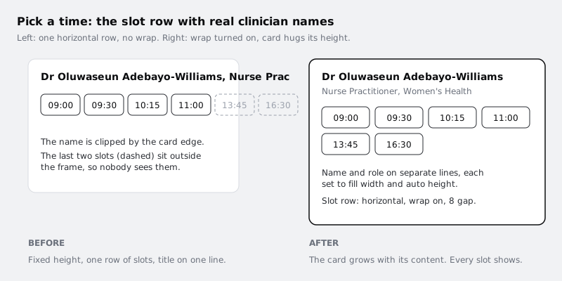
Paste in your longest clinician name with their full role, and the busiest day's slots. If the slots sit in one horizontal auto layout row, the later ones will be pushed outside the frame, where nobody can tap them. Fix it:
- Select the slot row. In the Layout section of the right sidebar, turn on wrap for the horizontal layout, and set the row to Fill container width.
- Give the row a gap between items and between rows, for example 8, so wrapped chips do not touch.
- Split the name and the role into two text layers, each set to fill width and auto height, so a long role does not push the name off the card.
Now check the shortest row. Set one day to zero slots. A row with nothing in it leaves an empty gap that looks like a loading problem. Add the message the system would show, such as "No appointments left on this day. Try Thursday." That message goes in your inventory too.
Check it worked
On the longest row, every time slot is inside the card and the full clinician name is readable. On the shortest row, the empty day shows a message instead of a blank area.
Step 6 · Fill the forms, errors and buttons
Forms hide the most bugs, because placeholder wireframes rarely show errors at all.
On Your details, paste in the longest field label and, under each field, the longest error message from your sheet, such as "Enter a mobile number with 11 digits". Show all errors at once on the longest-row copy. That is the worst case a person can actually reach by pressing Continue with an empty form.
Check two things:
- The error pushes the next field down instead of covering it. If fields are loose rectangles, put each label, input and error into a vertical auto layout group, and stack those groups in a vertical auto layout column. An error then takes up space instead of sitting on top of the next label.
- The page still scrolls to the button. With every error showing, the form is taller. Make sure the frame is tall enough, or mark it as a scrolling screen, so the Continue button is not hidden.
Then do the buttons on Your details and Confirm with your translated labels. A button with a fixed width either clips "Confirmer le rendez-vous" or squeezes it onto two lines. Set the button width to Hug contents, then, from the width setting in the right sidebar, add a minimum width so short labels such as "OK" still give a decent tap area. Write the minimum in the Rule column.
Check it worked
On the longest-row Your details screen, every field shows an error, no error overlaps another layer, and the Continue button is still visible or reachable. The translated Confirm button shows its whole label on one line.
Step 7 · Decide what may be cut off
Not every slot should wrap. On a summary or list where space is tight, cutting text with an ellipsis can be the right call, as long as nothing the person needs is lost.
Go through your inventory and fill in the Rule column for every row, using one of three answers:
- Wrap: the text always shows in full. Use for anything the person must read to act: service names, times, prices, addresses, error messages.
- Truncate after n lines: Figma's text settings let you turn on truncation and set a maximum number of lines, which ends the text with an ellipsis. Use it only where the full text is one tap away, such as a long description that opens a detail view.
- Limit at the source: some text should never be long. Agree a maximum length with whoever writes it, such as headings under 40 characters, and note it.
Apply the truncation setting to the slots you marked for it on the Content test page, then look at Confirm and Booked with the longest content. Nothing that confirms the booking (who, what, when, where) should end in an ellipsis.
Check it worked
Every row in your inventory has a Rule. On the Confirm and Booked screens in the longest row, the service, clinician, date, time and address are shown in full with no ellipsis.
Step 8 · Move the fixes back and leave notes
The Content test page proved the layouts. Now carry the repairs into the real wireframes.
For each screen, copy the structural fixes back to the original frames: the auto layout on cards, wrap on the slot row, auto height text, hug buttons with minimum widths and the truncation settings. If your wireframes use components, make the fix once on the main component and every instance picks it up.
Keep realistic content in the originals too: typical values, not lorem ipsum. Leave the Content test page in the file, so the next person who changes a layout can paste the longest row back in and check.
Finally, put the Rule column where developers will see it. Add a text frame beside each screen listing its slots and rules ("Service name: wrap, up to 2 lines. Main button: hug, min width 120. Errors: wrap, never truncate"), or link the spreadsheet in the file. Those rules are what keep the built product from re-introducing the bugs you have just fixed.
Check it worked
Your original wireframes contain no lorem ipsum and no generic "Name" or "Title" text. Paste the longest service name into a card on the original Choose a service screen: it wraps and the card grows, with nothing overlapping. Each screen has a visible note of its content rules, or a link to the inventory.
Next steps
- Turn these screens into tidy greyscale layouts with a type hierarchy and spacing in /tutorials/take-a-wireframe-from-low-to-mid-fidelity.
- If you skipped the first pass, start from grey boxes in /tutorials/build-a-low-fidelity-wireframe-in-figma.
- Get more out of hug, fill and wrap in /tutorials/make-layouts-wrap-and-stretch-with-auto-layout.
- Practise the card fix in isolation in /tutorials/build-a-responsive-card-with-auto-layout.
Part of these paths
Related tutorials
- Take a wireframe from low to mid fidelityYou will have the six Larkfield Clinic booking screens and four state frames at mid fidelity in Figma, still greyscale but with real copy, four text styles, one spacing scale and a small kit of reusable wireframe components, ready to test for content and flow.
- Build a low-fidelity wireframe in FigmaYou will have five grey-box wireframes in Figma for the Larkfield Clinic booking flow, drawn from your paper sketches with rectangles, lines and plain text only, and a written list of what you chose to leave out.
Need this done for you?
Padding does this work for growing companies, from the first diagnosis to a system that keeps working.
Get new tutorials