Figma and design tools · Beginner · 18 min
Build a small wireframe kit you can reuse
By Padding · Updated 18 Nov 2026
Figma (web) · November 2026
You will have a Wireframe kit page in Figma with thirteen plain greyscale components built on auto layout, and a test screen that proves you can assemble a new wireframe from them in minutes.
On this page
Every new wireframe starts the same way: draw a header, draw a button, draw a list row, draw a grey box with a cross for an image. Doing that by hand each time is slow, and the results drift. One screen has 12px padding, the next has 14px, and reviewers start commenting on the differences instead of the structure.
A wireframe kit fixes this. It is a small set of components, drawn once, that you drop into any screen. This tutorial builds thirteen of them in a single Figma file, all on auto layout so their instances stretch to any screen width, and all in greys so nobody mistakes a wireframe for finished design.
That last point is the rule the whole kit follows. The kit stays plain on purpose. No brand colour, no icons beyond a chevron and a back arrow, no shadows, no rounded corners, one typeface at two sizes. The moment a wireframe looks polished, people review the polish. A kit that looks unfinished keeps the conversation on what goes where and why.
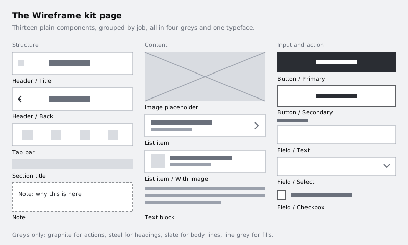
Step 1 · Set up the kit page and four greys
Create a new Design file and name it Wireframe kit. Rename the first page to Kit and add a second page called Test. The kit lives on the first page; the second page is where you will try it out at the end.
Decide on your greys now, because every component will use them and changing them later means touching every layer. Four is enough. Create a colour variable collection called Wireframe (with nothing selected, open the local variables from the right sidebar) and add four colour variables:
wf/strong#2A2D33for primary buttons, borders that matter and iconswf/heading#6A707Bfor titles and labelswf/body#9BA1ACfor body text, secondary lines and default borderswf/fill#D9DCE1for image placeholders, the tab bar background and disabled areas
Use white for surfaces. Pick one typeface that ships with Figma and does not look like a product font. Inter at 16 for headings and 14 for everything else works; a single family at two sizes is the whole type system.
Write the rule down where you will see it: add a text layer at the top of the Kit page that says Greys only. No radius, no shadow, no icons except chevron and back. One typeface, two sizes.
Check it worked
Your file has two pages, Kit and Test. With nothing selected, the local variables list shows a Wireframe collection with exactly four colour variables. The rule text sits at the top of the Kit page.
Step 2 · Build the two buttons first
Buttons are the simplest component with auto layout, so they set the pattern for the rest.
Add a text layer that reads Button label, set it to 14 and white, then press Shift A to wrap it in an auto layout frame. Set the frame's padding to 12 top and bottom and 16 left and right, fill it with wf/strong, and set its alignment to centre so the label sits in the middle. Give the frame a Fixed width of 328. A main component sitting loose on the canvas has no auto layout parent, so Figma does not offer Fill container for it; you set Fill on each instance instead, once it is inside an auto layout screen. Name the frame Button / Primary, then select it and press Ctrl Alt K (Option Command K on Mac) to make it a component.
Add a text component property to the label so you can change it from the right sidebar without digging into layers. Select the text layer inside the component, and in the right sidebar's text section, create a property from its content and call it Label.
Build a second button the same way. This one has a white fill, a 1px wf/strong stroke and wf/strong text. Name it Button / Secondary and make it a component with the same Label property.
The slash in each name groups the two buttons together when you browse the kit's components later, so keep the format Group / Variant for everything that follows.
Check it worked
The layers panel shows two component layers named Button / Primary and Button / Secondary. Drag an instance of either out to the canvas, select it, and you can type a new label in the right sidebar without opening the layer. Drag the instance's right edge to make it wider and the label stays centred while the button grows.
Step 3 · Build the fields
Forms appear in most wireframes, so the kit needs three field types.
Field / Text. Make a vertical auto layout frame with a gap of 6. Inside it put a Label text layer (14, wf/heading) and an input box: a horizontal auto layout frame with 10 top and bottom padding, 12 left and right, a white fill and a 1px wf/body stroke, holding a placeholder text layer (14, wf/body). Give the outer frame a Fixed width of 328, then set the input box to Fill container width so it follows the outer frame. Make the outer frame a component and add text properties for the label and the placeholder.
Field / Select. Duplicate the text field and add a small downward chevron at the right of the input box. Draw it as two lines with the pen tool rather than importing an icon set; the kit should own every shape in it. Then select the placeholder text layer and set its width to Fill container. It takes up all the spare room in the input box and pushes the chevron to the far right.
Field / Checkbox. A horizontal auto layout frame with a gap of 10 holding a 16 by 16 square with a 1.5px wf/strong stroke and a text layer. Add a boolean property called Checked that shows or hides a tick inside the square.
Keep the stroke weight and padding identical across the three. Consistency inside the kit is what makes screens built from it look consistent without effort.
Check it worked
Make a 360 wide frame, press Shift A to give it vertical auto layout with 16 padding, and place one instance of each field inside. Select the three instances and set their width to Fill container. All three stretch to the frame's inner width, their labels line up on the same left edge, and toggling Checked in the right sidebar shows and hides the tick.
Step 4 · Build the image placeholder and text block
Image placeholder. Draw a frame 320 by 180 and fill it with wf/fill. Inside it, draw two wf/body lines from corner to corner so it shows a cross, then select both lines, right-click and choose Flatten so they become a single vector. Resize that vector so it covers the frame exactly (X 0, Y 0, 320 by 180) and set its horizontal and vertical constraints to Scale in the right sidebar. Separate lines are rotated layers and can drift off the corners when the frame changes shape; one flattened vector scales with the frame. Name the frame Image placeholder and make it a component. The cross is a long-standing wireframe convention for "an image goes here" and needs no label.
Text block. Paragraphs in a wireframe should look like paragraphs, not like real copy someone will proofread. Make a vertical auto layout frame with a gap of 8 holding three wf/body rectangles, 8 high: the first two Fill container width, the last one Fixed at about two thirds of the width. Name it Text block and make it a component.
If you want real words instead, use a text layer at 14 in wf/body and put actual sample content in it. Avoid lorem ipsum either way; grey bars say "copy goes here" more honestly than fake Latin, and real content tests the layout properly.
Section title. One text layer, 14, wf/heading, in an auto layout frame with 8 top padding and 4 bottom. Make it a component with a text property. It is small, but you will place it more often than anything else.
Check it worked
Resize an instance of Image placeholder to 360 by 120. The cross still runs corner to corner. If it does not, the lines were not flattened into one vector or its constraints are not both set to Scale. An instance of Text block dropped into a wider frame shows two full-width lines and one shorter line.
Step 5 · Build the list items with nested auto layout
List rows are where auto layout earns its place, because their content length changes from screen to screen.
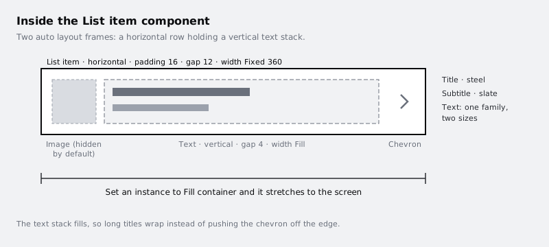
Build the inner piece first. Add a title text layer (14, wf/heading) and a subtitle text layer (14, wf/body), select both and press Shift A. Set this frame to vertical with a gap of 4 and name it Text. Select the title and subtitle layers and set each one's width to Fill container and height to Hug (auto height), so long text wraps instead of growing sideways.
Now draw a 48 by 48 square filled with wf/fill and a small right-pointing chevron in wf/body. Select the square, the Text frame and the chevron and press Shift A again. Set the new frame to horizontal, padding 16, gap 12, align items to the centre, a white fill, and a 1px wf/fill stroke on the bottom only. Give it a Fixed width of 360 and name it List item. Now that Text sits inside an auto layout parent, select it and set its width to Fill container so it takes the space between the square and the chevron.
Make it a component. Add text properties for the title and subtitle, and a boolean property called Show image linked to the square's visibility. Turn the square off by default.
You now have one component that covers both rows in the kit page diagram: List item with Show image off, and the same component with it on. That is better than two separate components, because a change to padding happens in one place.
Check it worked
Place an instance in a 360 wide vertical auto layout frame, set the instance's width to Fill container, and type a title long enough to need two lines. The title wraps inside the Text frame and the chevron stays at the right edge, still visible. Switch Show image on and the square appears to the left without pushing the chevron off the row.
Step 6 · Build the header, tab bar and note
Header / Title. A horizontal auto layout frame with a Fixed width of 360 and a Fixed height of 56, padding 16 left and right, white fill, 1px wf/fill bottom stroke. Inside: a title text layer (16, wf/heading). Set the frame's alignment to centre so the title sits in the middle both ways. Add a text property for the title.
Header / Back. Duplicate the title header and add a back arrow on the left, drawn as two short lines with the pen tool in wf/strong and wrapped in a 24 by 24 frame. Adding the arrow pushes the title off centre, so balance it: add an empty 24 by 24 frame with no fill on the right, set the title text layer's width to Fill container and its text alignment to centre. The arrow and the empty frame are the same width, so the title lands in the middle of the header again. Make it its own component so a reviewer can tell at a glance whether a screen sits at the top level or further in.
Tab bar. A horizontal auto layout frame with a Fixed width of 360, padding 8, with four children. Each child is a vertical auto layout frame set to Fill container width, holding a 20 by 20 wf/fill square and a short text layer (14, to keep the two-size rule) in wf/body. Because every tab fills, the four share the width equally on any screen size. Add text properties to the four tab labels so you can rename them per product.
Note. This is the component that keeps the kit honest. A vertical auto layout frame with padding 12, a white fill and a dashed 1px wf/strong stroke, holding one text layer (14, wf/strong). Name it Note. You will drop it beside parts of a screen to say why they exist or what is still undecided: "Sort order not agreed", "Only shown to returning users". Wireframes get reviewed for decisions, and the note makes those visible.
Check it worked
Count the component layers on the Kit page. You should have thirteen: Header / Title, Header / Back, Tab bar, Section title, Note, Image placeholder, List item, Text block, Button / Primary, Button / Secondary, Field / Text, Field / Select and Field / Checkbox. List item with its image switched on is the same component as List item, so if you laid out both as examples, only one of them should be a main component.
Step 7 · Lay out the kit page so it is easy to pick from
Arrange the main components into three columns with a small grey text label above each: Structure (headers, tab bar, section title, note), Content (image placeholder, list item, text block) and Input and action (buttons and fields). Leave space between them so it is obvious where one ends.
Put each main component inside a 360 wide frame or column, so you see them at a realistic phone width. Under each, add a one-line usage note in wf/body: for example, under Header / Back, "Use on any screen reached from another screen".
Then audit the page against the rule you wrote in the first step. Select every layer on the page and look at the selection colours in the right sidebar. The only colours listed should be your four wf/ variables and white. Anything else, such as a default black text layer or a leftover blue, gets fixed now before it spreads into every wireframe.
Check it worked
With every layer selected, the selection colours show only the four Wireframe variables and white. The page has three labelled columns, and every main component has a one-line usage note under it.
Step 8 · Test the kit by building one screen
A kit is only useful if it makes the next wireframe faster. Go to the Test page, set a timer for ten minutes, and build one screen using nothing but instances from the kit.
Create a 360 by 800 frame and turn it into a vertical auto layout frame with a gap of 0, keeping its height Fixed at 800. Pick a screen you know, such as a settings screen or an order detail screen, and add instances from the assets panel in order: Header / Back, Image placeholder, Section title, three List item instances with their titles changed, Button / Primary and Tab bar. Select every instance and set its width to Fill container so each one spans the screen.
The button needs space around it. Select the Button / Primary instance and press Shift A to wrap it in an auto layout frame, give that wrapper 16 padding and no fill, set the wrapper's width to Fill container and its height to Fill container, and set the button instance inside it to Fill container width. Because the wrapper fills the leftover height, it pushes Tab bar to the bottom of the screen. Override text through the properties in the right sidebar, not by double-clicking into layers.
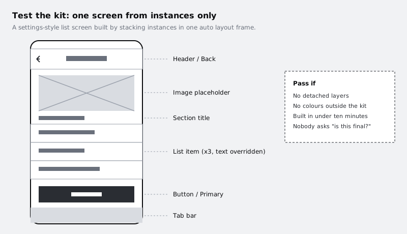
When the timer ends, look at what slowed you down. If you drew a shape by hand because the kit did not have it, decide whether it will come up again. If it will, build it on the Kit page as a component. If it is a one-off, leave it out; a kit with forty components is harder to pick from than one with thirteen.
Finally, go back to the Kit page, change the padding on List item from 16 to 20, and return to the Test page.
Check it worked
The test screen was built in about ten minutes or less. In the layers panel, every component on the screen shows the instance icon, with no detached frames; the only plain frame is the button's padding wrapper. Tab bar sits flush with the bottom edge of the 800 high frame. After you changed the main List item, all three rows on the Test page picked up the new padding. Set it back to 16 if you prefer.
Next steps
Use the kit straight away on a real flow in /tutorials/build-a-low-fidelity-wireframe-in-figma, where the plain look keeps feedback on structure. If you want more control over what each instance can change, /tutorials/add-component-properties-in-figma goes further into text, boolean and instance swap properties. To share the kit with your team so everyone builds from the same parts, follow /tutorials/publish-and-update-a-figma-team-library. For a refresher on how main components and instances relate, see /tutorials/make-your-first-figma-component.
Part of these paths
Related tutorials
- Build a low-fidelity wireframe in FigmaYou will have five grey-box wireframes in Figma for the Larkfield Clinic booking flow, drawn from your paper sketches with rectangles, lines and plain text only, and a written list of what you chose to leave out.
- Make your first component and use its instancesYou will have one appointment card component in the Larkfield Clinic file, with instances on three screens that all change when you edit the main component.
Need this done for you?
Padding does this work for growing companies, from the first diagnosis to a system that keeps working.
Get new tutorials