Figma and design tools · Beginner · 13 min
Pick the right fidelity for what you need to learn
By Padding · Updated 18 Nov 2026
Figma (web) or any notes app · November 2026
You will have a one-page fidelity plan for one of your projects that pairs each open design question with the cheapest artefact that can answer it and says when to move up.
On this page
Fidelity is how close a design artefact is to the finished product. A pencil sketch is low fidelity; a coloured, clickable screen with real data is high. Teams often treat fidelity as a sequence to walk through: sketch, then wireframe, then mock-up, then prototype. That habit wastes time in both directions. Some questions cannot be answered by a grey box no matter how many you draw, and others get buried under polish that nobody needed yet.
A better rule: start from the question you need answered, and build the least finished thing that can answer it honestly. "Is this the right order of steps?" can be settled on paper in an afternoon. "Does this page look trustworthy enough to type a card number into?" cannot be settled until the page looks real.
In this tutorial you list the open questions on one of your projects, sort them, decide how finished each artefact needs to be, and write it all down as a fidelity plan. The worked example is a small fictional project: a renewals feature for the Hollins Library app, where members renew borrowed books and pay any late fees. Use your own project alongside it.
Step 1 · Write down what you do not know yet
Open a blank page in your Figma file (or a new notes document) and call it Fidelity plan. Under a heading Open questions, write every design question you have about the project. Write each one as a question a person or a test could answer with yes, no or a choice, not as a task.
For the library renewals feature, the list starts like this:
- Do members expect renewals under "My loans" or under "Account"?
- Is renew-all, then pay, the right order, or should fees come first?
- Will people understand "Renewal limit reached" without extra help?
- Can members find the due date on each loan card at a glance?
- Does the payment screen look safe enough to enter card details?
- Does the renew button feel responsive when it takes two seconds?
Turn tasks into questions as you go. "Design the loans screen" is a task. "Can members see which loans are overdue?" is a question you can check.
Check it worked
Your Open questions list has at least five lines, every line ends in a question mark, and none of them starts with a verb like "design", "make" or "build".
Step 2 · Sort each question by what it is about
Most design questions fall into one of five kinds. Label each question with one of them:
- Structure: where things live, what order steps come in, what is on which screen.
- Words: whether labels, messages and instructions are understood.
- Layout: whether people notice and find things on a screen.
- Behaviour: how it feels to use: timing, feedback, gestures, transitions.
- Look: whether it feels trustworthy, on brand, calm, premium or whatever the brief asks for.
Add the label in square brackets at the start of each line. For the library:
- [Structure] Do members expect renewals under "My loans" or under "Account"?
- [Structure] Is renew-all, then pay, the right order?
- [Words] Will people understand "Renewal limit reached"?
- [Layout] Can members find the due date on each loan card at a glance?
- [Look] Does the payment screen look safe enough to enter card details?
- [Behaviour] Does the renew button feel responsive when it takes two seconds?
If a question seems to fit two kinds, split it into two questions. "Is the loans screen clear?" usually hides a words question and a layout question.
Check it worked
Every question on your page carries exactly one label, and you have used at least three of the five kinds. If every label is [Look], you have probably skipped the structural questions that need answering first.
Step 3 · Set the four fidelity dials
Fidelity is not one setting. Think of it as four dials you set separately for each artefact:
- Content: placeholder lines, then rough copy, then the real words and data.
- Layout: loose boxes, then aligned blocks on a grid, then exact sizes and spacing.
- Visual: greyscale, then a few key colours and type sizes, then the full style.
- Interaction: static pictures, then clickable screens, then real states, delays and transitions.
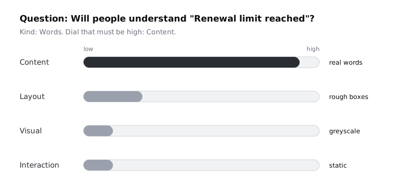
Each kind of question depends mainly on one dial. Turn that one up and leave the rest low:
- Structure questions need almost nothing high. Boxes and arrows will do.
- Words questions need high content. The layout can stay rough, but the words must be the real ones.
- Layout questions need high layout and realistic content length. Colour can stay grey.
- Behaviour questions need high interaction. The screens can be plain.
- Look questions need high visual and usually high content too, because fake text looks fake.
Next to each question on your page, write the dial that has to be high, for example → content high.
Check it worked
Each question on your plan names one dial (occasionally two) that must be high, and no question asks for all four. A question that seems to need all four is usually a launch-readiness check, not a design question; split it.
Step 4 · Choose the cheapest artefact that answers each question
Now match each question to an artefact. These are the usual rungs, from cheapest to most expensive:
- Paper sketches or a box-and-arrow flow.
- Grey wireframes in Figma with placeholder text.
- Grey wireframes with real copy and real data.
- A click-through prototype: wireframe frames joined with prototype connections.
- A static high-fidelity mock-up in the full visual style.
- An interactive high-fidelity prototype with states and timing.
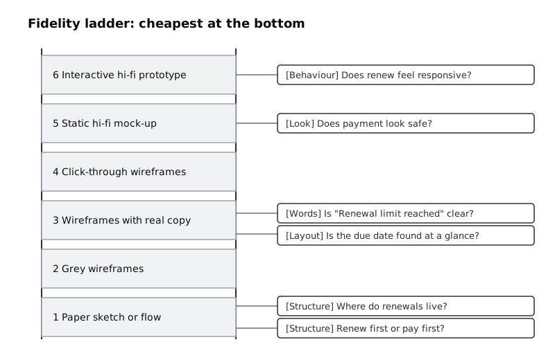
Pick the lowest rung where the dial the question needs is high enough. For the library:
- Where renewals live: rung 1, a quick card sort or tree test with five library members. Colleagues know the app too well to stand in for members.
- Step order: also rung 1, a paper flow sketch that you walk the same members through, asking them to say what they expect next. The card sort tells you where renewals belong, not which step comes first.
- "Renewal limit reached": rung 3, a grey loan screen with the exact message and a real book title.
- Due date at a glance: rung 3, because realistic titles and dates change what people scan.
- Payment screen trust: rung 5. Grey boxes cannot tell you whether a screen feels safe.
- Renew button responsiveness: rung 6, and only for that one interaction, not the whole app.
Write the rung number and a short name of the artefact after each question.
Check it worked
Each question has a rung number, and the numbers are not all the same. If more than half your questions sit on rung 5 or 6, go back through them and ask, for each one, whether a lower rung would give the same answer.
Step 5 · Check for false signals in each choice
Both too little and too much fidelity can give you wrong answers. Run through each pairing and look for these traps:
- Too low for look questions. People asked "would you trust this?" about a grey wireframe guess, and their guesses are worthless.
- Placeholder text on a words or layout question. Lorem ipsum and "Book title here" hide the long names, two-line labels and missing data that cause the real problems.
- Too high for structure questions. Show polished screens and people comment on colours and icons, not on whether renewals belong under "My loans". They are also more reluctant to suggest big changes to something that looks finished.
- A click-through tested as if it were real. If you are testing step order, people will happily click hotspots in a prototype that a real app would never allow. Note what the prototype does not simulate.
For each question, add one line starting Watch for: with the trap that applies, or none if you cannot see one.
Check it worked
Every question in your plan has a Watch for: line. At least one of them names a specific risk, such as "placeholder titles are shorter than real ones", rather than a general worry.
Step 6 · Put the questions in order and set move-up triggers
Questions depend on each other. There is no point testing how the payment screen looks if you have not settled whether payment comes before or after renewal. Order the questions so structure comes before words and layout, and those come before look and behaviour.
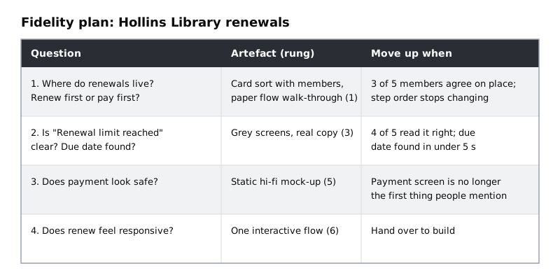
Then, for each rung, write a move-up trigger: the condition that tells you it is time to build the next, more finished artefact. A good trigger is something you can see, not a date.
For the library:
- Leave rung 1 when three of five members put renewals in the same place, and the step order no longer changes between sketches after you walk members through the paper flow.
- Leave rung 3 when four of five people read "Renewal limit reached" correctly and find the due date in under five seconds.
- Leave rung 5 when the payment screen is no longer the first thing people comment on.
Check it worked
Your questions are now numbered in the order you will answer them, no [Look] question comes before the [Structure] questions it depends on, and every rung you use has one trigger that names something you can count or observe.
Step 7 · Turn the notes into a one-page plan and use it
Tidy everything into a table with four columns: Question, Kind and dial, Artefact (rung) and Move up when. Keep the Watch for: lines as a short note under the table. If you are working in Figma, put the table on the Fidelity plan page as a text layer or a simple frame, so it sits next to the frames it describes.
Share the plan with whoever reviews the design before you build anything. It answers the common review questions in advance: why the screens are still grey, why one interaction is already animated when the rest are not, and what has to happen before the team sees colour.
Revisit the plan each time a trigger fires. Tick off the answered question, write the answer in one line beside it, and add any new questions that the answer raised. New questions go through the same steps: label, dial, rung, trap, trigger.
Check it worked
You have one page that someone else on your team could read in two minutes and then say what you are building next and why. The first row in the table is the artefact you will make this week, and it is the lowest rung in the plan.
Next steps
- Build the first rung for most projects in Sketch wireframes on paper before opening Figma.
- Make the grey screens your plan calls for with Build a low-fidelity wireframe in Figma.
- When a trigger fires, move up a rung with Take a wireframe from low to mid fidelity.
- Before you put a clickable artefact in front of people, work through Get a prototype ready for a usability test.
Part of these paths
Related tutorials
- Build a low-fidelity wireframe in FigmaYou will have five grey-box wireframes in Figma for the Larkfield Clinic booking flow, drawn from your paper sketches with rectangles, lines and plain text only, and a written list of what you chose to leave out.
- Get a prototype ready for a usability testYou will have a Larkfield Clinic prototype that a participant can open from one link, finish every test task in, and never get stuck in, with a saved version to fall back on.
- Sketch wireframes on paper before opening FigmaYou will have a photographed set of paper sketches for every screen and state in the Larkfield Clinic booking flow, each one chosen from several rough layouts drawn against the clock.
Need this done for you?
Padding does this work for growing companies, from the first diagnosis to a system that keeps working.
Get new tutorials