Figma and design tools · Beginner · 19 min
Take a wireframe from low to mid fidelity
By Padding · Updated 18 Nov 2026
Figma (web) · November 2026
You will have the six Larkfield Clinic booking screens and four state frames at mid fidelity in Figma, still greyscale but with real copy, four text styles, one spacing scale and a small kit of reusable wireframe components, ready to test for content and flow.
On this page
Low-fidelity wireframes answer one question: are the right things on the right screens in the right order? Grey boxes are good at that because nobody argues about a grey box. They are bad at the next question, which is whether a patient can actually read the screens and get through them. A box labelled "Button" cannot tell you that "Continue" is the wrong word, and a stripe standing in for a paragraph cannot tell you the paragraph is too long for a phone.
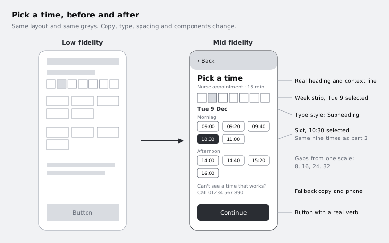
Mid fidelity is where you answer that second question. In this part of the series you take the Larkfield Clinic booking screens from part 2 (Home, Choose a service, Pick a time, Your details, Confirm and Booked), work through the Deferred from low fidelity list you wrote at the end of it, and change exactly four things:
- Copy. Every placeholder becomes the real words a patient would read, including the four awkward states the flow will meet, each drawn as its own frame.
- Type. Text gets a simple hierarchy of four styles, so the eye knows where to start.
- Spacing. Every gap comes from one short scale instead of being nudged by eye.
- Components. Repeated parts (header, button, field, time slot, list row) become reusable wireframe components.
Two things deliberately do not change. The screens stay greyscale, and there are still no photos, illustrations or brand. Colour waits because it pulls feedback away from the question you are asking. Show a tester a teal button and you get opinions about teal; show them a dark grey one and you find out whether they understood the word on it. Colour also needs decisions you have not made yet (brand, contrast ratios, what colour means in this app), and those belong in part 4, when you take these screens to high fidelity.
Step 1 · Copy the Wireframes page to a new page
Open your Larkfield Clinic booking file. Work on a copy, not the originals: the low-fidelity page is the record of what you agreed on structure, and you may want to show it next to the mid-fidelity version when someone asks why a screen changed.
In part 2 everything went on a page called Wireframes. In the pages list at the top of the left sidebar, right-click Wireframes and duplicate it. Rename the original Lo-fi and the copy Mid-fi. Then add one more empty page called Wireframe kit. It will hold the components you build in a later step, so they do not clutter the screens.
Everything on the page comes across with the copy: the Mobile flow section with frames 01 Home to 06 Booked, the locked sketch photos above them, the Kit frame to the left, the notes beside each frame and the Deferred from low fidelity text box below. Keep all of it on Mid-fi. The sketches are still useful for comparison, the Kit frame gets updated in the greyscale step, and the deferred list drives the next step.
Keep the numbered frame names. The numbers keep the screens in flow order in the layers panel, and part 4 renames its copies to plain names (Home, Pick a time and so on) when it pastes them onto its own page, so there is nothing to gain from renaming them now.
Check it worked
The pages list shows Lo-fi, Mid-fi and Wireframe kit, and no page called Wireframes. On Mid-fi, the layers panel shows the Mobile flow section holding six frames named 01 Home to 06 Booked, with the locked sketches, the Kit frame and the Deferred from low fidelity text box on the same page. Clicking back to Lo-fi shows the original grey boxes untouched.
Step 2 · Write the real copy and work through the deferred list
Do the words first, while the screens are still plain. If you style a heading and then rewrite it at twice the length, you redo the styling.
Go through the flow in order and replace every placeholder with what a patient of Larkfield Clinic would actually read. Double-click a text layer to edit it, and where a grey bar stands in for text, delete it and add a real text layer in its place. Keep the Step 1 of 4 lines from part 2. Write for a person on a phone, possibly anxious, possibly booking for a child. A starting set:
- 01 Home: heading
Larkfield Clinic; a line under it,14 Mill Lane; the primary buttonBook an appointment; a smaller linkView or cancel a booking. - 02 Choose a service: title
Choose a serviceand the lineWhat do you need an appointment for?, as in part 2; the same five rows, now with a duration under each:GP appointment · 10 min,Nurse appointment · 15 min,Blood test · 10 min,Vaccination · 15 min,Medication review · 20 min. - 03 Pick a time: title
Pick a time; the chosen service as a reminder line,Nurse appointment · 15 min; part 2's row of seven days, withTue 9still selected; a day headingTue 9 Decabove the slots; part 2'sMorningandAfternoongroups with the same nine times,10:30still selected; fallback copyCan't see a time that works? Call 01234 567 890; buttonContinue. - 04 Your details: title
Your details; the four labels from part 2,Full name,Date of birth,Mobile number,Email (optional); the reminder checkbox, still wordedText me a reminder the day before; buttonContinue. It stays a checkbox rather than becoming a line of small print, because the reminder is part of the Larkfield brief and a patient should be able to choose it. - 05 Confirm: title
Check your booking; a section headingYour appointmentabove the summary; the four summary rows from part 2 (Service,Date and time,Where,Your details) filled in with one real booking; aChangelink beside each; buttonConfirm booking. - 06 Booked: heading
You're booked; the service, date and time again;We've sent a text to 07••• ••• 123. We'll text you a reminder the day before.; the secondary buttonAdd to calendarabove the primary buttonDone, as in part 2.
A few rules make the copy testable rather than decorative. Use realistic lengths: a real name such as Adaeze Okonkwo-Hughes in a field shows you whether the field is wide enough, where John Smith hides the problem. Make every button say what happens when it is pressed (Confirm booking, not Submit).
Now open the Deferred from low fidelity list on the Mid-fi page and take each line in turn. Either resolve it on a screen now or carry it forward, and edit the line to say which:
- Resolve at mid fidelity anything that is words or structure. Field hints belong here: add a hint under
Date of birthsuch asFor example, 31 03 1985. Decide whetherChangeon Confirm goes back to that screen or edits in place, and say so in the note beside05 Confirm. Type is resolved in the next step. - Resolve with state frames the error and empty states: no free slots, a mistyped mobile number, a booking that fails. A later step in this tutorial draws them, so mark those lines with that step for now.
- Carry forward anything that needs a decision you cannot make in greyscale or without testing: colour and icons (part 4), the map of the entrance, the calendar file format, an email reminder, loading states.
Start each line with Done: or Later: and, for Later: lines, add where it goes, for example Later: colour and icons → part 4. A list where every line has a fate is what the next part of the series picks up.
Use Find (Ctrl F on Windows, Command F on Mac) to search the page for Lorem, Button, Text and Title, the usual leftovers.
Check it worked
Read the six screens in order out loud, top to bottom. You can say every word without inventing anything, and nothing you read is a placeholder. A search on the Mid-fi page for Lorem and Button finds no text layers (layer names may still match; it is the visible text that matters). 02 Choose a service still has five rows, 04 Your details still has four fields and the reminder checkbox, and 06 Booked still has both Add to calendar and Done. Every line of Deferred from low fidelity starts with Done: or Later:.
Step 3 · Set up four text styles
With the copy in place, give it a hierarchy. Part 2 allowed three sizes and no bold except for titles. Mid fidelity needs one more level, for the day heading on Pick a time and the section heading on Confirm, so this step replaces that rule with four styles. Using four rather than a long ladder of sizes still forces clear decisions. Pick one typeface, such as Inter, which Figma offers by default, and create these styles:
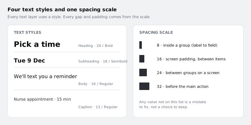
Heading: 24, Bold, line height 32. The one thing each screen is about.Subheading: 18, Semi Bold, line height 24. The day heading on Pick a time (Tue 9 Dec) andYour appointmenton Confirm.Body: 16, Regular, line height 24. Sentences, field values, list row titles, button labels.Caption: 13, Regular, line height 18. Durations, hints, step lines, theMorningandAfternoonlabels, the summary row labels on Confirm, the clinic address.
To make a style, select a text layer that already looks the way you want, then use the style control in the Typography section of the right sidebar to create a new style from it and name it. Repeat for the other three. With the styles made, select text layers screen by screen and apply the right style to each. Shift-click to select several layers that share a level, such as every Heading across the six frames, and apply the style once. Then replace the three text samples in the Kit frame with one sample of each style, so the kit stays the single place that shows what is allowed.
Body text at 16 is a sensible floor here. It is a common minimum for body text on phones, and it means testers hit content problems rather than squinting at small type. Keep text in the two text greys described in the greyscale step.
Check it worked
Click empty canvas so nothing is selected. The right sidebar lists your local text styles, and there are exactly four: Heading, Subheading, Body and Caption. Click any text layer on any screen: the Typography section shows one of those four style names rather than loose font settings. Each screen has exactly one layer in the Heading style, and the Kit frame shows four type samples.
Step 4 · Put every gap on one spacing scale
Low-fidelity screens are usually spaced by eye, which is fine for structure and shows up badly once text is real: 13 here, 18 there, and the screen looks slightly wrong without anyone being able to say why. Choose a scale and use nothing else:
8between things inside one group, such as a field label and its field16for screen padding and between items in a list24between groups on a screen, such as theMorningandAfternoongroups on Pick a time32above the main action button
The quickest way to hold to the scale is auto layout. Select the content inside each screen (everything under the header), wrap it in a vertical auto layout frame, and set its padding to 16 and its gap to 24. Then wrap each group inside it, for example a label and its field, in its own vertical auto layout with a gap of 8. Nesting like this means each gap is a number you typed, not a distance you dragged. If you want the scale stored as named values rather than typed each time, /tutorials/use-number-variables-for-spacing-and-radius shows how; it is optional at this stage.
Leave the header outside the content stack for now. It becomes a component in the next step and keeps its own padding.
Check it worked
Select any element and hold Alt (Windows) or Option (Mac), then hover a neighbour: every distance Figma shows is 8, 16, 24 or 32. Select any auto layout frame on the screens: its gap and padding fields in the right sidebar show only values from the scale. No content sits closer than 16 to the left or right edge of a screen.
Step 5 · Turn repeated parts into wireframe components
By now you have typed the same button six times and drawn nine time slots. Turn the repeats into components so a change made once reaches every screen. That matters at mid fidelity because testing will change wording: if Continue turns out to confuse people, you want to fix it in one place.
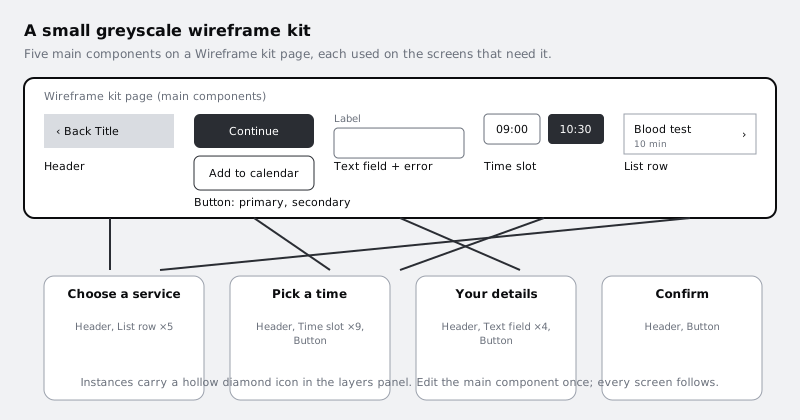
Go to the Wireframe kit page and build five components there. Copy one good example of each from the screens, then select it and create a component (Ctrl Alt K on Windows, Option Command K on Mac):
Header: a back control and a screen title, full width, light grey fill.Button: a primary version (dark grey fill, white text) and a secondary version (white fill, dark grey outline). If you have used variants before, make them one component set with aTypeproperty; two separate components also work.Text field: a label inCaption, a box, and an optional hint below. Add an error version too: a 2 pixel dark grey outline and aCaptionline under the box that starts with the wordError:. You use it in the next step.Time slot: a small box with a time inBody, plus a selected version with a dark fill.List row: a title, a caption line for the duration and a chevron, for Choose a service.
Then go back to Mid-fi and replace the loose copies with instances: drag each component from the assets list in the left sidebar onto the screen, put it where the old copy was, override its text, and delete the copy. Keep the components grey and plain, with no shadows, icons from a set, or rounded corners chosen for looks. They are wireframe parts; part 4 restyles them.
Do not delete the Lo-fi page or the Wireframe kit page later. Part 4 restyles these exact components, and the prototype parts link these exact frames.
Check it worked
In the layers panel on Mid-fi, every header, button, field, slot and list row shows the instance icon (a hollow diamond), not a frame icon. Go to Wireframe kit, change the primary button's corner radius or text size, and return to Mid-fi: every primary button on all six screens has changed. Undo the test change afterwards.
Step 6 · Draw the four awkward states as their own frames
A happy path tested on its own tells you little about the moments that make people give up. Four of them are already on your deferred list, and each now gets a frame of its own, built from the same instances, so testers and part 4 can see exactly what a patient reads when something goes wrong.
On Mid-fi, select a screen frame and duplicate it (Ctrl D on Windows, Command D on Mac), then move the copy below the main row so the six screens stay in a line. Make four copies in all, rename each exactly as below, and edit only what the state changes:
Pick a time / No times this week, from03 Pick a time. Delete the slot groups and theContinuebutton, since there is nothing to continue with. In their place, aBodylineNo free times this weekand a secondaryButtonreadingSee next week. Keep the phone fallback line.Pick a time / Time gone, from03 Pick a time. Above the slots, a shortBodymessage:10:30 was just taken. These times are still free.Set every slot back to unselected and remove10:30from the Morning group, leaving the other eight times.Your details / Errors, from04 Your details. Fill the fields with a realistic attempt, put a short number such as07700 9001in the mobile field, and switch that field to the error version. The message says what to do:Error: Enter a mobile number with 11 digits, such as 07700 900123.Confirm / Could not book, from05 Confirm. Above the button, aBodymessage:We could not book this time. Your details are saved.Change the button toTry again.
Each state must be clear in greyscale, through words, weight and outline rather than colour. Part 4 adds a status colour and an icon to each of these frames; if the words do not already carry the meaning, colour will not rescue them. When the four frames are done, change the matching Deferred from low fidelity lines to Done:.
Check it worked
Under the six screens on Mid-fi sit four more frames named Pick a time / No times this week, Pick a time / Time gone, Your details / Errors and Confirm / Could not book. Each one reads as a complete screen when you read it aloud, and its message says what happened and what the patient can do next. The error field on Your details / Errors shows the instance icon in the layers panel, not a detached frame.
Step 7 · Hold the line on greyscale
Now check that nothing coloured has slipped in. It happens easily: a pasted icon carries its own blue, a default link turns out to be a colour, or someone tries a green "booked" tick to see how it feels.
Keep part 2's Kit greys and add one. The three from part 2 already have jobs, and introducing a new set now would leave the file with two competing palettes. The fourth exists because mid fidelity has captions and hints, which need to read as quieter than body text:
- white, for screen backgrounds, secondary buttons and unselected slots
#E6E6E6, light grey, for the header background, the selected day in the week row and image placeholders#BDBDBD, mid grey, for field outlines, list row outlines and dividers#6B6B6B, the new one, forCaptiontext: durations, hints, step lines#333333, dark grey, for headings and body text, primary buttons, the selected time slot and the error outline
Add a #6B6B6B swatch to the Kit frame, labelled with its hex value and its job, so the kit still lists every grey in use. If any text or fill on the screens uses a grey not in the kit, change it to the nearest kit grey.
Emphasis comes from weight, size and fill darkness. The selected slot is darker than the others; the primary button is darker than the secondary one; the error field has a heavier outline than the rest. If a state cannot be told apart in greyscale (for example, the selected slot looks the same as the rest), fix it now. Colour added later should reinforce a difference that already exists, never be the only way to see it, which is also what people who cannot distinguish certain colours need.
Write down any place you wanted colour and why, as Later: lines on the deferred list. "Booked screen wants a success colour" is a useful note for part 4; adding green today is not.
Check it worked
Select all ten frames and look at the colours the right sidebar lists for the selection: the only values are white, #E6E6E6, #BDBDBD, #6B6B6B and #333333. The Kit frame shows four grey swatches, each labelled. On 03 Pick a time, the selected 10:30 slot is clearly darker than the others when you squint or zoom out to 25 percent.
Step 8 · Walk the flow and note what mid fidelity can now test
Finish by reading the screens as a patient would, in order, and writing down what these screens are now ready to test and what they are not. This is the hand-over to the rest of the series.
Check the six frames still run left to right in flow order, with the four state frames below. Then, for each of the six screens, ask three questions and note the answers in a text layer under the frame:
- What is the one thing a patient must understand or do here, and does the heading say it?
- Is there any word a patient might not know (
GP,Medication review,main entrance) and is it explained or replaceable? - What happens if it goes wrong here? Is there a state frame for it, or a
Later:line saying where it will be handled?
Mid-fidelity screens like these can be tested for content and flow: whether people find the right service, understand the slots, recover from a mistake, trust the confirmation and know what happens next. They cannot tell you whether the app looks trustworthy or on-brand, and that is fine. Those questions come back at high fidelity.
Check it worked
The Mid-fi page holds ten frames: 01 Home to 06 Booked and the four state frames. Under each of the six screens there is a short note answering the three questions, and at least one screen has a gap you found and either fixed or added to the deferred list. Every line of Deferred from low fidelity starts with Done: or Later:. Comparing Lo-fi and Mid-fi side by side, the layout of each screen is recognisably the same, while every word is real, every text layer uses one of four styles, every gap is on the scale, and the only colours are the kit greys.
Next steps
Your screens now say exactly what they will say, in a clear order, built from parts you can change in one place. Next, give them their final look:
- Turn a mid-fidelity layout into a high-fidelity design adds colour, brand and imagery to these same components, the six screens and the four state frames.
- Build a low-fidelity wireframe in Figma is the previous part, if you want to revisit the structure decisions.
- Override component instances safely explains which instance changes survive when you restyle the kit.
- Review a flow for cognitive load gives you a closer method for the read-through in the last step.
Part of these paths
Related tutorials
- Build a low-fidelity wireframe in FigmaYou will have five grey-box wireframes in Figma for the Larkfield Clinic booking flow, drawn from your paper sketches with rectangles, lines and plain text only, and a written list of what you chose to leave out.
- Turn a mid-fidelity layout into a high-fidelity designYou will have high-fidelity Larkfield Clinic booking screens in Figma, coloured, typeset, with icons and one photo, every text and colour pair checked for contrast and ready to wire into a prototype.
Need this done for you?
Padding does this work for growing companies, from the first diagnosis to a system that keeps working.
Get new tutorials