Figma and design tools · Intermediate · 15 min
Use number variables for spacing and corner radius
By Padding · Updated 18 Nov 2026
Figma (web) · November 2026
You will have a card and a list screen in Figma whose gaps, padding and corner radius all come from number variables, so changing one value in the variables table restyles every card at once.
On this page
A spacing scale written in a style guide is a promise. A spacing scale stored as Figma variables is a mechanism: every gap, padding and corner radius that uses it points back to one place, and when that place changes, every layer that points to it changes too. No hunting through layers for the cards someone set to 14 instead of 16.
Figma has four kinds of variable: colour, number, string and boolean. This tutorial covers number variables, and only as Figma mechanics: how to create them, how to make one variable point at another, how to stop them cluttering the wrong fields, how to bind them to auto layout and corner radius, and how a single edit travels through a screen. Which numbers belong in your scale is a separate decision, made in the UI and visual design tutorials. Here you use a common 4-based set so you can concentrate on the tool.
You will finish with two things on one page: a card component and a list screen of four cards. Everything about their spacing and roundness is driven by variables.
Step 1 · Set up the card and the list
Create a page called Number variables. If you built the appointment card in Build a responsive card with auto layout, copy it onto this page. Otherwise build a quick one:
- a frame called Card, vertical auto layout, width 328, height hug, white fill, light grey stroke
- inside it, three text layers: a service name, a clinician line and a time
Give the card any gap, padding and radius you like for now, such as gap 10, padding 14 and radius 10. Odd numbers are useful here: when you see them disappear later, you will know the variables did it.
Turn Card into a component (right-click, then create component, or Option+Cmd+K on Mac, Ctrl+Alt+K on Windows). Then draw a frame 360 wide called List screen, give it vertical auto layout, and place four instances of Card inside it.
Check it worked
The Layers panel shows a Card component and a List screen holding four Card instances. Select the Card component: the right sidebar shows your temporary gap, padding and radius values, none of them a multiple of four.
Step 2 · Create a collection and the scale variables
Click an empty area of the canvas so nothing is selected. In the right sidebar, find the Variables section and open the local variables table. Create a new collection and name it Dimensions. Keep collections focused: colour variables belong in their own collection, as in Create colour variables with light and dark modes.
Create a variable, choose Number as its type, and name it space/4 with the value 4. The slash makes Figma put it in a group called space, which shows as a folder on the left of the table. Add the rest of the spacing scale the same way:
space/4= 4space/8= 8space/12= 12space/16= 16space/24= 24
Then a second group for corners:
radius/sm= 8radius/md= 12radius/lg= 16
Name spacing variables after their value and radius variables after their size. Value names (space/16) never lie about what they hold, which matters for the scale. Size names (radius/md) let you change the actual radius later without a misleading name.
Check it worked
The variables table shows a Dimensions collection with two groups, space and radius. The space group has five variables from 4 to 24, and the radius group has three: 8, 12 and 16. Every variable shows the number type icon.
Step 3 · Add role variables that point at the scale
You could bind the card's padding straight to space/16. The trouble comes later: when you decide cards need more breathing room, changing space/16 to 20 would also change every other layer that happened to use 16, such as button padding and list gaps. Role variables fix this. They say what a value is for, and take their number from the scale.
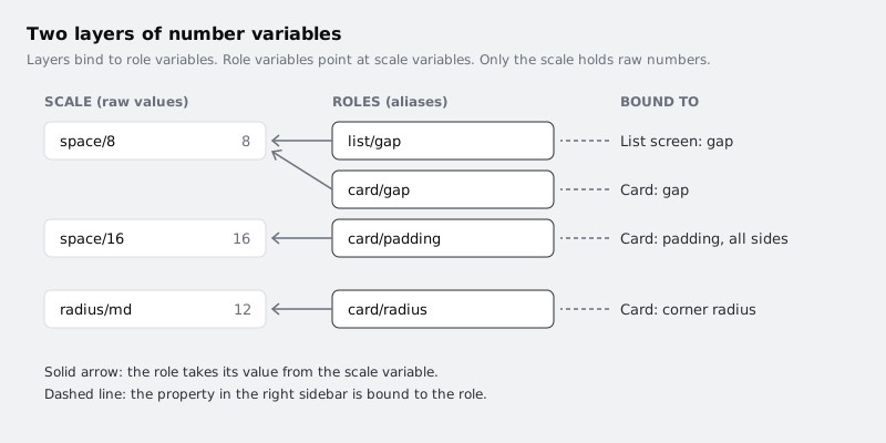
Add a third group called card, and a fourth called list. Create these number variables, and instead of typing a value, open the value field and pick an existing variable from the list it offers. That makes the new variable an alias:
card/paddingpoints atspace/16card/gappoints atspace/8card/radiuspoints atradius/mdlist/gappoints atspace/8
An alias shows the name of the variable it points to in place of a number. Both card/gap and list/gap point at 8 today, and that is the point: they can go separate ways later without touching any layer.
Check it worked
The value column for each card and list variable shows a variable name (for example space/16), not a number. Hover over or select an alias and Figma resolves it to the number it currently stands for.
Step 4 · Scope the variables to the right fields
By default a number variable is offered in every numeric field in the right sidebar, from opacity to font size. With a dozen variables that list gets long, and it invites mistakes such as a font size of space/12. Scoping limits where each variable appears.
In the variables table, select the five space variables plus card/padding, card/gap and list/gap, and open their settings with the edit control. Under scoping, every variable starts with All supported properties checked; uncheck that first, then check only Gap, which covers auto layout gap and padding. Then select the three radius variables and card/radius, uncheck All supported properties, and check only Corner radius.
Scoping only changes where a variable is offered. It does not change values, and it does not unbind anything already applied.
Check it worked
Select a text layer and open the font size field's variable picker: none of your Dimensions variables appear. Select the Card component and open the corner radius picker: only the radius group and card/radius appear, with no space variables in the list.
Step 5 · Bind gap and padding on the card
Select the Card component. In the Layout section of the right sidebar, hover over the gap field and click the variable icon that appears beside it. Pick card/gap. The field now shows the variable name as a pill instead of 10.
Do the same for padding. If your padding is shown as one value for all sides, bind it to card/padding. If it is split into horizontal and vertical (or four sides), bind each one to card/padding. Every side you leave unbound stays at the old 14, which is a common reason a card looks slightly off later.
Then select the List screen and bind its gap to list/gap.
Because the four cards on the list screen are instances of Card, they pick up the bindings from the main component. You do not bind anything on the instances.
Check it worked
Select the Card component: the gap field shows card/gap and every padding field shows card/padding, with no plain 10 or 14 left. Select any Card instance on the list screen: the same pills appear. Select the List screen: its gap shows list/gap, and the cards now sit 8 apart.
Step 6 · Bind the corner radius
With the Card component selected, hover over the corner radius field in the right sidebar, click the variable icon and pick card/radius. The card's corners change from 10 to 12.
If you have opened the independent corners control and set each corner separately, bind each corner to the same variable, or switch back to a single radius first. A card with three bound corners and one corner still at 10 is hard to spot by eye.
Optionally, round the List screen frame too, but bind it to radius/lg directly. A screen-level radius is not a card decision, so it should not follow card/radius.
Check it worked
The corner radius field on the Card component shows a card/radius pill. Zoom in to 400 per cent on a corner of one instance on the list screen: it has the 12 radius, the same as the component.
Step 7 · Change values and watch the screen follow
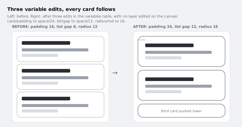
Open the variables table and make three edits, one at a time, looking at the list screen after each:
- Change what
card/paddingpoints at, fromspace/16tospace/24. Every card on the list screen grows by 16 pixels in height and its content moves 8 pixels in from each edge. - Change
list/gapfromspace/8tospace/12. The cards spread apart.card/gapstill points atspace/8, so the space between lines of text inside each card stays the same. - Change the value of
radius/mdfrom 12 to 16. Every card's corners grow, becausecard/radiuspoints atradius/md.
The first two edits changed which scale step a role uses. The third changed the scale itself. Both kinds are useful, but scale edits reach further, so make them deliberately.
Check it worked
Without selecting or editing any layer on the canvas, the list screen now shows taller cards, wider gaps between them and rounder corners. Select a card instance: its padding field still shows the card/padding pill, now resolving to 24.
Step 8 · Find and fix values that escaped the system
A layer with a raw number does not change when the variables do, so anything you missed shows up as the odd one out after an edit like the last step. Look for it on purpose.
Duplicate the list screen and, on the copy, select a single Card instance and type 14 directly into its padding field. That detaches the variable for that field on that instance only. Now point card/padding at space/16 in the variables table: every card on the copy shrinks back except that one, which keeps its 14. Point card/padding back at space/24. Revert the override (right-click the instance and reset the override, or undo), and the pill comes back.
For a final pass on the real screen, click through the Card component, the List screen and one instance, and read the Layout and corner radius fields. Every value should be a pill, not a number. If a teammate's file has many raw values, rebinding them one field at a time like this is the honest fix; changing the numbers to match does not connect them.
Finally, rename card/padding to card/inset in the variables table. The pills on the canvas update to the new name, because layers are bound to the variable itself, not to its name. Rename it back if you prefer the original.
Delete the duplicate list screen.
Check it worked
On the original list screen, every gap, padding and corner radius field on the Card component, its instances and the List screen shows a variable pill. The duplicate screen is gone, so no instance on the page carries a typed padding override.
Next steps
You now have a card and a list screen whose spacing and corners are controlled from the variables table, with role variables between your layers and the scale.
- Create colour variables with light and dark modes applies the same collection and binding workflow to colour, and adds modes.
- Build a responsive card with auto layout explains the hug, fill and fixed sizing that these variables sit on top of.
- Prototype a booking form with variables and conditional logic uses variables to hold state in a prototype rather than to style it.
Part of these paths
Related tutorials
- Create colour variables with light and dark modesYou will have a Figma screen whose every colour comes from variables, so switching one setting on the frame turns it from light to dark and back.
- Build a responsive card with auto layoutYou will have an appointment card in Figma, with a photo, a stack of text and a button, that keeps its layout at any width from 280 to 600 pixels because every layer has the right hug, fill or fixed setting.
Need this done for you?
Padding does this work for growing companies, from the first diagnosis to a system that keeps working.
Get new tutorials