Figma and design tools · Beginner · 13 min
Keep layers in place with constraints when a frame resizes
By Padding · Updated 18 Nov 2026
Figma (web) · November 2026
You will have a phone screen in Figma whose header and bottom bar hold together when you resize it from 320 pixels wide to tablet width, and you will know when constraints apply and when auto layout takes over.
On this page
A screen you design at one width rarely stays at that width. Developers will build it for phones from 320 pixels wide upwards, and someone will ask what it looks like on a tablet. Constraints are Figma's rules for what a layer does when its parent frame changes size: keep its distance from an edge, stay centred, stretch, or scale along with the frame.
In this tutorial you build a plain Inbox screen with a header and a bottom bar, set constraints on each part, and resize the frame to watch the result. You also see where constraints stop applying: inside auto layout frames, which have their own resizing rules. The file you end with is a small test bed you can return to whenever a layout misbehaves on resize.
Constraints only describe how layers react to a resize. They do not reflow content, wrap text into new lines of cards or add columns. When you need that, auto layout is the better tool, and the last step shows how the two fit together.
Step 1 · Build a screen with no constraints set
Create a new page in your file and call it Constraints practice. Select the Frame tool (press F), choose a custom size or draw a frame, then set it to 360 wide and 720 tall in the right sidebar. Rename it Inbox.
Inside the frame, build three parts. Draw each layer on top of the frame, so it lands inside it in the Layers panel.
- Header: with the Frame tool, draw a frame 360 wide and 56 tall at the top of Inbox, rename it Header and give it a dark grey fill in the right sidebar. Inside Header, add a 24 by 24 square near the left edge (the back icon), a text layer reading Inbox in the middle, and a 24 by 24 square near the right edge (the menu icon).
- Message cards: three rectangles 328 wide and 72 tall, with 16 pixels of space on the left and right, stacked under the header.
- Bottom bar: draw another frame 360 wide and 64 tall along the bottom of Inbox, rename it Bottom bar and give it a light grey fill. Inside it, add four 24 by 24 squares spaced evenly across it.
The frames' own fills are the backgrounds, so there is no separate background rectangle to keep in step later. Use frames, not groups: Figma cannot set constraints on a group itself, and passes any you set on to the layers inside, so the header would not behave as one unit.
Check it worked
The Layers panel shows Inbox with five children: Header (a dark frame with three layers), three card rectangles, and Bottom bar (a light grey frame with four squares). Nothing sits outside Inbox. Select any layer and look in the Position section of the right sidebar: its constraints read Left and Top, which is Figma's default.
Step 2 · Resize the frame and see the default
Select the Inbox frame and drag its right edge out until the W field reads about 768. Then drag the bottom edge down to about 1000.
Every layer keeps its distance from the left and top of the frame and keeps its own size. The header covers less than half of the width, the menu icon is stranded in the middle, the cards do not grow, and the bottom bar floats in the middle of the screen instead of at the bottom. This is the problem constraints solve.
Press Ctrl + Z (Command + Z) twice to undo both resizes, or type 360 into W and 720 into H, so the frame is back to 360 by 720.
Check it worked
Before undoing, you saw the header, cards and bottom bar all fixed in the top-left area of a much larger frame. After undoing, the frame is 360 by 720 again and the layers fit it exactly as you drew them.
Step 3 · Learn what the five options do
Select one of the message cards and find the Constraints controls in the Position section of the right sidebar. You can choose from two dropdowns, one horizontal and one vertical, or click the lines of the small square diagram next to them. Shift-click two lines of the diagram to pin both sides at once.
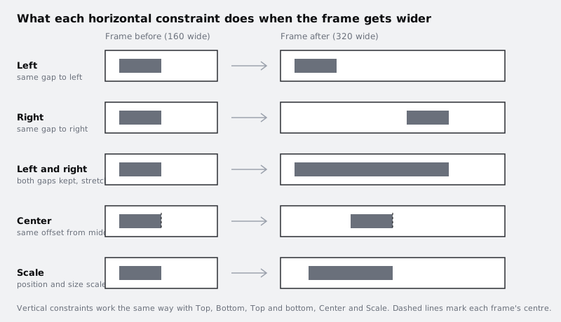
The horizontal options:
- Left: the gap between the layer and the frame's left edge stays fixed. The layer keeps its width.
- Right: the gap to the right edge stays fixed. The layer moves when the frame gets wider.
- Left and right: both gaps stay fixed, so the layer stretches or shrinks with the frame.
- Center: the layer keeps its offset from the frame's horizontal middle and keeps its width.
- Scale: the layer's position and width are kept as proportions of the frame, so a layer that fills a quarter of the frame still fills a quarter after the resize.
The vertical set is the same, with Top, Bottom, Top and bottom, Center and Scale.
Check it worked
With a card selected, you can point to the horizontal dropdown, the vertical dropdown and the diagram in the right sidebar, and both dropdowns currently read Left and Top. Without looking back, you can say which option a full-width header background needs (Left and right) and which one a menu icon pinned to the right needs (Right).
Step 4 · Set constraints on the header
Work from the outside in. A layer's constraints always measure against its parent frame, so the Header frame follows Inbox, and the layers inside Header follow Header.
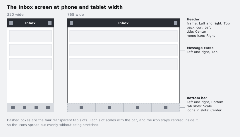
- Select the Header frame. Set horizontal to Left and right and vertical to Top. It now stretches across the width and stays at the top, and its dark fill stretches with it.
- Select the back icon. Leave it at Left.
- Select the Inbox text. Set horizontal to Center.
- Select the menu icon. Set horizontal to Right.
Drag the right edge of Inbox out to about 768 and watch the header, then undo.
Check it worked
During the resize, the dark background spans the full width, the back icon stays near the left edge, Inbox stays in the middle and the menu icon stays the same distance from the right edge as it was at 360. If the menu icon drifts towards the middle, it is still set to Left; if the dark background stops short, the Header frame is still set to Left.
Step 5 · Set constraints on the cards and the bottom bar
Select all three cards and set horizontal to Left and right. Leave vertical at Top. The cards now keep 16 pixels of space on each side at any width.
Select the Bottom bar frame. Set horizontal to Left and right and vertical to Bottom. It now stretches across, its light grey fill with it, and sticks to the bottom edge when the screen gets taller.
The four icons in the bar need more thought. Left keeps them bunched on the left. Center keeps them bunched in the middle. Scale spreads them out, but also stretches each icon wider, which distorts it. The fix is a slot for each icon:
- Draw a frame 90 wide and 64 tall over the first icon, so the icon sits in its middle. Remove its fill so it is invisible. Repeat for the other three icons, so four slots cover the bar edge to edge.
- Drag each icon into its slot in the Layers panel, and name the slots Tab 1 to Tab 4.
- Select the four slots and set horizontal to Scale.
- Select the four icons and set horizontal to Center and vertical to Center.
Each slot now takes a quarter of the bar at any width, and each icon stays centred in its slot at its own size.
Check it worked
Drag the right edge of Inbox out to 768: the cards stretch with 16 pixels of space on each side, the light grey bar spans the full width, and the four icons spread across it, still 24 by 24. Drag the bottom edge down to 1000: the bottom bar moves down with it and the header and cards stay at the top. Undo back to 360 by 720.
Step 6 · Test the screen at phone and tablet sizes
Resize Inbox through the widths you care about, typing values into W and H in the right sidebar or dragging edges:
- 320 by 640, a small phone
- 360 by 720, where you started
- 430 by 930, a large phone
- 768 by 1024, a tablet in portrait
At each size, look for overlaps and gaps. At 320, check that the Inbox title still clears both icons. At 768, check that the cards are not uncomfortably wide to read; constraints cannot add a second column, so that is a sign the tablet layout needs its own frame.
To move or resize the frame without applying constraints, for example to fix a size you drew wrongly, hold Command (Mac) or Ctrl (Windows) while you drag. The layers then stay where they are.
If you want to keep the results, duplicate Inbox (Ctrl + D or Command + D) for each size and set each copy to one of the sizes above, so you have the screen side by side at four widths.
Check it worked
At all four sizes, the header spans the frame with the icons at its edges and the title centred, the cards keep equal side margins, and the bottom bar sits on the bottom edge with its four icons evenly spaced and unstretched. Holding Command or Ctrl while dragging an edge leaves every layer where it was.
Step 7 · See where auto layout takes over
Constraints apply to layers inside a regular frame. Inside an auto layout frame, the frame arranges its children in a row or column itself, so constraints cannot be set on them. They get resizing options instead: Fixed, Hug contents or Fill container.
Try it on a duplicate so your working screen stays intact. Duplicate Inbox, select the duplicate's Bottom bar and press Shift + A to add auto layout. The bar holds only the four slots, so Figma removes their constraints and arranges them in a row. Select one of the slots: the Constraints controls are gone from its Position section, and its width now shows a resizing option. Set all four slots to Fill container, and they share the bar's width again, this time by auto layout rules.
Now select the Bottom bar frame itself. It still has its Left and right, Bottom constraints, because its parent, the duplicate Inbox frame, is a regular frame.
Finally, add a notification badge. Draw a small circle near the top right of the last slot. It lands inside that slot, which is a regular frame, so it has ordinary constraints and no auto layout options. In the Layers panel, drag the circle out of the slot and drop it directly inside Bottom bar. Auto layout now treats it as a fifth item in the row. With the circle selected, choose Ignore auto layout in the right sidebar: it leaves the flow and the slots close up again. Its Constraints controls come back; set horizontal to Right and vertical to Top, then move it to the bar's top right corner.
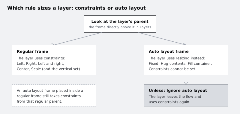
The rule of thumb: use constraints for a few layers pinned to the edges of a fixed screen, such as headers, bars and floating buttons. Use auto layout when content has to flow, such as lists, rows of buttons and cards that grow with their text. Most real screens mix both: an auto layout list inside a regular frame, pinned with constraints.
Check it worked
In the duplicate, a slot inside the auto layout Bottom bar shows resizing options and no constraints, the Bottom bar frame itself still shows Left and right and Bottom, and the badge, a direct child of Bottom bar set to Ignore auto layout, shows Right and Top constraints. Widen the duplicate Inbox and the badge stays the same distance from the bar's right edge. Your original Inbox frame is unchanged and still passes the resize test from the previous step.
Next steps
You have a screen that survives a resize and a clear sense of which rule sizes each layer. Next, put auto layout to work where content needs to flow, then tidy the file that holds your screens:
Part of these paths
Related tutorials
- Build a responsive card with auto layoutYou will have an appointment card in Figma, with a photo, a stack of text and a button, that keeps its layout at any width from 280 to 600 pixels because every layer has the right hug, fill or fixed setting.
- Make layouts wrap and stretch with auto layout min and max sizesYou will have one Figma frame for a time-slot picker that reflows from a 360 wide phone layout to a desktop layout by itself, using wrap, minimum and maximum widths and the grid flow, with no separate frame for each size.
- Organise a Figma file with pages, frames and layersYou will have a Figma file for the Larkfield Clinic booking app with a cover, a page for each stage of work, named mobile and desktop frames for all six screens, and sections that group them.
Need this done for you?
Padding does this work for growing companies, from the first diagnosis to a system that keeps working.
Get new tutorials