UI and visual design · Advanced · 18 min
Keep a design system in sync with code
By Padding · Updated 18 Nov 2026
Figma (web) and the app's code repository · November 2026
You will have a versioned Larkfield design system with a change log, its tokens exported from Figma into the code repository, an approval rule for new tokens and components, one real change shipped through all of it, and a monthly drift checklist.
On this page
At the end of part 7 the Larkfield system was in good shape: one palette, one type scale, one spacing scale, ten specified components and a style guide someone else could build from. That is the state it is in today. Within a few months it will not be, unless someone looks after it.
Systems drift in small, reasonable steps. A developer needs a pale amber for a hint and types a hex code into the stylesheet because the token does not exist yet. A designer adds a close button to a banner in one file and never publishes it. Each step is sensible on its own day. Six months later the Figma file and the app disagree on a dozen details, nobody knows which one is right, and the system has stopped saving anyone time.
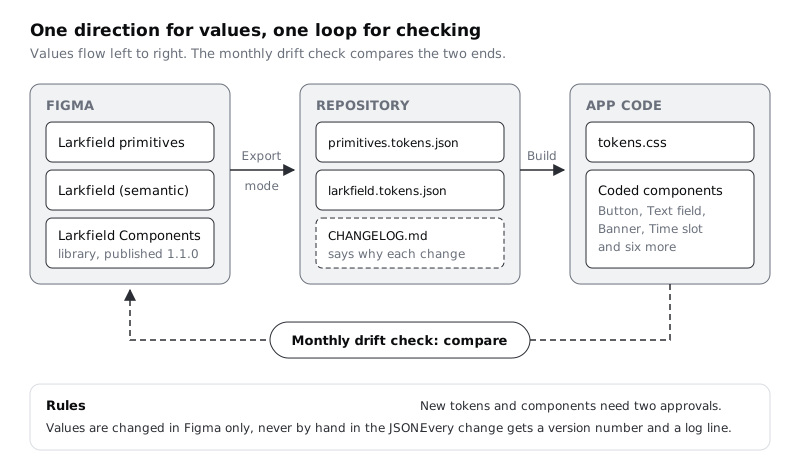
This last part of the series sets up four habits that stop that drift: a version number and change log, token values that travel from Figma to the code repository in one direction only, a rule for who approves a new token or component, and a monthly check that compares the two sides. Then you push one real change through all four, so you know the loop works before you rely on it.
You do not write any code here. The build that turns the token file into CSS lives in the frontend tutorials linked at the end; this part covers the designer's half and the agreements between the two halves.
Step 1 · Give the system a version number
A version number lets two people say which system they mean. "The banner from 1.1.0" ends an argument that "the new banner" starts.
Use the three-part numbers from Semantic Versioning: MAJOR.MINOR.PATCH. The scheme was written for software libraries, so decide what each part means for a design system and write it down. Larkfield's rule:
- Major (2.0.0): something people rely on stops working. A token or component is renamed or removed, a variant property changes name, or a component's behaviour changes so that existing screens need rework.
- Minor (1.1.0): something new is added and nothing existing breaks. A new token, a new variant, a new component.
- Patch (1.0.1): a fix that changes no names. A value corrected to what the spec already said, a missing focus ring drawn, a typo in a component description.
Call the state at the end of part 7 1.0.0. Then mark it in Figma so you can always get back to it. In the Larkfield file that holds your variables and components (published as the Larkfield Components library; use your own file and library name if they differ), open the file menu and choose Save to Version History. Title it 1.0.0; Figma clips titles after 25 characters, so keep the number first. In the description, write one line under 140 characters, such as First release: palette, type, spacing, 10 components, style guide.
Add the version to the style guide page from part 7 as well, at the top, next to the title: Larkfield design system 1.0.0. People read the guide more often than they open version history.
Check it worked
Open version history in the library file. A named version called 1.0.0 sits in the list with your description under it. The style guide page shows 1.0.0 next to its title. Your written rule has three bullets, and a teammate can sort these three changes without asking you: renaming colour/canvas to colour/background (major), adding a Badge component (minor), fixing a slot whose corner radius was 6 instead of radius/m (patch).
Step 2 · Start the change log in the repository
The version number says that something changed. The change log says what and why, in words a developer and a designer can both read.
Keep it in the code repository, next to the tokens, not only in Figma. Developers already review everything that lands there, and a file in the repository is versioned along with the code that uses it. Agree a folder with your developer. Larkfield uses design-system/ at the root of the app's repository:
design-system/
  CHANGELOG.md
  tokens/
    primitives.tokens.json
    larkfield.tokens.json
If your developers already keep token files somewhere (the Style Dictionary tutorial uses its own folder), use their path and put the change log beside it.
Write CHANGELOG.md in the layout from Keep a Changelog: the newest version at the top, an Unreleased section above it for changes that are agreed but not released, and entries grouped under Added, Changed, Deprecated, Removed and Fixed. Start it with the 1.0.0 release:
# Larkfield design system change log

Versions follow the rule on the style guide page: major breaks names or
behaviour, minor adds, patch fixes without renaming.

## Unreleased

## 1.0.0 - 2026-11-18

### Added
- Colour ramps for teal, grey, red and amber; 16 semantic colour tokens.
- Type scale with six text styles, display to label.
- Spacing scale (4 to 48), three radius tokens, two border widths.
- Ten components with spec cards: button, text field, select, checkbox and
  radio, list row, card, banner, header, tab bar, time slot.
Write entries for people, not for machines. "Added colour/notice-border so notice banners keep a visible edge on grey screens" helps the reader. "Updated tokens" does not.
Ask your developer to add the file in the usual way your team adds changes, which is usually a pull request they or you open and the other reviews.
Check it worked
The repository has design-system/CHANGELOG.md (or your agreed path) with an empty Unreleased section and a 1.0.0 section dated the same day as the named version in Figma. Open both side by side: the version numbers match.
Step 3 · Export the tokens from Figma into the repository
Now the values. The rule that keeps them in sync is short: values are changed in Figma, then exported; nobody edits the token files by hand. One source, one direction. If a developer needs a value that does not exist, they ask for a token rather than adding one in the file, and the approval rule in the next step decides.
Figma can write a variable collection's values to a JSON file. Open the variables window, find the Larkfield primitives collection, right-click its mode column and choose Export mode. Do the same for the Larkfield collection. If a collection has more than one mode, for example light and dark from the dark-mode tutorial, right-click the collection itself and choose Export modes to get every mode.
Save the files as primitives.tokens.json and larkfield.tokens.json in the tokens/ folder. Figma's import side follows the Design Tokens Community Group format, where each token is an object with a $value and usually a $type. Open the exported files in any text editor and look before you hand them over:
- Find
tealin the primitives file and the700step under it. Its value is the teal #0F5E5A in some colour notation. - Find
accentundercolourin the semantic file. Check how the alias came out. Figma does not document the exported shape for aliases, so look: a reference to the primitive (in curly braces, or in an$extensionsblock naming the primitive) means the two layers survived. A bare colour value with no reference means the file holds resolved values only. - Search for a spacing token such as
munderspace(space/m) and note whether it carries apxunit.
Write what you found in a short design-system/README.md or tell your developer directly. The build step needs to know whether it receives references or flat values, and whether units are included. It is far cheaper to learn that now than in the middle of a release.
If your plan cannot export variables, a community plugin that writes Design Tokens Community Group JSON does the same job. Pick one, write its name in the README, and use only that one, because two exporters will format the same tokens differently and every export will look like a change.
Check it worked
Two JSON files sit in design-system/tokens/. You found teal 700 with the value #0F5E5A, you know how colour/accent refers to it, and your README or message to the developer says which exporter you used and how aliases and units appear. Export once more without changing anything in Figma and compare the new files with the saved ones: they are identical. If they are not, the exporter is not stable and the drift check will be noisy; settle that now.
Step 4 · Write the rule for new tokens and components
Most drift starts as a reasonable request with nowhere to go. Give requests a place and a decision-maker, and keep it light enough that people use it rather than going round it.
Add a section called Changing the system to the style guide page, and the same text to the README in the repository. Larkfield's version:
- Anyone can propose. Write the proposal as a comment on the style guide page or an issue in the repository: what you need, which screen needs it, and what you tried with the existing tokens and components.
- Two people approve. The design lead and the front-end lead both say yes. One person alone cannot add to the system, which stops one side running ahead of the other. In a team of two, that is everyone; the rule still stops either of you adding things silently.
- A new token needs a job. It must be named by the naming rule from part 2 and point at a primitive. A new primitive is allowed only if no existing step will do; for colour, it comes from the ramps in part 3, never a hand-picked hex code.
- A new component needs a spec card. It uses only existing tokens, and has the anatomy, states and minimum touch size from part 6. It should be needed on at least two screens; a one-off stays a one-off in the screen file.
- Nothing is published until it is in the change log under
Unreleased, with its version type (major, minor or patch).
Name the two approvers by role and by person on the page, and say what happens when one is away: Larkfield's rule is "the other approver may approve a patch alone; minor and major changes wait".
Check it worked
The style guide page and the repository README both hold the same five-point rule and the names of both approvers. Test it on a real request: a developer has asked for "a grey that's a bit darker for the footer". Under the rule, the answer is either an existing token (colour/text-muted) or a proposal for a new semantic token pointing at an existing grey step, approved by both leads. It is never a new hex code in the stylesheet.
Step 5 · Push one real change through the loop
A process you have not used is a guess. Make a real change from proposal to release and note where it sticks.
Larkfield's change came from testing the Pick a time screen on a cheap Android phone outdoors. The "10:30 was just taken" notice banner has a colour/notice-tint fill, #FFF3E5, on a colour/canvas screen background, #F3F5F8. The two are about 1.0:1, so the banner has no visible edge: the text and clock icon float on the screen. On a dim, low-cost screen in daylight, which is how many patients book, the banner reads as ordinary text and people miss it. In many markets across Africa and elsewhere, mid-range and low-end Android phones are most of what your users carry, so test there before you call a colour finished.
Propose. The designer writes: "Notice banners need a visible edge on canvas and on white. Proposal: a new semantic token colour/notice-border pointing at the existing primitive amber/500 (#AA782F), used as a 1 px border on the Notice variant of Banner." #AA782F is 3.54:1 against the canvas, 3.86:1 against white and 3.53:1 against the tint, so the edge clears 3:1 wherever the banner sits, which matches the non-text contrast threshold. The banner was not failing that rule before, since the icon and words already carry the meaning; the border is about being noticed, and the proposal says so.
Approve. Both leads agree. It adds a token and changes no name, so it is a minor change: 1.1.0.
Log it before you publish. Add the entry under Unreleased:
## Unreleased

### Added
- `colour/notice-border` (points at `amber/500`, #AA782F). Notice banners
  now have a 1 px border so they stay visible on canvas and white.

### Changed
- `Banner` Notice variant: 1 px border in `colour/notice-border`
  (`border/thin`). Success and Danger variants unchanged.
Make it in Figma. In the Larkfield collection, add a colour variable colour/notice-border, alias it to amber/500 and scope it to stroke. On the Banner component, select the Notice variant, add a 1 px stroke inside, and bind its colour to colour/notice-border and its width to border/thin. Check the other two variants are untouched.
Release. Move the two entries from Unreleased into a new ## 1.1.0 - <date> section. Publish the library with the description 1.1.0: notice banners get a border (colour/notice-border). See CHANGELOG.md. Save a named version 1.1.0 in version history and update the number on the style guide page. Files that use the library are offered the update; they do not receive it until someone accepts it there.
Check it worked
On the Banner component, the Notice variant has a 1 px stroke bound to colour/notice-border and border/thin, and Success and Danger have none. Place a Notice banner on the canvas background and on a white card: you can see its edge on both. The change log has a dated 1.1.0 section with an Added and a Changed entry, and Unreleased is empty again. Version history shows 1.1.0 above 1.0.0, and the style guide page says 1.1.0.
Step 6 · Update the token file and hand the change to code
Export the Larkfield collection again, the same way as before, and replace larkfield.tokens.json. The primitives file does not change, because amber/500 already existed. Re-export it anyway and keep it if it is identical; that is the proof nothing else moved.
Open the change for review with your developer, with the change log and the new token file together. Before they read the code side, read the token file's difference yourself. You should see one token added, notice-border under colour, and nothing else. If other lines changed, someone edited a variable without going through the rule. Stop and find out who and why before you release; that is the drift the whole process is there to catch.
Your developer then runs the token build to regenerate the CSS (or other platform files) and adds the border to the coded Notice banner, using the new token, never the hex code. How they do that depends on the stack; the frontend tutorials linked below cover a build from a JSON file to CSS custom properties. When their change is merged, the code side is at 1.1.0 too. Agree that the release in the repository is labelled with the same number, so 1.1.0 means the same thing in both places.
Check it worked
The difference in larkfield.tokens.json shows exactly one added token, and the primitives file shows no change. On the test or live build of the app, open Pick a time with a time already taken: the notice banner has an amber edge, and your browser's developer tools show its border colour coming from a token such as --colour-notice-border, not a typed hex code. The repository and the Figma library both say 1.1.0.
Step 7 · Set up the monthly drift check
The rules prevent most drift. A regular check catches the rest before it piles up. Book 45 minutes on the first Monday of each month, with one designer and one developer, in a recurring calendar event both of you own.
Write the checklist once, on the style guide page under Changing the system, and work through it in order each month:
- Tokens. Export both collections and compare them with the files in the repository. The difference should be empty. Any change is either an unlogged Figma edit or a hand edit to the file.
- Hard-coded values. Ask the developer to search the app's styles for raw colour codes and pixel values that should be tokens. Each one found is a token request or a fix.
- Components. For each of the ten components, put the Figma component set next to the coded component in a browser. Read across the state matrix from part 6: every state drawn in Figma exists in code, and every state in code is drawn in Figma. Check names, tokens and minimum touch size.
- On a phone. Open two or three screens of the app on the cheapest Android phone the team owns, on mobile data, and look at the components there. Contrast and borders that are fine on a designer's monitor fail first on these screens.
- Versions. The style guide, version history, change log and repository release all show the same number.
Record what you find in a drift log on the style guide page: what you checked, what Figma shows, what the code shows, the decision, and who owns the fix. A difference is not automatically a code bug. Sometimes code is right and Figma is out of date. The decision column says which side changes, and every fix goes through the rule and the change log like any other change.
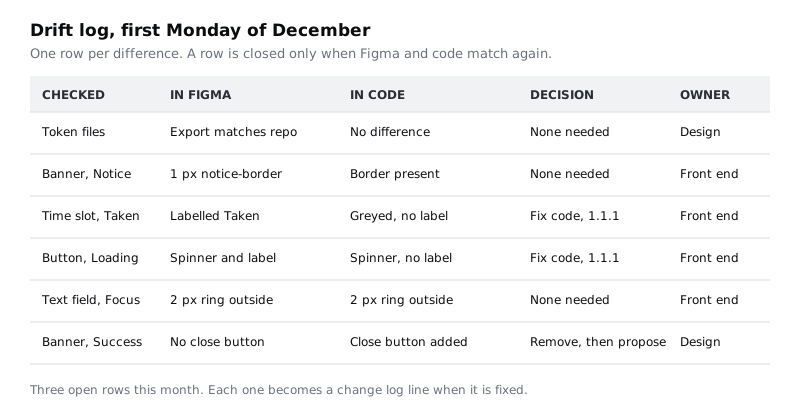
The example log shows the three kinds of finding you will meet. Two are code that fell behind the spec (patch fixes, 1.1.1). One is a feature someone added in code without asking: a close button on the Success banner. The rule says that is removed and proposed properly; it may well be approved as 1.2.0, but through the front door.
Check it worked
A recurring event for the first Monday of each month is in two calendars. The style guide page holds the five-point checklist and an empty drift log table with the five columns. Run the check once now, today, while 1.1.0 is fresh. The token difference is empty, all ten components have a row or a tick, and any open row has an owner and a version it will land in.
Next steps
This is the end of the series. You have a small system with a version, a log, one source for its values and a habit that keeps the two sides honest. Keep the system small: the drift check gets longer with every component, so add one only when two screens need it.
- Generate CSS from a token file with Style Dictionary is the developer's side of the export: it turns the token JSON into CSS and a JavaScript module with one command.
- Turn design tokens into CSS custom properties shows the same two token layers in a stylesheet, so you know what the coded banner's border should refer to.
- Publish a team library and push updates to other files covers the Figma half of a release in detail, including how other files review and accept 1.1.0.
- If you are starting here, Document a design system as a one-page style guide builds the page that this part adds the version, the rule and the drift log to.
Part of these paths
Related tutorials
- Document a design system as a one-page style guideYou will have a one-page Larkfield style guide in Figma, with principles, colour, type, spacing, ten components and error-message rules, tested by someone who built the Booked screen from it without asking you a question.
- Publish a team library and push updates to other filesYou will have the Larkfield Clinic components in their own library file, used by the booking app file, with one published change reviewed and accepted on the other side.
- Generate CSS from a token file with Style DictionaryYou will have the Larkfield Clinic design tokens in JSON files, a Style Dictionary build that turns them into CSS custom properties and a JavaScript module with one npm script, and a build that fails loudly when a token reference is broken, so it can run in CI.
Need this done for you?
Padding does this work for growing companies, from the first diagnosis to a system that keeps working.
Get new tutorials