UI and visual design · Intermediate · 19 min
Document a design system as a one-page style guide
By Padding · Updated 18 Nov 2026
Figma (web) · November 2026
You will have a one-page Larkfield style guide in Figma, with principles, colour, type, spacing, ten components and error-message rules, tested by someone who built the Booked screen from it without asking you a question.
On this page
By now the Larkfield system exists: sixteen semantic colour tokens pointing at tonal ramps (fourteen from part 3, including colour/accent-pressed, plus colour/focus and colour/accent-hover from part 6), six type roles, a spacing scale, three radii and ten components with spec cards. None of that helps the next person unless they can find it, read it in ten minutes and use it to make a decision. Most style guides fail at this point in one of two ways. They are empty (a page of swatches with no rules), or they are a wiki nobody finishes reading.
This part takes the narrow route. You write one Figma page that holds only what changes a decision: which colour to use for what, which type role a line of text gets, which gap goes where, how each component should and should not be used, and how to word an error. Everything else (history, rationale essays, definitions of "design token") stays out or sits behind a link.
Then you test it the only way that counts. You give the page to someone who has never touched the file, ask them to build the Booked screen from it, and watch where they get stuck. Every question they ask you is a gap in the guide.
This is part 7 of 8. Part 8 adds version numbers, a change log and the code side, so leave room for those rather than solving them here.
Step 1 · Set up one page with six sections
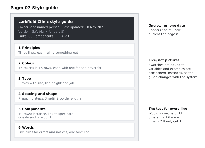
Add a page called 07 Style guide to the Larkfield file. Keep it in the same file as the components so that every swatch and example on it is a live instance or a layer bound to a variable, not a picture. When a token changes in part 8, the guide changes with it.
Draw one frame 1200 px wide and let it grow downwards. Inside it, add a header block and six sections, top to bottom:
- Principles: three lines.
- Colour: the semantic tokens with when-to-use rules.
- Type: the six roles.
- Spacing and shape: the spacing steps, radii and border widths.
- Components: the ten components, each with one do and one don't.
- Words: voice-and-tone rules for errors and notices.
The header block holds four lines: Larkfield Clinic style guide, an owner (a name, not a team), the date you last changed it, and links to the 06 Components page and the 11 Audit page. Leave a blank line under the date: part 8 puts a version number there.
Before you write anything, put this test in a text layer at the top of your own working notes, not on the guide: "Would a person build something differently if this line were missing?" If the answer is no, the line does not go on the page.
Check it worked
The file has a 07 Style guide page with one frame holding a header and six sections with the names above. The header names one person as owner, has today's date, and its two links jump to the 06 Components and 11 Audit pages when you click them in view mode.
Step 2 · Write three principles that settle arguments
A principle is useful only if it decides between two reasonable options. "Be user-friendly" never has. Look at the decisions you made in parts 1 to 6 and find the three that came up again and again. For Larkfield they are:
- Calm, then clear. One accent colour, one primary button per screen. If two things compete for attention, the one that is not the next action loses weight.
- Never colour alone. Every state that colour shows (selected, error, notice, booked) also shows an icon or words. A patient reading a phone in sunlight, or one who cannot tell red from green, must still know what happened.
- Built for a cheap phone on slow data. Text wraps rather than truncates, touch targets are at least 44 px, and no screen carries an image or icon style it does not need. Many Larkfield patients use low-end Android phones on prepaid data, so a heavier screen is not a matter of taste.
Write each as a bold phrase of four words or fewer, followed by one sentence that says what it rules out. Three is the limit. A fourth principle usually repeats one of the first three in different words.
Check it worked
The Principles section has exactly three entries. For each one, you can point to a real decision from earlier in the series that it would have settled: the tick on the selected time slot for "never colour alone", the wrapping duration line at 200% text size for "built for a cheap phone".
Step 3 · Document colour, type and spacing as when-to-use rules
The values already live in variables and text styles. The guide adds the one thing those panels cannot hold: when to use each value and when not to.
Colour. Make one row per semantic token. On the left, a 40 by 40 swatch whose fill is bound to the token, so it updates when the token does. Then the token name, the primitive it points at, a "Use for" column and a "Never for" column. Leave primitives out of the table: nobody designing a screen should reach for teal/700 directly. A few of the Larkfield rows:
colour/accent(teal/700, #0F5E5A). Use for: the primary button, the selected time slot, links. Never for: headings or decoration.colour/text-muted(grey/600, #656970). Use for: durations, hints, secondary lines. Never for: anything a patient must read to finish the booking, such as an error.colour/line(grey/200, #CFD5DC). Use for: dividers between list rows. Never for: the edge of a field, button or slot. That iscolour/border, which reaches 3:1 against white andlinedoes not.colour/noticeandcolour/notice-tint(amber/600andamber/50). Use for: something changed that the patient did not do, such as a time being taken. Never for: errors the patient can fix. Those usedanger.
Three colour tokens serve states rather than resting screens: colour/accent-pressed from part 3, and colour/focus and colour/accent-hover from part 6. Give colour/focus its own row, with "Use for: the focus ring only. Never for: fills or text". Give colour/accent-hover and colour/accent-pressed one shared row, with "Use for: button hover and pressed states only. Never for: a resting colour on any component". That makes fifteen colour rows covering sixteen tokens.
Type. One row per role, with a sample line set in that role, its size and line height (copy them from your part 4 specimen) and its job. Use real Larkfield copy as the sample, not "The quick brown fox":
display:10:30. The appointment time on Booked, and nothing else. One per screen at most.heading-l:Check your booking. Screen titles.heading-m:Tue 9 Dec. Header titles, day headings, section headings.body:We'll text you a reminder the day before.Sentences people read.body-small:Nurse appointment · 15 min. Durations, hints and error lines.label:Book appointment. Buttons, time slots and field labels.
Under the table, write the rule part 4 tested: no text is truncated at 200% text size; it wraps.
Spacing and shape. Draw the seven spacing steps from part 5 (4, 8, 12, 16, 24, 32, 48) as bars, each with its token name and one sentence of use. Then add the rule that decides between them, in the order part 5 set: tightest inside a component, then between components, then between groups on a screen (space/l), then more above the main action (space/xl), with space/2xl kept for space around a lone message. A sentence such as "space/m (16): screen edges, and card and list row padding" saves more questions than the bar does. Do the same for the three radius tokens and the two border widths: say what gets each, so nobody uses a different radius on a banner again.
Check it worked
Change the value of colour/accent-tint in the variables panel to any other colour, look at the Colour section, then undo. The swatch changed with it. Every colour token has a row (hover and pressed share one, so fifteen rows cover sixteen tokens), and every type role, spacing step and radius has a row with a "use for" line, and every colour row also has a "never for" line. The type table uses Larkfield copy, not filler text.
Step 4 · Give each component one do and one don't from the audit
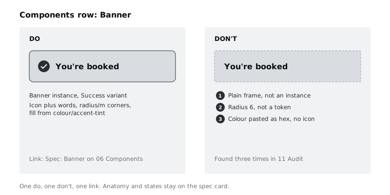
The spec cards on 06 Components already hold anatomy, variants, states and tokens. Do not copy them here. The guide gives each of the ten components one row: an instance of the component, a link to its spec card, and one do and one don't.
Take the don'ts from your 11 Audit page wherever you can. A don't that records a mistake your team really made is worth five invented ones, because it is the mistake most likely to happen again. Draw each pair as two small examples side by side, the do built from the real component and the don't built to show the mistake, each with a one-line caption.
For Larkfield:
- Banner. Do: use the
Bannercomponent with the Success, Notice or Danger variant. Don't: build a banner from a frame. The audit found three hand-built banners with a radius of 6 and no shared component. - Button. Do: one primary button per screen, labelled with what happens next ("Book appointment"). Don't: detach a button to change its label; the audit found one detached button that missed every later change.
- Time slot. Do: show the selected slot with the accent fill and the tick. Don't: show selection with colour alone.
- Text field. Do: put a format example in the hint under the field. Don't: use placeholder text; it failed contrast in part 4 of the earlier series and was removed.
- List row. Do: put the duration in
body-smallandtext-muted. Don't: add a third line in a new grey; the audit found the service descriptions in a raw #5B6371. - Header. Do: keep the back control at least 44 by 44 px. Don't: make the header sticky without checking that the focus ring on fields scrolled under it stays visible, as the spec card requires.
For the other four (select, checkbox and radio, card, tab bar), take a rule from their spec cards in part 6, such as "Card: do use it to group one appointment's facts; don't make the whole card tappable, put the action in a button or link inside it".
Check it worked
The Components section has ten rows. Each row holds a live instance (the instance icon shows in the layers panel), a link that opens the right spec card, and exactly one do and one don't. Every don't traces to a row on 11 Audit or to a rule on a spec card. For Larkfield, three come from the audit (Banner, Button, List row) and the rest from spec card rules.
Step 5 · Write voice and tone rules for errors and notices
Colour and components decide how an error looks. The words decide whether the patient can recover. Larkfield's error copy already follows a pattern from the earlier series; this step writes the pattern down so the next error message follows it too.
Write five rules, each with a Larkfield example:
- Say what happened, in the patient's terms. "10:30 was just taken." Not "Slot conflict".
- Say what to do next. "Enter a mobile number with 11 digits, such as 07700 900123." An example of the right format beats a description of the wrong one.
- Say what was kept. "We could not book this time. Your details are saved." People retry when they know they will not lose their work.
- Do not blame and do not use system words. No "invalid", "failed", "error code" or "you entered".
- Write so a translation survives. Short sentences, no idioms, no jokes, and no text baked into images. If Larkfield adds Yoruba, Hausa or French, each of these sentences should translate directly, and they will run longer: the
body-smallline under a field has to wrap, never cut off.
Add one line on tone: errors and notices are plain and calm, never cheerful. "Oops" does not belong on a medical booking app. The success message, "You're booked", is the one place for warmth, and it stays short.
Put an instance of the Text field in its error state and the Notice banner beside the rules, so the words appear inside the components they belong to. If you want the full method for rewriting a screen's copy, Write interface copy for labels, buttons and errors covers it; the guide only keeps the rules.
Check it worked
The Words section has five numbered rules, each with an example taken from a Larkfield screen, and one tone line. Read the three error and notice messages on your screens (Time gone, Errors, Could not book) against the rules: each one passes every rule that applies. If one does not, fix the screen, not the rule.
Step 6 · Share the guide where people will open it
A guide that lives behind three clicks will not be read. Make it one link.
Select the guide frame and copy a link to it, so the link opens the file at the guide rather than on whatever page was last open. In the Share dialog, set link access to "Anyone with the link" with "can view", so readers do not have to be invited one by one; if your organisation does not allow public links, invite each reader by email with view access instead. Send the link to the people who build Larkfield screens: designers, the developers and whoever writes the copy. Put the link where the team already looks: the project channel, the repository's README, the top of the ticket template.
If your Figma plan can publish libraries, publishing the components file means a designer in another file gets the same components through the library, and the guide stays the place that explains them. Publish and update a Figma team library walks through it. A library is not required for this part: a shared view link to one page is enough to run the test in the next step.
Some of your readers will open the link on a phone, and a large Figma file is heavy in a mobile browser on prepaid data. Export the guide frame as a PDF as well, check its size, and share it next to the link with the date in the file name (larkfield-style-guide-2026-11-18.pdf). Say in the header block that the Figma page is the current version and the PDF is a dated copy.
Check it worked
Ask a colleague who has only view access to open the link (or, if you set "Anyone with the link can view", open it yourself in a private browser window). It lands on the guide frame, and they can see but not edit it. The PDF opens on a phone and the type table is readable without zooming past the page width.
Step 7 · Test it by having someone build the Booked screen
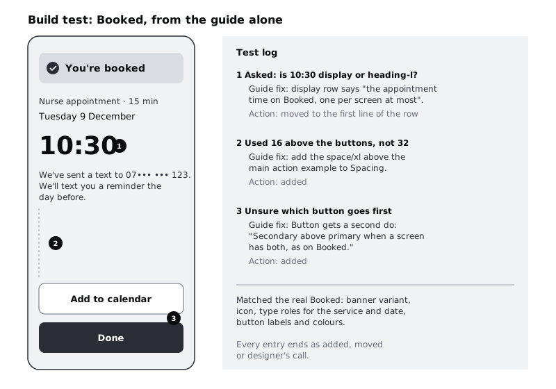
Ask your colleague to build the Booked screen in a new, empty frame on a scratch page, using only the style guide and the components. Do not show them the existing Booked frame. Give them the content and nothing else:
- The banner message:
You're booked - The booking:
Nurse appointment · 15 min,Tuesday 9 December,10:30 - The line:
We've sent a text to 07••• ••• 123. We'll text you a reminder the day before. - Two actions:
Add to calendarandDone
Sit with them, or join a call with their screen shared, and say nothing unless they are fully stuck for more than two minutes. Keep a log in a text layer next to their frame. Write every question they ask, every place they hesitate for more than a few seconds and every choice they make that differs from the real Booked screen. Ask them to think aloud; a hesitation they do not mention is still a gap.
When they finish, put their frame beside the real Booked frame and compare: banner variant and icon, the role used for 10:30, the gap between groups, which button is primary and which is secondary, and the order of the two buttons.
Check it worked
You have a frame built by someone else, a log beside it with every question and difference written down, and a side-by-side comparison with the real Booked screen. If the log is empty and the two frames match, the test was too easy: ask a second person to build Pick a time, which has more components and states.
Step 8 · Fix the guide from the log, then retest
Go through the log one entry at a time. Each one leads to one of three actions:
- The answer is missing. Add one line to the right section. The tester did not know the order of the two buttons, so the Button row gets a second do: "Secondary above primary when a screen has both, as on Booked."
- The answer is there but was not found. Move it, or make it the first line of its row. If the tester read the spacing bars but not the rule under them, the rule goes above the bars.
- The answer is a judgement call. Leave the guide alone and note it in the log as "designer's call". Not every choice needs a rule, and adding one for each would grow the page back into a wiki.
Then delete the scratch frame, or keep it on a Tests page if you want a record, and change the date in the header block. Before part 8, run the test once more with a different person and a different screen. A guide passes when someone new can build a screen with no questions that the page should have answered.
Check it worked
Every log entry is marked "added", "moved" or "designer's call", and every "added" or "moved" entry matches a change you can see on the 07 Style guide page. The header date is today's. The second tester's log is shorter than the first.
Next steps
Part 8, Keep a design system in sync with code, adds the version number this guide's header leaves room for, a change log and a token export, so the guide and the code describe the same system.
Part of these paths
Related tutorials
- Specify ten core components and their statesYou will have a short written spec for each of the ten components the Larkfield Clinic app needs, listing anatomy, variants, required states, tokens and minimum touch size, placed beside the rebuilt components in Figma.
- Keep a design system in sync with codeYou will have a versioned Larkfield design system with a change log, its tokens exported from Figma into the code repository, an approval rule for new tokens and components, one real change shipped through all of it, and a monthly drift checklist.
- Write interface copy for labels, buttons and errorsYou will have every string on three Larkfield Clinic booking screens rewritten to four rules and tested aloud, in a string table showing old and new side by side, plus a five-line voice guide the team can write new screens from.
Need this done for you?
Padding does this work for growing companies, from the first diagnosis to a system that keeps working.
Get new tutorials