UI and visual design · Intermediate · 22 min
Specify ten core components and their states
By Padding · Updated 18 Nov 2026
Figma (web) · November 2026
You will have a short written spec for each of the ten components the Larkfield Clinic app needs, listing anatomy, variants, required states, tokens and minimum touch size, placed beside the rebuilt components in Figma.
On this page
A component library goes wrong in two predictable ways. Either it grows a component for every screen ("booking summary card", "confirm summary card", "summary card v2") until nobody knows which to use, or it stops at the happy path, so the first time a developer needs a focused text field or a button that is waiting for the server, they invent one. Both come from the same gap: nobody wrote down which components exist and which states each one must show.
This is part 6 of the series that turns the Larkfield Clinic booking app into a minimal design system. You have the audit (part 1), the token names (part 2), the colour ramps (part 3), the type scale (part 4) and the spacing and radius tokens (part 5). Now you decide the component list and write a short spec for each one, then rebuild the components from those specs so the file and the words agree.
The work here is mostly decisions, not drawing. A spec card is a few lines of plain text: what the component is for, its parts, its variants, the states it must show, the tokens it uses and how small it may get. You write ten of them. Once they exist, a new screen is assembled rather than designed, and part 7 turns the cards into the style guide.
This tutorial uses the token names below. If earlier parts gave yours different names, keep yours: the values and roles are what matter.
- Colour:
colour/text,colour/text-muted,colour/surface,colour/canvas,colour/line,colour/border,colour/accent,colour/accent-tint,colour/on-accent,colour/danger,colour/danger-tint,colour/notice,colour/notice-tint,colour/accent-pressed(added in part 3, pointing atteal/800), and two added in this part:colour/focus, an alias ofcolour/accentfor focus rings, andcolour/accent-hoverfor button hover. - Type:
display,heading-l,heading-m,body,body-small,label. - Spacing:
space/2xs(4),space/xs(8),space/s(12),space/m(16),space/l(24),space/xl(32),space/2xl(48). - Radius and border:
radius/s(4),radius/m(8),radius/full(pill),border/thin(1),border/thick(2).
Step 1 · Decide which ten components the app needs
Open the audit page from part 1. Its component column lists everything you found on the ten Larkfield frames, including near-duplicates such as two slightly different summary boxes on Confirm and Booked. Turn that column into a short list using three questions for each item:
- Does it appear on more than one screen, or will it? If not, it is part of a screen, not a component.
- Does it behave differently from everything else on the list? A "Book again" button and a "Continue" button behave the same, so they are one component with two variants.
- Would a developer build it once and reuse it? If yes, it belongs on the list, because code will treat it as a component whatever the design file does.
For Larkfield the answers give these ten:
- Button: every action, from
Book an appointmenttoTry again. - Text field: Full name, Date of birth, Mobile number, Email (optional).
- Select: one field the clinic has asked for on Your details,
Language for your appointment, so an interpreter can be booked. The list of languages is long and fixed, which is what a select is for. - Checkbox and radio: one spec for both, because they share anatomy and states. The checkbox is
Text me a reminder the day before. The radio matters because the time slot is a radio in behaviour: one choice from a group. - List row: the five services on Choose a service, and the rows of
My appointmentsin the next release. - Card: the
Your appointmentsummary on Confirm and the summary on Booked, merged into one. - Banner: the Booked confirmation, the
Time gonenotice and theCould not bookerror, merged into one component with three tones. - Header: the title bar with a back control on every screen after Home.
- Tab bar: not on the six booking screens yet. The next release moves
View or cancel a bookinginto aMy appointmentstab besideHomeandHelp. Specifying it now means it is built from the same tokens instead of arriving as a one-off. - Time slot: the slots on Pick a time.
Write the list on the canvas with, beside each name, the screens that use it. Then write a second, shorter list headed Not components: the Home photo, the week strip on Pick a time, the Step 1 of 4 line. Each is either a one-off or a simple arrangement of tokens and text styles, and saying so out loud stops someone making it a component later.
Check it worked
Your canvas has ten component names, each with at least one screen beside it (or, for Tab bar, the release it is for), and a Not components list. Go back to the audit: every item in its component column is either one of the ten, merged into one of them, or on the Not components list. Nothing is left without a fate.
Step 2 · Set up the components page and a spec card template
Add a page called 06 Components. Each component will get one row on this page: the component set on the left, its spec card on the right, so that anyone who changes one sees the other.
Build the spec card once and reuse it. Draw a frame 360 px wide with vertical auto layout, colour/surface fill, a border/thin stroke in colour/line, padding space/m (16) and gap space/s (12). Inside it, add seven pairs of a small heading in label and colour/text-muted followed by a text layer in body-small and colour/text:
- Purpose: one line on when to use it, one on when not to.
- Anatomy: the numbered parts.
- Variants: each property and its values.
- States: which states it shows, how each one looks, and which do not apply and why.
- Tokens: every colour, type, spacing, radius and border token it uses.
- Minimum size: the smallest touch area, in px.
- Content: rules for the words inside it, such as length and wrapping.
Make the frame a component called Spec card, and give each body text layer a text property so you fill an instance from the right sidebar without diving into layers. Add component properties in Figma shows how. Place ten instances down the right side of the page and rename each one Spec / Button, Spec / Text field and so on.
Keep the cards short. If a section needs more than four lines, it is probably two components, or a decision you have not made yet.
Check it worked
The 06 Components page has ten Spec card instances in a column, each named for one component. Select any one: the right sidebar shows seven text properties you can type into. Change the padding on the main Spec card: all ten instances follow. Undo the change.
Step 3 · Decide every state in one matrix
Before you spec any component in detail, decide which states each one needs, all at once. Doing it in one table catches the inconsistencies a component-by-component pass misses, such as a list row that has a pressed state while the tab bar next to it does not.
Draw a table on the page, above the first row. Put the ten components down the side and seven states across the top. Agree what each state means for Larkfield, and write that definition under the column heading:
- Default: at rest, nothing happening.
- Hover: a pointer is over it. Phones have no hover, so it matters only on the clinic's desktop booking page, but it is cheap to draw and developers can apply it only when the device supports hover.
- Focus: reached by keyboard or switch. Larkfield's rule is one ring for everything: 2 px of
colour/focus(an alias ofcolour/accent) drawn 2 px outside the component's edge. It reaches 7.58:1 on white, well above the 3:1 needed for a visible boundary, and the gap keeps it visible around an accent button. - Pressed: the moment a finger is down. It is the only feedback a patient gets before the network answers, which on a slow connection or a low-end Android phone can be several seconds, so tappable things need it.
- Disabled: cannot be used right now. Inactive components are exempt from text contrast rules, but a patient still has to understand why. Larkfield's rule: never disable
Continueto hide errors; let people press it and show what is missing. - Error: the input is wrong or missing. Always colour plus an icon plus words, never colour alone.
- Loading: waiting for the server after an action.
Then go row by row and mark each cell as needed, not applicable, or needed only on a part of the component. Write the reason for every "not applicable" on the component's spec card later. A card has no hover because it is not tappable; a text field has no pressed state because pressing it is focusing it.
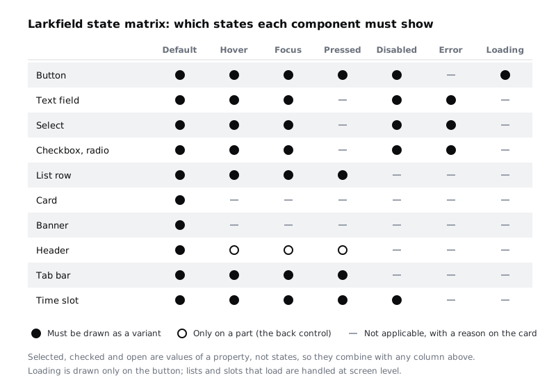
Two things are deliberately not columns. Selected, checked and open are values, not states: a selected time slot can also be focused or pressed, so they become a second property (Selected = true, false) that combines with the state. Loading appears only on the button. When a list of slots is loading, the whole screen shows it, which is a screen pattern, covered in Design loading states: spinners, skeletons and progress.
Check it worked
Your matrix has seventy cells and every one is marked. Read down the Focus column: every component a patient can tap or type into has focus, and only Card and Banner do not. Read down the Error column: only components that take input have it. If any row has a state the row above it lacks for no reason you can say in a sentence, fix one of them.
Step 4 · Spec the button and the three form controls
Now fill in the cards, starting with the button and the three controls that take input. They share the most rules (focus ring, disabled treatment, 48 px height), so writing them together keeps them consistent.
Button. Purpose: starts an action; not for going to another page in running text (that is a link). Anatomy: container, label, optional leading icon, spinner in the loading state. Variants: Kind = Primary, Secondary, plus the state. Tokens: Primary uses colour/accent fill with label text in colour/on-accent; Secondary uses colour/surface fill, a border/thin stroke in colour/border and label text in colour/accent; both use radius/m and horizontal padding space/l (24). Pressed uses colour/accent-pressed, the teal/800 token part 3 added for exactly this. Hover goes one step the other way on the teal ramp, so add one semantic token, colour/accent-hover, pointing at teal/600; steps 600 to 900 all keep white text above 4.5:1. Loading keeps the button's width, shows a spinner before the label, and changes the label to say what is happening, such as Booking. Minimum size: 48 px tall, 48 px wide. Content: starts with a verb, wraps to two lines rather than being cut off. Labels in Yoruba, Hausa or French are often longer than the English ones, and a button that wraps is better than one that hides the end of the sentence.
Text field. This card is the model for the other nine: every section filled, every token named, every missing state explained.
- Purpose: one line of typed text with a visible label, such as Full name or Mobile number. Not for a choice from a fixed list: use Select.
- Anatomy: 1 label, always visible above the container; 2 container; 3 typed value; 4 error line with an alert icon, shown only in the error state; 5 hint, such as
For example 07700 900123. - Variants:
State = Default, Hover, Focus, Disabled, ErrorandHas hint = true, false. - States: focus adds the 2 px
colour/focusring 2 px outside the container. Error changes the container stroke toborder/thickincolour/dangerand shows the error line, such asError: Enter a mobile number with 11 digits, which says how to fix it. Disabled keeps the layout and shows the label and value incolour/text-muted. Pressed and loading do not apply: pressing a field is focusing it, and a field never waits for the server. - Tokens: label in
labelandcolour/text; containercolour/surfacefill,border/thinstroke incolour/border,radius/m; value inbodyandcolour/text, insetspace/m(16) from the container's left edge; error line inbody-smallandcolour/danger; hint inbody-smallandcolour/text-muted;space/xs(8) between label, container, error line and hint. - Minimum size: 48 px tall, full width of the form column.
- Content: labels wrap to a second line, never cut off. No placeholder text: format examples go in the hint.
The illustration shows the same card laid out on the canvas, with the Mobile number field drawn in its error state.
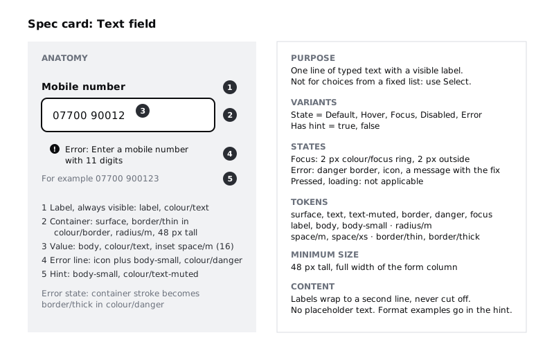
Two rules on that card come straight from the high-fidelity part: there is no placeholder text (format examples go in the hint under the field), and the error border is border/thick in colour/danger so it is visible without relying on colour, because the line also gets thicker.
Select. Purpose: one choice from a fixed list of more than about six options; for fewer, use radios so every option is visible. Anatomy: label, container, current value, chevron icon, hint and error line exactly as the text field. Variants and states: as the text field (State and Has hint), plus Open = true, false for the moment the list shows. Note on the card that the open list itself is drawn by the phone's own picker on Android and iOS, so you specify the closed control only. Tokens and minimum size match the text field, so a select and a field sit in the same form column without lining up by hand.
Checkbox and radio. Purpose: checkbox for an independent yes or no (the reminder), radio for one choice from a short group. Anatomy: the box or circle (24 by 24 px), the label to its right, an optional hint below. Variants: Type = Checkbox, Radio, Checked = true, false, plus the state. Tokens: unchecked edge border/thick in colour/border (3:1 or more on white is required for a control's edge), checked fill colour/accent with a tick or dot in colour/on-accent, label in body. Minimum size: the 24 px box sits inside a row at least 48 px tall, and the whole row, label included, is the touch area. Error applies to the group: one message above the options, not a red edge on each.
Check it worked
Four cards are filled in, and no section on any of them is blank. Read the Tokens section of each: every token exists in your variables panel. The text field, select and checkbox cards give the same minimum height (48 px) and the same error treatment (thick danger border or group message, icon, words).
Step 5 · Spec the components people choose from
These three present options or content rather than take typing: time slot, list row and card.
Time slot. Purpose: pick one appointment time from a day's free times. It is a radio in behaviour, so it shares the radio's states and adds Selected = true, false. Anatomy: container, time label, tick icon when selected. Tokens: unselected colour/surface fill, border/thin in colour/border, time in label and colour/text; selected colour/accent fill, time and tick in colour/on-accent; radius/m. States: default, hover, focus, pressed and disabled. In the component set the value is State = Disabled, like every other component, and the slot inside it shows the visible label Taken under the time. It is used only if a time is booked by someone else while the patient is on the screen; the next refresh removes it and the Time gone banner explains, as the high-fidelity frame does. Minimum size: 48 px tall and at least 96 px wide, the min width part 5 set so three slots fit a row, with space/xs (8) between slots so a thumb does not hit two. Content: 24-hour time only, such as 10:30.
List row. Purpose: one item in a list that opens something, such as a service or an appointment. Anatomy: title, secondary line, chevron. Tokens: colour/surface fill, a border/thin divider in colour/line at the bottom, title in body, secondary line (15 min) in body-small and colour/text-muted, padding space/m (16). States: default, hover, focus (the ring sits inside the row so it is not clipped by the list's edges) and pressed, which tints the row colour/canvas. No disabled state: a service that cannot be booked online stays tappable and opens a screen that says how to book it. Minimum size: 56 px tall. Content: titles wrap; nothing is cut off with an ellipsis, because Medication review translated may need two lines.
Card. Purpose: groups related facts, such as the appointment summary on Confirm and Booked. Not tappable as a whole; anything inside it that acts is a button or a link. Anatomy: optional heading, content rows, optional action at the bottom. Tokens: colour/surface fill on colour/canvas, radius/m, padding space/m (16), gap space/s (12), heading in heading-m. States: default only, and the card says why: interaction belongs to what is inside it. Minimum size: none of its own; the rule is that a Change link inside it gets a 44 by 44 px touch area.
Check it worked
Three more cards are filled in. On the time slot card, the selected and unselected looks differ in something other than colour (the tick), and the Disabled variant shows the word Taken. On the card spec, the States section has one state and a reason for leaving out the rest.
Step 6 · Spec the components that frame and report
The last three hold the screen together and tell people what happened: header, tab bar and banner.
Header. Purpose: the screen title and a way back. Anatomy: back control (an icon button with the accessible name Back), title, optional step line (Step 1 of 4). Variants: Back = true, false, because Home has none. The back control is a nested instance of a small Back button component, used only inside the header and not one of the ten; it carries State = Default, Hover, Focus, Pressed, so the header set itself has no state variants. Tokens: title in heading-m, step line in body-small and colour/text-muted, height at least 56 px, side padding space/m (16). States: default for the header; hover, focus and pressed for the back control only, matching the matrix. Minimum size: the back control's touch area is 44 by 44 px even though the arrow is 24 px. The card also notes that the header is not sticky. If a later screen makes it sticky, the focus ring on fields scrolled under it must stay visible.
Tab bar. Purpose: switch between the app's top-level sections: Home, My appointments, Help. Not for steps inside a flow; the booking flow hides the tab bar so a patient cannot leave halfway by accident. Anatomy: three items, each an icon above a text label. Variants: Selected = true, false per item, plus the state. Tokens: colour/surface fill, a border/thin top line in colour/line, labels in label; the selected item uses colour/accent for icon and label and a 2 px bar above it, so the selection is visible without colour. Minimum size: each item at least 56 px tall and a third of the screen wide. Content: labels always shown, never icons alone, and kept to one or two short words because three must fit on a 360 px wide screen, common on low-cost Android phones.
Banner. Purpose: a message about the whole screen, such as You're booked, 10:30 was just taken. These times are still free. and We could not book this time. Your details are saved. Not for errors on one field; those go on the field. Anatomy: icon, message, optional action (a Secondary button instance). Variants: Tone = Success, Notice, Danger. Tokens: Success uses colour/accent-tint with icon and text in colour/accent; Notice uses colour/notice-tint and colour/notice; Danger uses colour/danger-tint and colour/danger; all use radius/m, padding space/m (16) and body-small, apart from Success on Booked, which uses heading-m. States: default only; the action inside has the button's states. Each tone has its own icon (tick, clock, alert), so the tone is clear without colour. There is no close button: each Larkfield banner explains the screen it is on, and hiding it would hide the explanation.
Check it worked
All ten cards are filled in. Count the not-applicable states on the matrix and find a written reason for each on the matching card. Check every minimum size against two numbers: no touch area under 24 by 24 px (the WCAG 2.2 AA floor), and nothing a patient taps often under Larkfield's own 44 by 44 px.
Step 7 · Rebuild each component next to its card
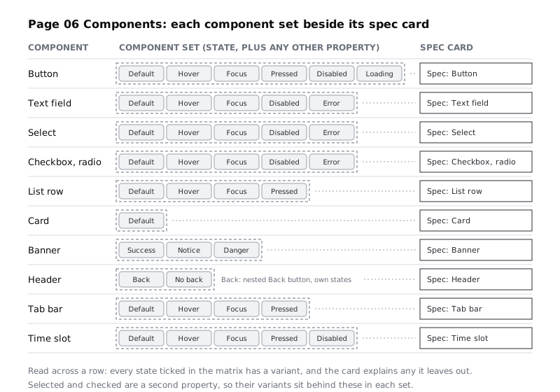
Now make the file match the words. For each component, take the existing main component from the high-fidelity part (Button, Text field, Time slot, List row, Header) or build a new one (Select, Checkbox, Card, Banner, Tab bar, plus the Back button nested in Header), and turn it into a component set with one variant per state ticked in the matrix. Use State as the property name and the matrix column headings as the values, with no exceptions (the time slot's value is Disabled; Taken is only the text it shows), so a developer reading Dev Mode sees the same words as on the card. Build a button component with variants covers the mechanics if you need them.
Move each component set into its row on 06 Components, to the left of its spec card. Edit the existing main components rather than replacing them, so the instances on all ten high-fidelity frames update; a fresh component would leave the screens pointing at the old one.
As you build, apply only tokens. Every fill and stroke is a colour variable, every corner a radius variable, every gap and padding a spacing variable and every text layer one of the six text styles. Where you find yourself wanting a value that is not a token, stop and decide: either the spec is wrong and the token set needs a step (write it down for part 8's change log), or the drawing is wrong.
Check it worked
Each of the ten rows has a component set and a spec card, and the set's State values match the ticked cells in the matrix exactly; other properties (Kind, Tone, Back, Selected, Checked, Has hint) are extra and must appear on the card's Variants line. Header's three hollow cells live on the nested Back button, whose set shows Default, Hover, Focus and Pressed. Select a component set and look at Selection colors in the right sidebar: every entry is a variable name, with no raw hex values. Go to the high-fidelity page: the screens still show the same buttons, fields, slots, rows and headers, now as instances of the rebuilt sets.
Step 8 · Test the specs on one screen
A spec is only finished when someone else can use it. Ask a colleague who did not write the cards (a developer is ideal) to read only the 06 Components page and answer three questions about the Your details screen without asking you:
- What does the Mobile number field look like when a patient tabs into it, and when they have typed 10 digits and pressed
Continue? - How big must the reminder checkbox's touch area be, and where does it end?
- Which tokens would they use for the
Language for your appointmentselect?
Compare their answers with what the high-fidelity screens show. Every mismatch is a gap in a card: a state you drew but did not write down, a token you used but did not name, or a rule that lives only in your head. Fix the card, not the reader's answer.
Then walk all ten high-fidelity frames once more and tick off every element against the ten components or the Not components list. Anything left over is either a missing variant or a new component someone has drawn by hand.
Check it worked
Your colleague answered all three questions from the page alone, or every point where they could not is now written on the right card. Every element on the ten frames maps to a component, a variant or the Not components list, and the 06 Components page holds ten component sets beside ten complete spec cards.
Next steps
Part 7, Document a design system as a one-page style guide, takes these ten cards, the palette, type and spacing and turns them into the page a new designer or developer opens first. Keep the 06 Components page as it is: part 7 links to it and part 8 checks it against the coded components.
To go deeper on one component, Design buttons: hierarchy, sizes and every state extends the button card into a full set with tertiary and destructive kinds, and Design visible focus states for keyboard users tests the focus ring on every Larkfield surface. If variants are new to you, start with Build a button component with variants.
Part of these paths
Related tutorials
- Define a spacing scale and corner radius tokensYou will have a seven-step spacing scale on a 4 px base, three corner radius tokens and two border widths in Figma variables, a reference frame with the rules for choosing a step, and a Larkfield Pick a time screen whose every gap, padding, radius and stroke is a token.
- Turn a button into a component with variantsYou will have a Figma button component set with Type, Size and State properties, so a teammate can place one button and switch it between primary, secondary, large, small and disabled from the right sidebar.
- Design buttons: hierarchy, sizes and every stateYou will have a button sheet with four kinds, two sizes and six states for each kind, plus a written one-primary-per-screen rule, checked against every screen of the Larkfield Clinic booking app.
Need this done for you?
Padding does this work for growing companies, from the first diagnosis to a system that keeps working.
Get new tutorials