UI and visual design · Intermediate · 18 min
Define a spacing scale and corner radius tokens
By Padding · Updated 18 Nov 2026
Figma (web) · November 2026
You will have a seven-step spacing scale on a 4 px base, three corner radius tokens and two border widths in Figma variables, a reference frame with the rules for choosing a step, and a Larkfield Pick a time screen whose every gap, padding, radius and stroke is a token.
On this page
The Larkfield screens already look tidy. Most gaps are 8, 16, 24 or 32, because the mid-fidelity work put them there. But the audit in part 1 found the cracks: a 15 beside the 16s, five 20s near the 24s, and two values, 4 and 12, that nobody had a rule for. Part 2 gave the spacing values names and parked those two with the note "part 5 decides".
This is part 5. A spacing scale is not only a list of numbers. It is a list of numbers plus a rule for choosing between them, and the rule is what stops the next designer typing 14 because 12 looked a bit tight. You will settle the scale, name its steps, add three corner radius tokens and two border widths, write the rules down on a reference frame, and then rebuild one screen, Pick a time, so that every gap, padding, corner and stroke on it is a token.
The Figma mechanics (creating number variables, aliasing, scoping, binding a field) are covered step by step in Use number variables for spacing and corner radius. This tutorial is about the decisions, and assumes you can do the clicks.
Step 1 · Pull the spacing and radius rows from the audit
Open the Larkfield file and go to the 11 Audit page. Read the Spacing and Radius sections and copy their rows onto a new frame beside them called Scale working. You want each value, its count and its job in one place, without the colour and type rows in the way.
For Larkfield, the rows are:
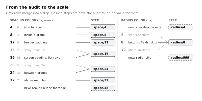
- Spacing: 4 (6 uses, icon to label), 8 (41, inside a group), 12 (9, header padding), 15 (2, stray), 16 (58, screen padding and list rows), 20 (5, stray), 24 (33, between groups), 32 (7, above the main button). The audit already decided 15 merges into 16 and 20 into 24.
- Radius: 6 (the hand-built status banners), 8 (buttons, fields, time slots), 12 (the photo on Home). The audit merged 6 into 8.
Then add one section the audit did not have: Border width. Select the fields, time slots, secondary button and the error version of the text field, and read the stroke weight in the right sidebar. Larkfield has 1 on the normal edges and 2 on the error outline. If you find any 1.5, note it: half-pixel strokes are drawn soft on many phone screens, and they are almost always an accident.
Check it worked
The Scale working frame lists eight spacing values, three radius values and at least two border widths, each with its count or where it is used. The 15 and 20 rows already say which value they merge into, and the 4 and 12 rows say "part 5 decides".
Step 2 · Choose the base and the seven steps
A scale needs a base unit that every step is a multiple of. Larkfield's values are all multiples of 4 except the strays, and part 4 set every line height on a 4 px rhythm (40, 32, 24, 20), so the base is 4. A base of 8 would be tidier on paper, but it would throw away 4 and 12, and the audit shows both doing real work inside small components.
Do not make the scale every multiple of 4 (4, 8, 12, 16, 20, 24, 28...). Next to each other, 24 and 28 look the same, so a designer choosing between them is guessing. Steps need to grow as the values grow: at the small end a 4 px difference is obvious, at the large end you need a jump of 8 or 16 before anyone sees it. Larkfield's scale is:
4, 8, 12, 16, 24, 32, 48
Each step below 16 adds 4. From 16 the gaps between steps grow: 16 to 24, 24 to 32, then 32 to 48. Every audited value lands on a step, and 48 is new. Nothing on the screens uses it yet, but the state frame Pick a time / No times this week needs space around a lone message that is clearly more than the 32 above a button, and without a step for it someone will type 40.
Stop at seven. If a later screen genuinely needs 64, add it then and write it in the change log, as part 2's naming rule asks.
Check it worked
Write the scale at the top of Scale working. Every value in the audit's Spacing section either sits on a step or has a merge arrow to one, and no two neighbouring steps are closer than 4 apart. Try this: name a value between 24 and 32 that you think a screen needs. If you can, write down which job it is for and ask whether that job is really "between groups" (24) or "before the main action" (32).
Step 3 · Name the steps and replace the role tokens
The primitives stay as part 2 named them: the value in pixels. In the Larkfield primitives collection, add the one missing primitive, space/48. You now have space/4, space/8, space/12, space/16, space/24, space/32 and space/48.
Part 2 also made five spacing role tokens in the Larkfield collection (space/stack-s, space/stack-m, space/stack-l, space/stack-xl and space/inset-screen) and said to leave them unbound until this part. With four values, naming each by its job worked. With seven steps and a written rule for choosing between them, it stops working: Pick a time alone needs a gap between days, a gap between slots, a gap from a label to its slots, padding inside a slot and padding at the screen edge, and a name per job would soon outnumber the steps. The rule does the job the role names were doing. So the semantic spacing tokens become the steps themselves, named by size:
| Semantic token | Points at | Typical jobs |
| --- | --- | --- |
| space/2xs | space/4 | icon to its text, two lines inside one small control |
| space/xs | space/8 | label to its field, between time slots, between days |
| space/s | space/12 | padding inside a time slot, gap between rows inside a card |
| space/m | space/16 | screen edges, card padding, list row padding, heading to its content |
| space/l | space/24 | between groups on a screen, button side padding |
| space/xl | space/32 | above the main action |
| space/2xl | space/48 | around a lone message such as an empty state |
In the Larkfield collection, create these seven number variables, each an alias of its primitive (right-click the value and choose Create alias). Then delete the five part 2 spacing role tokens. Because you did not bind them to any layer, nothing on the screens changes. If you did bind some, rebind those fields to the step tokens first, using the table above (stack-s to space/xs, stack-m and inset-screen to space/m, stack-l to space/l, stack-xl to space/xl), and delete the old tokens after.
Set the scope of all seven to Gap and Padding only, under the auto layout options. Then they are not offered in the font size, width or corner radius fields.
Finally, update part 2's naming rule on your Tokens frame: "Spacing semantic tokens are named by size step, from 2xs to 2xl. Radius tokens use s, m and full. Border tokens use thin and thick. The rule for choosing a step lives on the reference frame." Add -2xs, -xs, -2xl, -full, -thin and -thick to its closed list of variants now, including the three you will use in the radius and border step, as the rule says a team decision must be recorded.
Check it worked
The Larkfield collection has seven spacing tokens from space/2xs to space/2xl, each showing a primitive's name, not a number, in its value cell, and no stack or inset tokens. Select any auto layout frame and open its gap field's variable picker: the seven appear in size order. Open a text layer's font size picker: none of them appear.
Step 4 · Write the rules for choosing a step
A scale without rules gets used by feel, which is how 15 and 20 got into the file. Write these rules on Scale working, in this order:
- Inside a component is tighter than between components. Spacing inside a time slot, field or button uses
space/2xstospace/s, with one exception: the side padding of a large button, such as a full-width main action, usesspace/l, so its label never crowds the button's ends. Spacing between components in one group usesspace/xstospace/m. If the gap inside a component is as big as the gap around it, the component falls apart visually. - Between groups is bigger than anything inside a group. Groups such as Morning and Afternoon are separated by
space/l. If two groups sit closer than their own items, people read them as one list. - The main action gets
space/xlabove it. One step bigger than a group gap, so the button reads as the end of the screen, not one more item. - Screen edges use
space/m. Every screen, every width. Headers use the same side padding, so the back control's touch area starts on the same edge as the content below. - When two steps both look right, choose by the relationship, not the look. Ask "are these two things in the same group?" and the answer picks the step.
- Never type a number. If no step fits, the layout needs a different structure, or the scale needs a new step, which is a team decision.
Rule 1 is the most important. It is the same idea the white space tutorial covers from the reading side: closeness tells people what belongs together. The scale only makes that idea repeatable.
Check it worked
Look at any Larkfield screen and pick three gaps at random. For each, say which rule chooses its step, without measuring it. If one gap cannot be explained by a rule, either the screen is wrong (fix it when you rebuild) or a rule is missing (add it now).
Step 5 · Add radius and border width tokens
Radius gets three tokens and border width gets two. Fewer is better here: every extra radius is a shape that has to look intentional next to the others.
In Larkfield primitives, add radius/4 and radius/999 beside the existing radius/8, and border/1 and border/2 for strokes. Part 2's rule has space and radius as size families, so add border to its list on the Tokens frame. Then in Larkfield:
radius/spoints atradius/4: checkbox corners, and anything small sitting inside a control.radius/mpoints atradius/8: buttons, fields, time slots, day cells, cards and banners. Rename part 2'sradius/controltoradius/mrather than making a new token; renaming keeps any bindings, because layers are bound to the variable, not its name.radius/fullpoints atradius/999: radio buttons and pill shapes. A number much bigger than any control's height always gives a full curve.border/thinpoints atborder/1: field edges, unselected time slots, secondary buttons, dividers.border/thickpoints atborder/2: the error outline, the focus ring and the checkbox edge.
Scope the radius tokens to Corner radius and the border tokens to Stroke.
Two audit decisions follow from this. The status banners' 6 merges into radius/m, as the audit said. The photo on Home had 12; there is no 12 step, so it takes radius/m too. A card, a banner and a photo with the same corners look like one family. If a large container ever needs a softer corner, that is a fourth radius and a recorded decision, not a one-off.
One more rule for the reference frame: when a rounded element sits inside a rounded container with little padding, give the inner element the smaller radius, or the gap between the two curves looks uneven.
Check it worked
Larkfield now has three radius tokens and two border tokens, each aliasing a primitive, and no radius/control. Select the Continue button: its corner radius field still shows a variable pill, now named radius/m. Open the stroke weight picker on a text field: only border/thin and border/thick appear.
Step 6 · Build the spacing reference frame
The tokens live in the variables table, where only designers look. The reference frame is where a developer, a new designer or you in six months finds the scale and the rules together. Part 7 lifts it straight into the style guide, so build it once, properly.
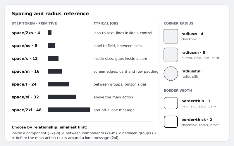
Make a frame called Spacing and radius next to the Tokens frame from part 2. Give it vertical auto layout, padding space/m and gap space/l, so the reference itself uses the scale. Inside it:
- A spacing column. Seven rows, one per step. Each row shows the token name and value (
space/m · 16), a solid bar whose width is bound to the step's primitive, so the bar changes if the value ever does, and one line of typical jobs from the table. - A radius column. Three 48 by 48 squares with their corner radius bound to
radius/s,radius/mandradius/full, each labelled with its jobs. - A border column. Two 48 by 40 boxes with
border/thinandborder/thickstrokes, labelled. - The six rules from the earlier step, word for word.
To bind a bar's width, select it, open the width field's variable picker and pick the primitive. Width and height take number variables, but because you scoped the semantic tokens to gap and padding, only the primitives appear here; for a reference frame that is the right choice.
Check it worked
The Spacing and radius frame shows seven bars that get visibly longer down the column, three corner shapes, two stroke weights and six rules. Change space/48 in the primitives to 64: the bottom bar grows. Undo it.
Step 7 · Rebuild Pick a time with tokens only
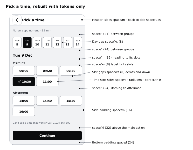
Duplicate the Pick a time frame on the 04 High fidelity page and name the copy Pick a time / Tokens. Keep the original for comparison. Work from the outside in, binding every field to a token as you go. These are Larkfield's choices, with the rule that picks each one:
- Screen frame: vertical auto layout, gap 0, holding three children: the header, a
Contentframe and aFooterframe. Fillcolour/canvas. - Header: side padding
space/m(rule 4), gapspace/2xsfrom the 44 by 44 back control to the title. The audit's 12 px header padding goes, and swapping it forspace/mis what lines the header up with the content: the back control's touch area now starts at the 16 px content edge, and the title sits after it, 64 px from the screen edge. - Content: padding top and sides
space/m, gapspace/lbetween its groups (rule 2): the service line, the week strip, the slots block and the fallback line. - Week strip: horizontal, gap
space/xsbetween the seven day cells, each cell set to fill container. Each cell has vertical paddingspace/xs, gapspace/2xsbetween the day name and the date, corner radiusradius/mand aborder/thinstroke. - Slots block: gap
space/mfrom theTue 9 Decheading to the times. Inside it, the Morning and Afternoon groups sitspace/lapart, and each group has gapspace/xsfrom its label to its slots. - Slot grid: horizontal auto layout with wrap on, gap
space/xsbetween slots andspace/xsbetween rows, each slot set to fill container. Fill alone does not decide how many fit on a row; each slot's minimum width does. Select the Time slot main component and set its min width to 96 (any value above 90 and up to 104 works): three slots fit on a row at 360 and at 390, and a fourth never fits at 390. Each time slot has side paddingspace/s, gapspace/2xsfrom the tick to the time, radiusradius/mand aborder/thinstroke. - Footer: padding top
space/xl(rule 3), sidesspace/m, bottomspace/l, holding the Continue button with side paddingspace/land radiusradius/m.
The time slot, button and day cell are component instances, so set their padding, radius and stroke on the main components on the Wireframe kit page and the screen picks them up. Fixed heights (48 for a slot and the button, 56 for the header and a day cell) are sizes, not spacing; part 6 records them as minimum touch sizes.
Check it worked
Put Pick a time / Tokens next to the original. The layout is nearly the same: the back control and title have moved 4 px right, so the back control's touch area now starts on the same 16 px edge as the content, and nothing else should jump. The three slots in a row are each 114 px wide on the 390 px frame, and the day cells are about 44 px wide.
Step 8 · Prove every gap is a token
A screen that looks right can still hide typed numbers, and those are the ones that drift. Check on purpose.
Click through every frame inside Pick a time / Tokens, from the screen frame down to the slot grid, and read the Auto layout section in the right sidebar. Every gap and padding field should show a variable pill, not a number. Do the same for corner radius and stroke weight on the main components. Fix any raw number by binding it, not by matching its value.
Then run a stress test. In Larkfield primitives, change space/8 to 12 and look at the screen: the gaps between days, between slots and from each label to its slots all widen together, and nothing else moves. Undo. If any gap stayed put, it is a typed number you missed.
Last, check the narrow case. Many patients book on low-cost Android phones whose screens are 360 px wide in CSS terms, often with data saver on and the text size turned up. Resize the frame to 360. The slots become 104 px wide and still fit three to a row, because 104 is above their 96 px min width. The day cells drop to 40 px wide. That is above the WCAG 2.2 minimum target size of 24 by 24 CSS px and below the 44 px Larkfield aims for, so write a note for part 6: at 360 the day cells stay 56 tall, and the 8 px gap between them must not be cut to win width back. A gap is part of what stops a thumb hitting two days at once.
Check it worked
Every gap, padding, radius and stroke field on Pick a time / Tokens and its components shows a pill. The space/8 test moved exactly the gaps you expected and nothing else. At 360 px wide, the screen has three slots per row, no clipped text and a note for part 6 about the day cells.
Next steps
You now have a spacing scale, radius and border tokens, written rules for choosing between them, and one screen that proves they cover a real layout. Rebuild the other five screens the same way when you next touch them, not all at once.
- Specify ten core components and their states is part 6: each component spec lists the spacing, radius and border tokens it uses, and its minimum touch size.
- Use white space to group and separate content explains, from the reader's side, why rule 1 works.
- Use number variables for spacing and corner radius has the Figma clicks for aliasing, scoping and binding in detail.
- Set a type scale for an app is part 4, if you want to check how its 4 px line heights sit on this scale.
Part of these paths
Related tutorials
- Set a type scale for an appYou will have a type scale for the Larkfield Clinic app worked out from a base size and a ratio, stored as Figma variables and six text styles named by role, shown on a specimen frame with real copy and checked at 200% text size.
- Use number variables for spacing and corner radiusYou will have a card and a list screen in Figma whose gaps, padding and corner radius all come from number variables, so changing one value in the variables table restyles every card at once.
- Use white space to group and separate contentYou will have a dense form-and-summary screen regrouped with space instead of boxes and divider lines, keeping two of its sixteen lines and boxes, and a gap ratio rule you can apply to any screen.
Need this done for you?
Padding does this work for growing companies, from the first diagnosis to a system that keeps working.
Get new tutorials