UI and visual design · Beginner · 14 min
Use white space to group and separate content
By Padding · Updated 18 Nov 2026
Any design tool or no-code builder with a gap or spacing setting · November 2026
You will have a dense form-and-summary screen regrouped with space instead of boxes and divider lines, keeping two of its sixteen lines and boxes, and a gap ratio rule you can apply to any screen.
On this page
Boxes and divider lines are the first thing most people reach for when a screen feels muddled. Put a border round the address, a line under each field, a card round the summary, and every part looks separated. The trouble is that every line has the same weight. Sixteen of them on one phone screen do not separate anything; they turn the screen into a grid of equal cells, and the reader has to work out which cells belong together.
Space can do most of that work with nothing drawn at all. Items close together read as one group; a larger gap reads as the end of a group. Once the gaps follow a simple rule, most of the lines can go, and the few that stay mean something.
The example is a draft of the Larkfield Clinic Your details screen. Larkfield is a fictional community clinic whose booking app runs from Home to Choose a service, Pick a time, Your details, Confirm and Booked. In this draft, someone on the clinic team added a summary of the chosen appointment above the form so patients can see what they are booking while they type: a Nurse appointment on Tuesday 9 December at 10:30. Then they boxed everything. You will take that draft apart line by line, rebuild the grouping with gaps, and keep only the lines that earn their place. If you are not following the Larkfield files, use any screen of yours that mixes a summary or read-only block with a form.
Step 1 · Duplicate the screen and number every line and box
Never strip the original. Duplicate the screen and name the copy Your details / Space only, so you can put the two side by side at the end.
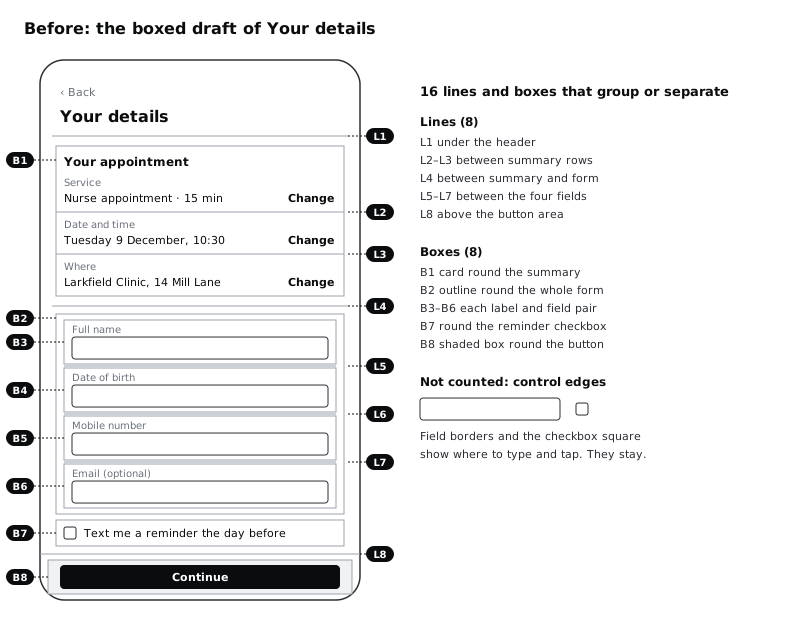
Now, on the original, number every drawn line and every box that is there to group or separate content. Put a small numbered note beside each one, either a text layer on the canvas or a comment. Use L for lines and B for boxes. The Larkfield draft has sixteen:
- L1: the line under the header
- B1: the outlined card round the appointment summary
- L2, L3: dividers between the three summary rows (Service, Date and time, Where)
- L4: a full-width rule between the summary and the form
- B2: an outline round the whole form
- B3 to B6: an outline round each label-and-field pair (Full name, Date of birth, Mobile number, Email (optional))
- L5 to L7: dividers between those four pairs
- B7: an outline round the
Text me a reminder the day beforecheckbox - L8: a line above the button area
- B8: a shaded box round the
Continuebutton
Do not number the borders of the text fields themselves or the square of the checkbox. Those are not grouping content; they show people where to type and tap. Write them on a separate line of your note as "control edges, not counted".
Check it worked
You have two copies of the screen. The original carries a numbered note for every line and box that groups or separates content, sixteen for the Larkfield draft, and a separate note listing the control edges you did not count. Count the notes against the screen: no line or box is left unnumbered.
Step 2 · Write down the job each line was doing
A line you delete leaves its job undone unless something else takes it over. Before deleting anything, add a one-line reason next to each number. Every line and box on a screen like this does one of four jobs:
- Holds a group together. B1, B2 and B3 to B6 say "these items belong to one thing". So does B7.
- Marks where one group ends and the next begins. L1, L4 and L5 to L7. L2 and L3 do it at a smaller scale, between summary rows.
- Shows a region that behaves differently. L8 and B8 mark the footer. If the button stays pinned to the bottom while the form scrolls under it, that line tells people the footer is a separate layer.
- Adds emphasis. B8's shading tries to make the button stand out, a job the button's own fill already does.
Then write, beside each one, what could replace it: a gap, a heading, alignment, or nothing. For the Larkfield draft, most answers are "a gap". The summary is the exception worth thinking about: it is read-only and the form is not, so it may still need a region of its own. Leave that open for now.
Check it worked
Every one of your sixteen notes now reads like L4: ends the summary, starts the form → a large gap. At least one note names a job other than grouping or separating (the pinned footer, for Larkfield). If you have a line whose job you cannot name, mark it "no job"; it is the first one to delete.
Step 3 · Remove every grouping line and box at once
On the Space only copy, delete all sixteen lines and boxes in one go. Keep the text field borders and the checkbox square. A field without a visible edge is a field people cannot find, and WCAG 2.2 asks for the edge that identifies a control to have at least 3:1 contrast against its background. Removing grouping lines is never a reason to remove those.
Leave the gaps exactly as they were. The screen will now look worse than the original, and that is the point of this step. In the draft every item sat 12 px from the next, because the boxes did the grouping and nobody had to think about space. Without the boxes, the label Mobile number sits as close to the Date of birth hint above it as to its own field below it, and the summary runs straight into the form.
Look at the copy for ten seconds and write down where your eye stalls. Those are the places where the deleted lines were doing real work.
Check it worked
The Space only copy has no lines or outlined boxes left except the four field borders and the checkbox. Read it from top to bottom: you can find at least one label that looks as if it belongs to the wrong field, or a boundary between summary and form you cannot see. Your note lists where.
Step 4 · Choose three gap sizes, each at least double the last
Equal gaps are why the stripped screen falls apart. Grouping by space needs a few distinct sizes, far enough apart that the eye sees the difference without measuring. Pick three:
- Tight, inside one item: 8 px between a label and its field, 4 px between a field and its hint.
- Between items in a group: 16 px between summary rows, 24 px between one field and the next label.
- Between groups: 48 px between the summary and the form.
The rule of thumb behind those numbers: the gap that ends a group is at least twice the largest gap inside it. A label 8 px from its field and 24 px from the field above is three times closer to the one it labels, so nobody misreads it. The summary's largest internal gap is 16 px and the form's is 24 px, so the 48 px gap between them is at least double both. If you use a spacing scale such as 4, 8, 12, 16, 24, 32 and 48, pick every gap from it so the steps stay consistent across screens.
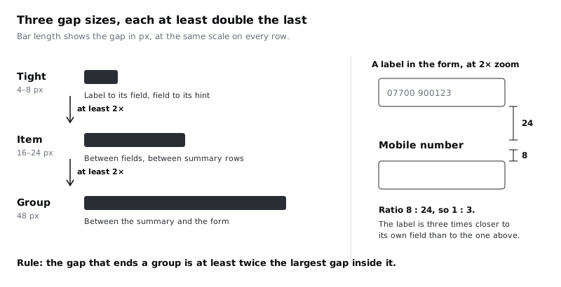
Write the three sizes and the rule as a note on the canvas next to the copy. You will check every gap against it in the next two steps.
Check it worked
Your canvas note lists three gap sizes and the doubling rule. Divide each size by the one below it: no ratio is under 2. If your tool or builder already has a spacing scale, each of your three sizes is a step on it.
Step 5 · Regroup the summary with space and alignment
Rebuild the appointment summary on the Space only copy. If your tool has auto layout, stacks or flex containers, use them so the gaps are settings rather than nudged positions: in Figma, the gap field of an auto layout frame; in most builders, a gap or spacing setting on a stack. Then the gaps cannot drift when someone edits the text.
- Put each summary row's label above its value, 4 px apart:
ServiceoverNurse appointment · 15 min,Date and timeoverTuesday 9 December, 10:30,WhereoverLarkfield Clinic, 14 Mill Lane. - Space the three rows 16 px apart. That replaces L2 and L3.
- Align each row's
Changelink to the right edge, on the line of the value. A shared right edge holds the three links together as a column without a line between them. - Put the heading
Your appointment8 px above the first row.
Now decide on the one open question from the second step. The summary is read-only, the form below it is editable, and patients scroll past it. Here a region is earned: give the summary a plain tinted background (no outline) with 16 px of padding inside. That is one box doing a job space cannot do on its own, marking content that behaves differently. Count it as kept.
Finally, set 24 px between the header and the summary, which replaces L1, and 48 px between the summary and the form, which replaces L4.
Check it worked
The summary reads as one block with three rows, each Change link sits on the same right edge, and there is no line inside it. Measure the gaps: 4 between label and value, 16 between rows, 48 below the block. Cover the tinted background with your hand: the three rows still read as a group, because the space around them is larger than the space between them.
Step 6 · Regroup the form, the reminder and the button
Now the form. Work through it in the same way:
- Each field becomes one tight unit: label, 8 px, field, then 4 px and the hint if it has one, such as
For example, 31 03 1985under Date of birth. This replaces B3 to B6. - Space the four fields 24 px apart, measured from the bottom of one field or hint to the top of the next label. This replaces L5 to L7.
- Put the reminder checkbox 24 px below the last field, its label on the same line as the box. It is one more item in the form, so it takes the item gap. This replaces B7.
- Do not add an outline round the whole form. The 48 px above it and the left edge it shares with every label already make it one group. B2 goes.
- Leave the button full width with its own fill and remove the shaded box round it. The button's fill is its emphasis. B8 goes.
On a long form, the four fields can feel like one undivided list. If yours has more than five or six fields, split it with a short heading such as About you and a 48 px group gap above it, rather than a line.
Check it worked
On the Space only copy, select each label in turn and measure: it is 8 px from its own field and at least 24 px from anything above it. The four fields, the checkbox and the button share one left edge. There are no outlines on the form other than the four field borders and the checkbox square.
Step 7 · Put back only the lines that earn their place
Some lines did a job space cannot do. Go back to your notes from the second step and put back a line only if its job is still undone on the Space only copy.
For Larkfield, one qualifies. The Continue button is pinned to the bottom of the screen, and the form scrolls under it on a small phone. Without a line, the last field slides under the button area with nothing to show where the content ends. Put L8 back as a 1 px line on top of the footer. It now marks a region that behaves differently, the job you wrote down for it at the start.
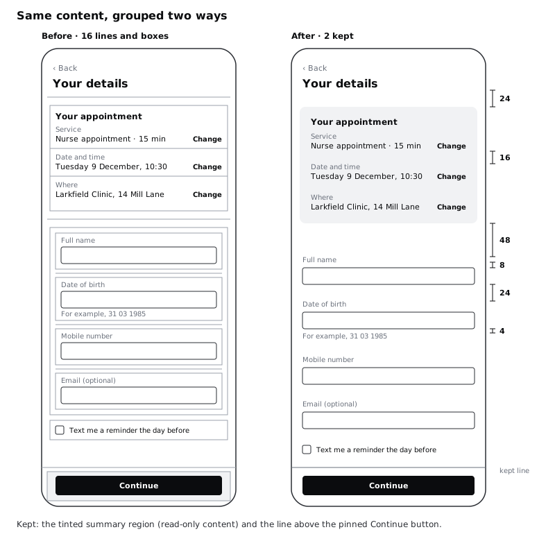
Then count. The original had sixteen lines and boxes. The Space only copy has two: the tinted summary region and the footer line. That is well under half, and each of the two has a reason you can say in one sentence. If your own count is more than half the original, look again at every survivor and ask whether a larger gap would do its job.
Check it worked
Your Space only copy has two lines or boxes beyond the control edges, compared with sixteen on the original, and each has a one-sentence reason in your notes. Put the two copies side by side at the same zoom: the new one has the same content in the same order, and nothing was deleted except lines and boxes.
Step 8 · Test the grouping with a squint and with longer text
Two quick tests show whether the space is doing its job.
The squint test. Zoom out until the text is unreadable, around 25 to 33 percent, or narrow your eyes. You should see three blocks: the header, the summary and the form, with the button pinned below. Inside the form, the four fields should show as four evenly spaced pairs. If two blocks run together, the gap between them is not yet double the gaps inside them.
The long text test. Space that works with short English labels can fail with real content. Try three changes on a duplicate of the Space only copy:
- Replace the name hint or value with a long real name, such as
Adaeze Okonkwo-Hughes. - Make the longest label wrap to two lines, as it might when translated into French, Hausa or Yoruba.
- Raise the body text size by half, as many people do in their phone's font settings. On lower-cost Android phones with 360 px wide screens, larger system text is common, and Android 14 and later let people scale text up to 200%.
In each case the label should still be closer to its own field than to anything else, because the gaps are fixed sizes outside the text, not padding that grows and shrinks with it. If a wrapped label now touches the field above, increase the item gap rather than adding a line back.
Check it worked
Zoomed out, the Space only copy shows three distinct blocks and four evenly spaced field pairs. On the long text duplicate, every label is still visibly nearer its own field, the wrapped label has not collided with the field above, and no line has been added back.
Next steps
You now have a screen grouped by space and a rule to check any other screen against: the gap that ends a group is at least double the largest gap inside it.
- To see proximity alongside five other grouping principles on broken screens, work through /tutorials/apply-gestalt-principles-to-an-interface.
- To turn your three gap sizes into named steps a whole team can use, read /tutorials/define-a-spacing-scale-and-radius-tokens.
- Space and alignment work together. Tighten the left edges and columns on the same screen with /tutorials/fix-a-cluttered-screen-with-alignment.
- Once the groups are clear, decide what people see first with /tutorials/create-visual-hierarchy-with-size-weight-and-position.
Part of these paths
Related tutorials
- Apply Gestalt principles to an interfaceYou will have six annotated before-and-after fixes, one for each of proximity, similarity, common region, continuity, closure and figure-ground, each naming the principle a screen broke and the change that repaired it.
- Define a spacing scale and corner radius tokensYou will have a seven-step spacing scale on a 4 px base, three corner radius tokens and two border widths in Figma variables, a reference frame with the rules for choosing a step, and a Larkfield Pick a time screen whose every gap, padding, radius and stroke is a token.
- Fix a cluttered screen with alignmentYou will have repaired a cluttered settings screen so that seven different left edges become two, with icons seated on their labels, centring used only where it helps, and a before and after with the alignment lines drawn on.
Need this done for you?
Padding does this work for growing companies, from the first diagnosis to a system that keeps working.
Get new tutorials