UI and visual design · Beginner · 16 min
Apply Gestalt principles to an interface
By Padding · Updated 18 Nov 2026
Any design tool with frames, text styles and layer opacity, such as Figma or Penpot · November 2026
You will have six annotated before-and-after fixes, one for each of proximity, similarity, common region, continuity, closure and figure-ground, each naming the principle a screen broke and the change that repaired it.
On this page
People do not read a screen element by element. Before they read a single word, they have already sorted it into groups: these things go together, that thing is in front, this line carries on past the edge. The Gestalt principles are names for the rules behind that sorting. Designers often learn them as a list of definitions beside diagrams of dots. They are more useful the other way round, as a diagnosis: when someone taps the wrong thing or misses something that was right there, one of these rules is usually working against you.
This tutorial uses six of them as a repair kit:
- Proximity: things close together look like one group.
- Similarity: things that look alike look like they do the same job.
- Common region: things inside the same boundary look like they belong together.
- Continuity: the eye follows a line or row, and expects it to carry on in the same direction.
- Closure: the eye completes a shape from its parts, as long as enough of it is there.
- Figure-ground: the eye splits a view into what is in front and what is behind.
The example is Larkfield Clinic, a fictional community clinic, and its appointment booking app: Home, Choose a service, Pick a time, Your details, Confirm and Booked. The clinic team has been adding to the high-fidelity screens, and six of their changes have gone wrong in ways patients noticed. You will diagnose each one, fix it, and end with a page of six annotated pairs. If you have your own app, find one screen per principle where it applies; the steps say what to look for.
Step 1 · Set up a page for six before-and-after pairs
Add a page to your file called Gestalt fixes. You will put each problem on it twice, as found and as fixed, with a note between them. Keeping the broken version is the point: the pair is what lets a colleague see the difference in a few seconds.
Lay the page out as six rows, one per principle, with two frames side by side in each. Name the frames Proximity / Before, Proximity / After, and so on. Under each pair, add a text note in three parts:
- Symptom: what a patient would do wrong, in their terms. "Picks 16:00 thinking it is on Wednesday."
- Principle: which rule is causing it, and how.
- Fix: the one change you made, with the numbers.
Write the symptom first, before you name a principle. Starting from what goes wrong keeps you from fitting a principle to a screen that has no problem.
Duplicate the screens from your high-fidelity page rather than moving them, so the flow you prototype from stays untouched.
Check it worked
Your Gestalt fixes page has six rows with two frames each, named by principle and Before or After, and a three-part note under each row. The notes can be empty for now, but each has the headings Symptom, Principle and Fix.
Step 2 · Proximity: put each day heading with its own slots
Some patients asked to see more than one day at a time, so the team tried a scrolling version of Pick a time that lists the next few days one after another, each with its own day heading and time slots. It has a booking problem: a patient chose 16:00 on Tuesday 9 December while meaning Wednesday.
Look at the gaps around the Wed 10 Dec heading. In the draft it sits 8 px below Tuesday's last row of slots and 28 px above Wednesday's. Proximity says the closest things form a group, so the heading reads as the last line of Tuesday, and Wednesday's slots look like they have no heading at all.
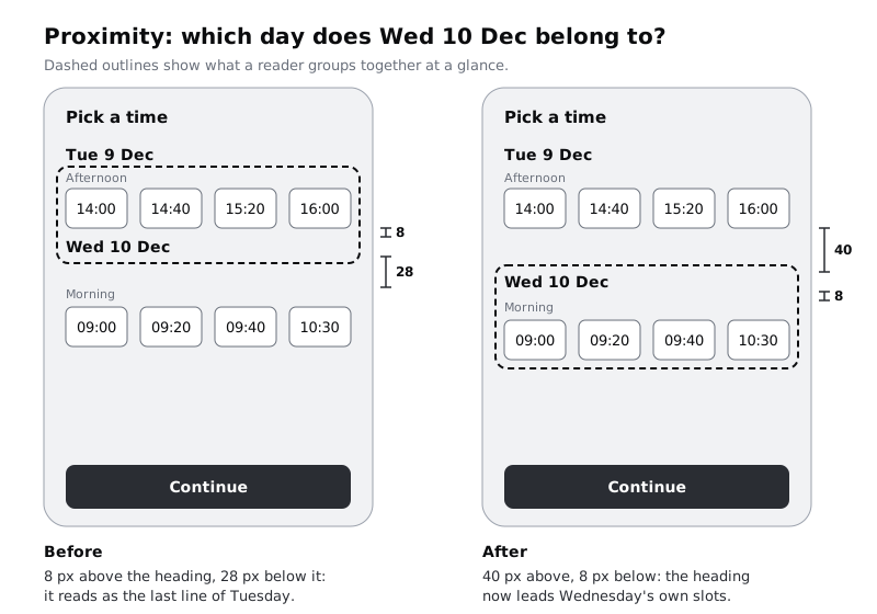
Fix it with two numbers. The gap below a heading must be clearly smaller than the gap above it. Set 8 px between Wed 10 Dec and its first row, and 40 px between Tuesday's last row and the heading. If your screens use stacks or auto layout, put each day in its own stack (heading, Morning, Afternoon) with an 8 to 16 px gap inside it, and set the gap between the day stacks to 40. Then the spacing holds when someone adds a third row of slots.
Use white space to group and separate content has a rule for choosing those gap sizes across a whole screen. Here you only need the two around each heading.
Check it worked
Measure the gap above and below every day heading in the After frame: each one is at least three times larger above than below. Cover the headings with your hand and look at the slots alone: you can still see where Tuesday ends and Wednesday begins.
Step 3 · Similarity: make links look like links, and nothing else
Two changes on different screens turn out to be the same problem.
On Home, someone restyled the link View or cancel a booking to match the address line, 14 Mill Lane: same Body style, same colour/text, no underline. The clinic's front desk now gets calls from patients who could not find a way to cancel. On Confirm, someone else set the summary labels (Service, Date and time, Where) in the Label style and colour/accent to make them stand out, and patients tap them expecting to change something.
Similarity says things that look alike seem to do the same job. On Home the link looks like plain text, so it is read as plain text. On Confirm the labels look like the Change links beside them, so they are tried as links.
Write one rule and apply it everywhere:
- Body-size text that can be tapped uses
colour/accentand an underline. - Body-size text that cannot be tapped never uses
colour/accentand is never underlined. Larger accent text in a banner, such asYou're bookedon Booked, is a heading and is not part of this rule.
Restore View or cancel a booking to the accent colour with an underline, and set the Confirm labels back to Body/Small in colour/text-muted.
The underline is not decoration. Larkfield's accent, #0F5E5A, against the body text colour, #1B1F24, is only 2.18:1. Both are dark, so a reader with low vision, or a phone screen turned down to save battery, may see no difference at all. WCAG 2.2 accepts a link marked only by colour if it reaches 3:1 against the surrounding text and gains another cue on hover and focus. The underline is the simpler fix, and it works for every reader.
Check it worked
Put Home and Confirm side by side and list every piece of accent-coloured, body-size text on both. Every item on the list is something you can tap, and every one is underlined. Nothing that cannot be tapped is on the list.
Step 4 · Common region: draw the card round what belongs together
On Confirm, the appointment summary sits in a white card. The Before frame in the image below shows the draft: the card holds Service and Date and time, but Where sits below it, and the Change links sit outside the card's right edge in the margin. The card was drawn as a fixed rectangle behind the text, and when someone added the Where row, the rectangle did not grow.
Common region is stronger than proximity: a boundary overrides spacing. Here it splits the appointment in two, and Where now reads as part of Your details below it. A patient checking the address may not think to look outside the card.
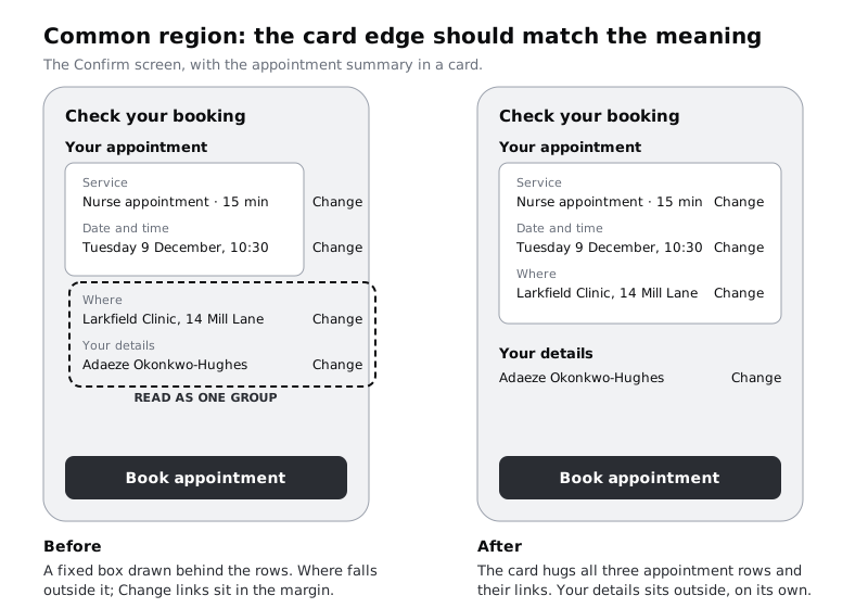
Rebuild the card so its edge follows the meaning:
- Delete the rectangle. Make the card a frame or container that holds the three appointment rows and sizes itself to them (in Figma, an auto layout frame set to hug its contents), with 16 px of padding on every side.
- Move each
Changelink inside the card, aligned to the right padding edge on the line of its value. - Leave
Your detailsoutside the card, 24 px below it, with its own heading. It is about the patient, not the appointment.
A test for any region: say what everything inside it has in common in two or three words. "The appointment" works for the card. If you cannot name it, or something inside does not fit the name, move the edge.
Check it worked
Add a fourth line of text to the card, such as a duration row: the card grows with it and nothing spills over its edge. Every Change link sits inside the boundary of the thing it changes, and you can name the card's contents in three words or fewer.
Step 5 · Continuity: let the week strip run off the edge
Duplicate Pick a time into a 360 px wide frame to stand in for a smaller phone. The seven-day strip no longer fits, so the team made it scroll sideways and sized the day cells so exactly five fit: Mon 8 to Fri 12, ending with the same 20 px margin as the rest of the screen. Patients who wanted a Saturday appointment assumed there was none.
Continuity says the eye follows a row and expects it to carry on. A row that stops at a clean edge with a margin after it looks finished. A row that runs off the edge of the screen, with its last item cut, looks like it carries on.
Fix it:
- Remove the strip's right margin so it runs to the screen edge. Keep the 20 px left margin so the first day lines up with the heading above.
- Size the cells so the last visible one is cut part way, about half a cell. At 360 px, with the 20 px left margin, five cells of 54 px and 8 px gaps leave a little over half of
Sat 13showing. - Keep all the cells on one baseline, the same height, with even gaps. A cell that sits a few pixels lower breaks the line, and the eye stops there.
Check the strip on the widest frame you support too. If all seven days fit at 390 px, there is nothing to scroll to, and nothing should be cut. Continuity is a signal; use it only when there really is more.
Check it worked
At 360 px, the strip shows five whole days and part of a sixth, cut by the edge of the screen, not by a margin. Show the frame to someone for five seconds and ask whether the clinic is open on Saturdays: they say there might be, or they try to scroll.
Step 6 · Closure: show the whole progress track, not only what is done
Choose a service, Pick a time, Your details and Confirm each carry a Step 1 of 4 line. The team replaced it with a progress bar of four segments, but drew only the completed segments, in colour/accent. On Pick a time a patient sees two short dark bars and nothing else. With no visible end, they cannot tell whether two bars is half the job or a fifth of it.
Closure is why a segmented bar works at all: four separate pieces with gaps between them read as one bar, because the eye fills the gaps. That only happens when the whole shape is there to complete, from its start to its end. Gaps inside a shape are fine. A missing end is not.
Fix it:
- Draw all four segments on every screen. Completed segments use
colour/accent; the rest usecolour/border(#7D8592), which reaches 3.47:1 on thecolour/canvasbackground. The lightercolour/line(#D5D9DF) reaches only 1.32:1 and would disappear on many phone screens, especially a lower-cost one in bright light. WCAG 2.2 asks for 3:1 for a graphic like this, which people need to understand where they are. - Keep the gaps between segments small and equal, 4 px, so the four still read as one bar.
- Keep the
Step 2 of 4text beside the bar. Accent and border are only 2.04:1 apart, so the text, not the colour difference, is what tells people which step they are on.
Check it worked
On every step screen you can see four segments from the start to the end of the bar, and the text says which step this is. Zoom out until the text is unreadable: you can still see a whole bar with part of it filled.
Step 7 · Figure-ground: put the sheet clearly in front
Patients did not know what Medication review meant, so the team added a sheet that slides up over Choose a service when someone taps it. In the draft, the sheet is white, the same white as the service rows, with square corners and only a thin top line. The list behind it stays at full strength. Patients tap Blood test behind the sheet and nothing happens, or they scroll looking for the rest of the list.
Figure-ground says the eye has to decide what is in front. Here every cue says the sheet is more of the list: same colour, same edges, nothing behind it pushed back.
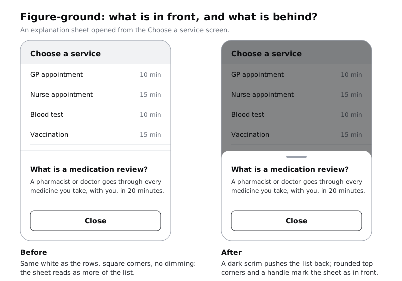
Fix the background first, then the sheet:
- Put a full-screen rectangle between the screen and the sheet, filled with
colour/textat 50% layer opacity. That dark scrim pushes everything behind it back. Make tapping it close the sheet, asClosedoes. - Round the sheet's top corners, 16 px, and add a small handle centred near the top. Both tell people the sheet is a separate layer that can move.
- Keep the
Closebutton. Not everyone will know to tap the dimmed area or drag the handle.
Do not rely on a soft shadow alone. A light shadow on a white screen often disappears on a dimmed or low-quality display, and on many lower-cost Android phones used outdoors, the scrim's darkness is what survives.
The same principle applies wherever text sits on a photo. If you place a caption over the clinic photo on Home, the busy picture competes with the words for the front. Move the caption under the photo, as the high-fidelity screens do, or put it on a solid band that gives the text at least 4.5:1.
Check it worked
Turn the After frame to greyscale, or squint at it: the sheet is the brightest and clearest thing on the screen, and the list behind is visibly darker. Ask yourself where a tap on Blood test would go: onto the scrim, which closes the sheet, never onto a row you can still see at full strength.
Step 8 · Test the six pairs on someone who has not seen them
Your fixes are a guess until someone else reads the screens the way you meant. Find a colleague, friend or patient who has not seen the work. Show them each Before frame for five seconds, hide it, and ask one question. Then do the same with the After frame. Use these questions, or write your own that turn on the same grouping:
- Proximity: "Which day is 16:00 on?"
- Similarity: "How would you cancel a booking?" and, on Confirm, "Which words can you tap?"
- Common region: "What is the clinic's address for this appointment, and is it part of the booking?"
- Continuity: "Is the clinic open on Saturday?"
- Closure: "How many steps are left?"
- Figure-ground: "What would happen if you tapped Blood test now?"
Show Before first every time, so the fix cannot teach them the answer. Write their answers in the Symptom part of each note, under what you predicted.
If an After frame still gets a wrong answer, the principle you named was not the whole problem. Look again for a second one: a card can fix common region and still have a link that looks like a label inside it.
Check it worked
Each of the six notes on your Gestalt fixes page has a Symptom, a Principle and a Fix with numbers, and under the Symptom, what your tester said for Before and After. At least five of the six After frames got the answer you intended. For any that did not, the note says what you will try next.
Next steps
The six principles rarely fail alone. Most of them come back to spacing and emphasis, which these tutorials cover in more depth:
- Use white space to group and separate content sets the gap sizes that make proximity work across a whole screen.
- Create visual hierarchy with size, weight and position decides what the eye lands on first once the groups are clear.
- Fix a cluttered screen with alignment works on the shared edges that continuity depends on.
- Never rely on colour alone to carry meaning goes further into the problem behind the link and progress bar fixes.
Part of these paths
Related tutorials
- Use white space to group and separate contentYou will have a dense form-and-summary screen regrouped with space instead of boxes and divider lines, keeping two of its sixteen lines and boxes, and a gap ratio rule you can apply to any screen.
- Create visual hierarchy with size, weight and positionYou will have a strip of six Figma frames that takes a flat confirmation screen to a clear one, one lever at a time, and a squint test showing the primary action is the strongest shape on the screen.
- Fix a cluttered screen with alignmentYou will have repaired a cluttered settings screen so that seven different left edges become two, with icons seated on their labels, centring used only where it helps, and a before and after with the alignment lines drawn on.
Need this done for you?
Padding does this work for growing companies, from the first diagnosis to a system that keeps working.
Get new tutorials