UI and visual design · Beginner · 15 min
Create visual hierarchy with size, weight and position
By Padding · Updated 18 Nov 2026
Figma (web) · November 2026
You will have a strip of six Figma frames that takes a flat confirmation screen to a clear one, one lever at a time, and a squint test showing the primary action is the strongest shape on the screen.
On this page
A screen where every line looks the same is not neutral. It hands the job of deciding what matters to the person reading it, and on a phone, in a waiting room or on a bus, most people will not do that job. They skim, miss the date, and tap whatever looks most like a button.
Visual hierarchy is the order in which someone notices things. You control it with a handful of levers: size, weight, colour, position and space. Most guides show a finished screen with all five applied together, which makes it hard to tell which lever did the work. In this tutorial you apply them one at a time to the same screen, keep a copy after each change, and see what each one adds on its own.
The screen is Confirm from the Larkfield Clinic booking app, a fictional community clinic: the patient checks their booking (Nurse appointment, Tuesday 9 December, 10:30) and books it. If you have not followed the Larkfield series, use any confirmation or checkout screen with five to ten lines of text and one main button. The method is the same.
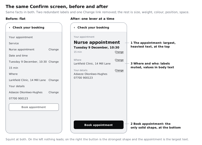
Step 1 · Make a flat Confirm screen
You need a starting point with no hierarchy at all, so the effect of each lever is visible. Add a page to your file called Hierarchy practice. Copy the high-fidelity Confirm frame onto it, or draw a 390 by 844 frame with a canvas (#F6F7F8) fill if you are starting fresh.
Leave the header alone. It is a component used on every screen, and its title, Check your booking, stays as it is. Below the header, make one vertical auto layout frame with 16 px padding and a gap of 16, and put these lines in it, in this order:
Your appointmentService, then a row withNurse appointmentand aChangelinkDate and time, then a row withTuesday 9 December, 10:30andChange, then15 minWhere, then a row withLarkfield Clinic, 14 Mill LaneandChangeYour details, then a row withAdaeze Okonkwo-HughesandChange, then07700 900123- the
Book appointmentbutton
Now flatten it. Give every text layer, including the Change links and the button label, the Body style (16, Regular) and the colour/text fill. Make the button the secondary version: surface fill, 1 px border stroke. Every gap is 16. Rename the frame 1 Flat.
Check it worked
Click any text layer below the header: the Typography section shows Body and nothing else. Zoom to fit and look at the frame for three seconds without reading. Nothing pulls your eye; the button reads like another row. If anything stands out, flatten it until it does not.
Step 2 · Decide what the patient must notice first, second and third
Before touching a single property, write the order down. Hierarchy is a decision about the patient's task, not about taste, and if you skip this the levers turn into decoration.
Ask what a patient on this screen is doing. They are checking that the booking is right, then committing to it. So:
- First: the appointment itself. Nurse appointment, Tuesday 9 December, 10:30. If the time is wrong, nothing else matters.
- Second: Book appointment. Once they are satisfied, the action must be findable without hunting.
- Third: where and whose details. Larkfield Clinic, 14 Mill Lane and Adaeze Okonkwo-Hughes. Worth a glance, rarely wrong.
- Everything else: the field labels, the
Your appointmentheading, the Change links. They help, but they should never compete.
Notice that the first and second items do different jobs. The appointment should be read first; the button should be the strongest shape, so the eye finds it when the reading is done. You will use different levers for each.
Put this list in a text layer to the right of 1 Flat, headed Order. Every later step is checked against it.
Check it worked
Your canvas has an Order note with four numbered lines. Each line names actual content from the screen (not "the important stuff"), and only one thing is in first place.
Step 3 · Change size only
Select 1 Flat and duplicate it (Cmd+D on Mac, Ctrl+D on Windows). Rename the copy 2 Size and move it to the right. In this frame you change font size and nothing else: weight stays Regular, colour stays text, spacing stays 16.
Set these sizes in the Typography section. Changing the size detaches the Body style on that layer, which is fine on a practice frame; you map everything back to styles in the last step.
Nurse appointment: 28Tuesday 9 December, 10:30: 20Your appointment,Service,Date and time,Where,Your details,15 minand the four Change links: 14- the button label: 14, the size of the
Labelstyle it will end up in; the button's shape, not its text size, will carry it later - everything else stays at 16
Size is the bluntest lever. A 28 px line among 16 px lines is noticed before anything else, even at Regular weight. Shrinking the labels matters as much as growing the service name: the gap between the levels is what creates the order, so making the quiet things quieter is half the work.
Check it worked
Put 1 Flat and 2 Size side by side and glance at each for three seconds. On 2 Size your eye lands on Nurse appointment first. The button has not moved up the order at all; if anything its smaller label makes it quieter. That is the limit of this lever, and the next three steps deal with it.
Step 4 · Change weight only
Duplicate 2 Size and rename it 3 Weight. Change only font weight:
Nurse appointmentandTuesday 9 December, 10:30: Semi Bold- the button label: Semi Bold
- everything else stays Regular
Weight adds darkness without taking space. That makes it the right lever for the date and time, which cannot grow much bigger without wrapping on a small phone. Use it sparingly: if four things are Semi Bold, none of them is.
Look at what has changed between 2 Size and 3 Weight. The appointment block now reads as one dark unit, and the button label is a little firmer, but the button is still an outline among text. Weight on its own cannot make an outlined box into the main action.
Check it worked
In 3 Weight, select each Semi Bold layer and count them: exactly three. Compare with 2 Size: the appointment lines look darker and more solid, and nothing else on the screen has changed.
Step 5 · Change colour only
Duplicate 3 Weight and rename it 4 Colour. Change only fills, using the Larkfield colour variables:
- Labels (
Your appointment,Service,Date and time,Where,Your details) and15 min:colour/text-muted - Change links:
colour/accent - The button: switch it to the primary version,
accentfill with the label inon-accent - Everything else stays
colour/text
Colour does two jobs here. Muting the labels pushes them back, so the values next to them come forward with no change in size. Filling the button makes it the only solid shape on the screen, so it becomes the strongest shape: the place the eye goes once the appointment has been read.
Check contrast while you are here, because muted is not the same as faint. The content sits on the canvas fill: text-muted on canvas is 5.73:1 and accent on canvas is 7.07:1, both above the 4.5:1 that WCAG 2.2 asks for body-size text. Muting by picking a lighter grey that falls below 4.5:1 is the most common way hierarchy work quietly breaks accessibility. People reading in bright sunlight, or on a dim budget screen with the brightness turned down to save battery, lose that text first.
Check it worked
Click empty canvas, select 4 Colour and look at Selection colors in the right sidebar: every entry is a Larkfield variable, with no raw hex values. The button is the only filled shape below the header, and every muted colour you used is at least 4.5:1 against its background.
Step 6 · Change position only
Duplicate 4 Colour and rename it 5 Position.
First, one content edit. Moving things is about to expose two redundant labels: once Nurse appointment sits directly above the date, nobody needs Service and Date and time to tell them what those lines are. Delete those two labels, and replace the Change links on the service and date rows with a single Change link for the block. That is the only content change in the strip; no words or facts are added, and every fact in 1 Flat is still on screen. Be honest with yourself about it when you compare 4 Colour and 5 Position: some of the calm comes from two fewer labels and one fewer link, not from position.
Now move things, without changing how anything looks:
- Stack the appointment block.
Nurse appointment, thenTuesday 9 December, 10:30, then15 min, directly underYour appointment. Move the block's one Change link to the right end of the15 minline. - Move the other Change links up to the right end of their label line (
Where,Your details), so the values, including07700 900123under the name, run in a clean left-aligned column with nothing beside them. - Move the button out of the list. Take it out of the auto layout stack and place it at the bottom of the frame, full width with 16 px margins and 16 px from the bottom edge. Then, in the Constraints section of the right sidebar, set horizontal to Left and right and vertical to Bottom, so the button stays pinned to the bottom and keeps its margins when the frame changes size. Without this it keeps the default Left and Top constraints and is left behind when the frame gets shorter.
Position works because people scan in a predictable order: top before bottom, and in a left-to-right language, left before right. The top-left of the content is the first place the eye lands, so the appointment goes there. The button at the bottom is where the reading ends and where a thumb rests on a phone held in one hand. If Larkfield ever ships an Arabic version, the left and right placements mirror; the top-to-bottom order does not.
The Change links are text-only targets. Make each one a frame at least 24 by 24 px around the word, which is the WCAG 2.2 minimum; 44 by 44 is more comfortable for fingers.
Check it worked
In 5 Position, the first text under the header is Your appointment, then Nurse appointment. The button's bottom edge is 16 px above the frame's bottom edge, its constraints read Left and right, Bottom, and there is empty space between the last row and the button. The Change links all line up on the right edge of the content.
Step 7 · Change space only
Duplicate 5 Position and rename it 6 Space. Change only gaps and padding:
- Inside a group (label to value, service to date, date to
15 min, name to number): 8, or 4 between a label and its value if 8 looks loose - Between groups (the appointment block, Where, Your details): 24
- Above the button, nothing to set; it already sits at the bottom of the frame
The easiest way is to wrap each group in its own vertical auto layout frame with a gap of 8, then set the gap of the parent stack to 24. Space tells people what belongs together. Before this step, Where sat as close to the line above it as to its own value; now the three groups read as three things, and the eye can jump from one to the next.
Check it worked
Select the content stack and read its gap in the Layout section: 24. Select any group inside it: its gap is 8 (or 4). Squint at the frame: you see three separate clusters of text and one button, not one long list.
Step 8 · Run the squint test and finish the after frame
Lay the six frames out in a row, 1 Flat to 6 Space. The first and last are your before and after.
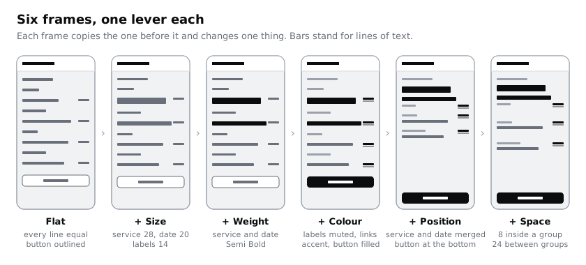
Now squint. Duplicate 1 Flat and 6 Space once more, and on each duplicate add a Layer blur effect from the Effects section of the right sidebar, with a blur of about 8. If you prefer, zoom out to around 10% instead, or step back from your screen and half-close your eyes. You are looking at shapes and darkness, not words.
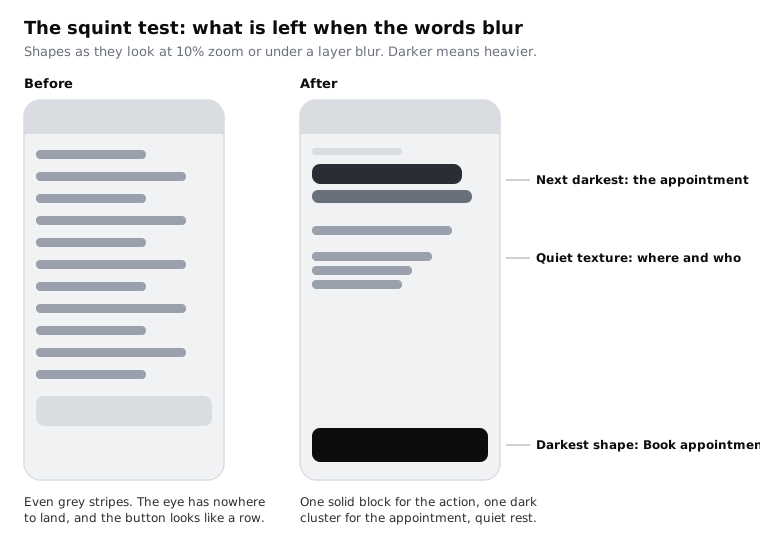
On the blurred 6 Space, the button should be the darkest, most solid shape, the appointment block the next, and the rest an even, quiet texture. If two shapes compete, take weight away from the one that is not the action rather than adding more to the button. Making the button bigger or adding a shadow to win an argument with a heavy heading only starts an arms race.
Two more checks before you call it done:
- Small screen. Duplicate
6 Space, resize it to 360 by 640, a common size for budget Android phones in many markets, and make sure the button still sits at the bottom with all three groups visible above it. - Longer words. Replace
Nurse appointmentwithMedication reviewand the name with a longer one. If Larkfield later adds translations, French or Swahili labels can run noticeably longer than English; the 28 px line should wrap onto two lines cleanly rather than squeeze.
Finally, map the practice frame back to the Larkfield text styles so nothing is left detached: the service name is Heading/L (Semi Bold 28), the date and time Heading/M (Semi Bold 20), values including the mobile number Body (Regular 16), labels, 15 min and Change links Body/Small (Regular 14), the button label Label (Semi Bold 14). The sizes and weights you chose already match those styles, so applying them changes nothing you can see.
Check it worked
You have six frames named 1 Flat to 6 Space in a row, plus two blurred copies. On the blurred 6 Space the button is the strongest shape, the appointment block is the next darkest cluster, and where-and-who is quiet texture. That is what your Order note asked for: the appointment read first, the action found second. On the blurred 1 Flat you cannot. Click every text layer in 6 Space: each shows one of the five Larkfield style names.
Next steps
You now know what each lever does on its own, which makes it easier to diagnose a screen that feels wrong: ask which lever is fighting your order.
- Use white space to group and separate content goes further with the space lever across a whole flow.
- Lay out screens on a column grid gives position a structure, so alignments stay consistent from screen to screen.
- Critique a screen with a visual design checklist turns the squint test into one item of a repeatable review.
- If you skipped the Larkfield series, Turn a mid-fidelity layout into a high-fidelity design sets up the colour variables and text styles this tutorial uses.
Part of these paths
Related tutorials
- Lay out screens on a column gridYou will have a Larkfield Clinic information page laid out in Figma on a 4-column phone grid and a 12-column desktop grid, with one deliberate break and a note of the grid values a developer needs.
- Critique a screen with a visual design checklistYou will have a ten-point visual design checklist with a test for each point, and a written critique of a real sign-up screen, under one page, where every finding states what you saw, the principle it breaks and a fix someone could draw.
- Use white space to group and separate contentYou will have a dense form-and-summary screen regrouped with space instead of boxes and divider lines, keeping two of its sixteen lines and boxes, and a gap ratio rule you can apply to any screen.
Need this done for you?
Padding does this work for growing companies, from the first diagnosis to a system that keeps working.
Get new tutorials