UI and visual design · Intermediate · 16 min
Critique a screen with a visual design checklist
By Padding · Updated 18 Nov 2026
A desktop browser with developer tools, a contrast checker and a document editor · November 2026
You will have a ten-point visual design checklist with a test for each point, and a written critique of a real sign-up screen, under one page, where every finding states what you saw, the principle it breaks and a fix someone could draw.
On this page
"It feels a bit busy" is the most common thing said about a screen, and the least useful. Nobody can act on it. A critique becomes useful when each comment says what is on the screen, which principle that breaks, and what to change. A checklist gets you there because it makes you look at the same ten things every time, in the same order, instead of reacting to whatever catches your eye first.
In this tutorial you build that checklist from the principles covered across the ui-visual-design tutorials: hierarchy, alignment, grouping, contrast, type, colour roles, states, consistency, density and touch size. You give each point a question with a yes or no answer and a test you can carry out. Then you use it to critique a sign-up screen from a public website or web app of your choice, and write up what you find on less than one page.
Sign-up screens make good practice. They are short, every product has one, and every visual problem on them costs the product new users. You will describe the screen in words instead of pasting a screenshot. Describing makes you notice more, and it means you can share the critique without republishing someone else's interface.
This is a critique you do alone, against principles you have written down. To run a critique with a group, see /tutorials/run-a-design-critique-in-figjam.
Step 1 · Write the ten checks as questions with a test
Open a new document and call it "Visual design checklist". Add a table with four columns: number, principle, question and test. Each question has to be one you can answer yes or no. Each test has to be something you do, not something you feel.
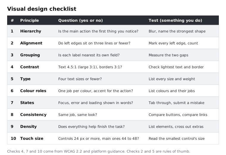
Here are the ten checks. Use the wording as a starting point and change it to suit your own work.
- Hierarchy. Is the one action this screen exists for the first thing you notice? Test: blur your eyes, or look at the screen from two metres away, and name the strongest shape.
- Alignment. Do the left edges of the content sit on three vertical lines or fewer? Test: mark every left edge on a printout or a duplicate, and count the distinct lines.
- Grouping. Is each label closer to its own field than to the field above it, and is the space between groups larger than the space inside them? Test: measure the two gaps.
- Contrast. Does all text reach 4.5:1 against its background (3:1 for large text), and do field borders and meaningful icons reach 3:1? Test: check the lightest text and the lightest border with a contrast checker.
- Type. Does the screen use four text sizes or fewer, and does body text read comfortably on a phone? Test: list every size and weight you find.
- Colour roles. Does each colour have one job, and is the accent colour reserved for the main action? Test: list every colour and write what it does.
- States. Do fields and buttons show what happens on focus, on error and while the form submits, with errors described in words? Test: tab through the form and submit it with a mistake.
- Consistency. Do things that do the same job look the same? Test: compare every button with every other button, and every link with every other link.
- Density. Does everything on the screen help the person finish this task? Test: list each element and cross out the ones the task does not need.
- Touch size. Is every control at least 24 by 24 pixels, and are the main ones nearer 44 to 48? Test: read the width and height of the smallest control.
Points 4, 7 and 10 come from WCAG 2.2 and the platform guidelines; the limits are in the sources for this tutorial. "Four sizes or fewer" and "three edges or fewer" are rules of thumb, not standards. A screen can break them and still be fine, but if it does, you should be able to say why.
Check it worked
Your table has ten rows. Read each question aloud: you can answer every one with yes or no. Read each test: every one is an action, such as measure, count, blur or submit, and none of them is "look at it and decide".
Step 2 · Choose a sign-up screen and view it at phone width
Pick a sign-up or create-account screen from a public website or web app. A product you use but did not design works best, because you will not fill in gaps from memory. Do not create an account, and do not type your own details into it. You only need to look at the form and send it once with a mistake.
Open the page in a desktop browser, open the developer tools and switch to device mode (Chrome and Edge) or Responsive Design Mode (Firefox). Set the width to 360 pixels. Many lower-cost Android phones, which are the main way a large share of people in Nigeria and across Africa reach the web, display pages at around this width, so problems that are hidden on a laptop show up here. Reload the page, so it loads the layout it serves to phones.
If you prefer, open the page on your own phone as well. You will still need the desktop tools to measure.
Check it worked
The page is showing at 360 pixels wide, with no sideways scrolling, and you can see the top of the form. You have written the product's name, the page's address and today's date at the top of a new document called "Sign-up critique".
Step 3 · Describe the screen in words, top to bottom
Before you judge anything, write down what is there. Work from the top of the page to the bottom, one line for each element. For each one, write what it is, what it says, and anything you can measure: its height, its text size and its colour. To measure, use the element inspector: select the element and read its width, height, padding and margin from the box model, and its font size and colour from the computed styles.
Note where the first screenful ends. That is everything a person sees before scrolling.
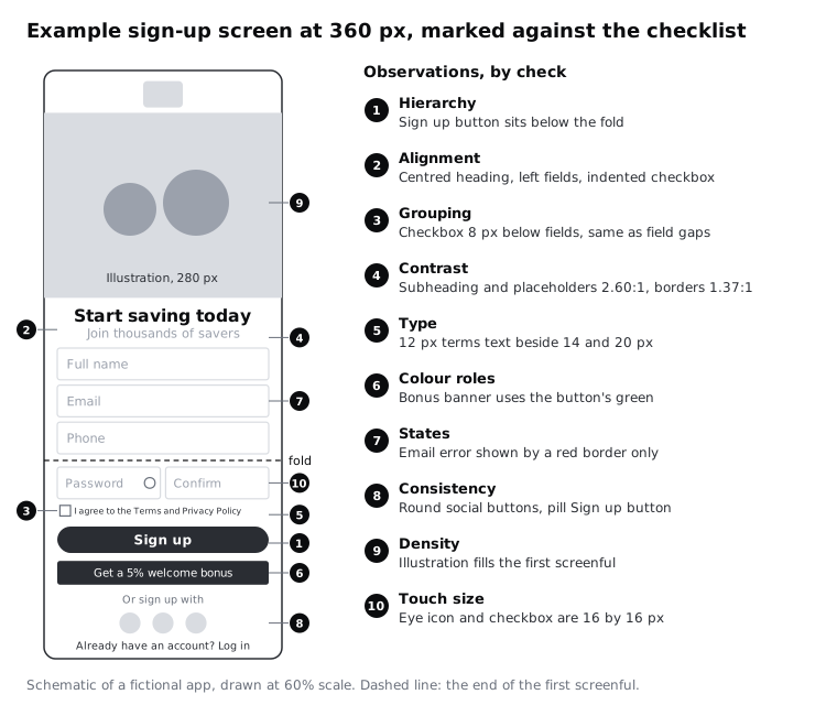
The rest of this tutorial uses a fictional savings app as its example. Its description reads:
- Logo, centred, 40 px tall.
- Illustration of people holding coins, full width, 280 px tall.
- Heading "Start saving today", 20 px bold, centred.
- Subheading "Join thousands of savers", 14 px, #9BA1AC on white, centred.
- Five fields, 8 px apart, each a white box with a 1 px #D9DCE1 border and the field name as grey placeholder text inside it, with no label above: Full name, Email, Phone, then Password and Confirm password side by side, each 156 px wide.
- An eye icon in the Password field, 16 by 16 px, with no padding around it.
- Checkbox, 16 by 16 px, with "I agree to the Terms and Privacy Policy", 12 px. Only "Terms" is underlined.
- Button "Sign up", full width, 40 px tall, in the brand green.
- Banner "Get a 5% welcome bonus", in the same brand green.
- "Or sign up with" and three round icon-only buttons, 32 px across.
- "Already have an account? Log in", 12 px, with "Log in" in the brand green.
- The first screenful ends at the Phone field. The Sign up button is below it, so people have to scroll to reach it.
Check it worked
Your description has one line for every visible element, in page order, and at least half the lines carry a measurement. A colleague who has never seen the page could sketch a rough wireframe from it. Your description says nothing about whether an element is good or bad yet.
Step 4 · Run each check and record what you see
Go down the checklist one row at a time, and do the test each row describes. Under each of the ten numbers in your critique document, write what you observed, as plain fact. If a check finds nothing wrong, write the evidence for that instead, such as "all controls are 44 px or taller".
For states (check 7), interact with the live form: press Tab to move through the fields, watch what each one does when it is focused, then type an invalid email such as name@ and press the submit button. Stop there.
The example's observations included:
- Hierarchy: blurred, the strongest shape is the illustration. The Sign up button is not visible without scrolling.
- Alignment: the heading and subheading are centred, the fields are left-aligned, and the checkbox sits 4 px further in than the fields. That makes four left edges, plus a centre line.
- Grouping: the fields are 8 px apart, and the checkbox is 8 px below the last field. The form and the terms read as one block.
- Contrast: the subheading and the placeholder text are #9BA1AC on white, 2.60:1. The field borders are #D9DCE1 on white, 1.37:1.
- States: with an invalid email, the email field's border turns red, and a message "Something went wrong" appears at the top of the page for about three seconds, then disappears.
- Touch size: the eye icon and the checkbox are 16 by 16 px, with no space around them. The social buttons are 32 px.
Check it worked
All ten checks have at least one line under them, and every line is something a second person could confirm by doing the same test. Search your notes for "feels", "looks", "nice" and "ugly": none of them should appear.
Step 5 · Turn each observation into a finding
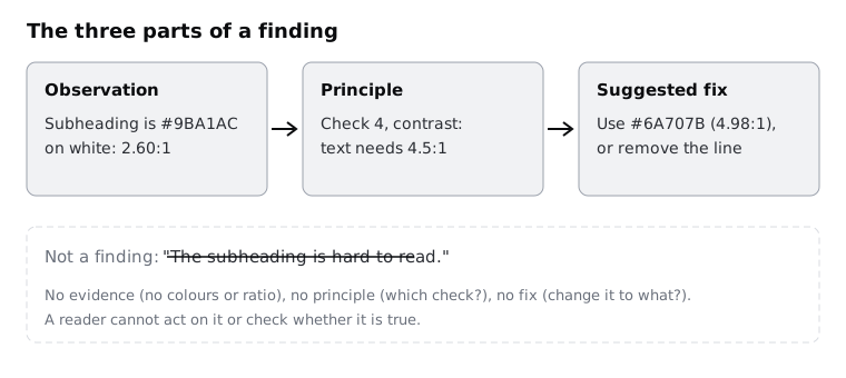
A finding has three parts, always in this order:
- Observation: what is on the screen, from your notes.
- Principle: which check it breaks, and why that matters to the person signing up.
- Suggested fix: a change specific enough that a designer could draw it without asking you what you meant.
Two of the example's findings read:
Observation: the field names appear only as placeholder text inside the fields, in #9BA1AC on white (2.60:1), and the field borders are #D9DCE1 (1.37:1).Principle: contrast (4) and states (7). Placeholder text has to meet 4.5:1 like any other text, and it disappears as soon as someone types, so the person loses the label while filling in the field. At 1.37:1, people with low vision may not find the fields at all.Suggested fix: put a visible label above each field in #2A2D33, and darken the field border to #6A707B (4.98:1).
Observation: an invalid email turns the field border red and shows "Something went wrong" at the top of the page for three seconds.Principle: states (7) and colour roles (6). The only sign of which field is wrong is a colour change, and the message neither says what went wrong nor stays long enough to read.Suggested fix: show "Enter an email address like name@example.com" in text directly under the email field, with an error icon, and keep it until the field is corrected.
An observation can feed more than one check. Write it once, and name every principle it breaks.
Check it worked
Every finding has all three parts. Cover the suggested fix with your hand and read the observation and principle: they should explain the problem on their own. Then read only the fix: you can picture the changed screen.
Step 6 · Rank the findings and keep the ones that matter most
You will probably have more findings than fit on a page. Give each one a rank:
- Stops people: someone could fail to sign up, or sign up with a mistake, because of it. The vanishing error message and the missing labels are in this group.
- Slows people: they get through, but with effort or doubt. The Sign up button below the first screenful is here: people have to scroll past an illustration to reach it.
- Polish: it makes the screen look less cared for, but it does not change what people can do. The four left edges are here.
Sort the findings by rank. Keep every finding that stops people, as many that slow people as will fit, and at most two polish items. Put the rest in a separate list at the end of your notes; they are not wrong, only not first.
Density often hides in the slows group. On the example screen, the 280 px illustration pushes half the form, and the Sign up button, below the first screenful, and on a slow or prepaid connection it is also the heaviest thing on the page to download. Cutting it, or shrinking it to a small strip, moves the form up and costs the person less data.
Check it worked
Every finding has one of the three ranks. The findings that stop people are at the top. You have between five and eight findings left, and the ones you cut are kept in a list, not deleted.
Step 7 · Write the critique on one page
Rewrite the critique document as the version you would hand to the team that owns the screen. Use this order:
- Header: the product, the page, the width you viewed it at, the date and which checks you ran.
- Summary: two or three sentences on what matters most. For the example: "The Sign up button is hidden below a large illustration and the fields have no visible labels. Errors are shown by colour only and vanish after three seconds. Fixing these three things should help more people finish signing up than any other change."
- Findings: a table with columns for rank, observation, principle and suggested fix, in rank order.
- What works: two things the screen does well, with the check each one passes. For the example, the button text is a clear verb ("Sign up") and the email field opens the email keyboard on a phone.
Keep each cell short. If an observation needs more than two lines, it is probably two findings.
Before you share it, read every finding once more and ask whether it would still hold if you liked the product's brand. A finding that disappears when you imagine a different taste was taste, not a principle. Cut it, or find the check it really breaks.
Check it worked
Export or print the document: it fits on one A4 or Letter page. Every finding in the table names a check from your checklist, and every check that found nothing is listed in the header, so a reader knows it was looked at. Give the page to someone who has not seen the screen. They can tell you the three most important changes without opening the website.
Next steps
Your checklist is a draft. After three or four critiques, you will find checks you never fail and things you keep noticing that are not on the list yet. Change it as you go.
- To take a screen like this to a group of colleagues and agree on changes together, follow /tutorials/run-a-design-critique-in-figjam.
- To fix a hierarchy finding properly, one lever at a time, work through /tutorials/create-visual-hierarchy-with-size-weight-and-position.
- For contrast findings on borders, placeholders and focus rings, see /tutorials/meet-contrast-rules-for-text-icons-and-focus-rings.
- To check the same screen for usability rather than visual design, try /tutorials/run-a-heuristic-evaluation.
Part of these paths
Related tutorials
- Run a design critique in FigJamYou will set up a FigJam board for one critique, run it in 30 minutes with a silent review before any discussion, and leave with a sorted list of agreed changes, each tied to the goal it serves.
- Create visual hierarchy with size, weight and positionYou will have a strip of six Figma frames that takes a flat confirmation screen to a clear one, one lever at a time, and a squint test showing the primary action is the strongest shape on the screen.
- Meet contrast rules for text, icons and focus ringsYou will have a contrast log for one Larkfield Clinic screen that covers icons and field borders, placeholder text, text on a photo and gradient, a disabled button and focus rings, with a measured ratio, a verdict and a fix for each failure.
Need this done for you?
Padding does this work for growing companies, from the first diagnosis to a system that keeps working.
Get new tutorials