UI and visual design · Intermediate · 17 min
Meet contrast rules for text, icons and focus rings
By Padding · Updated 18 Nov 2026
Figma (web) and a WCAG contrast checker in a browser · November 2026
You will have a contrast log for one Larkfield Clinic screen that covers icons and field borders, placeholder text, text on a photo and gradient, a disabled button and focus rings, with a measured ratio, a verdict and a fix for each failure.
On this page
Most contrast checks stop at body text: dark grey on white, 4.5:1, done. The failures that reach real screens are usually somewhere else. A field border so pale that the field disappears. A search icon in the same grey as the placeholder. A heading laid on a photo that passes on the dark doorway and vanishes on the white wall. A disabled button nobody can read. A focus ring that is the same colour as the button it surrounds.
WCAG 2.2 covers each of these, but with different rules. Text, including placeholder text, falls under success criterion 1.4.3. Icons, borders, and the parts of a control that show its state fall under 1.4.11, which asks for 3:1 against every colour the part touches. Disabled controls are exempt from both. Focus indicators have their own criteria. This tutorial works through all five cases on one screen, measures each one, and records the result in a contrast log that a developer or tester can read without opening the design.
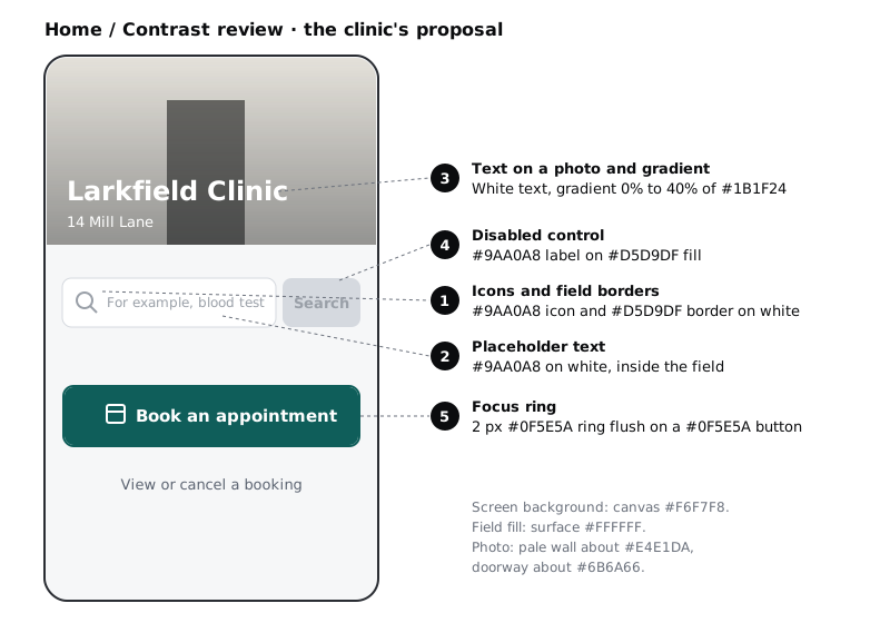
The screen is a proposal for the Larkfield Clinic booking app. The clinic has asked for a new Home: the entrance photo across the top with the clinic name and address laid on it, a search field for services with a Search button that stays disabled until something is typed, and the existing Book an appointment button with a calendar icon. The colours come from the Larkfield variables in the high-fidelity tutorial. If you rebuilt the palette with tonal ramps, your greys are a shade different; use your own values, and the method is the same.
Step 1 · Set up the review frame and an empty log
Duplicate the Home frame from your 04 High fidelity page and name the copy Home / Contrast review. Build the proposal on the copy so the approved Home stays untouched:
- Photo: the 16:9 entrance photo moves to the top of the frame, full width. On it, a linear gradient layer from #1B1F24 at 0% opacity at the top to #1B1F24 at 40% at the bottom. On the gradient,
Larkfield ClinicinHeading/L(28, semi bold) and14 Mill LaneinBody/Small(14), both white. - Search: a field with fill
surface, a 1 px stroke inline(#D5D9DF), a magnifier icon in #9AA0A8, and the placeholderFor example, blood testin #9AA0A8. Beside it, aSearchbutton with fill #D5D9DF and label #9AA0A8, standing for its disabled state. - Book: the primary button
Book an appointmentinaccent(#0F5E5A) with white text and a white calendar icon, and a focused version of it with a 2 pxaccentring drawn flush against its edge.
The frame background stays canvas (#F6F7F8).
If you did the high-fidelity tutorial, you deleted the grey placeholder colour and moved field borders from line to border. The proposal brings back both, the pale line border and the #9AA0A8 grey, which is exactly why it needs a review. Add #9AA0A8 as a plain hex value on the copy rather than restoring the variable.
Next to the frame, make a text layer or a simple table called Contrast log: Home. Give it these columns: element, case, foreground, what it touches, rule, needs, measured, result, fix, after fix. You fill one row per element as you go. Writing down what the colour touches, not just "the background", is the habit that catches most non-text failures.
Check it worked
Your file has a Home / Contrast review frame with the photo, the search field, the disabled Search button and both versions of the Book button, and the original Home frame is unchanged. Beside it sits an empty log with ten column headings.
Step 2 · Check icons and field borders against everything they touch
Non-text contrast (1.4.11) asks for 3:1 between a part of the interface and each colour next to it, when that part is needed to see the control or understand the content. A field border is the only thing that shows where the field is. An icon with meaning, such as the magnifier, counts too.
Select the field's stroke and use the eyedropper (I) or the stroke's hex code to get its colour, then check it against both sides:
line#D5D9DF against the field's white fill: 1.42:1- the same border against the
canvas#F6F7F8 around the field: 1.32:1
Both fail 3:1. Now the magnifier: #9AA0A8 on white is 2.64:1, which also fails. The calendar icon on the Book button is white on #0F5E5A, 7.58:1, a pass.
Fix the border with the border variable (#7D8592) that the high-fidelity tutorial added for exactly this job: 3.72:1 on white and 3.47:1 on canvas. Check both numbers, because a border that passes on one side can fail on the other when the field sits on a tinted panel. Give the magnifier text-muted (#5A6270), which reaches 6.15:1 on white. Leave line for decorative dividers, which do not need to meet 1.4.11.
Add three rows to the log: field border (fail, then 3.72 and 3.47 after the fix), search icon (fail, then 6.15) and calendar icon (pass, 7.58).
Check it worked
The field on your review frame has a #7D8592 stroke and the magnifier is #5A6270. Squint at the frame: the field reads as a box even from a distance. The log has three rows, and the border row shows two ratios, one for each side.
Step 3 · Treat placeholder text as text
The Understanding document for 1.4.3 says it applies to placeholder text. For example, blood test in #9AA0A8 on white is 2.64:1, against a requirement of 4.5:1. It fails.
Do not darken the placeholder until it passes; the placeholder fix in Turn a mid-fidelity layout into a high-fidelity design explains why. Apply the same fix here and move the words out of the field:
- Add a visible label above the field,
Search for a service, inLabelandtext(#1B1F24). - Put the example under the field as a hint,
For example, blood test, inBody/Smallandtext-muted. On thecanvasbackground that is 5.73:1. - Leave the field empty.
If the clinic insists on keeping a placeholder as well, colour it text-muted (6.15:1 on white) and keep the label and hint anyway, so nothing the person needs lives only inside the field.
Log the placeholder row as a fail at 2.64 with the fix "label above, hint below at 5.73".
Check it worked
Your search field has a label above it, a hint below it, and no grey text inside it. Read the hint at 50% zoom: it is still legible. The log row for the placeholder names the fix and the new ratio.
Step 4 · Measure text on a photo at its lightest point
Text on a photo has no single background colour, so there is no single ratio. Test the worst case: the lightest pixel the text crosses, because that is where it will vanish first. Averaging the photo hides the problem.
Hide the gradient layer. Zoom in on the area behind Larkfield Clinic and use the eyedropper to sample the lightest part of the photo under the letters, then the darkest:
- the pale wall beside the door, about #E4E1DA: white text there is 1.31:1
- the dark doorway, about #6B6A66: white text there is 5.41:1
Your photo will give different values; use the ones you sample. The heading is 28 px and semi bold, so it counts as large text and needs 3:1. The address is 14 px and needs 4.5:1.
Now account for the gradient. A layer of colour at an opacity changes what is behind it, per channel: blended = gradient colour × opacity + photo colour × (1 − opacity). Work it out where the gradient is weakest behind each line of text, over the lightest pixel you sampled:
- The heading sits where the gradient is about 30%. #1B1F24 at 30% over #E4E1DA gives #A8A7A3, and white on that is 2.41:1. Large text needs 3:1: fail.
- The address sits at the bottom, at 40%, which gives #949391 and 3.07:1. Small text needs 4.5:1: fail.
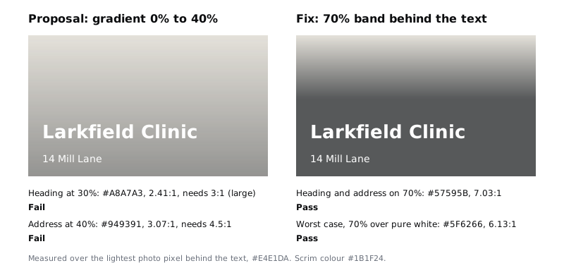
Change the gradient so it fades from 0% to 70% above the text, then holds 70% from the top of the heading to the bottom of the photo. Over the pale wall, 70% gives #57595B, and white on it is 7.03:1 for both lines. The other fix, often the better one, is to take the text off the photo and set it below, as the approved Home does.
The clinic will swap the photo one day. Test the scrim against the worst photo possible, pure white: 70% of #1B1F24 over #FFFFFF gives #5F6266, and white text on that is 6.13:1. Because no photo is lighter than white, write in the log that the scrim passes for any photo. If you change the scrim colour or opacity, run this check again.
Check it worked
With the gradient visible, the heading and address are readable over the lightest part of the photo, not just the dark doorway. Your log has a row for each text line with the lightest sampled colour, the gradient opacity at that point, the blended hex value and a ratio at or above its threshold.
Step 5 · Record the disabled button as exempt, then fix it anyway
The greyed-out Search button has an #9AA0A8 label on a #D5D9DF fill: 1.86:1. Both 1.4.3 and 1.4.11 exempt components that are visible but not available for interaction, so this does not fail WCAG.
Log it as exempt, and then log why it is still a problem:
- People with low vision, or anyone on a dim screen in sunlight, cannot read what the button says, so they do not know what will happen when it is enabled.
- A disabled button does not say why it is disabled. Someone who has not noticed the empty field taps it, nothing happens, and they are stuck.
- Disabled buttons are usually skipped by the Tab key, so keyboard users may not reach them, and screen readers announce them only as unavailable, without saying why.
The fix for Larkfield is to stop disabling it. Keep Search enabled in the normal accent style, and if someone searches with an empty field, show Enter a service to search for under the field in Body/Small and danger (#B42318). On canvas that is 6.13:1. If a team decides a control must be disabled, keep its label readable anyway: text-muted on #D5D9DF is 4.34:1, close to the text threshold, and text on the same fill is 11.69:1.
Check it worked
The Search button on your review frame uses the enabled style, and there is an error message variant of the field with the danger text under it. The log row for the button says "exempt (inactive component)", gives 1.86, and still lists a fix.
Step 6 · Make the focus ring visible against every neighbour
A focus indicator shows keyboard users where they are. Focus Visible (2.4.7, level AA) requires one to exist. 1.4.11 then asks that the indicator reaches 3:1 against the colours next to it. Focus Appearance (2.4.13) is level AAA, so it is a target rather than a requirement for most products, but it is a useful test: the indicator should cover at least the area of a 2 px line around the control, and the same pixels should change by at least 3:1 between unfocused and focused.
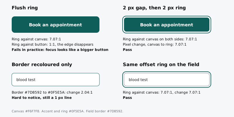
Check the proposal's flush ring on the Book button:
- The ring (#0F5E5A) against the canvas outside it: 7.07:1, a pass.
- The ring against the button it touches, also #0F5E5A: 1:1. The button just looks 2 px bigger.
On paper the ring passes 1.4.11 against the canvas, but nobody can see a change when focus lands. Log this as a Focus Visible problem (2.4.7, with 2.4.13 at AAA): it fails in practice while meeting 1.4.11 against the canvas, so a tester does not cite 1.4.11 for it. Separate the ring from the button: leave a 2 px gap of canvas between the button's edge and the ring, then draw a 2 px accent ring outside the gap. Now the ring is 7.07:1 against the canvas on both sides, the button edge is visible inside it, and the pixels where the ring sits change from #F6F7F8 to #0F5E5A, 7.07:1, which meets the AAA test as well.
Then check the search field. If its focus state only recolours the 1 px border from #7D8592 to #0F5E5A, those pixels change by 2.04:1. That misses only the AAA test in 2.4.13; #0F5E5A against white (7.58:1) or canvas (7.07:1) still passes 1.4.11, so do not log it as an AA failure. The indicator is the same thin line as before. Use the same offset ring there, so every control on the screen shows focus the same way.
The ring also has to stay visible on top of everything else, such as a sticky header, and has to work on tinted and dark surfaces. Design visible focus states for keyboard users covers that in detail; here you only need the contrast numbers in the log.
Check it worked
The focused Book button and the focused search field on your frame both have a 2 px gap and a 2 px accent ring. Turn your screen brightness down and look from arm's length: you can tell which control has focus without hunting. The log has two focus rows, each with the ratio against neighbours and the focused-versus-unfocused change.
Step 7 · Finish the log and test it on a real phone
Read the log top to bottom. Every row needs a measured ratio, a threshold, a result of pass, fail or exempt, and for every fail or exempt row a fix with its new ratio. You should have about ten rows across the five cases. The image below is a shortened view: it leaves out the foreground, what it touches and fix columns, which your full log keeps.
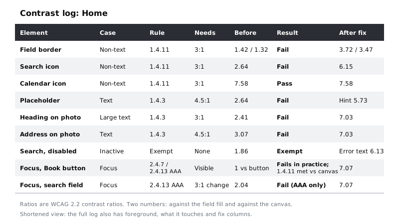
Then look at the fixed frame on an actual phone, by exporting it as a PNG or opening a prototype link. Contrast ratios are calculated, but people read on real screens: older and budget Android phones, often with battery saver dimming the screen, and often outdoors. Many Larkfield patients will book that way, as will many users across Africa and elsewhere where a lower-cost phone on prepaid data is the main device. Where you can, aim above the minimum for the text people must read, such as the appointment time, rather than stopping at 4.5:1.
A note on APCA
You may see APCA scores in some checkers. APCA is a contrast method whose own project describes it as a draft being evaluated as a replacement for the WCAG 2 maths, and the current WCAG 3 working draft says its contrast algorithm is yet to be determined. It can be a useful second opinion, especially for thin fonts and dark themes, but it is not a requirement. Keep your log in WCAG 2.2 ratios, which is what audits and accessibility laws refer to today.
Check it worked
Your log has a row for each element, no row is missing a result, and every fail or exempt row has a fix and an after-fix number. On the phone, the heading on the photo, the hint under the field, the field outline and the focus ring are all visible at low brightness.
Next steps
Hand the log to whoever builds or tests the screen, so the numbers travel with the design.
- Build a colour palette with tonal ramps labels every colour step with its contrast, so most of these checks are settled before you draw a screen.
- Design visible focus states for keyboard users takes the focus ring onto every Larkfield surface and adds a tab order.
- Never rely on colour alone to carry meaning covers the states and charts that contrast alone does not fix.
- Turn a mid-fidelity layout into a high-fidelity design has the text-pair contrast check this tutorial builds on.
Part of these paths
Related tutorials
- Build a colour palette with tonal rampsYou will have four ten-step colour ramps built in OKLCH on a Figma palette page, each step labelled with its contrast on white and on the darkest grey, and the Larkfield semantic colour tokens pointing at ramp steps.
- Design visible focus states for keyboard usersYou will have a focus sheet for the Larkfield Clinic booking app that shows one two-colour focus ring on every component and surface, the space it needs clear of sticky bars, and a numbered tab order for the Pick a time screen.
- Turn a mid-fidelity layout into a high-fidelity designYou will have high-fidelity Larkfield Clinic booking screens in Figma, coloured, typeset, with icons and one photo, every text and colour pair checked for contrast and ready to wire into a prototype.
Need this done for you?
Padding does this work for growing companies, from the first diagnosis to a system that keeps working.
Get new tutorials