UI and visual design · Intermediate · 19 min
Build a colour palette with tonal ramps
By Padding · Updated 18 Nov 2026
Figma (web) and any OKLCH colour picker in a browser · November 2026
You will have four ten-step colour ramps built in OKLCH on a Figma palette page, each step labelled with its contrast on white and on the darkest grey, and the Larkfield semantic colour tokens pointing at ramp steps.
On this page
Part 2 left Larkfield Clinic with a token table: a primitives collection of raw values and a semantic collection of jobs such as colour/accent and colour/danger. The primitives, though, are whatever the audit found. There is one teal, one red, one amber and a handful of greys, each picked at some point for one screen. The day someone needs a darker teal for a pressed button, or a pale red for a form summary, they will open a colour picker and invent one, and the palette starts to drift.
A tonal ramp stops that. For each hue you build about ten steps from near-white to near-black, all at fixed lightness levels, so that step 600 of teal and step 600 of red are equally dark and pass the same contrast tests. Later colours are then chosen from the ramp, not invented, and anyone can read a token like red/700 and know roughly what it does before they see it.
This is part 3 of the series that builds a minimal design system for the Larkfield booking app. You will build four ramps (teal for the accent, grey, red for danger, amber for notices), label every step with its contrast, add the ramps to the Larkfield primitives collection, and re-point the semantic tokens at ramp steps. The screens from the high-fidelity tutorial keep working throughout, because no layer on them points straight at a primitive.
Step 1 · Make a palette page and fix the lightness of each step
Add a page to the Larkfield file called Palette. On it, make a text layer with the ten step names you will use for every hue and the lightness each step must have. Lower numbers are lighter, as part 2's naming rule says:
- 50: L 0.97
- 100: L 0.93
- 200: L 0.87
- 300: L 0.79
- 400: L 0.70
- 500: L 0.61
- 600: L 0.52
- 700: L 0.44
- 800: L 0.35
- 900: L 0.26
L is the lightness channel of OKLCH, a colour space built so that equal steps in L look like equal steps in lightness to the eye, whatever the hue. That is the point of using it here. HSL, which most pickers default to, has a lightness channel too, but it does not track what people see: pure yellow and pure blue are both "50% lightness" in HSL, yet one is almost invisible on white and the other is very dark. In OKLCH, four hues at the same L land within a narrow band of contrast on white.
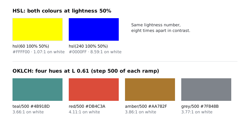
The targets above are not a standard. They are spaced a little closer at the light end, where the eye picks up small differences against white, and they put the 4.5:1 line for text between 500 and 600 for every hue. You can move them, but fix them before you build anything: changing one later means re-checking every ramp.
Under the list, draw ten empty frames in a row, 64 wide and 96 tall, 8 apart, and name them 50 to 900. These are the slots for the teal ramp. Duplicate the row three times for grey, red and amber, and put the hue name at the start of each row.
Check it worked
The Palette page has a text layer listing ten steps with an L value each, falling from 0.97 at 50 to 0.26 at 900 with no value repeated. Below it are four labelled rows of ten empty frames, named 50 to 900 from left to right.
Step 2 · Measure your anchor colours in OKLCH
Each ramp grows out of one colour you already have, the anchor. For Larkfield the anchors are the three brand and status colours from the audit, plus the old text grey:
- Accent teal: #0F5E5A
- Danger red: #B42318
- Notice amber: #8A5A00
- Text grey: #1B1F24
Paste each hex code into the OKLCH picker and write down the three numbers it shows on the palette page, next to the row the anchor belongs to. You should see something like this:
- Teal #0F5E5A: L 0.44, C 0.071, H 190
- Red #B42318: L 0.50, C 0.182, H 30
- Amber #8A5A00: L 0.51, C 0.108, H 73
- Grey #1B1F24: L 0.24, C 0.011, H 254
C is chroma, how colourful the colour is, and H is the hue angle. Read the L values against your step list. Teal's 0.44 sits exactly on step 700, red's 0.50 and amber's 0.51 are closest to 600, and the grey sits a little darker than 900. That tells you where each anchor belongs in its ramp, and it may not match the step part 2 gave it. Part 2 named the clinic red red/700 by eye; measured, it is a 600.
Check it worked
Your palette page has four lines, one per anchor, each with an L, C and H value, and a note of the step each anchor is closest to: teal 700, red 600, amber 600 and grey 900.
Step 3 · Build the teal ramp around the brand colour
Now fill the teal row. For every step, keep the hue at 190, set L to the step's target, and set C to a share of the anchor's chroma (0.071). Colours near white and near black cannot hold much chroma, so the share tapers at both ends:
- 50: L 0.97, C 0.014 (20%)
- 100: L 0.93, C 0.025 (35%)
- 200: L 0.87, C 0.039 (55%)
- 300: L 0.79, C 0.053 (75%)
- 400: L 0.70, C 0.064 (90%)
- 500 and 600: C 0.071 (100%)
- 700: the anchor itself, #0F5E5A
- 800: L 0.35, C 0.064 (90%)
- 900: L 0.26, C 0.053 (75%)
Type the three values into the picker, copy the hex code it gives you, and paste it as the fill of the matching frame. Write the hex code in a small text layer under the frame as well, because you will need it in the variables step.
At 800 and 900 the picker will warn that the colour does not fit in sRGB. Lower C a step at a time until the warning goes, rather than accepting the out-of-gamut value: a colour outside sRGB is shown on most screens as a clipped substitute you did not choose. Something around C 0.060 for 800 and 0.045 for 900 fits. This matters in practice. Many budget phones have displays that show little more than sRGB, so a palette that relies on wide-gamut colour can look different on the very screens a community clinic most needs to serve.
Step 700 is not computed. Put the brand colour there unchanged. The computed value for L 0.44 would be #105F5B, one digit away, which tells you the brand teal already sits on the curve. If your anchor's L sits between two targets, put it on the nearer step anyway and check that the ramp still gets darker at every step; a ramp that goes light, dark, light again is broken.
Check it worked
The teal row has ten filled frames that get darker from left to right with no step looking the same as its neighbour. Frame 700 is #0F5E5A exactly. No hex code in the row came from a value the picker flagged as outside sRGB. Your values should be close to these, within a digit or so: #EBF8F7, #D6EEEB, #B8DDDA, #94C6C2, #6EACA7, #4B918D, #2F7672, #0F5E5A, #014441, #002B29.
Step 4 · Build the grey, red and amber ramps the same way
Use the same lightness targets and the same chroma shares for the other three rows. Only the hue and the anchor change.
Grey has almost no chroma, so do not take a share: use C 0.012 and H 258 for every step, and C 0.004 at 50 so the lightest grey reads as nearly white rather than faintly blue. Do not pin the old text grey at 900. It was darker than the other 900s (L 0.24), and pinning it would make grey 900 pass tests the other 900s fail. The text colour moves from #1B1F24 to the computed grey/900, which is still far above any contrast threshold.
Red uses H 30, with C as a share of 0.182. Pin #B42318 at 600. Red is the most saturated hue here, so the picker will flag more of its steps than it did for teal: the light steps 50 to 300 and the dark steps 700 to 900 all need their chroma lowered for sRGB, the same way. Values that fit are about C 0.013 at 50, 0.035 at 100, 0.068 at 200, 0.120 at 300, 0.176 at 700, 0.140 at 800 and 0.104 at 900. Steps 400 and 500 fit at their full share.
Amber uses H 73, with C as a share of 0.108. Pin #8A5A00 at 600. Its light steps fit as they are, but 700 to 900 need lower chroma: about C 0.093 at 700, 0.074 at 800 and 0.055 at 900.
You should end up with values close to these:
- Grey: #F3F5F8, #E3E8F0, #CFD5DC, #B6BBC2, #9A9FA6, #7F848B, #656970, #4E5359, #373B41, #20242A
- Red: #FEF2F0, #FFE0DA, #FFC4BA, #FF9C8C, #F3715E, #DB4C3A, #B42318, #9D0900, #720500, #4B0100
- Amber: #FFF3E5, #F8E5CD, #EDCFAA, #DBB380, #C39557, #AA782F, #8A5A00, #714902, #513301, #341F00
Then do a squint test. Zoom out until the swatches are small, or blur your eyes, and look down each column. Step 500 of all four rows should look about equally dark, and so should step 200. If one hue jumps out as lighter or darker in a column, its L was typed wrong, or a pinned anchor sits too far from its target. Yellows and ambers can look muddy in the dark steps; some teams nudge the hue a few degrees towards orange at 700 to 900 to fix this. That is a fair choice, as long as L stays on target.
Check it worked
The palette page has four full rows, forty filled frames, each with its hex code written under it. Red 600 is #B42318 and amber 600 is #8A5A00 exactly. Looking down any column, the four swatches are close in lightness, and looking along any row, every step is darker than the one to its left.
Step 5 · Label every step with its contrast
A ramp is only useful to the next designer if it says which steps are safe for what. Under each hex code, add two lines with the contrast of that step on white (#FFFFFF) and on grey/900, the darkest grey (#20242A). Get the numbers from the contrast checker, and use a short form so they fit: W 7.58 and D 2.06. Make the numbers bold where they reach 4.5:1, the WCAG 2.2 minimum for normal-size text, so the safe steps stand out without relying on colour.
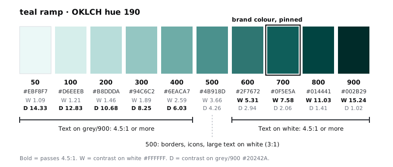
Because every hue shares the same lightness targets, the same pattern holds in all four rows:
- Steps 600 to 900 pass 4.5:1 on white. They are for text, links and filled buttons with white text.
- Steps 50 to 400 pass 4.5:1 on grey/900. They are for text on a dark surface, and for light tints behind dark text.
- Step 500 passes neither for normal text, with 3.66 to 4.11 on white across the four hues. It does pass 3:1 on white, which is the bar for input borders, icons that carry meaning and large text (18 pt, or 14 pt bold).
That gap at 500 is useful, not a flaw. It gives you a step for borders and icons that is clearly visible without competing with text.
Write the three rules as a text layer to the right of the ramps, under the heading How to use these steps. This note is what turns a set of swatches into a palette someone else can use.
Check it worked
Every one of the forty swatches has two contrast numbers under it. In every row, the bold W numbers start at 600 and the bold D numbers stop at 400. If a row breaks that pattern, find the step, check its L, and fix it before you go on. The How to use these steps note sits beside the ramps.
Step 6 · Add the ramps to the Larkfield primitives collection
Open the variables window and the Larkfield primitives collection from part 2. Do not delete the old primitives and start again: the semantic tokens point at them, and a variable you edit or rename keeps its place in those aliases. Work through each ramp:
- Where part 2 already has a variable at the right step, change its value to the ramp's hex code instead of adding a new variable with the same name. For Larkfield that is nine variables:
teal/700(no change),teal/50(from #E3F0EE to #EBF8F7),grey/50(from #F6F7F8 to #F3F5F8),grey/200(from #D5D9DF to #CFD5DC),grey/500(from #7D8592 to #7F848B),grey/600(from #5A6270 to #656970),grey/900(from #1B1F24 to #20242A),red/50(from #FDECEA to #FEF2F0) andamber/50(from #FFF4DC to #FFF3E5). - Where part 2 put a colour at the wrong step, rename the variable before you add anything. For Larkfield that is two variables, both measured as 600 in step 2:
red/700(#B42318) becomesred/600, andamber/700(#8A5A00) becomesamber/600. Their values do not change. - Add the missing steps as new colour variables, named
teal/100,teal/200and so on. The slash keeps each hue in its own group in the variables window. - Keep
grey/0at #FFFFFF. White is not part of a ramp, but it is a primitive the semantic tokens need. - Delete any old primitive that no longer matches a ramp step, such as a stray grey from the audit, but only after the next step, once no semantic token points at it.
Then go back to the palette page and set the fill of each swatch frame to its variable instead of the pasted hex. From now on the swatches show what the variables hold, so the page cannot fall out of date.
Check it worked
The Larkfield primitives collection has four colour groups, teal, grey, red and amber, each with ten variables from 50 to 900, plus grey/0. Open the Larkfield semantic collection: colour/danger now reads red/600, not red/700, and colour/notice now reads amber/600, not amber/700. Select any swatch on the palette page: its fill shows a variable name in the right sidebar, not a hex code.
Step 7 · Re-point the semantic tokens at ramp steps
Now go through the Larkfield semantic collection and make every colour token point at a ramp step. Choose by the usage rules you wrote, not by which swatch looks nearest. Some tokens already point at the right step after the last step's edits; check them anyway.
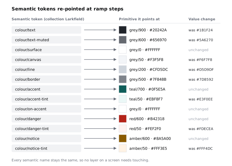
The pattern behind the choices:
- Text and filled actions sit at 600 to 900:
texton grey/900,text-mutedon grey/600,accent,dangerandnoticeon their 600 or 700. - Backgrounds and tints sit at 50:
canvason grey/50 and each-tinton its hue's 50. borderis grey/500, the step built for 3:1.line, the decorative divider, is grey/200 and does not need to pass.
Then re-run the contrast checker on the pairs the screens actually use, because a pair is two steps, not one. With the Larkfield values you should see text on surface at 15.59:1, text-muted on canvas at 5.05:1, on-accent on accent at 7.58:1, accent on accent-tint at 6.97:1, danger on danger-tint at 6.00:1, notice on notice-tint at 5.42:1 and border on surface at 3.77:1. All pass. Update the contrast note on the high-fidelity page with the new numbers.
Check it worked
In the Larkfield semantic collection, every colour token shows a primitive name such as grey/600 as its value, and none shows a raw hex code. Open the 04 High fidelity page and select a whole screen: Selection colors in the right sidebar lists only Larkfield semantic variables, and the screens look almost unchanged, with slightly cooler greys and paler tints. Your updated contrast note lists every pair as a pass.
Step 8 · Choose a new colour from the ramp
Test the palette the way it will be used. Larkfield needs a pressed state for the main button, a shade darker than colour/accent. Before this part, someone would have dragged the picker a little darker and typed the hex in. Now the answer is on the palette page: one step down, teal/800.
Add a semantic token colour/accent-pressed and point it at teal/800. Its contrast with white is already written under the swatch (11.03:1), so you know white text still reads on it without opening a checker. Part 6 uses this token when it specifies the button's states.
Add one line to the How to use these steps note: "New colour needed? Pick a step from a ramp and add a semantic token. If no step works, raise it with the team before adding a hex code."
Check it worked
The Larkfield semantic collection has colour/accent-pressed pointing at teal/800, and no variable anywhere in the file holds a hex code that is not on the palette page. The usage note ends with the rule about new colours.
Next steps
The colours are done. In Set a type scale for an app, part 4 of this series, you do the same for text: a short scale of sizes and line heights, chosen instead of typed.
For the contrast cases this palette does not settle on its own, such as icons, focus rings and text on photos, work through Meet contrast rules for text, icons and focus rings. If you want to check that every colour on a screen has a job before you add more steps, see Use colour for roles, not decoration. And when the ramps need a dark mode, Create colour variables with light and dark modes shows how a second mode points the same semantic tokens at different steps.
Part of these paths
Related tutorials
- Name design tokens from primitives to rolesYou will have the Larkfield Clinic values split into a primitives collection and a semantic collection in Figma variables, every semantic token aliasing a primitive, and a one-paragraph naming rule your team can apply to any new token.
- Meet contrast rules for text, icons and focus ringsYou will have a contrast log for one Larkfield Clinic screen that covers icons and field borders, placeholder text, text on a photo and gradient, a disabled button and focus rings, with a measured ratio, a verdict and a fix for each failure.
- Use colour for roles, not decorationYou will have a screen that uses one accent colour and neutrals, with every colour given a job, and a colour-role legend that says what each colour is for and never for.
Need this done for you?
Padding does this work for growing companies, from the first diagnosis to a system that keeps working.
Get new tutorials