UI and visual design · Beginner · 14 min
Use colour for roles, not decoration
By Padding · Updated 18 Nov 2026
Figma (web) or any design tool · November 2026
You will have a screen that uses one accent colour and neutrals, with every colour given a job, and a colour-role legend that says what each colour is for and never for.
On this page
Most screens that feel noisy do not have too many elements. They have too many colours, and each colour was added for a reason that made sense on the day: a brand gradient for the header, a different tint per category so the list "pops", an orange badge to push one option. None of them is wrong on its own. Together they leave the person using the screen with no way to tell which colour means "tap here", which means "you chose this" and which means "something is wrong".
The fix is not a better palette. It is a rule about what colour is for. In an interface, every colour should have one job, and there are only five jobs: action (things people can tap that do something), selection (what is currently chosen), status (the system telling people something needs attention), surface (backgrounds, cards and dividers) and text. A colour with none of those jobs is decoration, and on a working screen decoration competes with the colours that carry meaning.
In this tutorial you take one screen that has been decorated, list every colour on it, give each colour a job or remove it, keep the accent for things people can act on, and write the result down as a colour-role legend. The example is Larkfield Clinic, a fictional community clinic, and the Choose a service screen of its booking app: five services (GP appointment, Nurse appointment, Blood test, Vaccination, Medication review) and a button to go on and pick a time.
Step 1 · Set up a Before and an After frame
Someone has brightened up the Larkfield Choose a service screen for a clinic open day. Rebuild that version so you have something real to fix. Duplicate your high-fidelity Choose a service frame, name the copy Colour roles / Before, and change it to match the diagram:
- The header becomes a band with a gradient from #0F5E5A to #2BA59B, and the Back link turns white.
- The title
Choose a serviceturns accent teal, #0F5E5A, and so do the five chevrons. - Each service gets a 36 by 36 icon tile in its own colour: GP #3B82C4, Nurse #D9468F, Blood test #C93A3A, Vaccination #3E9B4F, Medication review #7A4FC2.
- The durations (
10 min,15 minand so on) turn light teal, #2BA59B. - GP appointment gets an orange
Popularbadge, #F08A24 with white text. - Blood test's duration is replaced by
Fully booked todayin red, #C93A3A. - Nurse appointment is selected, shown only by a pale #E3F0EE row background.
- The
Choose a timebutton stays #0F5E5A with white text.
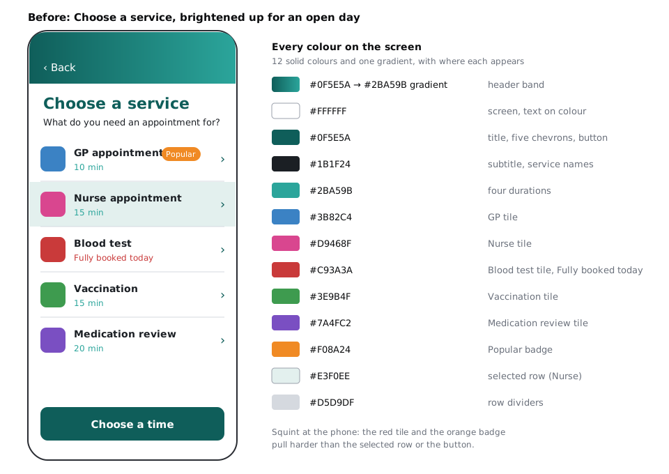
If you are working on your own product instead, pick a screen you suspect is too colourful and duplicate it as it is. Either way, duplicate Colour roles / Before once more and name the copy Colour roles / After. You change only the After frame from here on, so you can compare at the end.
Check it worked
You have two identical frames side by side, Colour roles / Before and Colour roles / After. Squint at Before, or zoom out until you cannot read the words. Write down which shape your eye lands on first. On the Larkfield version it is usually the red tile or the orange badge, not the button.
Step 2 · List every colour on the screen
You cannot judge colours you have not counted. Select the Colour roles / After frame. In Figma, the right sidebar shows a Selection colors section listing every solid fill and gradient used inside the selection, once each, grouped into variables, styles and plain fills. In another tool, use the eyedropper on each element.
Next to the frame, make a plain table with three columns: the hex value, where it appears, and how many layers use it. In Figma, the target icon next to a colour in Selection colors selects every layer that uses it; the selected layers are highlighted in the layers panel, so count the highlighted rows.
Include the colours you stop noticing: the white of the header and rows, the near-black of the text, the grey of the dividers. They are colours with jobs too, and leaving them out makes the decorative ones look like the only colours on the screen.
Check it worked
Your table covers every distinct colour: for the Larkfield Before screen that is twelve solid colours and one gradient. Where one hex value is used in very different places, give each place its own row, because the next step gives every row one role. Here #0F5E5A gets rows for the title, the chevrons and the button; #C93A3A for the Blood test tile and for Fully booked today; #FFFFFF for the header and rows, the Back link, and the button and badge labels.
Step 3 · Give each colour one job
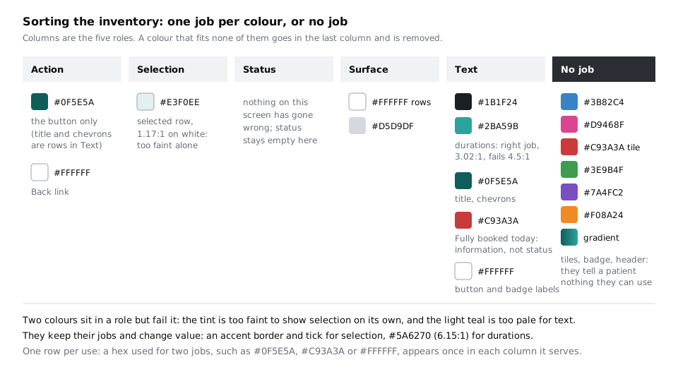
Add a fourth column to the table, Role, and fill it with one of the five roles for every row (every use of a colour, not every hex): action, selection, status, surface or text. Use what the colour does for the person on the screen, not why it was added. The test is a question: "If this colour changed, what would a patient no longer be able to tell?"
- Action: a patient taps it and something happens. The
Choose a timebutton and the Back link (white on the Before screen, but still an action). - Selection: it shows what the patient has already chosen. The pale row behind Nurse appointment.
- Status: the system is telling the patient something needs their attention now, such as an error.
- Surface: it holds content and separates it. The white header and rows, the divider grey.
- Text: it is there to be read. Headings, names, durations, the white labels on the button and badge.
If the honest answer to the question is "nothing", write No job. On the Larkfield screen that covers the five tile colours (a patient does not choose a nurse appointment because its tile is pink), the gradient, and the Popular badge. The teal title and chevrons are text, not action: their rows go under Text. The red on Fully booked today is a harder case: it looks like status, but nothing has gone wrong. It is information, so that row goes under Text, and red has no job there.
Two colours sit in the right role but cannot do the job. The selected-row tint, #E3F0EE, has a contrast of about 1.17:1 against white, so on many screens the selection is close to invisible. The light-teal durations, #2BA59B, are text at about 3.02:1, below the 4.5:1 that normal-size text needs. Mark both fix value.
Check it worked
Every row in your table, one per use, has exactly one role or No job, and a hex used for two jobs shows up once per role. No role holds a colour only because "it looks nice". Count the No job rows: on the Larkfield screen there are seven (five tiles, the badge and the gradient). The Fully booked today row sits under Text, even though its red also appears in a No job row for the Blood test tile.
Step 4 · Remove the colours with no job
Work through the No job rows on the After frame. Removing a colour does not always mean removing the element. Ask whether the element still has a job without its colour.
- Icon tiles: the icons help people scan the list, so keep them. Fill every tile with
colour/canvas(#F6F7F8) and every icon withcolour/text(#1B1F24). The shape of each icon now does the work the colour pretended to do. - Header gradient: set the header to
colour/surface(#FFFFFF) with acolour/linedivider under it. The Back link goes back tocolour/accent, because it is an action. - Popular badge: ask what a patient gains from it. "Popular" helps the clinic, not someone deciding between a blood test and a vaccination. Delete it. If the clinic insists, it can come back as a small neutral label, but not in a new colour.
- Fully booked today: rewrite it as useful information in
colour/text-muted(#5A6270) with a calendar icon:None today · next Wed 10 Dec. It tells the patient what to do instead of only that something is unavailable.
Then fix the two fix value rows. Change the durations to colour/text-muted (#5A6270, about 6.15:1 on white). Leave the selection for the next steps.
If you use Figma variables, apply them rather than typing hex values, so the After frame ends up pointing at the same Larkfield variables as the rest of the app.
Check it worked
Select the After frame and look at Selection colors again. The blue, pink, red, green, purple, orange and the gradient are gone. What is left is #1B1F24, #5A6270, #FFFFFF, #F6F7F8, #D5D9DF, #0F5E5A and #E3F0EE, and in Figma most of them now show up under variables rather than as plain fills.
Step 5 · Keep the accent for things people can act on
Teal is Larkfield's accent, and an accent only works if it is rare. On the Before screen teal was on the title, five chevrons and the button: seven teal things, and only the button moved the booking on. The title did nothing at all.
Apply one rule: the accent goes only on things a patient can act on, or has chosen. Then a second one, which people often miss: not everything a patient can act on needs the accent.
- Title: a patient cannot tap it. Change it to
colour/text. - Chevrons: the rows are tappable, but five teal chevrons shout louder than the one button that moves the booking on. The row shape and the chevron already say "this opens". Change the chevrons to
colour/text-muted. - Back link and the Choose a time button: these keep the accent. They are the two ways off this screen.
Do the tap test. Look at the After frame and point at every accent-coloured thing. Each one must do something when tapped. Then point at the thing a patient should do next: it should be the strongest accent shape on the screen.
Check it worked
On the After frame, the accent appears on the Back link, the Choose a time button and nothing else so far. When you squint, the button is the first shape your eye lands on. Compare it with the note you made in the first step about the Before frame.
Step 6 · Make selection and status work without colour meaning
Selection and status are the roles people misread most, because they often rely on a colour's meaning alone. Fix selection first. On the Nurse appointment row, keep the colour/accent-tint background, and add:
- a 2 px
colour/accentborder round the row (7.58:1 against white, well above the 3:1 a state indicator needs), - a tick in an accent circle at the right end of the row, in place of the chevron,
- the word
Selectedafter the duration:15 min · Selected, incolour/text-muted.
The tint now helps, but no longer carries the selection on its own.
This screen has no status message, and that is fine: status colours are for something that needs attention now, such as the danger error on Your details or the notice banner when a time has gone on Pick a time. When you do use them, pair the colour with an icon and words every time, as the high-fidelity tutorial did for those state frames.
That rule matters more than it looks. Colour meanings are not universal. Red, white and green carry different associations across African markets: they are national colours on many flags, party colours at elections, and tied to mourning or celebration in different communities. In parts of Ghana, for example, red and black are worn at funerals, while white can mark the celebration of a long life. A patient reads a red label through their own experience, not only through your design. Words and icons travel; colour meaning does not.
Then run a greyscale test. In Figma, add a rectangle as the top layer inside the After frame, the full size of the frame, fill it with any grey (#808080) and set its layer blend mode to Saturation. The frame now shows in greyscale. Other tools have their own desaturate setting, or you can export a PNG and view it with your phone's greyscale filter. Hide or delete the rectangle when you are done.
A pale tint is the first thing to disappear on a budget Android phone with the brightness turned down to save battery, or in bright sunlight outdoors. The greyscale test is a quick way to see your screen as those patients do.
Check it worked
With the greyscale layer on, you can still tell which service is selected (the border, the tick and the word survive), and None today · next Wed 10 Dec still reads as information because of its icon and words. Run #5A6270 on white and #0F5E5A on white through the contrast checker: both pass 4.5:1.
Step 7 · Write the colour-role legend
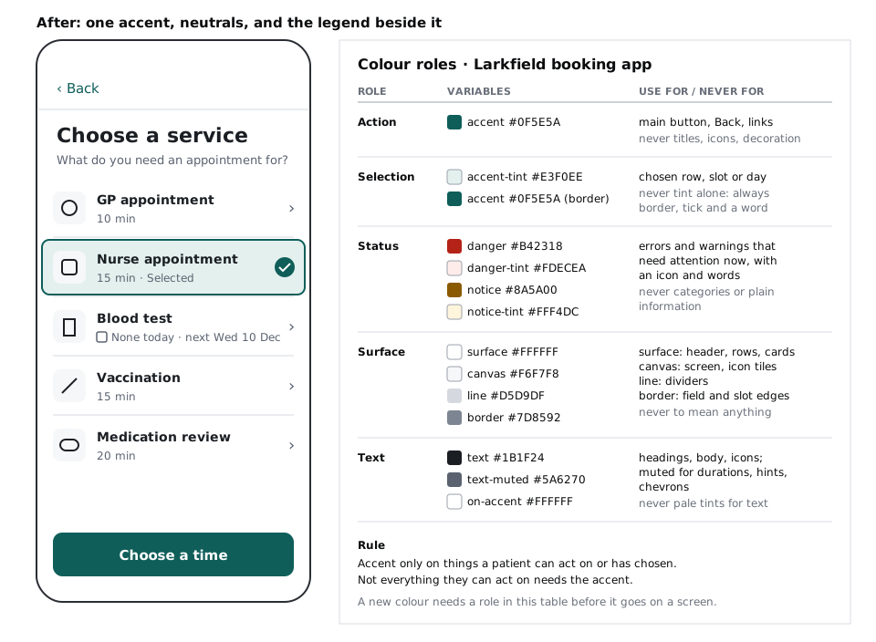
The screen is fixed, but the next person to touch it will not know why. Next to the After frame, make a small card titled Colour roles · Larkfield booking app with a row per role and four columns: role, colour (variable name and hex), use for, and never for.
- Action:
colour/accent#0F5E5A. Use for the main button, Back and links. Never for titles, icons or decoration. - Selection:
colour/accent-tint#E3F0EE with ancolour/accentborder. Use for the chosen row, slot or day. Never the tint alone: always a border, a tick and a word. - Status:
colour/danger#B42318 andcolour/danger-tint#FDECEA;colour/notice#8A5A00 andcolour/notice-tint#FFF4DC. Use for errors and warnings that need attention now, with an icon and words. Never for categories or plain information. - Surface:
colour/surface#FFFFFF,colour/canvas#F6F7F8,colour/line#D5D9DF,colour/border#7D8592. Use canvas for the screen background and icon tiles, surface for the header, rows, cards, fields and sheets, line for dividers, and border for the edges of fields, time slots and secondary buttons. Never to mean anything. - Text:
colour/text#1B1F24,colour/text-muted#5A6270,colour/on-accent#FFFFFF. Use for headings, body text and icons; muted for durations, hints and chevrons. Never pale tints for text.
Under the table, write the two accent rules from earlier and one more line: "A new colour needs a role in this table before it goes on a screen." That sentence is what stops the next open day from undoing your work.
Check it worked
Put Before and After side by side. After uses one accent hue (with its tint) and neutrals, and every colour on it appears in your legend with a role. Pick any layer on the After frame at random: you can find its colour in the legend and say in one sentence why it is that colour.
Next steps
Your legend names roles; the colours behind them still need to come from somewhere consistent. In Build a colour palette with tonal ramps you build the ramps those role colours are picked from, so a new shade comes from the ramp rather than a colour picker.
Selection and status are where colour-only meaning does the most harm. Never rely on colour alone to carry meaning goes further into icons, patterns and text for charts, forms and states. To see how colour fits with size, weight and position in deciding what people notice first, work through Create visual hierarchy with size, weight and position.
Part of these paths
Related tutorials
- Build a colour palette with tonal rampsYou will have four ten-step colour ramps built in OKLCH on a Figma palette page, each step labelled with its contrast on white and on the darkest grey, and the Larkfield semantic colour tokens pointing at ramp steps.
- Never rely on colour alone to carry meaningYou will have a booking screen, an error state and a small bar chart that still read correctly in greyscale and under four colour-vision simulations, because every meaning that colour carries now has a second cue.
- Create visual hierarchy with size, weight and positionYou will have a strip of six Figma frames that takes a flat confirmation screen to a clear one, one lever at a time, and a squint test showing the primary action is the strongest shape on the screen.
Need this done for you?
Padding does this work for growing companies, from the first diagnosis to a system that keeps working.
Get new tutorials