UI and visual design · Beginner · 15 min
Choose and pair typefaces for an interface
By Padding · Updated 18 Nov 2026
Any design tool that can set text, a phone and a web browser · November 2026
You will have a one-page type decision for an app, with the test strings you ran, a pass or fail for each candidate typeface on legibility, numbers, language coverage, weights, licence and file size, and a written reason for using one family or a pair.
On this page
Most typeface decisions are made by scrolling a font site until something looks nice. That works until the app has to show a booking reference where 1 and l look the same, a list of times that jumps sideways as the digits change, or a patient's name with a letter the font does not have. Then someone has to redo the choice with a shipped product around it.
This tutorial makes the choice the other way round. You write down what the type has to do, build one test frame that exposes the usual failures, knock out candidates on licence and coverage before you judge looks, and only then decide whether one family is enough or a second one earns its place. Taste still matters, but it gets the last word, not the first.
The example is Larkfield Clinic, a fictional community clinic, and its appointment booking app. Its screens (Home, Choose a service, Pick a time, Your details, Confirm, Booked) use one typeface, Inter, at sizes from 14 to 28. Patients write their names in English, Yoruba, Igbo and Hausa, and patients from Ghana in Akan and Ewe. Many book on low-cost Android phones with prepaid data. You will test whether Inter still holds up against a few alternatives, and end with the one-page decision the rest of the team can read. If you are working on your own app, swap in its screens, languages and smallest text size as you go.
Step 1 · Write down what the type has to do
Before you open a font site, write a short constraints list on a new page in your design file, called Type decision. Keep it to facts you can check later:
- Smallest size in use. Larkfield's smallest text is 14 px, used for hints and durations such as "15 min". Any typeface that is hard to read at 14 is out, whatever it looks like at 28.
- What the text contains. Not just words. Larkfield shows times (09:00, 10:30), dates (Tue 9 Dec), phone numbers and a booking reference that patients read aloud at reception, such as
LK-4821. - Languages and names. English for the interface, plus patients' own names, which may include Yoruba, Igbo and Hausa letters, and Akan and Ewe letters for patients from Ghana. Write the languages down even if the interface is only in English: names are user data, and they appear on Your details, Confirm and Booked.
- Weights. Larkfield needs Regular for body text and Semi Bold for headings and labels. Write the exact weights you will use.
- Where it ships. An Android app, an iPhone app and a web booking page. That decides which licence you need.
- Budget for downloads. Many Larkfield patients pay for data by the megabyte. Every font file the web page downloads is data they pay for, so note "as few files as possible" as a real constraint, not a nice-to-have.
Check it worked
Your Type decision page has a list of six constraints, each one specific enough to test: a pixel size, named content types, named languages, named weights, named platforms and a note on file size. If any line says something like "modern" or "friendly", rewrite it as something you could pass or fail.
Step 2 · Build a test frame with strings that expose problems
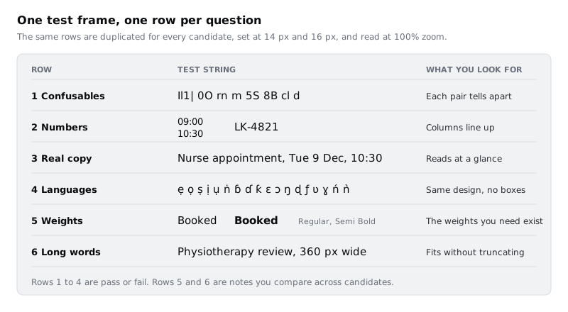
A specimen of "The quick brown fox" tells you almost nothing about an interface. Build a frame that shows the failures you actually care about. Make a frame 360 wide, the width of many Android phones, and add six text rows, each set at 14 px and repeated at 16 px:
- Confusables:
Il1| 0O rn m 5S 8B cl d. In some typefaces capital I, lower-case l, the digit 1 and the vertical bar are four near-identical strokes, andrnreads asmat small sizes. - Numbers: a column of times,
09:00,10:30,11:10,14:00, one under the other, and the booking referenceLK-4821. - Real copy:
Nurse appointment, Tue 9 Dec, 10:30and the longest service name you have, such asPhysiotherapy review. - Languages: the letters your users need beyond basic Latin. For Larkfield: Yoruba
ẹ ọ ṣ Ẹ Ọ Ṣ ń ǹand the dotted vowels with tone marksẹ́ ẹ̀ ọ́ ọ̀; Igboị ọ ụ ṅ Ị Ụ Ṅ; Hausaɓ ɗ ƙ Ɓ Ɗ Ƙ; Akanɛ ɔ Ɛ Ɔ; and Eweɛ ɔ ŋ ɖ ƒ ʋ ɣ Ɛ Ɔ Ŋ Ɖ Ƒ Ʋ Ɣ. The Ewe lettersɖ ƒ ʋ ɣare the ones fonts most often lack, so they are the likeliest to fall back silently. Ask a speaker on the team for one real name or phrase in each language as well, because a word shows spacing problems a row of single letters hides. - Weights: the word
Bookedin every weight you listed. - Long words at width: the longest heading you have, at its real size, in the 360 frame.
Write the strings once, then duplicate the frame for each candidate and change only the font.
Check it worked
You have one frame, 360 wide, with six labelled rows at 14 px and at 16 px. The language row contains every letter from the constraints list, including at least one dotted vowel with a tone mark, and at least one real word from a speaker. Copy all the strings into a text note on the page too, so they survive if someone changes the font on the frame.
Step 3 · Shortlist three or four candidates and knock out the easy failures
Pick three or four typefaces to test. Include at least one baseline that costs nothing to download: the phone's own interface font (Roboto on many Android phones, San Francisco on iPhone). For Larkfield the shortlist is Inter (the current choice), Noto Sans, one other open-licence sans you like, and the system font.
Before you look at a single letter, check three things for each candidate and write the answers in a table on the Type decision page:
- Licence. Read the licence that comes with the font files, not a blog post about it. Fonts under the SIL Open Font License can be embedded in apps and web pages and shipped with them. A commercial font often has separate desktop, web and app licences, each priced on its own terms, and an app licence may be missing. If you cannot find which licence covers an app, the font is out for now.
- Weights available. Does the family have every weight from your list? A family with only Regular and Bold forces you to fake Semi Bold, which you should not do.
- File size. Note the size of the regular weight as a WOFF2 file, and whether the family comes as a variable font. A variable font holds a range of weights in one file, so two weights may cost one download instead of two. Write the number in kilobytes from the files you downloaded.
Cross out any candidate that fails the licence or weights check. Do not spend time on its letterforms.
Check it worked
Your table has one row per candidate and three filled columns: licence name, weights available, and WOFF2 size in KB (or "system font, no download"). Any candidate that failed licence or weights is crossed out with the reason written beside it.
Step 4 · Test legibility, numbers and long words at real size
Apply each remaining candidate to a copy of the test frame. Set your zoom to 100%, because a font at 14 px viewed at 200% zoom is a font at 28 px. Better still, look at the frames on a phone: open the file in your design tool's mobile viewer if it has one, or export each frame as a PNG at 1x and open it on the phone.
Mark each row:
- Confusables: pass only if you can name every character in
Il1|and0Owithout comparing them to each other. If a candidate fails here, check whether it has an alternate set that fixes it. Inter, for example, documents a stylistic set (ss02) and character variants for a serifed capital I and a lower-case l with a tail. In Figma, open Type settings from the Typography section of the right sidebar, then the Details tab (Type settings > Details); options the font does not support are greyed out. A fixable fail counts as a pass with a note, as long as you record the setting. - Numbers: pass if the times in the column line up digit under digit. If they do not, look for tabular numbers in the same Type settings > Details tab. Proportional digits are fine in running text, but a column of appointment times that shifts left and right looks broken, and a developer will need the same setting in code (
font-variant-numeric: tabular-numson the web). - Long words: note whether the longest heading fits the 360 frame on one or two lines. Wider typefaces push headings onto more lines. That is not a fail, but it is a cost you will feel on every screen.
Only now look at the whole frame and ask whether it suits a clinic: calm, plain, easy to trust. Write one line on how each feels. That line goes in the decision, but it cannot overturn a fail.
Check it worked
Each candidate's frame has a pass, fail, or pass-with-setting mark beside the confusables and numbers rows, and a note on how many lines the long heading takes. Any OpenType setting you relied on (such as a stylistic set or tabular numbers) is written in the table next to that candidate, by name.
Step 5 · Test language coverage and catch silent fallbacks
This is the row most choices skip, and the one that hurts most in a multilingual product. Look closely at the language row for each candidate:
- Missing glyphs sometimes show as empty boxes, which are easy to spot.
- Silent fallback is harder. Browsers pick a font one character at a time, so if your typeface lacks
ɓ, the browser draws it from another installed font. The name still appears, but one letter has a different weight, height or style. Design tools can do something similar. Look for any letter that seems slightly too dark, too tall or too narrow compared with its neighbours. - Mark placement. Yoruba tone marks on dotted vowels (
ẹ́,ọ̀) are built from a letter and a separate combining accent. In a font that handles them well, the accent sits centred over the letter and the dot sits centred under it. In a font that does not, the accent drifts sideways or crashes into the line above.
Check the same row in a browser as well as in your design tool, because the web booking page is where most patients will meet it. A quick way is to type the language row into a simple text field on a web page that uses the font, such as the font's own specimen page if it lets you type, and compare it with your frame. Ask the speaker who gave you the real words to look at both and say whether anything looks wrong to them.
Mark the row pass only if every letter is drawn by the candidate itself, in the same style as its neighbours, with marks in the right place. For Larkfield, the decision that follows assumes Inter passed this row when the team ran it; if it fails in the version you download, that is a fail and the decision changes.
Check it worked
Every candidate has a pass or fail on the language row, checked in both your design tool and a browser, with a note naming any letter that failed. A speaker of at least one of the languages has looked at the row and their comment is written beside it.
Step 6 · Decide whether one family is enough
Most interfaces need one family. A good interface typeface with two or three weights covers headings, body text, labels and numbers, and every second family adds a download, another licence to track, and another set of language tests. Start from one family, and add a second only if it answers yes to every question below.
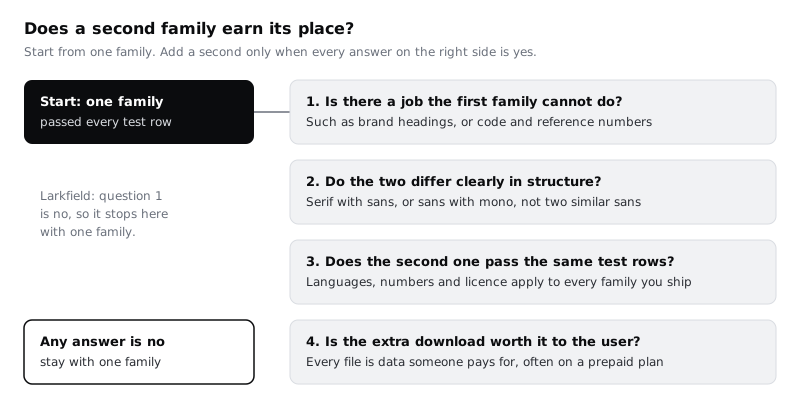
- Is there a job the first family cannot do? A brand voice on large headings on the clinic's website might be one. Code samples or long reference numbers that must be read character by character might be another, which a monospace face does well.
- Do the two differ clearly in structure? A serif for headings with a sans for body text, or a sans with a monospace, reads as a deliberate choice. Two sans faces that are slightly different reads as a mistake, as if someone forgot to apply a style.
- Does the second family pass the same tests? Every family you ship has to pass licence, languages and, if it carries numbers, the numbers row. Patients' names will turn up in headings too.
- Is the extra download worth it to the user? On a phone with a prepaid plan, a second family is data spent on looks. If the second face appears on one screen, it is probably not worth it.
If you do pair, match the two by x-height (the height of the lower-case x) at the sizes where they sit together: set a heading and the body line under it, and adjust the heading size until the lower-case letters feel related rather than mismatched.
For Larkfield, question 1 is a no: the app has no job that Inter at Regular and Semi Bold cannot do, and the booking reference reads well with tabular numbers and the disambiguation set on. So it stays with one family.
Check it worked
The Type decision page has the four questions with a yes or no written beside each for your app. If you chose a pair, the second family has its own row in the candidates table with every test row filled in, and you have a frame showing a heading and body line in the two families at their real sizes.
Step 7 · Write the one-page decision
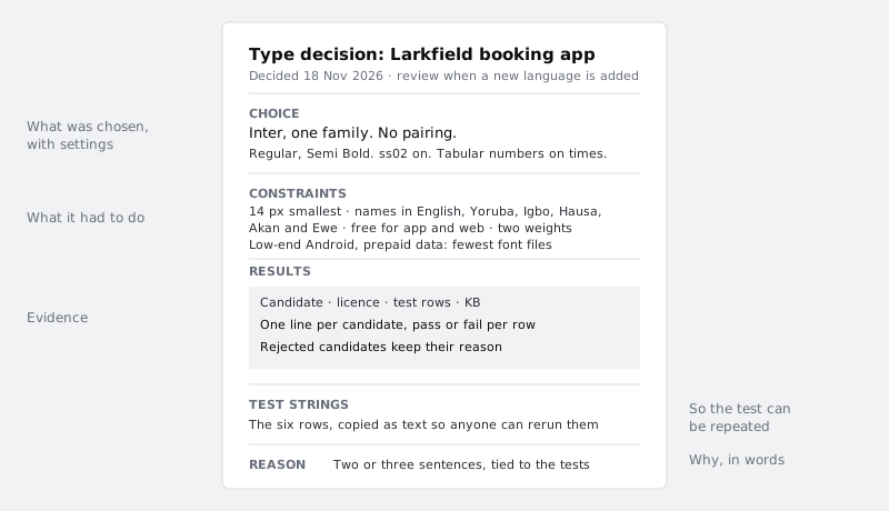
Turn the page into something a developer or a new designer can read in two minutes and act on. Lay it out in this order:
- Choice: the family (or families), the weights, and every setting you relied on, such as "ss02 on" and "tabular numbers on times and references".
- Constraints: the list from the first step, unchanged.
- Results: the candidates table, including the crossed-out ones and why they failed. Rejected options are the most useful part when someone suggests one of them again next year.
- Test strings: the six rows as copyable text, so anyone can rerun the test when a new language is added or the font is updated.
- Reason: two or three sentences that point at the tests, not at taste.
For Larkfield the reason reads: "Inter passed licence, weights, numbers and the language row for Yoruba, Igbo, Hausa, Akan and Ewe letters, and with ss02 its I, l and 1 are distinct at 14 px. One variable file covers both weights the app uses. No job needs a second family, so there is none."
Add a date and a trigger for review, such as "review when a new language is added to the interface". Then share the page with whoever builds the app, so the settings make it into code.
Check it worked
Your Type decision page fits on one screen or one printed page, and has all five sections. Someone who was not involved can tell from it which font to install, which weights, which OpenType settings to switch on, and why the other candidates were rejected, without asking you.
Next steps
With the typeface settled, the sizes, line heights and long-form settings come next:
- Set a type scale for an app turns Larkfield's five text styles into a scale with a base and a ratio, stored as variables.
- Make body text readable: measure, leading and size tunes line length and spacing for longer text such as help articles.
- Create visual hierarchy with size, weight and position shows how to get emphasis from the weights you just chose.
Part of these paths
Related tutorials
- Set a type scale for an appYou will have a type scale for the Larkfield Clinic app worked out from a base size and a ratio, stored as Figma variables and six text styles named by role, shown on a specimen frame with real copy and checked at 200% text size.
- Make body text readable: measure, leading and sizeYou will have before and after frames of a long help article, reset for comfortable reading on phone and desktop by changing line length, line height, paragraph spacing, size and alignment, checked at 200% text size and summed up in a short text settings rule.
- Create visual hierarchy with size, weight and positionYou will have a strip of six Figma frames that takes a flat confirmation screen to a clear one, one lever at a time, and a squint test showing the primary action is the strongest shape on the screen.
Need this done for you?
Padding does this work for growing companies, from the first diagnosis to a system that keeps working.
Get new tutorials