UI and visual design · Beginner · 15 min
Make body text readable: measure, leading and size
By Padding · Updated 18 Nov 2026
Figma (web) and a spreadsheet · November 2026
You will have before and after frames of a long help article, reset for comfortable reading on phone and desktop by changing line length, line height, paragraph spacing, size and alignment, checked at 200% text size and summed up in a short text settings rule.
On this page
Most of an app is short text: buttons, labels, one-line hints. Then someone needs to read something properly, such as what to do before a blood test, and the app shows them a wall. The words are fine. The setting is wrong. Lines run across the whole window, the lines sit on top of each other, paragraphs merge into one block and justified spacing opens rivers of white down the page. People skim it, miss the line that says "do not eat for 12 hours", and turn up for a test they cannot have.
Five settings decide whether long text reads comfortably:
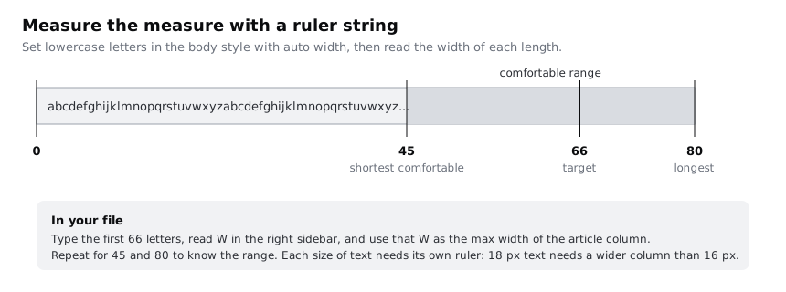
- Measure: how many characters fit on one line. Somewhere between 45 and 80 is comfortable for body text in most Latin-script languages, with about 66 as a good target.
- Leading (line height): the distance from one line to the next. Body text wants about 1.5 times the font size.
- Paragraph spacing: extra space after each paragraph, so the breaks show.
- Size: big enough to read at the distance people hold the device.
- Alignment: left aligned with a ragged right edge for left-to-right languages, never justified.
In this tutorial you take one long help article in the Larkfield Clinic booking app, a fictional community clinic, set it badly on purpose, then fix each setting in turn on a desktop frame and a phone frame. You finish with before and after frames, a check at 200% text size and a five-line rule anyone on the team can apply to the next article. This is about long-form reading inside a product; headings and UI labels are covered by the type scale tutorial linked at the end.
Step 1 · Set up the before frame
Open your Larkfield file, or any file, and add a page called Reading. Draw a frame 1280 wide and 900 tall and name it Help article / Before.
Add a heading text layer, Before your blood test, and under it a single text layer with the article. Use this copy, or a real long help page from your own product, so you are fixing real words:
A blood test at Larkfield Clinic takes about 10 minutes. Most tests need nothing special from you, but some need you to stop eating first. Your booking text tells you which kind you have. If it says "fasting test", do not eat anything for 12 hours before your appointment. You can drink plain water, and you should, because it makes the blood easier to take.

Keep taking your usual medicines unless the nurse or doctor told you to stop. If you take medicine for diabetes and have been asked to fast, call us on 01632 960 123 before the day so we can book you an early slot and tell you what to do about your dose.

Bring your booking text or the name and date of birth you booked with. You do not need to bring a referral letter if the test was requested at Larkfield. If it was requested by a hospital, bring the form they gave you, because it tells us which tubes to use.

Wear a top with sleeves that roll up above the elbow. If you feel faint when you have blood taken, tell the nurse when you arrive; you can lie down for the test. Afterwards, keep the plaster on for at least an hour and avoid carrying anything heavy with that arm for the rest of the day.

Results usually reach the clinic within five working days. We will text you when they are ready. If anything needs a follow-up, a doctor will call you, so check that the mobile number in your details is correct.
Now set it the way many first drafts end up. Set the text layer to fixed width 1040 with auto height, Inter Regular 16, line height 18, paragraph spacing 0 and justified alignment. Set the heading in Inter Semi Bold 20.
Count one line to see how long it is. Select a full line in the text layer (from the first word of a line to the last), copy it, paste it into cell A1 of a new spreadsheet tab called Measure, and in B1 type =LEN(A1). Do this for two or three lines and note the typical count.
Check it worked
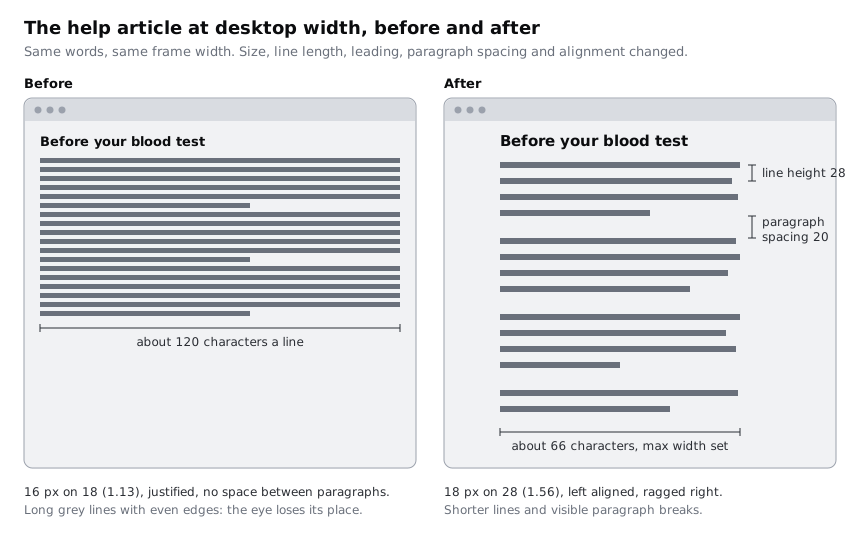
Your Help article / Before frame shows five paragraphs with no visible gap between them, lines that run nearly the full width of the frame, tight lines and even left and right edges. The Measure tab shows counts of roughly 120 characters a line. If your font gives a different number, adjust the text box width until lines are around 120 characters; that is the problem you are fixing.
Step 2 · Choose the body size for each screen
Duplicate the before frame (Ctrl+D or Cmd+D) and name the copy Help article / After desktop. Every change from here goes on the copy, so the before frame stays as evidence.
Start with size, because measure and line height both depend on it. Larkfield's Body style is 16 on 24, and that stays the size for long text on phones: it is the browser default for body text and still fits enough words per line on a narrow screen.
On a desktop or laptop, people sit further from the screen than they hold a phone, so the same 16 px looks smaller. For long reading at wide sizes, add one more step: create a text style called Body/Long at Inter Regular 18, line height 28 (you will check that line height in a later step). Use it only for articles and other long reading, never for form labels or list rows; those keep Body.
Apply Body/Long to the article text layer on the desktop copy, and leave the heading as it is for now.
Check it worked
The text styles list has a new Body/Long style at 18 on 28. Select the article layer on the desktop copy: the Typography section of the right sidebar shows Body/Long. Then click the heading, and one of the article layers on the before frame: neither shows Body/Long.
Step 3 · Find your column width with a ruler string
Measure is counted in characters, but Figma sizes boxes in pixels, so you need a conversion for your font at your size. Build a ruler.
On the canvas beside the frames, add a text layer set to auto width, in Body/Long, and type the lowercase alphabet, then continue from a again until you have 66 letters: abcdefghijklmnopqrstuvwxyzabcdefghijklmnopqrstuvwxyzabcdefghijklmn. Lowercase letters average out close to the width of ordinary running text, so this is a fair stand-in. Read the layer's width W in the right sidebar.
Make two more rulers in the same style with 45 and 80 letters. Write the three widths beside them. For Inter at 18 px the 66 ruler lands somewhere around 600 to 640 px; trust your own reading over that, especially if you use another typeface.
Now set the measure. Fill and max width only appear on layers inside an auto layout frame, and your page frames are plain frames, so build the auto layout first:
- On
Help article / After desktop, select the heading and the article text layer together and press Shift+A. Figma wraps them in a new auto layout frame. Make sure its direction is vertical, set the gap to 16 and rename itArticle. - Select the page frame
Help article / After desktopitself and press Shift+A again, so the page frame becomes a vertical auto layout frame withArticleinside it. Set its top padding to 64 and its left and right padding to 120 (or whatever matches the rest of your desktop layout). In the alignment control, choose top left, or top centre if the help page has no sidebar. Set the frame's height back to fixed at 900 if it shrinks to hug its content. - Select
Articleand set its width to Fill container. In the width menu, add a max width equal to your 66 ruler rounded to a tidy number, such as 640. - Select the heading and the article text layer and set both to Fill container width, with auto height.
The page frame is 1280 wide minus 240 of padding, so Article would fill 1040, but the max width stops it at 640.
Write the 80 character width in your notes too. That is the ceiling: WCAG's AAA criterion for visual presentation asks for lines no wider than 80 characters (40 for Chinese, Japanese and Korean text).
Check it worked
Copy a full line of the resized article into the Measure tab again. Typical lines now count between about 55 and 75 characters, and none exceeds 80. On the canvas, Help article / After desktop shows the auto layout settings in the right sidebar, and Article shows Fill container with a max width; its width reads your rounded 66 ruler (640) because the page frame is wider than that.
Step 4 · Open up the line height
Line height is what lets the eye travel back from the end of one line and land on the start of the next. At 16 on 18 (a ratio of 1.13) the lines are so close that the eye can drop onto the wrong one.
Body/Long is set to 28 on 18, a ratio of 1.56. Body on phones is 24 on 16, exactly 1.5. Both meet the AAA guidance of line spacing at least one and a half times the font size. Use 1.5 as the floor for body text and go slightly higher as the measure gets longer, because longer lines need more help finding the next one. Go no higher than about 1.7, or the lines float apart and paragraphs stop looking like paragraphs.
Then test with text that needs vertical room. Larkfield's patients write in several languages, and the clinic plans to publish this article in Yoruba too. Add a line to the end of the article such as Ẹ jọ̀wọ́, ẹ má ṣe jẹun fún wákàtí méjìlá (a Yoruba line with dots below and tone marks above) and check the marks on one line do not touch the letters of the line above or below. If they do, raise the line height by one step of your spacing scale (4 px) and note why.
Check it worked
Select the article layer: the Typography section of the right sidebar shows Body/Long, 18, line height 28. Zoom the canvas to 100% and follow one line to its end and back to the start of the next: you land on the right line without searching. The Yoruba test line shows no marks touching adjacent lines.
Step 5 · Separate paragraphs and fix the alignment
With no paragraph spacing, five paragraphs read as one. Open the type settings for the text layer (the Type details panel from the Typography section) and set paragraph spacing to 20 on the desktop article. Update Body/Long from the layer so the style carries it.
Check the gap with a little arithmetic. A normal line is 28 from one baseline to the next. Across a paragraph break it is 28 + 20 = 48. WCAG 1.4.8 asks for paragraph spacing at least 1.5 times the line spacing, and W3C's Understanding page explains that as a blank line 150% of a single-spaced line, so the distance from one line to the first line of the next paragraph comes to about 250% of the font size. At 18 px that is 45, and 48 clears it.
Now change the alignment from justified to left. Justified text stretches the spaces between words to make both edges straight. In a narrow column that leaves uneven gaps, and they can line up into channels of white running down the paragraph, which slows reading and is especially hard for some readers with dyslexia. Left-aligned text keeps every word space the same and gives each line a slightly different end point, which also helps the eye find its place. For right-to-left scripts such as Arabic, align to the right instead; the rule is "align to where reading starts".
Do not centre more than two lines of text. Centring makes every line start in a different place.
Check it worked
Put the before and after desktop frames side by side at 50% zoom. You can count the five paragraphs on the after frame without reading a word, the right edge is ragged, and the alignment control in the right sidebar shows left aligned. On the before frame you cannot count the paragraphs at a glance.
Step 6 · Set the phone version
Draw a frame 360 wide and 800 tall (360 is a common width for budget Android phones, and the narrowest most Larkfield patients use) and name it Help article / After phone. Copy the Article frame from the desktop and paste it into the phone frame. Select the phone frame and press Shift+A to give it vertical auto layout, with 20 left and right padding and 32 top padding, aligned top left. Then select Article and check its width is Fill container: it fills 320 px, well under its 640 max width.
Apply Body (16 on 24) to the article and set the heading to Heading/M. Add paragraph spacing 16 to the article layer. Across a paragraph break that is 24 + 16 = 40, exactly 250% of 16, so it meets the 1.4.8 measure with nothing to spare. Do not go below 16 here. Keep it left aligned.
Count a line again. At 16 px across 320 px you will get something like 38 to 42 characters. That is under the 45 that suits a desktop, and that is fine on a phone: the screen is close to the eye and the reader scrolls with a thumb. Do not shrink the text to fit more characters per line. Many people read help pages on low-cost phones outdoors, on a cracked or dim screen, or with the system font size already turned up; small text fails them first.
If the help article comes in a language with longer words, such as German or Swahili compounds, look for lines that end with a big gap because a long word wrapped. A few are normal; if many lines are short, reduce side padding to 16 rather than reducing the text size.
Check it worked
Your phone frame is 360 wide with auto layout and 20 padding each side, Article reads 320 wide, and the article is in Body at 16 on 24, paragraph spacing 16 and left aligned. Two counted lines in the Measure tab are between about 35 and 45 characters. Open the frame on your own phone through the Figma mobile app or a prototype link and read the first paragraph at arm's length without zooming.
Step 7 · Check it at 200% text size
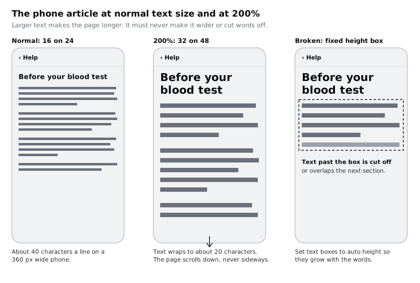
People enlarge text. WCAG asks that text can be resized to 200% without losing content or function, and Android 14 and later let users scale fonts up to 200%, although large text scales less than small text. Your layout has to cope with that.
Duplicate the phone frame and name it Help article / Phone 200%. Double the type: article 32 on 48 with paragraph spacing 32, heading doubled from its size too. Set the frame's height to Hug so it grows with the text, as a scrolling page would. Do not change the frame width.
Look for three things:
- No sideways scrolling. Every line still fits inside 320 px. If any text box has a fixed width wider than the frame, change it to fill.
- No clipped text. Every text layer and every frame that holds text is set to auto height or hug. A fixed-height box hides the last lines or lets them spill over the next section.
- Lines still make sense. About 20 characters a line is short, but every word is whole and the paragraph breaks still show.
Then do the desktop equivalent. Browser zoom at 200% on a 1280 px window gives the page about 640 CSS pixels to work with, which is close to a phone layout. Duplicate the After phone frame, name it Help article / Desktop 200% and change its width to 640. The article stays in Body (640 is below the 768 breakpoint in the rule you write next). Because the frame has auto layout and Article is set to Fill, the column grows to 600 and stops there instead of overflowing.
Finally, check spacing overrides. Some readers use a browser extension to force wider spacing: line height 1.5, paragraph spacing 2 times, letter spacing 0.12 times and word spacing 0.16 times the font size. On a copy of the phone frame, set the article's letter spacing to about 2 px (0.12 × 16) and paragraph spacing to 32 and check nothing is cut off. Delete that copy afterwards; it is a test, not a design.
Check it worked
Your Phone 200% frame is still 360 wide, the article inside it is taller but no wider, and no text layer has a fixed height (the resizing control for each shows auto height). The Desktop 200% frame shows Article at 600 wide, filling the space inside the padding, with no text outside the frame. Delete it once checked.
Step 8 · Write the text settings rule
Put the three finished frames in a row with the before frame on the left: Before, After desktop, After phone, Phone 200%. Above them, add a text note called Long text rule and write the settings you chose, so the next help article does not depend on anyone remembering this tutorial. Larkfield's reads:
Long text rule (help articles, preparation instructions, policies)
1. Size: Body/Long 18 on 28 at 768 px wide and above; Body 16 on 24 below. Never smaller for paragraphs.
2. Measure: article column max width 640 px, about 66 characters. Never over 80.
3. Leading: at least 1.5 times the font size; raise it for scripts with marks above and below.
4. Paragraphs: 20 px after each on desktop, 16 on phone. Left aligned (right for right-to-left), never justified or centred.
5. Resizing: page frames use auto layout, text boxes auto height, columns fill with a max width. Checked at 200%.
Give a copy to whoever builds the help pages. If they work in CSS, the measure translates to a max-width in ch or rem on the article column, and the rest maps one to one onto font size, line height and margin between paragraphs.
Check it worked
The Reading page shows four frames left to right with a five-line rule above them. Ask a colleague to read the first paragraph of the before frame and then the after frame, and to tell you which one says when to stop eating. On the after frame they should find "12 hours" faster. Each line of the rule names a number they could apply without asking you.
Next steps
Body text is one role in a set. Set a type scale for an app builds headings and small text around the same 16 px base, and Choose and pair typefaces for an interface covers picking the face these settings are applied to.
To take the 200% check further across whole screens, see Design layouts that survive large text. If you build the article in code, Build fluid type with CSS clamp shows how to move smoothly between the phone and desktop sizes instead of switching at one breakpoint.
Part of these paths
Related tutorials
- Choose and pair typefaces for an interfaceYou will have a one-page type decision for an app, with the test strings you ran, a pass or fail for each candidate typeface on legibility, numbers, language coverage, weights, licence and file size, and a written reason for using one family or a pair.
- Set a type scale for an appYou will have a type scale for the Larkfield Clinic app worked out from a base size and a ratio, stored as Figma variables and six text styles named by role, shown on a specimen frame with real copy and checked at 200% text size.
- Design layouts that survive large textYou will have the Larkfield Clinic booking screens tested at the largest phone text size and at 200% browser zoom, every truncated label, overlap and fixed-height box fixed so it wraps, stacks or scrolls, and each screen shown at default and large text side by side.
Need this done for you?
Padding does this work for growing companies, from the first diagnosis to a system that keeps working.
Get new tutorials