UI and visual design · Intermediate · 18 min
Design layouts that survive large text
By Padding · Updated 18 Nov 2026
Figma (web) · November 2026
You will have the Larkfield Clinic booking screens tested at the largest phone text size and at 200% browser zoom, every truncated label, overlap and fixed-height box fixed so it wraps, stacks or scrolls, and each screen shown at default and large text side by side.
On this page
Most people who turn up their phone's text size are not testing anything. They have left their reading glasses in another room, or they are holding the phone at arm's length on a bus, or their eyes are older than they were. Phones are often shared within a family, and then the large text setting one person chose is what everyone else sees too. Your app gets that setting whether you designed for it or not.
When text grows and the boxes around it do not, the same five failures appear in almost every app: labels cut off with an ellipsis, rows of things running off the edge of the screen, text spilling out of fixed-size chips, content sliding under a pinned button, and button labels clipped by a fixed height. None of them needs a new design. Each one needs a box that is allowed to grow, and a decision about where the extra size goes: the content wraps onto another line, a row stacks into a column, or a strip scrolls on its own.
In this tutorial you stress-test the Larkfield Clinic booking app, a fictional community clinic, at the largest text size and at 200% browser zoom, list what breaks, fix each fault in the components, and finish with every screen shown at default and large text side by side. The screens are the ones from the high-fidelity tutorial: Home, Choose a service, Pick a time, Your details, Confirm and Booked.
Step 1 · Set up a large text mode you can switch on per frame
You want the large version of a screen to come from the same components and styles as the default one, so that when you fix a component both versions update. A variable mode does that. In Figma, open the variables panel and create a new collection called Text size test. Rename its first mode Default and add a second mode called Largest.
Add a number variable for the size and the line height of each of Larkfield's five text styles, and fill in both modes. Values are size on line height, Default first, then Largest:
Heading/L: 28 on 34, then 40 on 48Heading/M: 20 on 26, then 34 on 42Body: 16 on 24, then 32 on 44Body/Small: 14 on 20, then 28 on 38Label: 14 on 20, then 28 on 36
Name them text/body/size, text/body/line-height and so on. Small text doubles and headings grow less, which is roughly how a phone at its largest setting behaves: Android 14 and later scale fonts up to 200% on a curve that enlarges big text less than small text. These numbers are a stress test, not a copy of any one phone. iPhones with the larger accessibility sizes turned on go further still, with body text reaching about three times its default, so if Larkfield ships as a native iPhone app, try your two busiest screens at that size as well.
Then edit each of the five text styles (click empty canvas, open the style's edit panel from the right sidebar) and bind its font size and line height to the matching variables. If your styles already read type tokens from Set a type scale for an app, keep those bindings and set this collection's Default values as aliases to the same tokens instead of typing numbers.
Make a page called Large text. Copy the six screens onto it twice: the top row stays as it is, the bottom row is for the large version. Resize each bottom-row frame to 360 wide, the width of many Android phones, and keep the height. Select the bottom row and, in the Layer section of the right sidebar, set the Text size test mode to Largest.
If your plan only allows one mode per collection, duplicate the whole file instead, edit the five text styles in the copy to the Largest values, and do the fixes in the original file once you have found them.
Check it worked
The Large text page has two rows of six screens. Click any text layer in the top row: its size matches the Default value. Click the same layer in the bottom row: its style name is the same, but the size is the Largest value. Changing a Largest value changes only the bottom row; changing a Default value changes only the top row.
Step 2 · Walk every screen and log what breaks
Do not fix anything yet. Go through the bottom row in flow order and write down every fault in a list on the canvas next to the screens, one line each, as screen · component · fault. Look for five things:
- Truncated: text that ends in an ellipsis or stops mid-word. Check the text properties of headers and list rows for truncation; a maximum of one line is the usual cause.
- Running off: a row of items wider than the frame, so the last ones are hidden or the frame would need to scroll sideways.
- Spilling: text wider or taller than the box drawn around it, often overlapping the next item.
- Hidden behind: content that slides under a pinned header or a pinned bottom button.
- Clipped: text cut through horizontally because the frame around it has a fixed height.
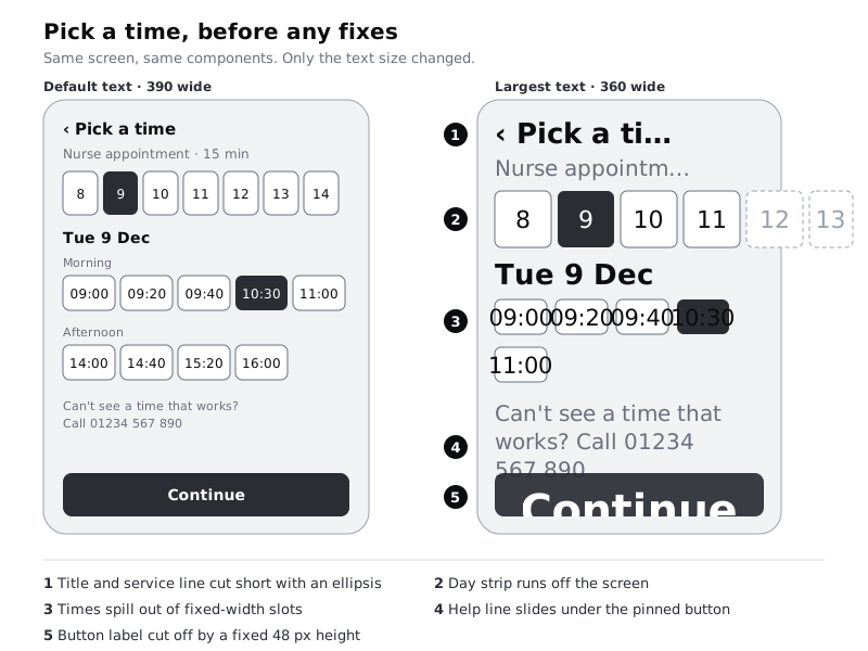
On Larkfield, Pick a time alone shows all five. A typical full log reads something like:
- Pick a time · Header · title truncated to "Pick a ti…"
- Pick a time · week strip · days 12 to 14 off the right edge
- Pick a time · Time slot · "10:30" wider than its 56 px slot
- Pick a time · help line · runs under the pinned Continue button
- All screens · Button · label clipped by 48 px fixed height
- Choose a service · List row · "Medication review · 20 min" truncated
- Your details · reminder checkbox · label overlaps the box
- Confirm · summary rows · value squeezed to two letters a line between label and Change
- Booked · "We've sent a text…" banner · last line clipped by fixed height
Mark each fault with the component it lives in, because that is where you fix it. A fault that appears on four screens is almost always one component.
Check it worked
Your canvas has a numbered log with at least one line for every screen in the bottom row, each naming a component and one of the five fault types. If a screen has no faults, write none against it so you know you looked.
Step 3 · Let text boxes grow instead of clipping
Fix the clipping faults first, because they hide others. Go to the main components and check every text layer and every frame that holds text:
- Text layers are set to auto height, never fixed size. A text layer you resized by hand switched to fixed size without telling you, so check them all.
- Truncation is off on anything a patient needs to read in full: screen titles, service names, times, error messages, button labels. Keep it only where the full text is one tap away, and say so in the component's description.
- Buttons go from a fixed height of 48 to hug contents with a minimum height of 48. Set top and bottom padding so the label sits in the middle at the default size, and the button grows when the label wraps onto two lines. The 48 stays a floor for tapping, not a ceiling for text.
- Banners and cards that hold sentences, like the Booked confirmation and the error banners, hug their contents vertically.
The header needs one more decision. With a back control on the left and a long title, the title wraps onto a second line and the header grows taller. Let it, and align the back control to the top so it stays put.
Check it worked
Turn on the bottom row's Largest mode if you turned it off, and look again. No text in the bottom row ends in an ellipsis or is cut through, every button is at least 48 tall with its whole label visible, and items 1, 5, 6 and 9 in your log are crossed out. Select any button instance: its height setting reads hug, with a minimum of 48.
Step 4 · Wrap rows of small items
Rows of equal items, such as the time slots on Pick a time, should flow onto more lines as each item gets bigger. Open the Time slot component and change it from a fixed width to hug, with a minimum width of 88 so short times still give a comfortable target. Then on Pick a time, select the frame that holds each group of slots (Morning, Afternoon), make sure it is a horizontal auto layout, and turn on wrap. Set the gap between items and the gap between rows to the same spacing value.
At default text the slots still sit four or five to a row. At the largest text they drop to two a row, and the morning group becomes three rows tall. That is fine: the page grows downwards and the patient scrolls, which they are used to.
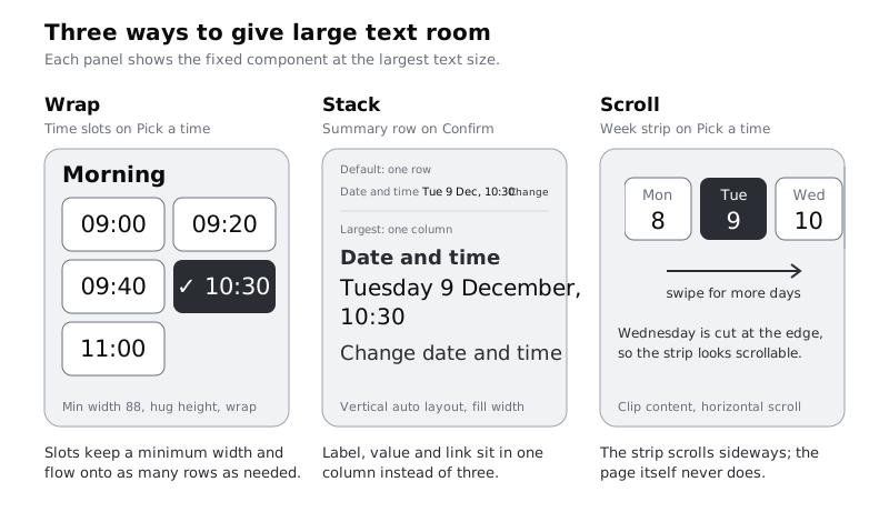
The same fix applies anywhere a row of chips or tags appears. Do not make it a grid with a fixed number of columns: a grid that fits four at default text has nowhere to go at large text.
Check it worked
In the bottom row, the Morning and Afternoon groups show every time in full, each inside its own slot, with no slot overlapping another. In the top row, the same groups look as they did before you started. Item 3 in your log is crossed out.
Step 5 · Stack rows that hold different things side by side
Some rows put different things next to each other: a label, a value and a link on Confirm, a checkbox and its sentence on Your details. At large text the middle item is squeezed until it shows a letter or two per line. Wrapping does not help here; the row should become a column.
On Confirm, change each summary row from horizontal to vertical auto layout, with the label on top in Label, the value under it in Body, and the Change link under that. Make the link say what it changes, such as "Change date and time", because once it sits below the value it is further from the label it belongs to. The value now has a full line to itself, so spell out the date as "Tuesday 9 December, 10:30" instead of "Tue 9 Dec, 10:30": abbreviations save space a stacked row no longer needs to save, and they are harder to read and to translate. Set the row to fill the width of the screen.
You could make this a variant and only stack at large text, but test the stacked version at default text first. On a 360 or 390 wide phone it often reads better at every size, and one layout is less to build and test than two.
On Your details, the checkbox and its label stay side by side, because a checkbox is small and does not grow much. Set the label to fill the remaining width and wrap, and align the checkbox to the top of the first line rather than the middle of the block.
Check it worked
In the bottom row's Confirm screen, each of the four summary rows shows its label, the full value and a link, one above the other, and no line has fewer than about ten characters. On Your details, the reminder sentence wraps beside the checkbox without overlapping it. Items 7 and 8 in your log are crossed out.
Step 6 · Give each scrolling area one direction
Some content cannot wrap or stack without losing its meaning. The week strip on Pick a time is a sequence: seven days in order, with today's place among them. Let the strip scroll sideways on its own while the page scrolls down.
Select the strip's frame, give it a fixed width that fills the screen, and turn on clip content so the days beyond the edge are hidden. Size the day buttons so that at large text the third day is cut part way at the edge of the screen: a half-visible item tells people there is more. In prototype mode, set the strip's overflow to horizontal scrolling and the screen frame's overflow to vertical scrolling. Keep the selected day in view when the screen opens; at large text that may mean the strip starts scrolled to Tuesday 9.
Then look at what is pinned. The Continue button pinned to the bottom of Pick a time takes up far more of a short screen at large text, and the help line slid under it. Either let the button sit at the end of the content, so it scrolls with the page, or keep it pinned and add bottom padding to the scrolling content equal to the button's height plus its margin. For Larkfield, put it at the end of the content: the patient has to scroll past the times to reach it anyway, and nothing hides behind it.
Only one thing on a screen should scroll sideways, and never the page itself. WCAG 2.2 asks that content reflows at 320 CSS pixels wide without scrolling in two directions, with exceptions only for content such as maps or wide data tables that needs both.
Check it worked
Play the bottom-row Pick a time in prototype mode. The page scrolls down, the week strip scrolls sideways on its own, Tuesday 9 is visible when the screen opens, and the help line and Continue button are both fully readable at the end of the content. Items 2 and 4 in your log are crossed out.
Step 7 · Check the web booking page at 200% browser zoom
If patients can also book in a browser, test the desktop layout zoomed. At 200% zoom, a 1280 pixel wide browser window leaves the page about 640 CSS pixels to lay out in; at 400% it leaves 320. WCAG 2.2 asks that text can be resized to 200% without losing content or function, and that pages reflow at 320 CSS pixels.
You do not need to zoom anything in Figma. Copy the default (top-row) versions of Pick a time and Confirm, resize one copy of each to 640 wide and one to 320 wide, and leave the Text size test mode on Default: at browser zoom each CSS pixel gets bigger, so the page has fewer of them to lay out in, and the text stays at its normal CSS size. At 640, the layout should behave like a large phone: one column, with the stacked summary rows and wrapped time slots you already made. At 320 it is the narrowest phone you will meet, and narrower than the 360 frames you have tested so far.
If someone builds the web version, ask them to check the same two screens in a real browser at 200% and 400% zoom, because CSS can differ from the Figma file in small ways that only show at the edges.
Check it worked
You have four extra frames: Pick a time and Confirm at 640 and at 320 wide. In all four, every word is readable, nothing sits outside the frame, and nothing needs sideways scrolling except the week strip.
Step 8 · Lay out default and large text side by side
Arrange the Large text page so the result can be reviewed in one glance: each default screen with its large version directly under it, in flow order from Home to Booked, the four browser zoom frames on the far right. Label each column with the screen name and each row with Default · 390 or Largest · 360. Let the large frames be as tall as their content needs, so a reviewer sees the full length of each page rather than a cut-off phone screen.
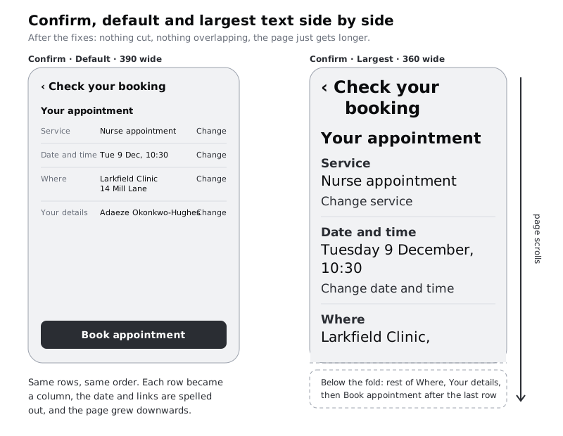
Read your fault log again and check every item is crossed out. Then add a short note above the screens called Large text rule, so the next screen does not repeat the faults:
- Text layers are auto height. No truncation on anything a patient must read.
- Buttons, banners and cards hug their contents, with a minimum height, never a fixed one.
- Rows of equal items wrap. Rows of unlike items stack.
- Only components that hold a sequence scroll sideways, and the page only scrolls down.
- Every new screen is checked in the
Largestmode at 360 wide before review.
Pair this with Design for translation and longer text: a Hausa or French label at the largest text size is the hardest case your layout will meet, and the same wrap, stack and scroll fixes cover both.
Check it worked
The Large text page shows six columns from Home to Booked, each with the default screen above its large version, plus four browser zoom frames. Point at any large frame: nothing is truncated, overlapping or clipped, and the Large text rule note sits above the screens with five lines.
Next steps
Large text often turns a comfortable tap target into a cramped one, or a cramped one into an oversized one; check both in Size touch targets for thumbs. To carry the same thinking across screen sizes rather than text sizes, see Design one layout for phone, tablet and desktop. For long help pages inside the app, Make body text readable: measure, leading and size covers line length and spacing at 200%, and Design for translation and longer text tests the same screens with longer languages.
Part of these paths
Related tutorials
- Make body text readable: measure, leading and sizeYou will have before and after frames of a long help article, reset for comfortable reading on phone and desktop by changing line length, line height, paragraph spacing, size and alignment, checked at 200% text size and summed up in a short text settings rule.
- Design one layout for phone, tablet and desktopYou will have the Larkfield Clinic Pick a time screen designed at 360, 768 and 1280 pixels wide, with breakpoints chosen from where the content breaks and a note that tells a developer what reflows, what moves and what stays fixed.
- Set a type scale for an appYou will have a type scale for the Larkfield Clinic app worked out from a base size and a ratio, stored as Figma variables and six text styles named by role, shown on a specimen frame with real copy and checked at 200% text size.
Need this done for you?
Padding does this work for growing companies, from the first diagnosis to a system that keeps working.
Get new tutorials