UI and visual design · Beginner · 14 min
Size touch targets for thumbs
By Padding · Updated 18 Nov 2026
Figma (web) · November 2026
You will have the Larkfield Clinic Pick a time screen with every tappable area at least 48 by 48 pixels, the main action within one-handed reach, and an overlay frame that shows each hit area and its size.
On this page
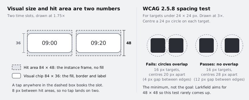
A button can look big enough and still be hard to hit. What matters to a thumb is the area that responds to a touch, the hit area, and that area does not have to be the same size as the shape people see. A 36 pixel tall time slot can sit inside a 48 pixel tall hit area, and nothing about the visual design changes.
The second thing that matters is where the target is. On a tall phone held in one hand, the bottom half of the screen is easy to reach and the top corner on the far side is not. A perfectly sized button in the wrong place still costs a change of grip, and on a bus or with a child on one arm, that is a missed tap.
In this tutorial you audit the Larkfield Clinic Pick a time screen: you list every target, measure its hit area, compare it with WCAG and the Apple and Android guidance, enlarge the small ones without enlarging what people see, and check one-handed reach. You end with a Pick a time / Hit areas frame that shows all of it at a glance, ready to hand to a developer.
Step 1 · List every target on the screen
Add a page to your file called Touch targets. Copy the high-fidelity Pick a time frame onto it and rename the copy Pick a time / Before. Duplicate that frame and name the duplicate Pick a time / After. You will change only the After frame and the components; the Before frame is your record.
Now find every place a person can tap. Do not trust your memory of the design; go over the frame from top to bottom and write each target into a text box on the canvas beside it. On the Larkfield screen there are five kinds:
- the Back control in the header
- the seven days in the week strip,
Mon 8toSun 14 - the nine time slots:
09:00,09:20,09:40,10:30and11:00under Morning, and14:00,14:40,15:20and16:00under Afternoon - the phone number in the fallback line,
Can't see a time that works? Call 01234 567 890, which a phone will offer to dial - the
Continuebutton
Count text that phones make tappable, such as phone numbers, email addresses and links. Leave out anything decorative, such as the service line Nurse appointment · 15 min, unless tapping it does something.
Check it worked
Your Touch targets page has two frames, Pick a time / Before and Pick a time / After, and a list beside them with 19 targets: 1 Back, 7 days, 9 slots, 1 phone number and 1 Continue. If your screen differs, the count is whatever your list says, but every item on it does something when tapped.
Step 2 · Measure the hit area, not the visual
For each target, you need two sizes: the shape people see, and the area that responds. In Figma the area that responds is the bounds of the layer that carries the tap. In a prototype that is the layer with the interaction on it, and in code it is usually the element with the click handler. Select that layer, usually the component instance rather than the text or icon inside it, and read the W and H fields in the right sidebar.
Then measure the gaps. Select one target, hold Option (Mac) or Alt (Windows), and hover over its neighbour: Figma shows the distance between them in red.
Add a table to your canvas list with four columns: target, visual size, hit area, gap to nearest target. In the version of the screen used for this tutorial, the first draft measured:
- Back: a 24 pixel arrow inside a 44 by 44 hit area
- Days: 40 by 56 pills, and the hit area is the pill itself, so about 11 pixels between pills respond to nothing
- Time slots: 84 by 36 chips, hit area the same as the chip, 8 pixels apart in both directions
- Phone number: part of a 13 pixel text line, a hit area of roughly 100 by 18
- Continue: 358 by 48, the full content width
Your numbers will differ. Record what your file says, not these.
Check it worked
Every row in your table has a hit area with two numbers. For at least one target the hit area and visual size differ (the Back arrow, at minimum), and you can say which layer carries the tap for each target. If you cannot, open the prototype tab and check which layer the interaction starts from.
Step 3 · Set the size rule you will design to
There are three numbers in common use, and they are not the same kind of rule:
- WCAG 2.2, 2.5.8 Target Size (Minimum), level AA: 24 by 24 CSS pixels. A smaller target can still pass if a 24 pixel circle centred on it does not overlap another target or another small target's circle. Text links inside a sentence are exempt, as are targets where a larger equivalent exists on the same page.
- WCAG 2.2, 2.5.5 Target Size (Enhanced), level AAA: 44 by 44 CSS pixels.
- Platform guidance: Apple recommends at least 44 by 44 points for anything tappable, and Android at least 48 by 48 density-independent pixels.
At the 1x size you design in Figma, a pixel on a 390 wide iPhone frame is a point, and a pixel on a 360 wide Android frame is a dp, so you can treat the three units as the same.
24 is the legal-style floor, not a comfortable size. Larkfield's patients include older people and people booking in a hurry, and the app ships on both platforms, so write a house rule that meets the strictest of the three and say what happens when space runs out. Add it as a text box at the top of the page:
Every hit area is at least 48 by 48. Where a row cannot fit that, never below 44 by 44, and record the exception. Hit areas may touch but never overlap.
Now mark your table. Next to each target, write pass, below 48, or below 44. On the first draft: Back is below 48, the days are below 44 wide, the slots are below 44 tall, and the phone number is below everything. Under WCAG AA alone, all of them pass: the days and slots are over 24, and the phone number sits in a sentence, so the inline exception covers it. That gap between passing the audit and being easy to use is the reason for a house rule.
Check it worked
Your page has the house rule written at the top, and every target in the table has a pass, below 48 or below 44 mark. At least the days, the slots and the phone number are marked as failing the house rule.
Step 4 · Enlarge hit areas without enlarging the visuals
Fix sizes in the main components, not on the screen, so every screen that uses them gets the fix. Go to the page with your components.
Time slot. The chip should stay 36 tall; it reads as a light choice, not a button. Select the main Time slot component and wrap its contents so there is an outer frame and an inner chip:
- Select the chip's contents and press Shift+A to give them their own auto layout frame. Name it
Chip, and move the fill, stroke and corner radius from the component ontoChip. - On the outer component frame, remove the fill and stroke so it is invisible, set vertical padding to 6 and horizontal padding to 0, and set its height to Hug contents. Leave its width fixed at 84. If the height stays Fixed at 36, the padding squeezes the chip instead of growing the frame.
- Set
Chipto fill width with a fixed height of 36. The outer frame hugs 6 + 36 + 6, so the component is now 48 tall, and the visible chip has not changed.
Do the same in the selected variant. On the screen, set the gap between slot rows to 0. The chips now sit 12 pixels apart vertically (6 + 6 of invisible padding) instead of 8, and the hit areas meet edge to edge without overlapping.
Day. Leave each pill 40 wide. Make the outer frame of the Day component transparent, put the pill inside it centred, and set the outer frame's height to Hug contents so it stays 56, the height of the pill. On the screen, select each day instance, set its width to Fill container, and set the strip's gap to 0. On a 390 frame each hit area becomes 51 wide, and the full strip is tappable with no dead gaps between days.
Back. The header's Back control is already a 44 by 44 frame around a 24 pixel arrow. Change the frame to 48 by 48. The header has the room.
Because the tap belongs to the instance, a prototype now responds anywhere inside the transparent frame. Developers build the same thing with padding or a minimum height on the element, so the hit area you drew is the one that ships.
Check it worked
On Pick a time / After, select any time slot: the right sidebar shows a height of 48, while the visible chip still looks the same as on the Before frame. Select a day: it is about 51 wide and 56 tall, with no gap between neighbouring day frames. Hold Option or Alt and hover between two slots in different rows: the distance between hit areas is 0, and between the chips it is 12. Play the prototype and tap the very top edge of a slot, above the chip: it still selects.
Step 5 · Fix inline and crowded targets
The phone number is the hardest target on the screen and, for some patients, the most important: someone whose data bundle has run out, or who cannot find a time, needs to reach the clinic. The WCAG inline exemption means it passes; it does not mean it is easy to hit.
Take the number out of the sentence. Keep Can't see a time that works? as a line of Body/Small text, and below it add an instance of the secondary Button component labelled Call 01234 567 890, full width. That gives a 358 by 48 target that says what it does. Write the number out in full, with spaces in the usual groups, so it is easy to read aloud or copy by hand if the call cannot be placed from the phone.
Then look for crowding anywhere on your own screen. Two targets with less than 8 pixels between their visuals are easy to confuse, even when each is big enough: icon buttons side by side in a header, a small close button over a card's corner, or a link right under a button. Space them apart or give them adjacent hit areas that split the space between them, so the line where one area ends and the next begins sits in the middle of the gap.
Check it worked
The After frame has no phone number inside running text. There is a Call 01234 567 890 button, 48 tall and the full content width, under the Can't see a time that works? line. Your table now marks every target as pass, apart from any you have written down as an exception.
Step 6 · Map where your thumb reaches
Export Pick a time / After as a PNG and open it full screen on your phone, or open the prototype on your phone with the Figma app. Hold the phone in your usual hand, the way you would on the street, with your thumb free.
Without moving your grip, touch each part of the screen with your thumb. Sort what you touch into three zones:
- Easy: your thumb lands there without effort.
- Stretch: you reach it, but your thumb straightens, and you would miss more often.
- Hard: you have to shift the phone in your hand or use your other hand.
Then swap hands and do it again. Left-handed people mirror the zones, and many people switch hands through the day.
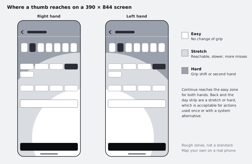
Sketch your zones on a copy of the frame with three rectangles or curves at low opacity, as in the diagram. Do it on the largest phone you can borrow too. Many inexpensive Android phones now have tall screens, so a tall screen is not a premium edge case, and that includes many of the phones your patients in African markets are likely to use.
Check it worked
You have a frame named Pick a time / Reach with your three zones drawn over the screen for each hand. Write one line beside it naming which targets fall in the hard zone. On the Larkfield screen that is Back, and on most phones the day strip.
Step 7 · Put the key actions within reach
Rank the targets by how often people use them on this screen. On Pick a time, nearly everyone taps one time slot and then Continue. Fewer people change the day, fewer still go back, and only some call.
Use that ranking to decide what moves:
- Continue must be in the easy zone for both hands. Pin it to the bottom of the screen, full width, with 16 pixels of space below it plus the space taken by the system's own navigation bar or home indicator, so a swipe for the system does not hit the button.
- Time slots sit in the middle of the screen, mostly in the stretch zone. They are large now, and that is acceptable for a single choice.
- The day strip is near the top. Most people book within the week shown and change the day at most once, so a stretch is acceptable. If your own testing shows people often pick a different week, move the strip lower or make it scroll with the content instead.
- Back stays top left, where people expect it. It is a stretch or hard to reach one-handed, but it is not the main path, and Android also offers the system back.
Do not move a control people expect in a fixed place just to bring it into reach. A Back control in the bottom right would be easy to touch and hard to find.
Check it worked
On Pick a time / Reach, Continue overlaps the easy zone for both the right and left hand. Every target in your hard zone has a reason written beside it: used rarely, has a system alternative, or expected in that position.
Step 8 · Build the hit area overlay
The overlay turns your audit into something a developer and a reviewer can check in seconds. Duplicate Pick a time / After and name the copy Pick a time / Hit areas.
For each of the 19 targets, draw a rectangle exactly over its hit area. Select the target first, read its X, Y, W and H, and give the rectangle the same values; rectangles snap to the target's bounds too. Style every rectangle the same way: a grey fill at 35 percent opacity and a 1 pixel dashed stroke. Then add a small bold text label in the middle of each with its size, such as 84×48. Group them as Hit areas so they can be hidden in one click.
Beside the frame, add a short table: each kind of target, its hit area and how many there are, with the total. Copy the house rule under it, and list any exceptions with the reason.
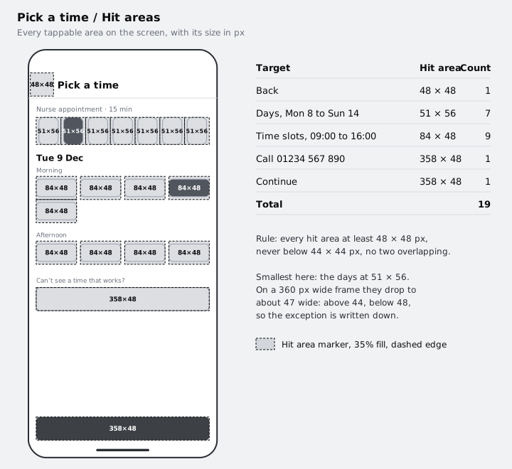
Check the narrow case before you call it done. Duplicate Pick a time / After, resize the duplicate to 360 wide and look at the days: they shrink to about 47 wide, above 44 but below 48. That is the exception the house rule allows, so write it down in your list rather than discovering it in the build.
Check it worked
Pick a time / Hit areas has 19 markers, each labelled with a size, and no two overlap. No label is below 48 in either direction except an exception you have written down with its reason, and none is below 44. Hide the Hit areas group: the screen underneath looks the same as the After frame.
Next steps
Hit areas are one part of designing for the phones people actually use. Design for low-end Android phones carries the work on to small screens, slow networks and limited memory. Follow iOS and Android conventions in one design covers where the two platforms differ beyond target size, such as back navigation and system bars. If your screen needs moving between sections of the app, Choose a navigation pattern for an app applies the same reach thinking to tab bars and menus.
Part of these paths
Related tutorials
- Design for low-end Android phonesYou will have a written low-end phone profile, a Larkfield Clinic booking screen revised to work at 360 by 640 dp on a dim screen with large text, and a constraint checklist your team can run on every new screen.
- Follow iOS and Android conventions in one designYou will have the Larkfield Clinic Pick a time screen as a pair of iOS and Android frames that share one brand, one set of words and one layout, and a "same or native" table that tells a developer which parts follow each platform and why.
- Choose a navigation pattern for an appYou will have compared a bottom tab bar, a top app bar with a drawer and a hub screen for the Larkfield Clinic app, written down why one wins, and drawn it on four screens with active, inactive and badge states.
Need this done for you?
Padding does this work for growing companies, from the first diagnosis to a system that keeps working.
Get new tutorials