UI and visual design · Intermediate · 17 min
Follow iOS and Android conventions in one design
By Padding · Updated 18 Nov 2026
Figma (web) or any design tool, with Apple's Human Interface Guidelines and Android's design guidance open in a browser · November 2026
You will have the Larkfield Clinic Pick a time screen as a pair of iOS and Android frames that share one brand, one set of words and one layout, and a "same or native" table that tells a developer which parts follow each platform and why.
On this page
Most booking apps ship on both iPhone and Android, and most small teams cannot afford two separate designs. The usual result is one of two mistakes. Either the app is an iPhone design with an Android build bolted on, so Android users meet a back control that fights their phone's own back gesture, or the team tries to make each platform feel fully native and ends up maintaining two products that drift apart.
There is a workable middle. The things that make the app yours (brand colour, words, the order of information, the flow) stay the same on both. The things people's hands and habits already know (going back, the bars at the top and bottom of the screen, picking a date, sharing, how text grows when they make it bigger) follow the platform. The hard part is deciding which is which for each element, and writing the decision down so a developer does not have to guess.
In this tutorial you take the Larkfield Clinic Pick a time screen, where a patient choosing a Nurse appointment picks Tuesday 9 December at 10:30, and make an iOS frame and an Android frame of it. You end with the two frames side by side and a "same or native" table on the canvas next to them. Apple's Human Interface Guidelines (HIG) and Android's design and Material 3 guidance are the references throughout; draw your own frames rather than pasting screenshots of either.
Step 1 · Set up the paired frames
Duplicate your Pick a time frame twice. Rename the copies Pick a time / iOS and Pick a time / Android, and put them side by side with a 120 px gap. Keep the original where it is; it is the shared source you will compare against at the end.
Size each frame for its platform. For iOS, 390 by 844 works, the size the Larkfield screens already use. For Android, use 412 wide (many current mid-range phones) or 360 wide (common on lower-cost phones, which many Larkfield patients will have, especially where people buy entry-level Android handsets and pay for prepaid data). Figma's frame tool lists device presets for both, or type the sizes in. Use a height around 900 for Android; the exact height matters less than the width, because the content scrolls.
On a separate area of the canvas, make a text box titled Same or native with four columns you will fill in as you go: element, decision (same or native), what iOS gets, what Android gets. You can draw it as a simple table with auto layout rows, or use a text box with one line per element for now.
Write the first three rows straight away, because they are the easy ones and they set the rule for the rest:
- Brand colours (the
Larkfieldvariables): same. - Words on the screen, including
Pick a time,Nurse appointment · 15 minandContinue: same. - Order of content (service line, week strip, day heading, Morning and Afternoon slots, phone fallback, button): same.
Check it worked
You have two frames named Pick a time / iOS and Pick a time / Android, sized for each platform, next to each other on the canvas. Your Same or native table has three rows, all marked same. If the Android frame is 360 wide, nothing on it is cut off: the nine time slots wrap onto extra rows rather than running off the edge. If they do not wrap, fix the auto layout now, before any platform work.
Step 2 · Make back navigation feel native on each phone
Back is where cross-platform designs most often feel wrong, because both platforms have strong habits and they differ.
On iOS, the back control is part of the bar at the top of the screen. Apple's guidance is to use the standard back symbol (a chevron at the leading edge, the left in left-to-right languages) rather than a custom arrow or a text button that says "Back". People can also swipe in from the left edge of the screen to go back, as a shortcut alongside the button.
On Android, back belongs to the system. Depending on how the person has set up their phone, it is either a swipe in from the left or right edge of the screen (gesture navigation) or a button in the three-button navigation bar at the bottom. With predictive back, the swipe shows a preview of the screen they are going back to before they let go. Android's top app bar can also show a back arrow at the start, and inside an app it does the same thing as system back.
Make the Header component carry both versions as variants: Platform=iOS and Platform=Android. In the iOS variant, a chevron at the left followed by the title in the centre. In the Android variant, a back arrow at the start with the title beside it, which is Android's small top app bar. Leave the title words and the Heading/M style the same in both. Keep the hit area of the back control at 48 by 48 on both, Larkfield's house rule from Size touch targets for thumbs; it already clears Apple's 44 by 44 pt default and matches Android's 48 by 48 dp.
Now look at the week strip on Pick a time. If people can swipe it sideways to see the next week, that swipe starts near the screen edges, which is exactly where both platforms listen for back. Give the strip a start and end inset of at least 16 so the first and last day are not at the edge, and add small next-week and previous-week arrow buttons, so nobody has to swipe at all.
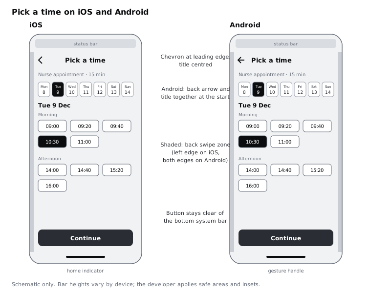
Add a row to the table: Back navigation: native. iOS: chevron at leading edge, title centred, edge swipe. Android: system back (gesture or button), back arrow in a small top app bar. Add a second row for the week strip: Week strip: same, with arrow buttons and edge insets on both.
Check it worked
Swap the Header instance on each frame to its platform variant. On the iOS frame the title is centred with a chevron at the left; on the Android frame the arrow and title sit together at the start. Neither frame has a text label reading "Back". Measure the week strip: its first and last day both sit at least 16 in from the frame edge, and arrow buttons are visible. If you have the phones, hold each one and swipe back from the edge over your printed or prototype screen: your thumb lands on empty margin, not on a day.
Step 3 · Respect the system bars and safe areas
Both platforms draw their own bars over your app, and you do not design them. You design around them.
On iOS, the status bar sits at the top (around the Dynamic Island or notch on recent iPhones) and a home indicator line sits at the bottom. Apple calls the area clear of these the safe area. On Android, the status bar is at the top and the navigation bar is at the bottom, either a thin gesture handle or three buttons. On Android 15 and later, apps that target Android 15 (API level 35) or higher draw edge to edge, so your background runs behind both bars and the developer has to pad content away from them using insets.
Place a status bar at the top of each frame and a home indicator or gesture handle at the bottom, either from your design tool's device frames or as plain grey placeholder rectangles labelled iOS status bar and so on. Do not try to match exact pixel heights: they vary between devices, and Android manufacturers vary them further. Then check two things on each frame:
- The
canvasbackground colour runs to the very top and bottom of the frame, behind the bars, so nothing looks boxed in. - The
Continuebutton and the phone fallback line sit clear of the bottom bar, with at least 16 of space between the button and the bar. On Android, also check the three-button version: the button row there is taller than the gesture handle.
Write the row: System bars: native. Background runs behind both bars on both platforms; all tappable content stays inside the safe area (iOS) or system bar insets (Android).
Check it worked
Each frame shows the platform's bars at top and bottom. The canvas fill reaches all four edges of both frames. The Continue button does not overlap the home indicator, the gesture handle or the three-button bar (add a second Android frame or an overlay with the three-button bar to see it), and there is visible space between them.
Step 4 · Use each platform's own date picker for anything beyond this week
The week strip is Larkfield's own control. It shows seven days, the selected day (Tue 9) and is the same on both platforms, because it is part of how the clinic presents its availability. But a patient who wants a date three weeks away should not tap the next-week arrow three times. Add a text button under the strip, Choose another date, and decide what opens.
This is a good place to go native. Both platforms ship date pickers people already know, and they handle the person's language, calendar and date order for them:
- iOS: the compact date picker style is a button showing the current date in the app's accent colour; tapping it opens a calendar in a modal view. The inline style shows the calendar directly in the layout, which is too big for this screen.
- Android: Material 3 has a modal date picker that opens as a dialog over the screen, a docked one that drops down in the layout, and a modal input version where people can type the date.
For Larkfield, use the iOS compact picker and the Android modal picker. On both, the developer greys out dates with no free appointments, so patients do not pick a day and then find it empty. In each frame, add a small annotation next to Choose another date saying which picker it opens, and draw one schematic of each picker beside the frames: a calendar grid with a month heading, 9 December selected, and the full days greyed. Keep these as grey boxes and text labels; they are notes for the developer, not a redesign of the system control.
The phone's language and region also decide how the date reads. A phone set to French shows French day and month names and puts the day before the month; Apple's guidance notes that the values a date picker shows, and their order, depend on the device's region. Your week strip should follow the same rule. Write Tue 9 and Tue 9 Dec in the frames as examples, and add a note: Format from device locale; do not hard-code English day names. That matters for a clinic whose patients may set their phones to English, French, Swahili or Yoruba.
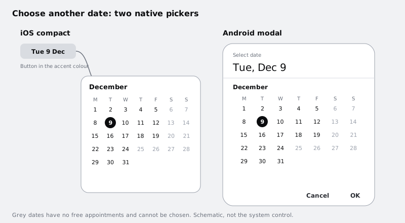
Add the row Choose another date: native. iOS compact date picker; Android Material modal date picker; unavailable days disabled on both; format from locale.
Check it worked
Both frames have a Choose another date text button under the week strip, with an annotation naming the picker it opens. Beside the frames there are two picker schematics with 9 December selected and some days greyed out. Your table has a row for the date picker marked native, and the week strip row is still marked same. Search the frames for any day or month name you typed: each one has the locale note next to it.
Step 5 · Keep the brand type and let it grow the way each phone expects
Typography is where teams most often over-adapt. The platforms do have different defaults. On iOS the system font is San Francisco and the default body size is 17 pt. On Android, Material 3's default type scale uses Roboto, and its bodyLarge style is 16 sp with a 24 sp line height. You do not have to use either system font. A brand typeface such as Larkfield's Inter is fine on both, as long as it behaves like system text.
Make these decisions and write them in the table:
- Typeface: same. Inter on both, using the five Larkfield text styles.
- Sizes: same.
Bodyat 16 on both. Bumping it to 17 on iOS gains little and adds a second set of styles to maintain. If your own app is iOS-heavy and your body text feels small there, change it on both platforms, not one. - Growing text: native. On iOS, a custom font does not follow the person's text size setting automatically; the developer has to connect each style to Dynamic Type. On Android, text sized in sp grows with the font size setting. Apple asks for text that can grow to at least 200 percent.
To check what growing means for this screen, duplicate each frame once more and set every text style to double its size in the duplicate only (detach the styles there, or use a temporary copy of the file). Look at the Pick a time / iOS / Large text and Pick a time / Android / Large text frames. The header title will need to shorten or wrap, the time slots will need fewer per row, and the Continue button will need to grow in height rather than clip its label. These are the same fixes on both platforms; Design layouts that survive large text goes through them in detail.
Check it worked
Your table has three typography rows: typeface same, sizes same, growing text native, each with a one-line reason. You have a large-text duplicate of each frame in which no text is cut off or overlaps, the slot rows have reflowed, and Continue is still fully readable.
Step 6 · Hand sharing to the system share sheet
Pick a time has nothing to share, so move to its partner screen for this one decision. Duplicate the Booked frame into Booked / iOS and Booked / Android, and give them the same header variants and bar placeholders as before.
Patients often book for someone else, a parent or a child, and want to send the details on. Add a secondary button, Share appointment details, under Add to calendar, keeping Done as the primary button. When it is tapped, the app should not show a Larkfield-designed list of messaging apps. Both platforms provide a share sheet that already knows which apps the person has, and in what order they like them: the activity view on iOS and the Android Sharesheet. What you design is the button, the icon beside it and the content that gets shared.
- Button and icon: native icon, same words. Use each platform's standard share icon, from SF Symbols on iOS and Material Symbols on Android, beside the same label.
- Shared content: same. Write it out as a text layer next to the frames so it can be reviewed like any other copy:
Nurse appointment at Larkfield Clinic, Tuesday 9 December, 10:30. 14 Mill Lane.Keep it short and plain: it may arrive as an SMS or a chat message, on a phone with a different language set, and it should still make sense. - The sheet itself: native, drawn only as a grey annotation box labelled
System share sheeton each frame.
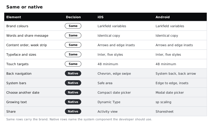
Add the rows: Share icon: native. Share message text: same. Share sheet: native (system).
Check it worked
You have Booked / iOS and Booked / Android frames, each with a Share appointment details button below Add to calendar and the platform's share icon beside it. A text layer next to them holds the exact message, reading as one complete sentence a relative could act on. Neither frame contains a hand-drawn list of messaging apps.
Step 7 · Review the pair and finish the table
Put the four frames (Pick a time and Booked, iOS and Android) in a row with the table under them. Read the table top to bottom and check every row has a decision and a reason. Then test the decisions with three questions:
- Would a patient switching phones recognise the app? Look at the iOS and Android
Pick a timeframes from across the room. The colours, the week strip, the selected10:30slot and theContinuebutton should look identical. If the two frames look like different apps, something marked native has spread into the brand. - Would a patient who only uses one phone find anything strange? Go through the native rows and imagine someone who has used only Android for years. A text button reading "Back", a back chevron with no system back support, or a home-made share list would all feel foreign. If you have the phones, put each frame on its phone with your design tool's mobile viewer and try going back and opening the date picker.
- Can the developer build it from the table alone? Every native row should name the system component (compact date picker, modal date picker, activity view, Sharesheet) rather than describe a look, so the developer uses the real control instead of redrawing it.
Add any rows the review turns up. Common extras are alerts and confirmation dialogs (native: both platforms style these themselves), switches and checkboxes (often native), and the bottom tab bar, which Choose a navigation pattern for an app covers in detail. Add one last row for touch targets: Touch targets: same, 48 by 48 minimum on both.
Check it worked
Your canvas has four frames and a Same or native table of at least twelve rows, each marked same or native with a one-line reason. Every native row names a system component or behaviour. The two Pick a time frames, viewed zoomed out, differ only in the header, the bars at top and bottom, and the annotations, while everything else matches.
Next steps
The Android frame is now ready for the harder constraints of cheaper phones. Design for low-end Android phones carries it on to small screens, slow networks and limited memory. Design layouts that survive large text goes further into the large-text frames you made here. If you have not set hit areas on these screens yet, Size touch targets for thumbs does that with the same Pick a time screen, and Choose a navigation pattern for an app settles how people move between the app's main sections on both platforms.
Part of these paths
Related tutorials
- Choose a navigation pattern for an appYou will have compared a bottom tab bar, a top app bar with a drawer and a hub screen for the Larkfield Clinic app, written down why one wins, and drawn it on four screens with active, inactive and badge states.
- Size touch targets for thumbsYou will have the Larkfield Clinic Pick a time screen with every tappable area at least 48 by 48 pixels, the main action within one-handed reach, and an overlay frame that shows each hit area and its size.
- Design for low-end Android phonesYou will have a written low-end phone profile, a Larkfield Clinic booking screen revised to work at 360 by 640 dp on a dim screen with large text, and a constraint checklist your team can run on every new screen.
Need this done for you?
Padding does this work for growing companies, from the first diagnosis to a system that keeps working.
Get new tutorials