UI and visual design · Intermediate · 16 min
Choose a navigation pattern for an app
By Padding · Updated 18 Nov 2026
Figma (web) and a spreadsheet · November 2026
You will have compared a bottom tab bar, a top app bar with a drawer and a hub screen for the Larkfield Clinic app, written down why one wins, and drawn it on four screens with active, inactive and badge states.
On this page
Navigation is the one part of an app people use on every screen, so it is worth choosing on purpose rather than copying whatever the last app you opened did. The choice is mostly about three things: how many places people need to go, how often they move between them, and whether they can reach the control with the thumb holding the phone.
So far the Larkfield Clinic app has been one flow: Home, Choose a service, Pick a time, Your details, Confirm, Booked. The clinic now wants more. Patients should see and change their bookings, read messages from the clinic (reminders, "your results are ready", seasonal vaccine notices) and manage an account with their details and preferred language. That is four top-level places, and the app needs a way to move between them.
In this tutorial you list those destinations with the facts that matter, compare three common patterns against them, pick one with a written reason, and draw it with every state it needs. You will not test the labels here; Run a tree test on your navigation does that, and it is the next thing to do once the pattern is chosen.
Step 1 · List the destinations and what people do in each
Open a spreadsheet and add a tab called Destinations. One row per place a patient goes from the top level, with these columns: destination, what people do there, how often, needs attention signal, and where it starts.
For Larkfield:
- Home (book). Start a booking with
Book an appointment, see the address and phone number. Every visit to the app that is about a new appointment starts here. Attention signal: none. - My appointments. See the Nurse appointment on Tuesday 9 December at 10:30, change or cancel it, see past visits. Used before every appointment and whenever plans change. Attention signal: yes, an appointment is coming up.
- Messages. Read texts from the clinic. Used whenever something arrives, often opened from a notification. Attention signal: yes, unread count.
- Account. Name, mobile number, language, text reminders, help and contact. Used rarely, but patients need to find it when they do.
Write the count at the top of the sheet: four destinations. Then write down what is not a destination. Choose a service, Pick a time, Your details, Confirm and Booked are steps inside the booking flow, not places people go on their own, so they belong under Home. Help, which Choose and use icons consistently planned as a tab before messages and accounts existed, becomes a row in Account plus the phone number on Home. That keeps the top level at four.
Check it worked
Your Destinations tab has four rows, each with how often it is used and whether it needs an attention signal. Below them, a short list names every booking flow screen as belonging to Home, and nothing in it is also a top-level row. If your own app has more than five rows, merge or demote some before going on; most patterns get harder past five.
Step 2 · Sketch the three candidates on the same phone
Draw the same four destinations three ways, as quick boxes on a 360 by 800 frame (a common small Android size). Keep them rough: this is about structure, not styling.
- A. Bottom tab bar. A row of four labelled icons fixed to the bottom of every top-level screen. One tap moves between any two destinations.
- B. Top app bar with a drawer. A bar at the top with a menu button in the corner. Tapping it slides a panel in from the side with the four destinations listed.
- C. Hub screen. A start screen of four large tiles. Each tile opens its section, and Back returns to the hub.
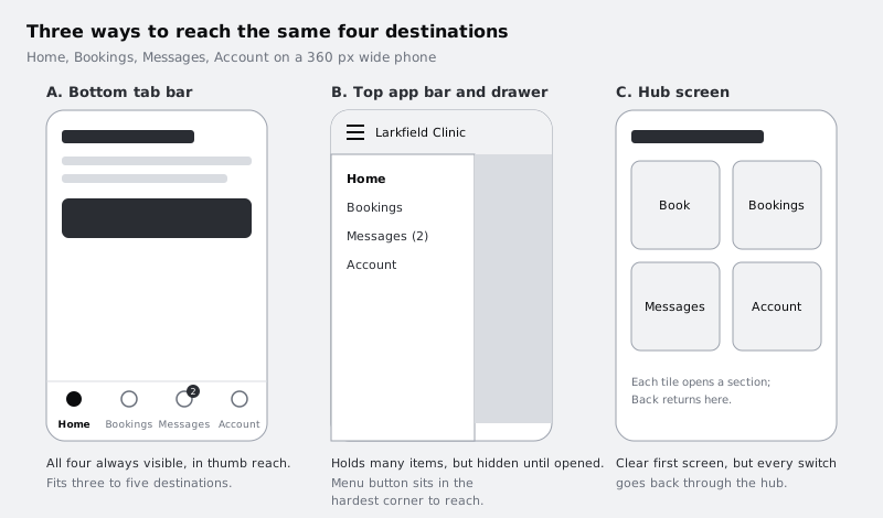
Put your phone in one hand and hold it the way you would on a bus. Lay it over each sketch, or print the sketches at phone size, and touch each destination's control with your thumb without shifting your grip. Note which ones you can reach and which make you stretch or use the other hand.
Check it worked
You have three frames, labelled A, B and C, each showing all four destinations (in B, show the drawer open as a second frame or overlay). Beside each, a one-line note says which controls your thumb reached without changing grip. On most phones held in one hand, the menu button in the top corner of B is the hardest to reach.
Step 3 · Score each pattern against the destinations
Add a tab called Compare. Put the three patterns across the top and these five rows down the side. Score each cell 1 (poor), 2 (fair) or 3 (good), and write the reason in a few words next to the score. A score without a reason is just a preference.
- Reach. Can the main navigation be used one-handed? A: 3, bottom of the screen. B: 1, menu in the top corner, though a swipe from the edge also opens many drawers. C: 2, tiles are large, but Back is often at the top.
- Discoverability. Can a first-time patient see that Messages exists without opening anything? A: 3, all labels always visible. B: 1, hidden behind the menu; research on hidden navigation finds it is used less than visible navigation. C: 2, visible on the hub, invisible once inside a section.
- Switching cost. Steps to go from a message ("Your Tuesday appointment is tomorrow") to My appointments. A: one tap. B: two taps (menu, then item). C: Back, then a tile. Score A 3, B 2, C 2.
- Fits the count. Four destinations. Tab bars suit three to five, drawers suit many, hubs suit a handful of rarely switched sections. A: 3, B: 2, C: 3.
- Attention signals. Two destinations need badges (from your Destinations tab). A: 3, badges sit on the visible tab. B: 1, the badge has to be repeated on the menu button or it is missed. C: 2, visible on the hub only.
Total each column. For Larkfield, A scores 15, C 11 and B 7.
Then write what would change the answer, because it will change one day. If Larkfield grows to eight or more sections that patients rarely switch between, a drawer or an Account page holding the extras becomes reasonable. If the app only ever did one thing (book, then leave), a hub or even no persistent navigation at all would be simpler than a tab bar with one useful tab.
Check it worked
The Compare tab has 15 scored cells, every one with a reason. The totals are at the bottom, and under them is a line starting "We would revisit this if", naming at least one concrete change, such as more than five destinations.
Step 4 · Write the decision and its rules on the canvas
In Figma, add a page called Navigation. Put a text box at the top that a developer or a new designer can read in under a minute:
- Pattern: bottom tab bar, four items: Home, Bookings, Messages, Account.
- Why: four destinations, frequent switching between Messages and Bookings, two need badges, one-handed reach. Scores 15 against 11 (hub) and 7 (drawer).
- Where it shows: on the four top-level screens and on every screen inside a tab, including the booking flow. Each tab remembers where the patient was. Tapping the active tab again returns to the top of that tab.
- Not in the bar: actions.
Book an appointmentis a button on Home, not a fifth tab. Tab bars move between places; they do not start tasks.
The label Bookings needs a note of its own. At 360 px wide, each of four items gets 90 px, and "My appointments" at the app's 14 px label size does not fit on one line. "Bookings" fits, and the screen it opens is titled Your bookings. Treat this as a draft label: the tree test is where you find out whether patients look for "Bookings", "Appointments" or something else.
Plan for longer words, too. If the app is offered in Yoruba, Hausa or French, tab labels will often be longer than the English, so the label can wrap to two lines, centred, and never truncate with an ellipsis. And remember what sits under the tab bar: on many Android phones, especially budget ones, the system's own Back, Home and Recents buttons sit directly beneath your app, and on others a gesture handle does. Current Android draws apps edge to edge, under that system area, so the tab bar's items must sit above it or a patient hits the wrong row. You set that up when you assemble the bar.
Check it worked
The Navigation page has the decision box with pattern, reason, where it shows and what is not in it. Read the label note aloud: it says why Bookings is used, that it is provisional, and that labels may wrap to two lines.
Step 5 · Build the tab item as a component with every state
Draw one tab item: a frame 90 wide and 64 tall with vertical auto layout, a 24 px icon, 4 px gap, and a label. Make it a component called Tab item and add two variant properties (Build a button component with variants covers the panel if you have not done this before):
State:Inactive,ActiveBadge:None,Dot,Count
You need all six combinations. Inactive takes each of the three badges, and so does Active: Messages can be open while new messages arrive (Active with Count), and the Bookings dot stays while Bookings is open, because it means "an appointment is within 24 hours", not "you have not looked yet" (Active with Dot). Style them with the Larkfield variables:
- Inactive: outline icon and label in
Body/Small, both incolour/text-muted. On the white bar that is 6.15:1, comfortably above both the 4.5:1 text and 3:1 icon thresholds. - Active: filled icon and label in
Label(Semi Bold), both incolour/accent(7.58:1 on white), and a pill-shaped indicator behind the icon incolour/accent-tint. - Count badge: a pill 16 px tall, minimum 16 wide, in
colour/dangerwith white text (6.57:1), overlapping the icon's top-right corner. Show 1 to 9, then9+. - Dot badge: an 8 px circle in
colour/dangerat the same corner, for "something here needs a look" without a number.
Check one thing carefully. The accent-tint indicator against the white bar is only 1.17:1, so on its own it is invisible to many people. That is fine as long as the active state does not depend on it: the filled icon and the heavier label already carry the difference. Selection that relies on a colour change alone fails WCAG 1.4.1.
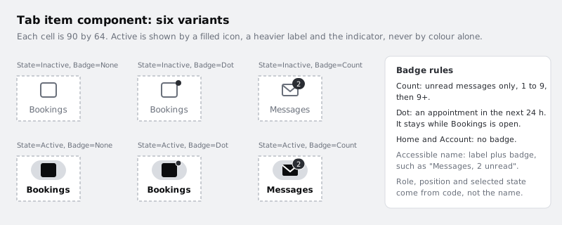
Finally, write the accessible name for each badge in the component's description: the tab's visible label plus what the badge means, such as "Messages, 2 unread" or "Bookings, appointment within 24 hours". Keep role, position and state out of it. The developer sets those in code, and the screen reader adds them, so a patient hears something like "Messages, 2 unread, tab, 2 of 4, selected". Your note matters because a red circle means nothing to a screen reader.
Check it worked
Your Tab item component set shows six variants, with State and Badge properties in the right sidebar. Desaturate the component set (a temporary greyscale layer on top, or squint): you can still tell Active from Inactive by the filled icon and bold label alone. Every badge's text or shape is at least 3:1 against the bar.
Step 6 · Assemble the bar and draw it on four screens
Make a second component, Tab bar: a horizontal auto layout frame of four Tab item instances, fill colour/surface, a 1 px colour/line divider along its top edge, and padding below the items. Let the bar's background run down under the system navigation area, and give the items extra bottom padding equal to the system's bottom inset, which the developer reads from the platform at run time because it differs between three-button navigation and gesture navigation. Draw 8 px in Figma as the minimum on top of that inset, and write "8 px + system bottom inset" in the component description. Set each item's label: Home, Bookings, Messages, Account, in that order. Order follows the Destinations sheet: the starting point first, then the destinations people switch between most, and the rarely used one last.
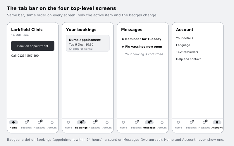
Now place the bar on four screens on the Navigation page, each 360 by 800, with the bar's instance pinned to the bottom:
- Home: Home active. Bookings shows a dot (the nurse appointment is within 24 hours in this example), Messages shows a count of 2.
- Your bookings: Bookings active, with the Nurse appointment card: Tue 9 Dec, 10:30,
Change or cancel. Messages still shows 2. - Messages: Messages active with its count, two unread messages at the top in bold, one read message below.
- Account: Account active, rows for Your details, Language, Text reminders, Help and contact.
Use the Badge property on each instance rather than drawing badges by hand, so the states stay in one place.
Check it worked
Four frames on the Navigation page each show the Tab bar instance at the bottom, with a different item active on each and the same badges on all four. Click any tab item on the canvas: the right sidebar shows State and Badge values, not a detached group.
Step 7 · Test reach, size and states before you move on
Run four checks and write the result of each under the screens:
- Reach. Open the four screens on your phone (a prototype link or a mirrored file both work) and tap every tab with the thumb of the hand holding the phone. All four should be reachable without changing grip.
- Target size. Each item's tappable area is the whole 90 by 64 cell, far above the WCAG 2.2 minimum of 24 by 24 px. Check that the area is the cell, not just the 24 px icon.
- Long labels. Duplicate the Account screen and replace the labels with the longest translations you might ship, or a test string twice the English length. Labels wrap to two lines and nothing overlaps the badge or gets cut off.
- Greyscale. View the four screens in greyscale. The active tab is still obvious on each.
If one fails, fix the component, not the screens, so the fix reaches all four.
Check it worked
Under the four screens there are four lines, one per check, each ending in pass or a fix you made. The long-label copy shows two-line labels with no overlap, and you tapped every tab one-handed on a real phone.
Next steps
The pattern is chosen, but the labels are still guesses. Test them with patients in Run a tree test on your navigation before anyone builds the bar.
If the same product also has a website, Design a responsive site header and menu covers the web side of the same decision. To make the bar feel native on both iPhone and Android, see Follow iOS and Android conventions in one design, and for thumb-friendly sizing across the rest of the app, Size touch targets for thumbs.
Part of these paths
Related tutorials
- Run a tree test on your navigationYou will have a proposed navigation tested with real people as a text-only tree, scored for success, directness and first click on every task, and a list of the labels to change before anyone designs a screen.
- Design a responsive site header and menuYou will have the Larkfield Clinic website header designed at 1280, 768 and 360 pixels wide, with a Book an appointment button that never hides, a menu for smaller screens, a written collapse point, and closed, open, focus and current-page states ready for a developer.
- Follow iOS and Android conventions in one designYou will have the Larkfield Clinic Pick a time screen as a pair of iOS and Android frames that share one brand, one set of words and one layout, and a "same or native" table that tells a developer which parts follow each platform and why.
Need this done for you?
Padding does this work for growing companies, from the first diagnosis to a system that keeps working.
Get new tutorials