UI and visual design · Intermediate · 19 min
Design error states that help people recover
By Padding · Updated 18 Nov 2026
Figma (web) and a spreadsheet · November 2026
You will have an error matrix covering every way a booking can fail outside the form, and five Figma state frames that keep the person's work, say what happened in plain words and offer a next step.
On this page
Most error work in a design file goes into the form: a red outline, a message under a field. The failures that lose people are usually somewhere else. The phone drops off the network halfway through booking. The server is down for an hour. The time someone picked was taken by another patient while they typed their date of birth. They put the phone down to deal with a child, come back twenty minutes later and the app has forgotten them. Or, worst of all, they tap Book appointment, nothing comes back, and they cannot tell whether they have an appointment or not.
None of those is the person's fault, and none can be fixed by typing something differently. A good response to each one does three things: it keeps what the person has already done, says what happened in words they would use, and gives them one clear thing to do next.
This tutorial works through those failures for the Larkfield Clinic booking app: six screens (Home, Choose a service, Pick a time, Your details, Confirm, Booked), with the example booking of a Nurse appointment on Tuesday 9 December at 10:30. Field validation on Your details is covered in its own tutorial (see Next steps), so it is left out here. You finish with two things a team can build from: an error matrix in a spreadsheet, and five state frames in Figma.
Step 1 · List every way the flow can fail outside the form
Open a spreadsheet and name the first tab Failures. Walk through the flow screen by screen, and at every point where the app talks to a server, ask: what if the answer never comes, comes back as a refusal, or comes back too late? Write one row per failure with four columns: failure, where it can happen, what triggers it, and how often you expect it.
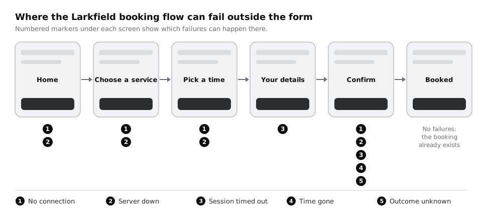
For Larkfield, the app talks to the server five times: checking that online booking is available when Home opens, loading the services on Choose a service, loading free times on Pick a time, holding the booking session open while the patient fills in Your details, and sending the booking from Confirm. That gives this list:
- No connection. On any screen that loads or sends. The phone is in a lift, on a bus between masts, or out of prepaid data.
- Server down or overloaded. On any screen that loads or sends. The booking system is being updated, or Monday morning brings more patients than it can handle.
- Time gone. On Confirm. Between choosing 10:30 and tapping Book appointment, another patient booked it.
- Session timed out. On Your details or Confirm. The patient left the app open for longer than the server keeps a booking session.
- Outcome unknown. On Confirm. The booking was sent, but no answer came back before the app gave up waiting. It may have booked; it may not.
- Payment declined. Not applicable to Larkfield, whose appointments are free. Keep the row and mark it
n/a, so anyone reusing the matrix for a paid service sees it is missing on purpose.
Pick a time already has a Pick a time / Time gone frame from the high-fidelity work, for a slot taken while the screen is open. That is the same failure caught earlier; note it in the where column, and use its words, "10:30 was just taken. These times are still free.", on Confirm too, so the two responses read the same.
Check it worked
Your Failures tab has at least six rows. Every row names a screen and a trigger, and none of them is something the patient typed wrong. Confirm appears in more rows than any other screen; if it does not, look again at what happens after the button is tapped.
Step 2 · Sort each failure by what the person can do about it
A message is only useful if it leads somewhere. Before writing any words, decide which kind of recovery each failure allows. Add a column called recovery type and give every row one of these four:
- Wait and try again. Nothing is wrong with what the person did; the network or server needs time. No connection and Server down belong here.
- Choose again. The thing they chose is no longer available. Time gone belongs here.
- Carry on from where they were. The app lost track of them, but what they entered is safe. Session timed out belongs here.
- Check first, then decide. Nobody knows yet what happened. Outcome unknown belongs here, and it is the one that most needs care, because "Try again" could book the same patient twice.
Then add a column called fallback: what the person can do if the app cannot help at all. For Larkfield it is the phone line already on Pick a time, Call 01234 567 890. Voice calls often work when mobile data does not, and many patients without data left on a prepaid plan can still make a call, so the number belongs on every error state that stops a booking, not only on one screen.
Check it worked
Every row has one recovery type and a fallback. Read across the Outcome unknown row: if its recovery type is "Wait and try again", change it. Retrying before knowing the outcome is how double bookings happen.
Step 3 · Decide what is kept, and for how long
The single biggest difference between an error that annoys and one that drives people away is whether their work survives it. Add two columns: kept and kept until.
Go row by row and write down exactly what the app still holds after the failure:
- No connection: the chosen service, the chosen time and everything typed on Your details, held on the phone. Times already loaded on Pick a time stay on screen, marked as possibly out of date, instead of being cleared.
- Server down: the same. The app does not throw the patient back to Home.
- Time gone: the service, the day (Tuesday 9 December) and every detail. Only the time is cleared, and the screen offers the nearest free times on the same day.
- Session timed out: everything typed, kept on the phone. When the patient returns, the app starts a new session in the background and checks the chosen time again before showing anything. The patient should not have to retype a word.
- Outcome unknown: everything, until the app has found out whether the booking exists.
For kept until, write a real rule, such as "until the booking succeeds or the patient taps Start again" or "24 hours". Ask whoever looks after data protection at the clinic whether health-related details can be kept on the phone at all and for how long, and record the answer in the sheet. If the answer is "not at all", the matrix must say so, and the messages in the next step must not promise it.
For anything stored only in the app's memory, assume it is lost if the phone closes the app. On low-memory Android phones, which are common in many markets including much of Africa, the system closes background apps and browser tabs quickly. If keeping the work matters, it has to be saved to the phone, not just held in memory.
Check it worked
Every row has something in kept and a rule in kept until. No row says "nothing" unless you have written down why. Read the Session timed out row: it should say the patient does not retype anything, and it should say the time is checked again before it is shown as theirs.
Step 4 · Write a message that says what happened, what is safe and what to do
Each recovery message has three parts, in this order:
- What happened, in the patient's words. "You're offline", not "Network error". "10:30 was just taken", not "Conflict".
- What is safe, in one short clause. "Your details are saved." This is the line that stops people giving up.
- What to do next, as the label of a single button, with the phone number as a second route where a booking is blocked.
Add a message column and a button column. Larkfield's set:
- No connection: "You're offline. Your details are saved on this phone." Button:
Try again. Below it: "Or call 01234 567 890 to book." - Server down: "Online booking isn't working at the moment. Your details are saved." Button:
Try again. Below it: "Or call 01234 567 890 to book." - Time gone: "10:30 was just taken. These times are still free." The free times shown are all on Tue 9 Dec. The free times appear as slots. Button:
Book 11:00once one is picked. - Session timed out: "You were away for a while, so we checked your time again. 10:30 on Tue 9 Dec is still free." Button:
Continue. If the time has gone meanwhile, this row hands over to the Time gone message. - Outcome unknown: "We're checking whether your booking went through. Please don't book again yet." No button while checking. Then either the Booked screen, or "Your booking didn't go through. Nothing has been booked." with
Try again.
Leave out what does not help: "Oops", "Something went wrong" on its own, apologies longer than "Sorry", raw error codes and anything that suggests the patient did something wrong. If reception needs a way to find a failed attempt, add a short reference in Body/Small at the bottom of the message ("Reference LK-4821, if you call us"), never as the headline.
Write plainly, too, because these messages will be translated. Larkfield serves patients who read English as a second language, and short sentences without idioms survive translation and machine translation far better than chatty ones.
Check it worked
Read each message aloud. Every one answers three questions within two sentences: what happened, is my work safe, what do I do now. No message uses the words "error", "invalid" or "failed", and none shows a code. The Time gone words match the Pick a time / Time gone frame exactly, and the Outcome unknown message tells the patient not to book again.
Step 5 · Choose where each message appears
The same words can help or hide depending on where they sit. Add a form column and pick one of three for each row:
- Banner on the current screen. Use this whenever the patient's work is on that screen. The banner sits under the header, the content stays visible below it, and the button sits in the banner or replaces the screen's main button. No connection, Time gone and Session timed out are banners, and so is Server down on every screen except Home.
- Replacement screen. Use this only when nothing on the screen can be used. If Home cannot reach the booking system at all, there is nothing to book with, so a screen that explains and offers the phone number is better than a button that leads to an empty list. That makes Server down the one row with two forms: a replacement screen on Home, and a banner with
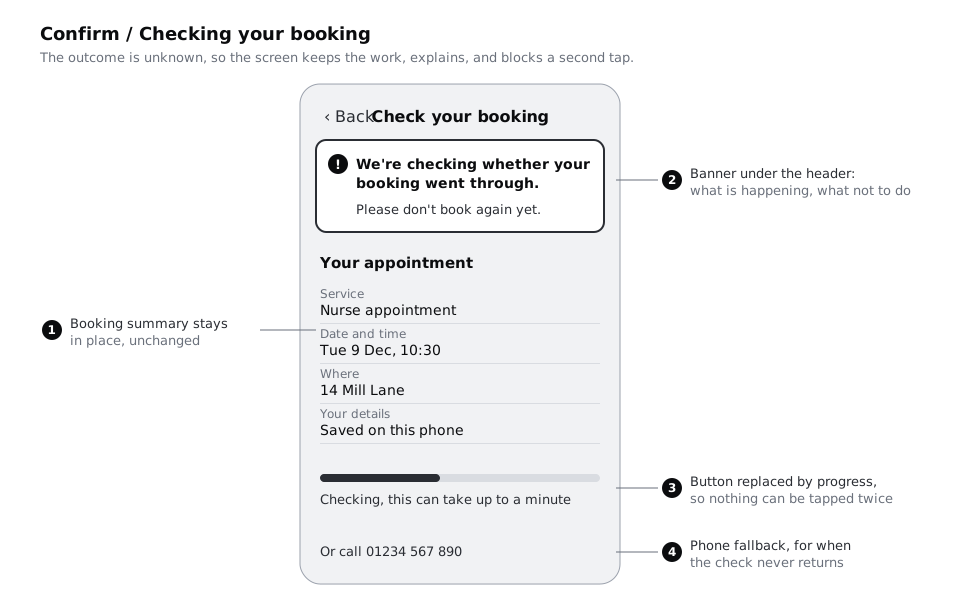
Toneset toDangeron Choose a service, Pick a time and Confirm, where the patient's choices and details are on screen and must stay there. Write both in the form cell, for example "Screen on Home; banner elsewhere". - Holding state on the button area. Use this for Outcome unknown. The Confirm screen stays, the main button is replaced by a progress line and the message, and nothing can be tapped twice.
Do not use toasts (messages that appear for a few seconds and slide away) for any of these. A patient who glances away misses it, and someone using a screen magnifier may never see it at all.
Two notes for the developers belong in this column too. A banner that appears without moving focus must be announced to screen reader users as a status message. And the banner must not depend on colour: each one has an icon and words that carry the meaning, so it reads the same on a cheap screen in bright sunlight.
Check it worked
Every row in the matrix now has a form. Only Server down uses a replacement screen, and only on Home; its cell also says banner for every other screen, so a reader can tell what Server down looks like on Confirm. No row uses a toast. Each banner row says where focus stays and notes that the message is announced as a status message.
Step 6 · Build the five state frames in Figma
On the 04 High fidelity page, or on a new page called Recovery states if you prefer to keep them apart, duplicate the screen each state belongs to and rename the copy. Lay the five frames out in a row under the screens, next to the four state frames from the high-fidelity work:
Pick a time / Offline, from Pick a time. The nine slots stay visible at reduced emphasis, with10:30still selected. Anotice-tintbanner under the header holds the alert icon and "You're offline. Your details are saved on this phone."Try againreplacesContinue, and the existing phone line stays.Home / Booking unavailable, from Home. The one replacement screen: the clinic name and address stay at the top, theBook an appointmentbutton is replaced by adanger-tintcard with "Online booking isn't working at the moment.", aTry againbutton and "Or call 01234 567 890 to book."Your details / Session timed out, from Your details, with the fields filled in. Anaccent-tintbanner with the tick icon: "You were away for a while, so we checked your time again. 10:30 on Tue 9 Dec is still free." Use the tick, not the alert icon; the news is good, and the banner should look it.Confirm / Time gone, from Confirm. Anotice-tintbanner with "10:30 was just taken. These times are still free." Below it, the Date and time row shows four free slots from Tue 9 Dec (09:00, 09:20, 09:40 and 11:00) asTime slotinstances. Service, Where and Your details rows stay unchanged.Confirm / Checking your booking, from Confirm. Build it as drawn in the diagram in the previous step.
Make the banner a component so all five use the same one. Draw it once with an icon, a Body message, an optional Body/Small line and an optional button, then add a variant property called Tone with the values Notice, Danger and Success. Each variant uses the tint, text colour and icon from the Larkfield variables (notice and notice-tint, danger and danger-tint, accent and accent-tint).
Keep the existing Confirm / Could not book frame and change its banner to an instance of the same component with Tone set to Danger. It is what Server down looks like on Confirm: the summary stays, the banner reads "We could not book this time. Your details are saved.", the button is Try again and the phone line sits below. It also covers any other refusal from the server that none of these five explains. On Choose a service and Pick a time, Server down uses the same Danger banner with the Server down message; you do not need a separate frame for each, because the matrix row names the component and the words.
Check it worked
You have five new frames, named as above, each one the same size as the screens. Every banner on them is an instance of one banner component, and the layers panel shows the instance icon, not detached groups. Put a desaturate layer over the row: you can still tell each banner from the content around it by its icon and words alone.
Step 7 · Fill the matrix, hand it over and walk it once more
Bring the work together. Rename the Failures tab to Error matrix and make sure it has, for every row: failure, where, trigger, recovery type, fallback, kept, kept until, message, button, form, and a new column, frame, holding the name of the Figma frame that shows it. The Server down row names two: Home / Booking unavailable and Confirm / Could not book. Paste a link to each frame (right-click the frame, copy a link to it) into that column so developers can jump straight there.
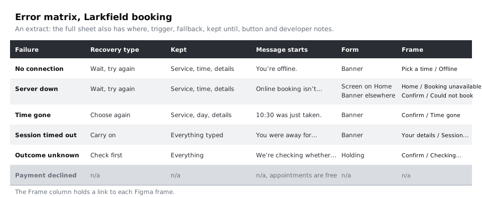
Add a short developer notes column. These are not instructions to engineers on how to build it, only the facts the design depends on:
- No connection: the phone reporting that it is online does not prove it can reach the server, so treat a request that gets no answer the same as being offline.
- Time gone: the server says the slot is taken (often a
409 Conflict) and returns the free times for that day in the same answer, so the screen does not need another request. - Session timed out: the server refuses the session (often
401); the app starts a new one and checks the time again without showing anything until that check returns. - Server down: often
503or504. Do not retry automatically in a loop; each retry costs a patient on prepaid data, and it adds load to a server that is already struggling. One automatic retry, then the message and the button. - Outcome unknown: the booking request must be safe to send twice, so that a retry after a lost answer cannot create a second appointment. The checking state asks the server whether a booking with this attempt's reference exists.
Last, walk through the matrix with the frames open side by side, row by row, and read each message aloud as if you were the patient. Then ask someone who did not make the frames to do the same with three questions: what happened, is your booking safe, and what would you tap?
Check it worked
The Error matrix has six rows, one marked n/a, and every other row links to a frame that exists; Server down links to both of its frames. The person you asked can answer all three questions for every frame without your help, and in particular says they would not book again on Confirm / Checking your booking.
Next steps
You now have the failures that happen to people, rather than the mistakes they make. The neighbouring states are worth the same care:
- /tutorials/design-form-errors-and-inline-validation covers the errors people can fix by typing, on the same Your details screen.
- /tutorials/design-loading-states-spinners-skeletons-and-progress designs what the screens show while they wait, before anything has failed.
- /tutorials/design-for-slow-networks-and-costly-data goes further on patients with weak signal and little data, where many of these failures start.
- /tutorials/announce-errors-and-notices-with-a-live-region builds the banners so screen reader users hear them.
Part of these paths
Related tutorials
- Design form errors and inline validationYou will have a validation timing table for every field on a booking form, a message for every way each field can go wrong, and an error-states frame in Figma showing the field errors, the error summary and where focus goes.
- Design empty states that say what to do nextYou will have four empty-state frames for one list screen, first use, no results, all done and cleared, each with its own message and next action, plus a copy table a developer can build from.
- Design for slow networks and costly dataYou will have a per-screen data budget for the Larkfield Clinic booking flow, Figma frames for what each screen shows offline, a save-and-resume state, a use-less-data option and SMS confirmation text that fits in one message.
Need this done for you?
Padding does this work for growing companies, from the first diagnosis to a system that keeps working.
Get new tutorials