UI and visual design · Beginner · 15 min
Design empty states that say what to do next
By Padding · Updated 18 Nov 2026
Figma (web) · November 2026
You will have four empty-state frames for one list screen, first use, no results, all done and cleared, each with its own message and next action, plus a copy table a developer can build from.
On this page
An empty screen is still a screen. Someone opened it for a reason, and the blank space where a list should be is the moment they decide whether the app is broken, whether they did something wrong, or what to do instead. Most apps answer that with one generic "Nothing here yet" and a cheerful drawing. That covers one situation and gets the others wrong.
A list can be empty for at least four different reasons, and each needs different words and a different action:
- First use. The person has never had anything here. They need to know what will appear and how to make it appear.
- No results. There is content, but a filter or search hides all of it. They need to know the filter is the cause and how to undo it.
- All done. Everything that was here has been dealt with. They need confirmation that nothing is missing, and a way to look back or start again.
- Cleared by the person. They have just removed the last item themselves. They need to know it worked, and what it changed.
You will design all four for the My appointments screen of Larkfield Clinic's booking app: the tab beside Home and Help where patients see their bookings. You end with four frames, one shared empty-state component and a copy table.
Step 1 · Write down why the screen can be empty
Before drawing anything, describe what the screen holds when it is full. Larkfield's My appointments has a header, two segments (Upcoming and Past), a service filter on Past for patients with a long history, a list of appointment rows, and the tab bar at the bottom. A typical row reads "Nurse appointment, Tuesday 9 December, 10:30".
Now list every way that list can have zero rows. Open a text layer next to your screens, or a spreadsheet, and make a table with four columns: the kind, what is true about the data, what the patient probably wants at that moment, and the one action that serves that want.
For Larkfield it reads:
| Kind | What is true | What the patient wants | Next action |
| --- | --- | --- | --- |
| First use | No appointments ever, upcoming or past; a cancelled booking does not count | To know this is where bookings go | Book an appointment |
| No results | Past has appointments, the service filter matches none | To see their appointments again | Show all services |
| All done | No upcoming appointments, one or more past | To check nothing is missing, maybe book again | Book an appointment |
| Cleared | The patient has just cancelled their only upcoming appointment | To know the cancellation went through | Book a new time |
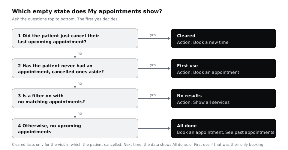
The order in which the app checks these matters, because more than one can be true at once. A patient who cancels their only appointment also has no upcoming appointments, and a new patient who books for the first time and then cancels also has no appointments that count. Write the checks in order: the patient has just cancelled their last upcoming appointment in this visit means cleared; no appointments ever, not counting cancelled ones, means first use; a filter on with no matches means no results; anything else with no upcoming rows means all done. Cleared goes first so that whoever has just cancelled always sees their cancellation confirmed, even if it was their first booking. The next time the patient opens the tab, cleared becomes all done, or first use if the cancelled booking was their only one.
Check it worked
Your table has four rows, each with a different next action or a different reason for the same action. You can point to any combination of data (no bookings ever, three past visits and a filter on, one booking just cancelled, a first booking made and then cancelled) and say which single row applies, using your ordered checks.
Step 2 · Build one empty-state block and decide what stays on screen
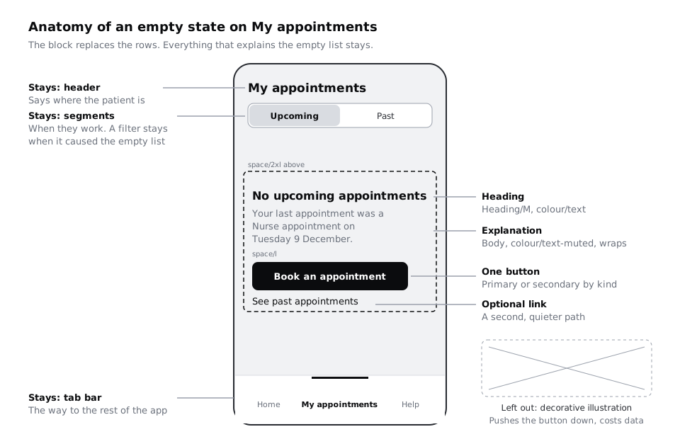
An empty state replaces the list, not the screen. Duplicate your filled My appointments frame and delete only the rows. Keep the header, the tab bar, and the segments and filter wherever they still mean something: if the patient used the filter to get here, the filter is part of the explanation and has to stay visible.
In the space the rows used to fill, build one block with vertical auto layout:
- A heading in
Heading/Mandcolour/textthat names the situation in a few words. - One or two sentences in
Bodyandcolour/text-mutedthat explain it with the patient's own data where possible. - One button, primary or secondary depending on the kind.
- An optional text link underneath for a second, quieter path.
Set the gap between the text and the button to space/l, put space/2xl above the block, and align it to the left edge of the screen padding, like the rows it replaces. Set both text layers to fill the container width so they wrap. Do not give the block a fixed height: the copy in Yoruba, Hausa or French can run well past the English, and a 360 px wide screen, common on lower-cost Android phones, has room for fewer words per line than your design frame.
Leave out the illustration. A large drawing pushes the action below the fold on small phones, adds to the download on prepaid data, and says nothing the heading does not. If your app already has a meaningful icon for the section, such as Larkfield's Appointments icon, it may sit above the heading at 24 px, but the block must work without it.
Make the block a component called Empty state. Add a text property for the heading and one for the body, a boolean property to show or hide the link, and an instance swap property for the button so each use can pick the primary or secondary button.
Check it worked
Your file has an Empty state component with two text properties, a boolean for the link and a button you can swap. Place an instance and paste a body sentence three times as long: the block grows downwards and the text wraps, nothing is clipped, and the tab bar does not move.
Step 3 · Design the first-use state
Duplicate the frame and name it My appointments / Empty - first use. A patient who has never booked has nothing to switch between, so hide the Upcoming and Past segments and the filter. Showing controls that cannot do anything invites taps that lead nowhere.
The heading tells them what the screen is for, not that it is empty. The body tells them what will appear, so they recognise it later. The action is the one thing that fills the screen:
- Heading: "No appointments yet"
- Body: "When you book, your appointments show here with the date, time and a way to change or cancel them."
- Button (primary): "Book an appointment", which opens Choose a service.
- Link: "Booked by phone or at the desk?", which opens the Help answer "Why can't I see my booking?". That answer says phone and front-desk bookings can take a day to appear in the app, and gives the clinic's phone number.
Only keep that link if your service has that delay. It is there because the most likely confused patient on this screen is someone who booked at the front desk and expected to see it. The link names their situation so they know it is meant for them, and the Help answer, not the empty state, holds the detail and the number. Answering that question one tap away saves a phone call. If you do not know what confuses people on your empty screen, ask the people who answer the clinic's phone.
Check it worked
The frame shows the header, the block and the tab bar, with no segments, filter or illustration. The link has a destination written next to it: the Help answer about phone and desk bookings. Read the heading and body aloud to someone who has not seen the app: they can tell you what the screen will show once they have booked, and which button to press to get there.
Step 4 · Design the no-results state
Duplicate again and name it My appointments / Empty - no results. Set it on the Past segment, with the service filter showing Blood test. Keep both visible and unchanged: the filter is the reason the list is empty, so the patient must be able to see it and change it right here.
Use the patient's own numbers. "No results" tells them nothing; a count tells them their history is still there:
- Heading: "No blood test appointments"
- Body: "None of your 4 past appointments was a blood test."
- Button (secondary): "Show all services", which resets the filter to
Alland shows the 4 rows.
The button is secondary because it undoes a choice rather than starting a task. Name it after what it does, not "Reset" or "Clear", which do not say what comes back. If your list has a search box rather than a filter, the same pattern applies: repeat the search term in the heading, and offer to clear it.
Check it worked
The filter chip still reads Blood test, the heading names the filtered service, and the body gives a number from the patient's data. Ask yourself what happens if they ignore your button and change the filter themselves: the empty state disappears and the list returns, with no extra step.
Step 5 · Design the all-done state
Duplicate and name it My appointments / Empty - all done. Imagine the patient opening the app on 15 December, after their Nurse appointment on Tuesday 9 December. The Upcoming segment is selected and has no rows; Past has one.
This empty state should reassure, not sell. The patient's real question is "have I missed something, or did my booking disappear?" Answer it with the most recent fact you have:
- Heading: "No upcoming appointments"
- Body: "Your last appointment was a Nurse appointment on Tuesday 9 December."
- Button (primary): "Book an appointment"
- Link: "See past appointments", which switches to the
Pastsegment.
Keep the segments visible here: they work, and Past has something in it. Do not write "All caught up" or celebrate an empty calendar; a clinic visit is not a task the patient wanted to finish. In a to-do or inbox app, that tone can suit all-done. Match the words to how people feel about the content, not to a pattern library.
Check it worked
The body sentence names a real past appointment by service and date, and the link goes to that appointment on the Past segment. Cover the heading with your hand: the body alone still tells the patient that their earlier booking happened and nothing is waiting.
Step 6 · Design the cleared state
Duplicate and name it My appointments / Empty - cleared. This is the screen straight after the patient cancels their Nurse appointment on Tuesday 9 December at 10:30, their only upcoming booking. They caused the empty list, so the first job is to confirm that what they did worked:
- Heading: "Appointment cancelled"
- Body: "Your Nurse appointment on Tuesday 9 December at 10:30 is cancelled. You have no other upcoming appointments."
- Button (secondary): "Book a new time"
The button is secondary here because many people cancel because they no longer need the visit. Offer the path without pushing it. If your service can restore a cancelled booking, an undo link belongs here, but only if it is honest: at Larkfield the slot is released as soon as the patient cancels, so an undo that might fail is worse than none. Say so instead, in the confirm dialog before the cancellation, where the patient can still change their mind.
Mark the frame with a note for the developer: this state shows only in the visit where the patient cancelled, and it is checked before first use, so a patient who cancels their very first booking still sees it. When they come back to the tab later, the all-done state replaces it, or first use if they have no other appointment, past or upcoming.
Check it worked
The heading confirms the action in the past tense, the body repeats the service, date and time of what was cancelled, and the button is the secondary style. Your note on the frame says when the state ends and which state takes over.
Step 7 · Check the four together for words, size and focus
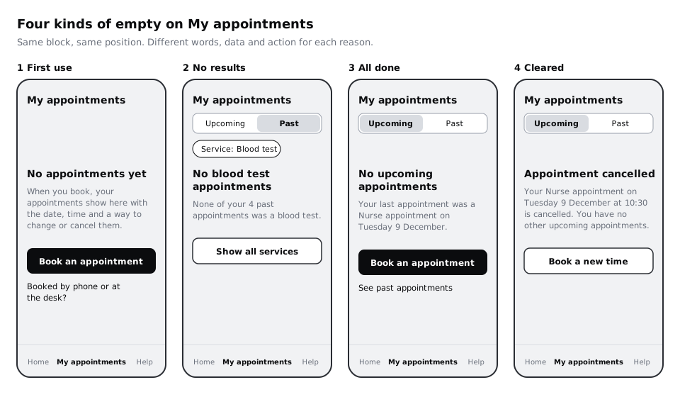
Lay the four frames in a row and read them as a set. Each heading should be different, and none should be "Nothing here", "Oops" or "No data". Each body should use something from the patient's own data or say what will appear. Each action should match the row in your first-step table.
Then run three checks:
- Small screen. Resize each frame to 360 by 640. The heading, body and button are all visible above the tab bar without scrolling.
- Longer words. Replace each body with a translation or a sentence twice as long. The block still wraps cleanly and the button stays below the text.
- Screen readers and keyboards. When the list empties because of a filter, the new state appears without the patient moving anywhere, so a screen reader user may not notice. Add a developer note that the heading is announced as a status message, such as "No blood test appointments". After a cancellation, note where keyboard and screen reader focus lands: on the "Appointment cancelled" heading, not back at the top of the page.
Check it worked
At 360 by 640 all four frames show their button without scrolling. Each frame has a note on what is announced, and the cleared frame says where focus goes. No two headings share the same words.
Step 8 · Hand over a copy table with the frames
Add a final table next to the frames for whoever builds the screen. One row per state, in check order (cleared, first use, no results, all done), with these columns: check number, state name, the condition from your ordered checks, heading, body, button label and its style, link label, what the button and link do, and the announcement or focus note. Write the conditions out in full: cleared is "the patient cancelled their last upcoming appointment in this visit", and first use is "no appointments ever, upcoming or past, not counting cancelled ones".
Write the body copy with the variable parts marked, so the developer knows which words come from data: "None of your {pastCount} past appointments was a {serviceName}." and "Your last appointment was a {serviceName} on {date}." Note what happens at the edges, for example a count of 1 ("your 1 past appointment") and a service name that should be lowercase in the middle of a sentence.
Check it worked
Your copy table has four rows, every variable in the copy is in braces with the data it comes from, and each row's condition matches the decision order in your first table. A developer who reads only the table could tell which state to show for any data you give them.
Next steps
Empty states are one of three moments when a screen has no normal content to show. The other two need the same care:
- /tutorials/design-loading-states-spinners-skeletons-and-progress covers what My appointments shows while the list is still on its way, which must never look like the first-use state.
- /tutorials/design-error-states-that-help-people-recover covers the list that could not load at all, which is not empty and must not say so.
- /tutorials/write-interface-copy-for-labels-buttons-and-errors takes the writing rules used here across the rest of the app.
- /tutorials/specify-ten-core-components-and-their-states shows how to document the
Empty statecomponent alongside the rest of the Larkfield components.
Part of these paths
Related tutorials
- Design error states that help people recoverYou will have an error matrix covering every way a booking can fail outside the form, and five Figma state frames that keep the person's work, say what happened in plain words and offer a next step.
- Design loading states: spinners, skeletons and progressYou will have a loading-state table for every wait in a booking flow, with the pattern chosen by expected wait time, and Figma frames for a skeleton, a button spinner, an upload progress bar, an optimistic switch and a "taking longer than usual" state.
- Specify ten core components and their statesYou will have a short written spec for each of the ten components the Larkfield Clinic app needs, listing anatomy, variants, required states, tokens and minimum touch size, placed beside the rebuilt components in Figma.
Need this done for you?
Padding does this work for growing companies, from the first diagnosis to a system that keeps working.
Get new tutorials