UI and visual design · Intermediate · 18 min
Design loading states: spinners, skeletons and progress
By Padding · Updated 18 Nov 2026
Figma (web) · November 2026
You will have a loading-state table for every wait in a booking flow, with the pattern chosen by expected wait time, and Figma frames for a skeleton, a button spinner, an upload progress bar, an optimistic switch and a "taking longer than usual" state.
On this page
Every app waits. The question is what the person sees while it does. A spinner on every screen is the usual answer, and it is wrong more often than it is right: on a fast connection it flickers for a fraction of a second and makes the app feel slower, and on a slow one it spins for twenty seconds without saying whether anything is happening.
A better rule is to choose the loading pattern by how long the wait will be and by what is being waited for. Loading content is different from performing an action, and an action people can undo is different from one they cannot. A short wait needs nothing at all.
You will work through the Larkfield Clinic booking app (Home, Choose a service, Pick a time, Your details, Confirm, Booked) and decide what each wait looks like, on a good connection and on a poor one. Many Larkfield patients book on a mid-range Android phone over mobile data, sometimes on a prepaid bundle that is nearly used up, so the slow case is a normal case. You end with a loading-state table a developer can build from and a set of frames on a new Figma page.
Step 1 · List every wait in the flow
Open the Larkfield file and add a page called Loading states. Next to the screens, or in a spreadsheet, start a table with these columns:
- Moment: the screen and what the person just did.
- Waiting for: content to show, or an action to finish.
- Fast: how long it takes on a good connection.
- Slow: how long it might take on a weak mobile signal.
- Pattern, Slow state and If it fails: left blank for now.
Walk the flow from Home to Booked and write a row each time the app has to fetch or send something. Ask the developer for real timings if the app exists. If it does not, estimate and mark the numbers as estimates. For Larkfield the rows read:
| Moment | Waiting for | Fast | Slow |
| --- | --- | --- | --- |
| Open the app on Home | Content (clinic name, address) | Under 0.5 s | 1–3 s |
| Choose a service opens | Content (five services) | Under 0.5 s | 1–3 s |
| Pick a time opens | Content (a week of free times) | 0.5–1.5 s | 3–15 s |
| Tap another day in the week strip | Content (that day's times) | Under 1 s | 2–8 s |
| Attach a photo of the blood test form | Action (upload, 2–4 MB) | 2–5 s | 30 s or more |
| Tap Book appointment on Confirm | Action (book the slot) | 1–2 s | 3–20 s |
| Switch a reminder text off on My appointments | Action (save a setting) | Under 1 s | 1–5 s |
The photo upload is new in this tutorial: patients booking a Blood test can attach a photo of the request form their GP gave them, as an optional field on Your details. It is the one long wait in the flow, which is why it is here.
Leave out anything that happens on the phone without the network, such as moving from Your details to Confirm after the fields pass their checks. Those should be instant, and if they are not, that is a bug to fix, not a state to design.
Check it worked
Your table has a row for every fetch or send in the flow, seven for Larkfield, and each row says whether it is waiting for content or for an action. Every Slow figure is larger than its Fast figure, and estimates are marked as estimates.
Step 2 · Choose a pattern for each row by wait time
Waits fall into rough bands. Under about a second, people keep their train of thought and do not need to be told anything. Between one and ten seconds they notice the wait and need to see that the app is working. Past about ten seconds their attention drifts, and they want to know how much longer.
Use those bands, and what is being waited for, to pick one pattern per row:
- Nothing. For waits that are almost always under a second. Show the previous screen until the new one is ready, or show the new screen's fixed parts straight away. A spinner that appears for 300 ms reads as a glitch.
- Skeleton. For content that takes one to ten seconds. Draw the shape of the coming layout in plain blocks so the screen does not jump when the content arrives.
- Spinner in place. For an action that takes one to ten seconds. Put a small spinner on the control the person touched, not over the whole screen, so they can see which tap is being handled.
- Progress bar or steps. For anything that can run past ten seconds and has a known size or known stages, such as an upload. Show how far it has got.
- Optimistic update. For a small action that almost always succeeds and is easy to undo. Show the result immediately and send the change in the background.
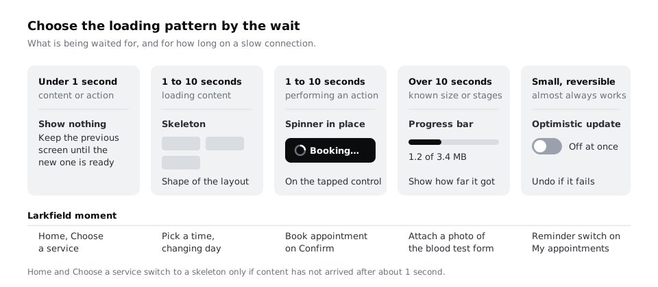
Choose the pattern from the Slow column as well as the Fast one. Home and Choose a service are under a second on Wi-Fi but can reach three seconds on mobile data, so they get a rule rather than a fixed state: show nothing at first, and show a skeleton only if the content has not arrived after about one second. Fill in the Pattern column for every row.
Check it worked
Every row in your table has exactly one pattern. Content rows use nothing or a skeleton, action rows use a spinner in place, a progress bar or an optimistic update, and no row says "full-screen spinner". The upload is the only row with a progress bar, and Book appointment is not optimistic.
Step 3 · Design the Pick a time skeleton
Pick a time is the screen patients wait on most, so it gets the most careful skeleton. Duplicate the high-fidelity Pick a time frame onto the Loading states page and name the copy Pick a time / Loading.
Keep everything the app already knows before it asks the server: the header with Pick a time and the back control, the line Nurse appointment · 15 min, the week strip with Tue 9 selected, and the day heading Tue 9 Dec. Patients can read these and confirm they are in the right place while the times load.
Replace only the parts that come from the server:
- The
MorningandAfternoonlabels stay, because they are fixed text. - Each group of time slots becomes rounded blocks the same size as a time slot, with the same gaps. Draw five in Morning and four in Afternoon, matching an ordinary day.
- The phone fallback line stays. Someone who cannot wait can call.
- The
Continuebutton stays visible but disabled, because no time can be chosen yet.
Fill the blocks with colour/line (#D5D9DF) on the canvas background. They are placeholders, not controls, so they should look quieter than a real unselected slot with its border stroke. Do not put fake text or grey lines that look like words in them; a patient on a slow phone may try to read them.
Make a component for the placeholder block with two variants, Static and Pulse. Pulse is the same block with a slightly lighter fill, for the developer to fade between. Note beside the frame that the pulse stops when the phone is set to reduce motion, and that the skeleton then stays still. Animation that runs for a long time on an older phone also costs battery and makes the rest of the screen slower, so keep it to a slow fade, not a shimmer sweeping across many blocks.
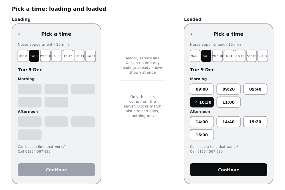
Then do the same for the smaller case: tapping another day in the week strip. Duplicate the loaded frame again and name it Pick a time / Loading day. Do not blank the whole screen. Move the selection in the week strip to Wed 10 at once, change the day heading to Wed 10 Dec at once, and show the slot blocks only in the slot area.
Check it worked
Place Pick a time / Loading exactly over the loaded Pick a time frame and switch between them, or set the loading frame to 50 percent opacity. The header, service line, week strip, day heading, group labels and button sit in the same place in both, and each placeholder block lines up with a real slot. Nothing in the loading frame looks like readable text.
Step 4 · Put a spinner on the Book appointment button
Booking is an action, and it has a real consequence: it takes a slot another patient could have had. The patient must not be able to book twice by tapping again, and must not be shown "You're booked" before the clinic's system has said yes.
Open the Button component and add a variant called Loading to the primary button. In it:
- Keep the button the same width and height as the default state. If the label is shorter, the button must not shrink, or the layout jumps and the patient's thumb is suddenly over empty space.
- Replace the label with a 20 by 20 spinner in
on-accentand the wordBooking…inLabelstyle, side by side. - Make the button look pressed but not disabled. It is still the button they tapped; dimming it suggests something went wrong.
- Note for the developer that a second tap does nothing while it is loading.
On Confirm, make a frame called Confirm / Booking with the button in its Loading variant and every Change link greyed out, since changing details halfway through a booking would be confusing. Nothing else on the screen changes.
A spinner is invisible to someone using a screen reader. Write the announcement under the frame: "Booking your appointment", spoken once when the spinner appears, and "Booked" or the error message when it ends. Ask that the spinner graphic is hidden from screen readers, so the visible Booking… text and the status message carry the meaning. Marking the area as busy can help, but screen reader support for it is uneven, so do not rely on it.
Check it worked
Your Button component set shows a Loading variant beside the default one, and selecting both shows identical width and height in the right sidebar. The Confirm / Booking frame has the loading button, disabled Change links and a written screen reader announcement for the start and the end.
Step 5 · Design the upload with a progress bar
A 3 MB photo can take half a minute or more on a weak mobile signal. A spinner for that long tells the patient nothing, and many will give up and try again, paying for the data twice. Show progress instead.
Under the Your details fields, add the optional field Blood test form (optional) with a secondary button Add a photo. Then make three frames:
Your details / Uploading: a card where the button was, showing a small thumbnail of the photo, the textUploading form… 1.2 of 3.4 MB, a progress bar the full width of the card, and aCancellink. The bar isaccenton acolour/linetrack, and the number is inBody/Smallintext-muted.Your details / Checking: the same card with the bar full and the textChecking the photo is readable. This stage has no size, so it uses a small spinner instead of the bar.Your details / Attached: the thumbnail, a tick icon,Form attachedand aRemovelink.
The patient should be able to keep filling in their name and date of birth while the upload runs, so the card does not block the rest of the form. If they tap Continue before it finishes, the button changes to Waiting for upload… with the same spinner as Book appointment, and moves on by itself when the upload ends.
Note that the app should shrink the photo on the phone before sending it. A form photographed at full resolution can be several times larger than needed to read it, and on prepaid data the patient pays for every megabyte. The amount in the text then shows the smaller size.
Check it worked
Your three upload frames show three different things: an amount that changes, a stage with no amount, and a finished state with a way to undo it. The uploading card has a Cancel link, the amount is written in megabytes, not only as a percentage, and the other fields on Your details / Uploading are not dimmed.
Step 6 · Make the reminder switch optimistic
An optimistic update shows the result before the server confirms it. It makes small actions feel instant on a slow connection, but it is only safe when four things are true:
- The action almost always succeeds.
- If it fails, nothing bad has happened that the person did not see coming.
- It is easy to put back.
- Nobody else is competing for the same thing.
Booking an appointment fails the fourth test, since another patient may take the slot first, so it stays a spinner. A reminder switch passes all four. Give each upcoming appointment on My appointments a row with Text me a reminder and a switch, and make two frames:
My appointments / Reminder off: the switch moved to off the moment it is tapped, with no spinner.My appointments / Reminder failed: the switch moved back to on, and a shortnotice-tintbanner under the row with the alert icon:We couldn't turn the reminder off. You'll still get a text. Try again. The wordsTry againare a link.
Write the rule beside the frames: the switch moves straight away; if the save fails, it moves back and the banner says so. A failure that quietly leaves the switch in the wrong position is worse than a spinner.
Check it worked
The switch in Reminder off has no loading indicator, and the Reminder failed frame shows the switch back in its original position with a message that says what actually happens now. Read the four tests against Book appointment and against the reminder switch: you can say which test booking fails.
Step 7 · Add a "taking longer than usual" state
The bands from the second step assume a normal connection. On a congested network a skeleton can sit for twenty seconds, and a still skeleton looks the same as a broken one. Each content and action row needs one more state for when the wait passes what is normal.
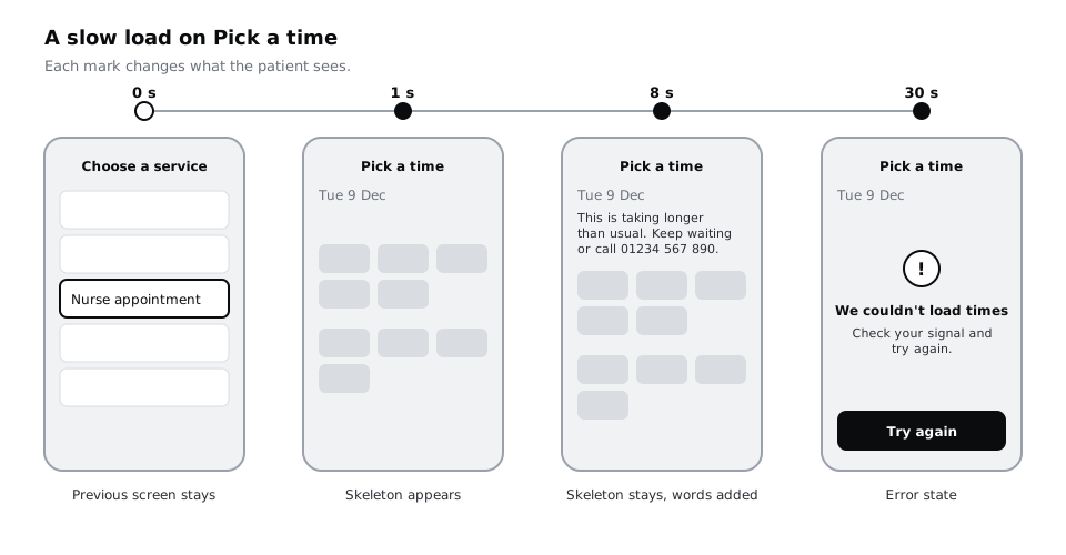
Set a threshold per row at about five times the top of its Fast figure, rounded to a whole number of seconds, and check it falls inside the Slow range. Pick a time (Fast up to 1.5 s, Slow 3–15 s) gets 8 s; Book appointment (Fast up to 2 s, Slow 3–20 s) gets 10 s. Then say what changes. For Pick a time:
- 0–1 s: nothing new, the previous screen stays.
- 1 s:
Pick a time / Loadingwith the skeleton. - 8 s: a line appears above the slot blocks, in
Body/Smallandtext-muted:This is taking longer than usual. Keep waiting or call 01234 567 890.The skeleton stays. - 30 s: the request gives up and the screen shows its error state with
Try again.
Make the 8 s state as a frame: duplicate Pick a time / Loading, name it Pick a time / Slow and add the line above the slot blocks. For the 30 s mark, duplicate the loaded frame, name it Pick a time / Could not load, and put a placeholder in the slot area: We couldn't load times and a Try again button. It is a placeholder for now; the next step explains where its full design comes from.
Book appointment needs different words, because trying again might book twice. Duplicate Confirm / Booking and name it Confirm / Still booking. In it, at 10 seconds, the text under the loading button reads Still booking. Please keep this screen open; we'll show your booking as soon as it's confirmed. There is no Try again here. If the request times out, the app checks whether the booking went through before showing an error, and the error state says which it found.
Keep the slow-state text short and plain. It may be translated, for example into Yoruba, Hausa or French, and a translation is often longer than the English, so give the line room to wrap to two lines without pushing the button off the screen.
To show the sequence in a prototype, link Pick a time / Loading to Pick a time / Slow with an After delay trigger, so a reviewer sees the line appear without tapping anything.
Check it worked
Your table's Slow state column has a threshold and the exact words for every row that uses a skeleton, spinner or progress bar. The page has three new frames: Pick a time / Slow still shows the skeleton under the slow-state line, Pick a time / Could not load has the placeholder error and Try again, and Confirm / Still booking offers no button that could send the booking twice.
Step 8 · Finish the table and hand it over
Complete the last column, If it fails, for each row with the name of the error frame it leads to. Only Pick a time / Could not load exists so far, as a placeholder; the detail of the error frames belongs to error-state design, but the loading table must say where each wait ends if it does not succeed. Then add one more column, Announce, with the words a screen reader should hear at the start and end of each wait that lasts more than a second, such as Loading times and Times loaded.
Arrange the Loading states page so each frame sits under the screen it belongs to, in flow order, and put the finished table on the left. The Larkfield page ends with eleven frames: Pick a time / Loading, Pick a time / Loading day, Pick a time / Slow, Pick a time / Could not load, Confirm / Booking, Confirm / Still booking, the three upload frames, and the two reminder frames.
Finally, read the table for one full booking on a poor connection, from opening Home to seeing Booked, and say what the patient sees at each wait. If at any moment you would say "a blank screen" or "the same skeleton for half a minute with nothing changing", that row needs another look.
Check it worked
Every row of the table has values in Pattern, Slow state, If it fails and Announce. Each frame named in the table exists on the Loading states page, and reading the slow-connection walk-through aloud, you never describe a blank screen, a whole-screen spinner, or a wait longer than about ten seconds with no words on screen.
Next steps
Loading states hand over to error states the moment a wait fails, so design those next, using the If it fails column as your list.
- Design the frames each wait leads to with /tutorials/design-error-states-that-help-people-recover.
- Build a skeleton in code, with the reduced-motion rule and screen reader handling, in /tutorials/build-skeleton-loading-screens-in-css.
- Go further on poor connections, with data budgets and save-and-resume, in /tutorials/design-for-slow-networks-and-costly-data.
- If a load returns nothing at all, the screen needs an empty state instead: see /tutorials/design-empty-states-that-say-what-to-do-next.
Part of these paths
Related tutorials
- Design error states that help people recoverYou will have an error matrix covering every way a booking can fail outside the form, and five Figma state frames that keep the person's work, say what happened in plain words and offer a next step.
- Build skeleton loading screens in CSSYou will build a skeleton for the Larkfield Clinic My appointments list that has the same shape as the loaded rows, keeps quiet for screen readers, stops shimmering under reduced motion, and passes a browser check for zero layout shift when the data arrives.
- Design empty states that say what to do nextYou will have four empty-state frames for one list screen, first use, no results, all done and cleared, each with its own message and next action, plus a copy table a developer can build from.
Need this done for you?
Padding does this work for growing companies, from the first diagnosis to a system that keeps working.
Get new tutorials