UI and visual design · Intermediate · 18 min
Design toasts, banners and notifications
By Padding · Updated 18 Nov 2026
Figma (web) and a spreadsheet · November 2026
You will have a message pattern table that gives every Larkfield Clinic message a channel by urgency and persistence, plus Figma frames for the inline, banner, toast, push and SMS forms, each with a rule for when it goes away.
On this page
An app talks to people in more places than its screens. A line of red text under a field, a strip across the top of Home, a dark pill that slides up for a few seconds, a buzz on a locked phone, a text message that arrives while the app is closed. Each of those is a channel, and each one makes a promise about how loud the message is and how long it lasts.
Most messaging problems come from a mismatch between the message and the channel. A cancellation confirmed by a toast that vanishes before the patient reads it. A reminder sent only as a push notification to someone who turned notifications off. A "clinic closed" banner that cannot be closed and sits on Home for a week. None of these is a visual design problem. They are choices about urgency and persistence that were never made on purpose.
This tutorial makes those choices for the Larkfield Clinic booking app: six screens (Home, Choose a service, Pick a time, Your details, Confirm, Booked) and the example booking, a Nurse appointment on Tuesday 9 December at 10:30. You list every message the clinic sends, sort each one by how much it asks of the patient and how long it stays true, give each a channel and a rule for going away, then design the forms. The failure messages from the error states tutorial (offline, could not book, time gone) appear here only to be placed; their wording is covered there.
Step 1 · List every message the clinic sends
Open a spreadsheet and add a tab called Messages. Walk through the six screens in order, then think past them: what does Larkfield tell a patient before they open the app, after they close it, and when something changes at the clinic? Write one row per message with three columns: message (the gist, in a few words), trigger (what causes it) and where the patient is at that moment (on the screen it is about, elsewhere in the app, or not in the app at all).
Larkfield's list has eleven rows:
- Mobile number wrong. Trigger: Continue on Your details with ten digits. On that screen.
- Time gone. Trigger: someone else books 10:30 first. On Pick a time or Confirm.
- Could not book. Trigger: the server refuses the booking. On Confirm.
- Offline. Trigger: no connection. Anywhere in the app.
- Booking confirmed. Trigger: booking succeeds. On Booked, then the app closes.
- Reminder. Trigger: 9am the day before, Monday 8 December. Not in the app.
- Added to calendar. Trigger: tapping
Add to calendaron Booked. On Booked. - Appointment cancelled. Trigger: the patient cancels, in the app or by replying C to a text. Either.
- Closing early. Trigger: the clinic closes at 13:00 on Wednesday 24 December. Anywhere, for the days before.
- Running late. Trigger: the nurse's list is about 30 minutes behind on the day. Usually not in the app.
- Appointment moved. Trigger: the nurse is off sick and the clinic must move the booking. Usually not in the app.
Do not decide anything yet. Resist writing "toast" or "banner" next to a row; the next two steps do that.
Check it worked
Your Messages tab has at least ten rows, each with a trigger and a place. At least three rows happen while the patient is not in the app, and at least one is caused by the clinic rather than by anything the patient did. If every row starts with a tap, you have only listed feedback; go back and add what the clinic needs to tell people.
Step 2 · Score each message for urgency and persistence
Add two columns and answer one question in each.
- Must act? Does the patient have to do or decide something because of this message? Write
yesorno. "Read it and carry on" is a no. "Choose another time" is a yes. A reminder is a yes, because the patient has to turn up or cancel. - True for how long? Write
momentif the message describes something that has already finished and nothing about it will change (it was added to the calendar). Writeuntil changedif it stays true until someone fixes it or a date passes (the number is still wrong, the appointment still needs a new time, the clinic is still closing early).
Two more columns help the next step: by when (now, today, before the appointment) and cost of missing it (none, annoyance, a missed appointment). For Larkfield, Appointment moved scores yes, until changed, before 10:30 on Tuesday, missed appointment. Added to calendar scores no, moment, now, none: the event is in the calendar whether or not the patient sees the message.
Check it worked
Every row has a yes or no and a moment or until changed. Sort the tab by must act?: every row with a cost of "missed appointment" is in the yes group. Only one or two rows score no and moment together. If you have many, check whether some of them are really errors that need fixing.
Step 3 · Give every message a channel
Larkfield uses five channels. Each one has a single job, and the job decides what can go in it:
- Inline message. Text attached to one field or control on the current screen. It is for something the patient can fix right there, and it stays until they fix it.
- Banner. A strip under the header that pushes the content down rather than covering it. It is for something about the whole screen or the whole service, and it stays as long as it is true.
- Toast. A short message that appears near the bottom of the screen and leaves on its own. It confirms something the patient just did, where the result is visible somewhere else and nothing more is needed.
- Push notification. A notification from the app on the lock screen or in the notification shade. It reaches someone who is not in the app, if they have agreed to receive them.
- SMS. A text message to the mobile number on Your details. It reaches any phone, without data, without the app, and without notification permission.
Now apply three rules, in this order, and write the result in a channel column:
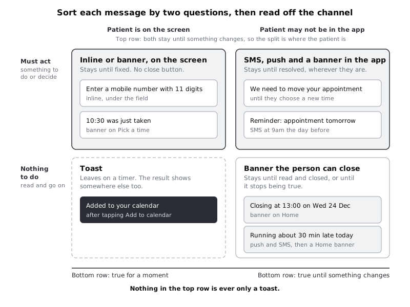
- If the patient must act, it is never only a toast. A toast leaves whether or not anyone saw it. Anything that needs a decision lives in an inline message or a banner that stays.
- If the patient may not be in the app and the cost of missing it is a missed appointment, send an SMS. Push is an extra shortcut, not a replacement. Notifications can be turned off, and a phone with no data bundle left gets no push, but it still gets texts. For many Larkfield patients on prepaid plans, that is the normal state of the phone in the last days of the month.
- Anything sent outside the app also appears inside it. A patient who taps the push, or opens the app after reading the text, should see the same news on Home without searching for it.
Applied to the list, rows 1 to 4 stay where they are: row 1 is inline, rows 2 to 4 are banners on their own screen. They score the same as Appointment moved (yes, until changed); what sets them apart is that the patient is on the screen when they happen, so rule 2 does not apply. That is how the top row of the figure is split: by where the patient is, not by how long the message lasts. Persistence only separates the bottom row. Row 5 is the Booked screen plus a confirmation text. Row 6 is an SMS, with a push as well for those who said yes, and inside the app it is the upcoming appointment card on Home, which reads "Tomorrow, 10:30" from the day before. Row 7 is the one true toast. Rows 10 and 11 are SMS, push and a Home banner.
Row 8 is the trap. A common design shows "Appointment cancelled" in a toast with an Undo button. That puts the only way to reverse a serious action inside a message that leaves on a timer, which fails rule 1. Larkfield confirms before cancelling instead (a choice covered in the modal and bottom sheet tutorial in Next steps), then shows Home with no upcoming appointment and a banner, "Your Nurse appointment on Tue 9 Dec at 10:30 is cancelled", and sends a text saying the same.
Row 9 is a banner that the patient may close, because it asks nothing of them and they only need to read it once.
Check it worked
Every row has a channel. No row that scores yes on must act? has toast as its only channel. Every row that happens while the patient is not in the app includes SMS if missing it could cost an appointment, and also lists where it appears in the app.
Step 4 · Decide how each message goes away
Add a column called goes away and give each row one of three behaviours:
- When fixed. Inline messages and the banners for problems (offline, time gone, could not book, appointment moved). There is no close button. The message leaves when the cause does: the number has 11 digits, the connection is back, a new time is chosen. A close button on a problem banner only hides the problem.
- When closed, or when no longer true. Information banners such as Closing early and Running late. They have a close button at least 44 by 44 px. Once closed, Closing early stays closed on that phone unless the message changes; Running late removes itself at the end of the day.
- On a timer. Toasts only. Larkfield's house rule: a toast stays for at least six seconds, longer if its text is longer, and the timer stops while the patient touches it. Because a toast has no button, it never takes keyboard focus, so a keyboard user cannot pause it; that is one more reason a toast may only carry a result that is visible somewhere else.
The timer is where toasts cause most harm. A message that removes itself is widely treated as a time limit under WCAG 2.2 success criterion 2.2.1 (Timing Adjustable), which asks that people can turn off, adjust or extend time limits that content sets. Larkfield's six-second, pause-on-touch rule reduces the harm, but it does not meet that ask: nobody can turn the timer off or extend it. Someone using a screen magnifier may be looking at the other end of the screen when the toast appears and leaves. Someone who reads slowly, or reads English as a second language, may get halfway through. A screen reader can announce a toast as a status message (success criterion 4.1.3), but that only helps if the code marks it up to be announced, which is a note to write for developers, not something the design can assume.
That is why toasts are kept to messages whose result can be seen elsewhere, where missing the toast costs nothing. Row 7 passes that test: the event is in the patient's calendar either way, and the Add to calendar button changes to Added to calendar so the result is on the screen after the toast has gone.
Two placement rules belong here too. A toast must never sit on top of a button, because a patient reaching for Done hits the toast instead, and WCAG 2.2 success criterion 2.4.11 (Focus Not Obscured, Minimum) asks that a focused control is not entirely hidden by content the page adds. And only one toast shows at a time; a second one waits until the first has gone.
Check it worked
Every row has a goes away value. Only toast rows say "on a timer", and each of those rows has a sentence in a seen elsewhere column saying where the same result is visible once the toast has gone. Problem banners have no close button in your notes.
Step 5 · Design the in-app forms in Figma
Open the Larkfield file and the 04 High fidelity page. You need three components, and you may already have one.
Banner. If you built the banner component in the error states tutorial, with a Tone property of Notice, Danger and Success, add a fourth value, Info: surface fill, a 1 px border stroke, an info icon and Body text in text. Then add a boolean property called Closable that shows or hides a 44 by 44 close button on the right. Keep Closable off on Notice and Danger instances, because those banners go away when fixed. If you do not have the component yet, draw it now with an icon, a Body message, an optional Body/Small line, an optional link or button, and both properties.
Toast. Make a new component: fill colour/text, text in Body and on-accent, a tick icon in on-accent, corner radius 8, padding 12 by 16, and a width of the screen minus 16 on each side. White on colour/text is the same pair as the clinic's body text on white, so contrast passes easily. Give it no button. If a message seems to need one, it is not a toast.
Inline message. This is the error line on the Text field component you already have, with the alert icon and Body/Small in danger. Nothing new to build; check that the icon is there.
Then build three new frames by duplicating the screens they belong to:
Home / Closing early. AnInfobanner under the header,Closableon: "Closing at 13:00 on Wed 24 Dec." and aSee opening hourslink. Content below moves down; nothing is covered.Home / Appointment moved. ANoticebanner,Closableoff: "We need to move your Nurse appointment on Tue 9 Dec at 10:30." with aChoose a new timebutton that leads to Pick a time, and "Or call 01234 567 890" below it.Booked / Added to calendar. The toast "Added to your calendar" sitting 8 px above theAdd to calendarbutton, which now readsAdded to calendar. The toast must clear both buttons.
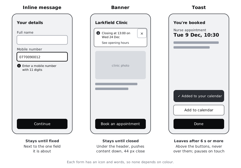
To check the toast's timing, wire it in a prototype: from Booked, tapping Add to calendar goes to Booked / Added to calendar, and an After delay trigger of 6000 ms returns to a copy of Booked with the button reading Added to calendar.
Check it worked
You have three new frames, all the same size as the screens. Every banner is an instance of one component, the Notice one has no close button, and the Info one does. Put a desaturate layer over the frames: each message is still recognisable by its icon and words. Play the prototype and look away when you tap Add to calendar: when you look back after the toast has gone, the button label still tells you it worked.
Step 6 · Write the push and SMS versions
Messages outside the app are read in a few seconds, often by someone half paying attention, and sometimes by someone who is not the patient. Write them on the canvas as two more frames, Outside / Reminder SMS and Outside / Reminder push, drawn as plain text cards rather than pictures of a real phone's interface.
For the SMS, put the facts first and keep it to one message:
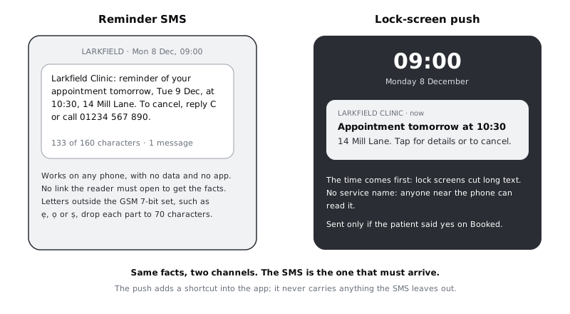
Larkfield Clinic: reminder of your appointment tomorrow, Tue 9 Dec, at 10:30, 14 Mill Lane. To cancel, reply C or call 01234 567 890.
That is 133 characters. A single SMS in the standard GSM 7-bit alphabet holds up to 160; text that uses any character outside that alphabet is sent in a different encoding that holds 70. Larkfield sends reminders in Yoruba to patients who ask, and letters with dots below, such as ẹ, ọ and ṣ, are outside the 7-bit set, so the same reminder in Yoruba splits into several parts, and each part costs the clinic as much as a whole message. Write the translated version as its own short message, and have a Yoruba speaker check it, rather than translating the English one word for word.
Keep every fact the patient needs in the text itself. A link alone ("See your appointment: larkfield...") is no use on a phone with no data or a basic phone with no browser.
For the push, put the time in the title, because the lock screen cuts long text:
- Title:
Appointment tomorrow at 10:30 - Body:
14 Mill Lane. Tap for details or to cancel.
Notice what is missing: the service name. A lock screen can be read by anyone near the phone, and some clinic services are private. The SMS can say "your appointment" for the same reason; the patient knows what they booked.
Then decide when to ask for push permission. Android 13 and later, iOS and web browsers all require the app to ask before it can send notifications, and a patient who says no at first launch, before they know why, is hard to win back. Larkfield asks on Booked, next to the reminder line: "Get a notification as well as a text?" with Yes and Not now. If the app is built for Android, put appointment messages and clinic news in separate notification channels, so a patient can turn off news without losing reminders.
Write the other outside-the-app messages the same way: Running late ("we are running about 30 min late today. Your 10:30 appointment is still on. No need to call.", 110 characters with the clinic name), and Appointment moved, which ends with what to do and a phone number.
Check it worked
Every SMS on the canvas is 160 characters or fewer, counted with the clinic name, and works without opening a link. No push title or body names a service. Your Booked frame has the push permission question, placed after the booking is made, not before.
Step 7 · Fill in the pattern table and walk through one bad morning
Bring everything into one table, either in the spreadsheet or on a Message patterns page in Figma. One row per message, with these columns: message, must act, true for how long, channel, goes away, seen elsewhere, announced (a note for developers: status for messages that inform, alert for those that need attention now), wording, and frame (a link to the Figma frame; right-click the frame to copy a link to it).
Then test the table with a story rather than row by row. Ask a colleague who did not write it to play a patient on a difficult Tuesday: the nurse is off sick, so the clinic moves the 10:30 appointment, and the patient's data bundle ran out yesterday. Walk them through the table and frames in order:
- At 07:30 they receive the Appointment moved text. Can they act on it with no data? (Yes: the phone number is in the text.)
- They top up, open the app and land on Home. What do they see? (The
Noticebanner withChoose a new time, not a toast that already played while the app was loading.) - They choose 11:00 on Pick a time. Where does the banner go? (It disappears because it is no longer true, and the Booked screen and a new confirmation text take over.)
- They tap
Add to calendarand look away. Do they know it worked? (Yes, from the button label.)
Each answer should come from the table and the frames, without you explaining. Where your colleague has to ask, add the missing piece to the table.
Check it worked
The pattern table has one row for each message from the first step, with no empty cells. Every row links to a frame that exists. Your colleague answered all four questions from the table and frames alone, and at no point did the only copy of something they needed sit in a toast or a push notification.
Next steps
Your message channels are decided. The tutorials below go deeper into the pieces this one placed but did not fully design:
- /tutorials/design-error-states-that-help-people-recover writes the wording for the offline, time gone and could not book banners placed here.
- /tutorials/announce-errors-and-notices-with-a-live-region builds the banners in HTML so screen reader users hear them as status messages or alerts.
- /tutorials/choose-between-a-modal-a-bottom-sheet-and-a-new-screen covers the confirmation step that replaces the cancel-and-undo toast.
- /tutorials/design-for-slow-networks-and-costly-data looks harder at patients with weak signal and little data, for whom SMS is often the channel that works.
Part of these paths
Related tutorials
- Design error states that help people recoverYou will have an error matrix covering every way a booking can fail outside the form, and five Figma state frames that keep the person's work, say what happened in plain words and offer a next step.
- Announce errors and notices with a live regionYou will build two Larkfield Clinic banners, a polite "10:30 was just taken" notice and an urgent "could not book" error, that screen readers announce once each, plus a Playwright script that checks them in the accessibility tree.
- Design form errors and inline validationYou will have a validation timing table for every field on a booking form, a message for every way each field can go wrong, and an error-states frame in Figma showing the field errors, the error summary and where focus goes.
Need this done for you?
Padding does this work for growing companies, from the first diagnosis to a system that keeps working.
Get new tutorials