UI and visual design · Intermediate · 16 min
Choose between a modal, a bottom sheet and a new screen
By Padding · Updated 18 Nov 2026
Any design tool that draws phone frames, such as Figma (web), and a spreadsheet or document · November 2026
You will have decided, with written reasons, where four Larkfield Clinic tasks belong (inline, a modal dialog, a bottom sheet or a new screen), drawn each one, and turned the reasons into a three-question rule with a fallback that you can reuse.
On this page
Every time a task needs a bit of room, a designer reaches for a container: pop a dialog over the screen, slide a sheet up from the bottom, push a whole new screen, or just make room on the page. The choice usually gets made by habit ("we use sheets for everything now"), and the habit shows. Patients get a full-screen interruption to read three lines of opening hours, or lose a half-typed form because a sheet slid away under their thumb.
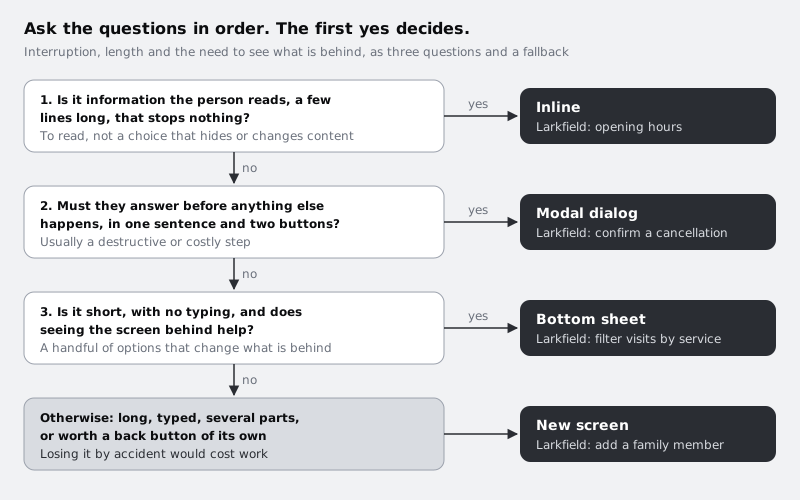
The decision rests on three questions about the task, not the container:
- Interruption. Must the person stop and answer before anything else happens, or can the task wait alongside what they were doing?
- Length. Is it a sentence and two buttons, a handful of options, or a form with typing and scrolling?
- What is behind. Does seeing the screen underneath help, because the task changes it or refers to it?
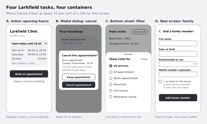
In this tutorial you take four tasks from the Larkfield Clinic booking app, answer those questions for each, pick a container, and draw the result. The four tasks are deliberately different, so each lands somewhere else: confirm a cancellation, pick a service filter, read the clinic's opening hours, and add a family member. You finish with a short rule your team can apply to the next task without a meeting.
Step 1 · Write the four tasks down with their facts
Open a spreadsheet or a document and make a table with one row per task and these columns: Task, Where it starts, Interruption, Length, What is behind, Cost of losing it, Container. Leave the last column empty for now. Deciding the container before you have written the facts is exactly the habit you are trying to break.
Fill in the four Larkfield rows. Be concrete: count fields and options, and name the screen.
- Confirm a cancellation. Starts on Your bookings, from
Change or cancelon the Nurse appointment card (Tuesday 9 December, 10:30). Interruption: yes, the app must not cancel without a clear yes, because the slot goes back to other patients at once. Length: one question, one line of detail, two choices. Behind: the booking card, but the dialog repeats what matters. Cost of losing it: none, closing it by mistake keeps the appointment. - Pick a service filter. Starts on the
Past visitslist under Your bookings, which shows every visit, newest first. Interruption: no, the list is still the point. Length: six options (All servicesand the five services: GP appointment, Nurse appointment, Blood test, Vaccination, Medication review), pick one, no typing. Behind: yes, the list is what the filter changes. Cost of losing it: one tap. - Read the clinic opening hours. Starts on Home, under
14 Mill Lane. Interruption: no. Length: four lines (weekdays, Saturday, Sunday, bank holidays). Behind: yes, people check the hours and then book. Cost of losing it: nothing. - Add a family member. Starts on Account, so a parent can book for a child or someone can book for an older relative. Interruption: no, but it is a task in its own right. Length: four fields (full name, date of birth, relationship, mobile number), one checkbox and a button, with the keyboard open for most of it. Behind: no, nothing on Account helps while typing a date of birth. Cost of losing it: real, a half-filled form typed on a phone.
Check it worked
Your table has four rows and every column except Container is filled in. Each Length cell has a number in it (lines, options or fields), and each Cost of losing it cell says what the person would have to redo. If any cell says "it depends", rewrite it for the Larkfield case specifically.
Step 2 · Write down what each container costs
Every container trades something away. Before you match tasks to them, add a second small table to the same document, one row per container, with what it gives and what it costs. Write it in your own words; these are the points that matter for the decision:
- Inline. The content becomes part of the page, for example a row that expands. Gives: no interruption, nothing covered, nothing to dismiss. Costs: space on the page, and it pushes content below it down.
- Modal dialog. A small box over a dimmed screen that waits for an answer. Gives: the person cannot miss it or carry on by accident. Costs: it blocks the whole app, so every unnecessary one teaches people to tap through dialogs without reading.
- Bottom sheet. A panel that slides up from the bottom edge, usually over a scrim, and can rest at part height. Gives: options within thumb reach, with the screen behind still partly visible. Costs: limited height, especially once a keyboard opens, and it can be swiped away, which is fine for a filter and dangerous for a form.
- New screen. A full page with its own header and back button. Gives: all the room it needs, its own place in the back history, and a stable home for typing and errors. Costs: the person loses sight of where they were, and it feels heavy for small things.
Two accessibility points belong in the table too. A modal dialog or modal sheet must move focus into itself, keep keyboard and screen reader focus inside until it closes, and return focus to the control that opened it. A sheet that closes by dragging must also close with a single tap, such as a Close button, because not everyone can drag.
Check it worked
You have a four-row container table with a "gives" and a "costs" for each. Read the costs column aloud: each one should describe something a patient would notice, such as "loses a half-typed form", not something only a designer cares about.
Step 3 · Put the opening hours inline
Start with the question most teams skip: does this task need a container at all? The opening hours are four short lines, they stop nothing, and people read them on the way to booking. A dialog would block Home to show a timetable. A sheet would hide the Book an appointment button the patient is about to press. A new screen would take them away from Home for something they could read in two seconds.
So the hours go inline, as a row that expands. On your Home frame, under 14 Mill Lane, draw:
- A row showing today's status:
Open today until 18:30, with a chevron on the right. This line alone answers the most common question, "can I go now?". - Its expanded state: the full week as a short two-column list (
Mon to Fri08:00 to 18:30,Saturday09:00 to 12:00,SundayClosed), and a muted lineBank holidays: closed. - The whole row as the tap target, at least 48 px tall, not only the chevron.
Draw both states, collapsed and expanded, side by side. Times use the 24-hour clock with the same to wording everywhere, so they read the same in a screen reader.
A note for patients on small Android phones and prepaid data: inline content loads with the page, so opening the hours costs no extra request and no wait. That matters more than it sounds when a connection drops between taps.
Check it worked
Write Inline in the opening hours row of your table, with a one-line reason such as "short, stops nothing, people book straight after". Your Home frame has two states of the hours row, and in the expanded one the Book an appointment button is still visible on a 390 by 844 frame without scrolling. If it is not, move the hours row below the button rather than reaching for a sheet.
Step 4 · Confirm the cancellation in a modal dialog
Cancelling is the one task of the four that should stop everything. The patient tapped Cancel on purpose, probably, but a mis-tap on a moving list is easy, and once the 10:30 slot goes back to the clinic another patient may take it within minutes. You cannot offer a reliable undo for something other people can grab, so a confirmation earns its interruption here. (Where an action can be undone, such as removing a saved filter, prefer doing it at once with an undo message over asking first.)
Draw the dialog on a copy of Your bookings:
- Title as the question:
Cancel this appointment? - Body that repeats the facts:
Nurse appointment, Tuesday 9 December, 10:30.and a second line in the muted colour,The time goes back to other patients straight away.The patient should not have to remember which card they tapped. - Buttons that say what they do:
Keep appointmentandCancel appointment. NeverYesandNo, and neverCancelas the label for "close this dialog", because in this dialog the word means the opposite. - Stack the buttons full width inside the dialog rather than side by side. Two long labels such as these do not fit side by side at a readable size on a 360 px wide phone, and a translated label, in Hausa or French for example, is often longer than the English.
- Mark the destructive button with the danger style from your colour set (in the Larkfield set,
colour/danger) and with its words, not colour alone.
Annotate the behaviour for whoever builds it: the dimmed screen behind cannot be used; tapping the scrim, pressing Escape or using the system back gesture means Keep appointment; focus starts on Keep appointment, the safe choice; and when the dialog closes, focus goes back to the booking card.
The choice here is about behaviour, not position. On a phone this dialog may be drawn anchored to the bottom edge, and it is still a modal dialog as long as it blocks the app, cannot be swiped or dragged away, and keeps the focus rules above. What this tutorial calls a bottom sheet is the part-height panel that a swipe can dismiss, and that is what a cancellation must never be.
Check it worked
Write Modal dialog in the cancellation row of your table. On your frame, cover the dialog's title with your hand: the body still tells you which appointment is affected. Read only the two button labels: you know what each does without the title. Your annotation names what scrim tap, Escape and back do, and where focus starts and ends.
Step 5 · Put the service filter in a bottom sheet
The filter changes the list behind it, so the list should stay in view. Six single-choice options with no typing fit comfortably in a sheet at about half height, and on a tall phone the options sit where the thumb already is. A dialog would work but hides the list and feels like a demand. A new screen would take the person away from the very list they are trying to narrow.
Draw it on a copy of Past visits:
- The trigger: a chip at the top of the list reading
Service: All. The chip shows the current filter even when the sheet is closed, which a filter icon alone does not. - The sheet: a drag handle, the title
Show visits for, aClosetext button on the right of the title, and six radio rows:All services, then the five services in the order patients see them on Choose a service. Each row is at least 48 px tall and the whole row is tappable. - Behaviour: tapping an option applies it, closes the sheet, and updates both the list and the chip, for example to
Service: Blood test. No separateApplybutton is needed for a single choice that takes effect at once. - Height: keep the sheet at or below about 60 per cent of the frame so the list heading and the chip remain visible above it.
Check the small-screen case too. Duplicate the frame at 360 by 640, a common size on low-cost Android phones. Six rows plus a title still fit there, but if the list ever grows past about eight options or needs a search box, the keyboard will take half the screen and the sheet stops being the right container. Write that limit next to the frame.
Check it worked
Write Bottom sheet in the filter row of your table. On both frame sizes, the Past visits heading and the chip are visible above the sheet, all six options are visible without scrolling, and there is a visible Close control as well as the drag handle. Your annotation says what happens after a tap and what the chip reads afterwards.
Step 6 · Give adding a family member its own screen
Adding a family member fails every test for a lighter container. It has four fields and a checkbox, the keyboard is open for most of it, mistakes produce error messages that need room, and a swipe that closes a sheet would throw away a name and a date of birth typed on a phone. It also deserves a back button and a place in history: a parent who leaves to find their child's date of birth should come back to the same form.
Draw a new screen, Add a family member, reached from Account:
- Header: a back arrow and the title.
- Fields, one per row with the label above:
Full name,Date of birth,Relationship to you(a picker with options such as Child, Parent, Partner, Other), andMobile number (optional). - A permission checkbox:
I can book for this person as their parent, guardian or with their permission.Clinics are careful about who books for whom, so the screen says it plainly. - One primary button at the bottom:
Add family member. - Leaving with unsaved changes: if the person has typed anything and taps back, show a small modal dialog,
Discard this person's details?, withKeep editingandDiscard. This is the one place on the screen where a dialog is right, for the same reason as the cancellation: it guards against losing something.
For multilingual households, leave room in the name field for long names and names with diacritics, such as Ọlọ́runfẹ́mi, and do not split the name into first and last unless the clinic's records need it.
Check it worked
Write New screen in the family member row of your table. Your frame has a back arrow, four labelled fields, the permission checkbox and one primary button, and a second frame shows the discard dialog. With a keyboard drawn over the bottom 40 per cent of the frame, the field being typed in is still visible above it.
Step 7 · Turn the four decisions into a rule and test it
Look at the Container column and the reasons beside each entry. They come from the same few facts every time, asked in the same order. Write them down as a rule your team can use:
- Is it information the person reads, a few lines long, that stops nothing? Put it inline. A choice that hides or changes other content, such as a filter or a setting, does not count, even when it is short.
- Must they answer before anything else happens, in one sentence and two buttons? Use a modal dialog. Usually this is a destructive or costly step that cannot be undone.
- Is it short, with no typing, and does seeing the screen behind help? Use a bottom sheet, with a visible close control.
Otherwise, because it is long, typed, has several parts or deserves a back button: give it a new screen. That fallback is the fourth answer, not a fourth question.
The order matters. Asking question 1 first stops you putting information to read in a container at all, and asking question 2 before question 3 stops destructive confirmations ending up in swipe-away sheets.
Now test the rule on two tasks you have not designed. Run each through the questions without looking at your earlier answers:
- Choose the language for text reminders (English, French, Hausa, Yoruba, Igbo), from Account.
- "Your results are ready", which arrives while the patient is booking.
The first should land on a bottom sheet: five options, no typing, and the Account screen behind shows the setting changing. It does not stay inline, because picking a language is a choice that changes a setting, not information to read, so it fails question 1 even though the list is short. The second is not a container decision at all; it should not interrupt a booking, so it belongs in the app's notification patterns, covered in Design toasts, banners and notifications.
Check it worked
Your document has the three questions and the fallback in order, and running the four Larkfield tasks through them gives the same containers as your table. Your two test tasks each have an answer and the question that decided it. If the rule gave a different answer from your judgement on any task, you have either found a missing question or a weak decision; write down which, and fix the rule or the design.
Next steps
To build the cancellation dialog in code with correct focus handling, follow Build an accessible modal with the dialog element. For messages that should never block the screen, such as results arriving mid-booking, see Design toasts, banners and notifications.
The family member screen is a form, so Design a mobile form people can finish is the natural follow-on. If you have not yet chosen how people move between Your bookings, Account and the rest of the app, Choose a navigation pattern for an app covers that decision.
Part of these paths
Related tutorials
- Design toasts, banners and notificationsYou will have a message pattern table that gives every Larkfield Clinic message a channel by urgency and persistence, plus Figma frames for the inline, banner, toast, push and SMS forms, each with a rule for when it goes away.
- Build an accessible modal with the dialog elementYou will build the Larkfield Clinic "Cancel this appointment?" confirmation with the native dialog element and showModal(), with focus that moves in and comes back, Escape and backdrop dismissal, an inert page behind, a safe default button, a bottom-sheet layout on phones and a Playwright keyboard test that proves all of it.
- Choose a navigation pattern for an appYou will have compared a bottom tab bar, a top app bar with a drawer and a hub screen for the Larkfield Clinic app, written down why one wins, and drawn it on four screens with active, inactive and badge states.
Need this done for you?
Padding does this work for growing companies, from the first diagnosis to a system that keeps working.
Get new tutorials