UI and visual design · Beginner · 16 min
Design a mobile form people can finish
By Padding · Updated 18 Nov 2026
Figma (web), or any design tool, and a spreadsheet · November 2026
You will have cut a 21-field clinic registration form down to a five-field phone screen in one column, with labels above fields, the right keyboard for each input, sensible defaults and one clear button, plus a before and after showing fields and estimated taps cut and a note of every field you deferred.
On this page
People rarely abandon a form because one field is hard. They abandon it because the form keeps going. Each field is a small decision, a tap, often a keyboard change, and on a phone the keyboard hides half the screen, so nobody can see how much is left. A form people finish is mostly a form that asks less, in an order that makes sense, with the phone doing as much of the work as it can.
In this tutorial you redesign one long form for a phone. The example is Larkfield Clinic, the fictional community clinic whose booking app runs Home, Choose a service, Pick a time, Your details, Confirm and Booked. The clinic's office has handed the design team its new-patient registration form, copied from paper, and asked for it to appear before every first booking. You will triage every field, cut and defer what is not needed to book, lay out what is left in one column, pick the keyboard for each input, set defaults, group the fields and settle on one button. You finish with a before and after frame that states the field count and estimated taps on each side, and a note saying where each deferred field will be collected instead.
This is about the design decisions. The markup that carries them (labels, type, inputmode, autocomplete) is covered in Build accessible HTML forms, and what happens when someone gets a field wrong is covered in Design form errors and inline validation.
Step 1 · Put the long form in front of you and count it
Start with the form as it is today, not with a blank frame. Draw a 360 by 800 frame named Registration / Before and rebuild the form roughly in grey boxes, or paste a screenshot of your own form into it. The Larkfield form, top to bottom, is:
- About you: Title (dropdown), First name, Middle name, Surname, Date of birth (three dropdowns: day, month, year), Gender (three radio buttons), Marital status (dropdown)
- Address: Address line 1, Address line 2, Town or city, Postcode
- Contact: Home phone, Mobile number, Email, Confirm email
- Medical: Next of kin name, Next of kin phone, Previous clinic, Allergies
- Other: How did you hear about us? (dropdown), I agree to the terms (checkbox)
- Two buttons side by side:
ResetandSubmit
On the paper original, several of these sit two to a row with the label to the left of the box. Rebuild that faithfully. The point of the before frame is to show the real starting point, cramped labels and all.
Then open a spreadsheet and make a sheet named Field triage with these columns: Field, Control, Who uses it, When it is needed, Decision, Where it goes instead. Add one row per field. Count date of birth as one field even though it is three controls, and count the terms checkbox as a field, because the person still has to deal with it.
Check it worked
Your Registration / Before frame shows every field in the list above, including the Reset button. The Field triage sheet has 21 rows, one per field, and the first two columns are filled in for every row. If your own form gives a different count, write that number at the top of the sheet: you need it for the before and after.
Step 2 · Ask what each field is for, then keep, defer, merge or drop it
For each row, fill in Who uses it and When it is needed. Be literal. "The receptionist uses the address to post a letter" is an answer. "It might be useful" is not. Then choose one decision:
- Keep if the booking cannot happen without it, today, on this screen.
- Defer if someone needs it, but later: at the first visit, after booking, or the first time a letter is sent.
- Merge if two fields ask for one thing.
- Drop if nobody can name a use, or the answer is already known.
For Larkfield, the question is: what does the clinic need to hold a nurse appointment on Tuesday 9 December at 10:30 for this person, and to reach them if it moves? That gives:
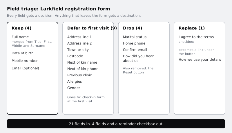
- Keep: Mobile number (to confirm and remind), Date of birth (to match the right patient record, since two people can share a name).
- Merge: Title, First name, Middle name and Surname become one
Full namefield. Names do not reliably split into first, middle and last: some people have one name, some put the family name first, some carry several family names, such asAdaeze Okonkwo-Hughes. One field takes all of them. Title is dropped in the merge; the clinic can ask how to address someone in person. - Keep, marked optional: Email. Some patients prefer it for the booking confirmation, but many people use a phone number as their main contact and do not check email often.
- Defer to the first visit: Address (all four fields), Next of kin name and phone, Previous clinic, Allergies, Gender. Reception confirms these on a tablet or paper form at check-in, and the nurse asks about allergies in the room, where an answer can be checked rather than trusted from a text box.
- Drop: Marital status (no use named), Home phone (Mobile covers it; a landline can go on the visit form), Confirm email (a second box doubles the work, and people often paste the first entry into it, so it does not reliably catch typos; showing the address back on Confirm is a better check), How did you hear about us (marketing can ask one optional question on Booked, once the booking is safe),
Resetbutton. - Replace: the terms checkbox becomes a one-line link,
How we use your details, under the button. Before you remove a consent checkbox, ask whoever owns privacy at your organisation whether a tick is legally required for your form. Larkfield's privacy lead confirmed it was not for booking.
The deferred fields are not lost. Each one needs a named place in the Where it goes instead column, or someone will add it back to the form next month.
Check it worked
Every row in Field triage has a Decision. Every row marked Defer or Replace has something specific in Where it goes instead, such as "Check-in form at first visit" or "Link under the button". Count the rows marked Keep plus the one new merged field: for Larkfield that is four fields, Full name, Date of birth, Mobile number, Email (optional). The Your details screen in Take a wireframe from low to mid fidelity asks for exactly these, so if you built that series, the triage confirms it rather than changing it.
Step 3 · Lay out what is left in one column with labels above
Duplicate your before frame, name the copy Your details / After, delete everything inside it, and build the short form from the top:
- Header with a back arrow and the title
Your details Full nameDate of birthMobile numberEmail (optional)
Use one column, with each field the full width of the screen less a 16 pixel margin on each side. Put each label above its field, not beside it and not inside it as placeholder text. The reasons are practical:
- One column gives one path down the screen. Two fields on one row get read out of order, and on a 360 pixel screen each half is too narrow for a long name or email.
- Labels above leave the full width to the answer, still work when a translated label runs longer than the English (in French, for example, labels can run a third longer, and short labels can more than double), and stay readable when someone zooms the text.
- No placeholder labels, because placeholder text disappears as soon as someone types, and they then cannot check what the field asked for. WCAG 3.3.2 asks for labels or instructions whenever a form needs input.
Mark optional fields with (optional) in the label rather than starring every required one. With four fields and one optional, one word does the job of a legend.
In Figma, put each label and field in a vertical auto layout with an 8 pixel gap, and stack those groups in a parent auto layout with a 24 pixel gap and 16 pixel padding, so the spacing is typed rather than dragged.
Check it worked
Draw a vertical line down the left margin of Your details / After: every label and every field starts on it. No row on the screen holds two fields side by side. Type Adaeze Okonkwo-Hughes into the name field and a long email such as adaeze.okonkwohughes@example.com into the email field: both fit without being cut off. No field shows text inside the box until the person types.
Step 4 · Choose the keyboard and input for each field
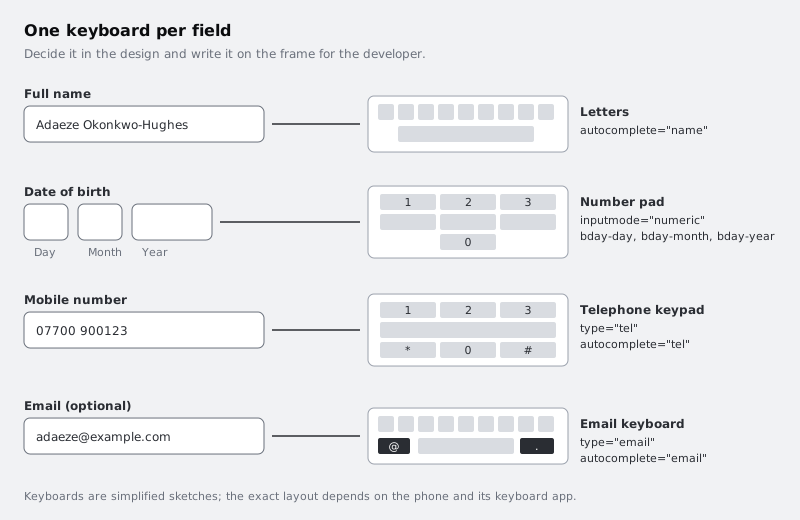
On a phone, every field brings up a keyboard, and the wrong one costs taps: a phone number typed on a letter keyboard means switching to numbers first. Decide the keyboard as part of the design, and write it next to each field so the developer does not have to guess. Add a small annotation to the right of the frame for each field:
| Field | Keyboard | Annotation for the developer |
| --- | --- | --- |
| Full name | Letters, capital at the start of each word | autocomplete="name"; autocapitalize="words"; spellcheck="false" |
| Date of birth | Number pad, in three short boxes labelled Day, Month, Year | inputmode="numeric"; autocomplete="bday-day", bday-month, bday-year |
| Mobile number | Telephone keypad | type="tel"; autocomplete="tel" |
| Email (optional) | Email keyboard, with @ and . on the first layer | type="email"; autocomplete="email" |
The date of birth decision matters most. The old form used three dropdowns, and the year list starts at 2026: someone born in 1985 has to scroll past more than forty years to reach it. A calendar picker is worse for the same reason. Three small number boxes, Day (2 digits wide), Month (2 digits wide) and Year (4 digits wide), let people type a date they already know. Keep the hint from the mid-fidelity screen under the label: For example, 31 03 1985. Size each box to the length of its answer, which also tells people how much to type.
The autocomplete values let the browser offer details the person has saved, so a returning user can fill name, mobile and email with a tap each. WCAG 1.3.5 asks for this purpose to be identifiable for fields about the user.
Check it worked
Each of the four fields on Your details / After has an annotation naming its keyboard and the attributes from the table. Date of birth shows three boxes of different widths, labelled Day, Month and Year, with the example hint under the label. If you have a phone to hand, open any form that uses type="tel", such as a mobile sign-in page, and tap the phone field: the keypad you see is the one your annotation asks for.
Step 5 · Set defaults and stop asking what you already know
Every question you can answer for the person is a question they do not have to read. Go down the screen and look for three kinds of saving:
- Answers you already have. The patient chose
Nurse appointmenton Choose a service andTuesday 9 December, 10:30on Pick a time. Do not ask again on this screen. Show them as one summary line above the fields,Nurse appointment · Tue 9 Dec, 10:30, so the person can see what they are booking while they type. WCAG 3.3.7 covers this: information entered earlier in the same process should be filled in or offered, not asked for twice. - A likely default. Most Larkfield patients have local mobile numbers, so the field accepts the local format shown in the hint,
For example 07700 900123, without asking for a country code. If your users often have numbers from more than one country, show the country as a small selector before the number, set to the most common one, rather than a separate field. - A choice with an obvious answer for most people. Add the reminder checkbox under the email field:
Text me a reminder the day before. Larkfield ticks it by default because missed appointments cost a slot someone else could have had, and the message is only about this booking. It stays visible and one tap to untick. Anything that is marketing, such as news from the clinic, is never ticked by default.
A note for low-cost Android phones and prepaid data, common for many Larkfield patients and across much of Africa: a short form that loads fast and keeps what someone typed if the connection drops costs them less data and less frustration than a long one. Ask the developer to keep the entered values if the page reloads, and say so in an annotation.
Check it worked
The summary line Nurse appointment · Tue 9 Dec, 10:30 sits above the first field. Nothing on the screen asks for the service, the date or the time. The reminder checkbox is shown ticked, with its full label readable beside it, and it is the only pre-set choice on the screen. The mobile field's hint shows the expected format.
Step 6 · Group the fields and order them the way people think
Even four fields read better in an order that matches a conversation: who you are, then how to reach you. Group them with space, not boxes:
- Group 1, about you:
Full name,Date of birth - Group 2, how we contact you:
Mobile number,Email (optional), and the reminder checkbox
Inside a group, keep the 24 pixel gap between fields. Between the two groups, use 48: the gap that ends a group should be at least twice the largest gap inside it, a rule Use white space to group and separate content explains in more detail. If you want a heading for the second group, How we contact you in the subheading style is enough; with only two groups, the extra space often does the job alone. Do not put fields in cards or bordered panels: on a narrow screen every border eats width the fields need.
Then check the order against the keyboard. Name brings up letters, date of birth brings up numbers, mobile stays on numbers, email goes back to letters. Putting date of birth and mobile next to each other means one keyboard change fewer than splitting them.
Check it worked
Squint at the frame, or zoom out until you cannot read the words: you see two clusters of fields, not five evenly spaced rows. Measure the gaps: 8 between a label and its field, 24 between fields in a group, 48 between the groups. Read the labels top to bottom out loud: they follow the order you would ask the questions at a reception desk.
Step 7 · End with one clear button
The old form ended with Reset beside Submit. Reset wipes everything with one tap and nobody wants it, so it has already gone. Now design the button that is left:
- One primary button, full width, after the last field, labelled with what happens next. On Your details that is
Continue, because the patient still checks the booking on Confirm before anything is sent. - At least 48 pixels tall. WCAG 2.5.8 sets 24 by 24 CSS pixels as the minimum target size; a full-width 48 pixel button is far easier to hit with a thumb on a moving bus. See Size touch targets for thumbs for the detail.
- Always enabled. A greyed-out button gives no reason why it will not work. Let people press it and show what to fix; Design form errors and inline validation covers how.
- The privacy link under it,
How we use your details, in body small text, so it is there for anyone who wants it without standing between the person and the button.
Then look at the screen with a keyboard open. Draw a grey block over the bottom half of the frame (400 of its 800 pixels), roughly what a keyboard takes on a phone of this size. Check that the field someone is typing in is never under it, and that the button only needs a scroll, not a hunt.
Check it worked
Your details / After has exactly one button, full width, labelled Continue, at least 48 pixels tall, with How we use your details under it. There is no Reset, no Submit and no second button. With the 400 pixel keyboard block in place over the lower half, each field in turn can sit above it when the screen scrolls.
Step 8 · Count fields and taps, and write up the before and after
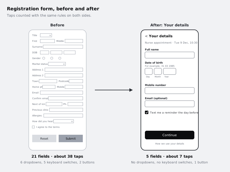
Numbers make the case faster than a description. Put the two frames side by side on one page and count taps for each with the same rules, written above both frames so anyone can repeat the count:
- 1 tap to move into each text or number field (typing is not counted)
- 1 extra tap each time the person has to switch the keyboard to numbers for a number answer
- 2 taps for each dropdown (open, choose), plus 3 for scrolling a long list such as years
- 1 tap for each radio group or checkbox the person must answer
- 1 tap for the button
For Larkfield this gives:
| | Before | After |
| --- | --- | --- |
| Fields | 21 | 5 (4 fields and the reminder checkbox) |
| Estimated taps | 38 | 7 |
| Keyboard switches | 5 | 0 |
| Dropdowns | 6 | 0 |
| Buttons | 2 | 1 |
The before count: 2 for Title; 1 each for First name, Middle name and Surname; 9 for the date of birth dropdowns (2 + 2 + 2 + 3 for the year scroll); 1 for Gender; 2 for Marital status; 2 for Address line 1 (it starts with a house number) and 1 for Address line 2; 1 for Town; 2 each for Postcode, Home phone, Mobile number and Next of kin phone; 1 each for Email, Confirm email, Next of kin name, Previous clinic and Allergies; 2 for How did you hear; 1 for the terms checkbox; 1 for Submit. The after count: 1 for name, 3 for the three date boxes, 1 for mobile, 1 for email, 0 for the reminder (already ticked), 1 for Continue. The estimate is rough, and the same rules on both sides is what makes the comparison fair.
Under the after frame, add a text box titled Deferred fields that lists each field you removed and where it is now collected, copied from the Where it goes instead column. For Larkfield: address, next of kin, previous clinic, allergies and gender on the check-in form at the first visit; How did you hear as one optional question on Booked; the terms checkbox replaced by the privacy link.
Check it worked
The page shows Registration / Before and Your details / After side by side, with the tap rules written above them and the table of counts beside them. Recount the after frame yourself with the rules: you get the same number. The Deferred fields note names a place for every field that left the form, and none says "later" or "TBC".
Next steps
Your form now asks for less and asks it in a better order. Next, decide what happens when someone gets a field wrong, and make sure the build matches the design:
- Design form errors and inline validation designs the error states, when each Larkfield field is checked and where focus goes.
- Build accessible HTML forms turns the annotations into labelled HTML with the right input types.
- Size touch targets for thumbs goes further on button and checkbox sizes.
- Take a wireframe from low to mid fidelity shows how the Your details screen fits the rest of the Larkfield flow.
Part of these paths
Related tutorials
- Design form errors and inline validationYou will have a validation timing table for every field on a booking form, a message for every way each field can go wrong, and an error-states frame in Figma showing the field errors, the error summary and where focus goes.
- How to Build Accessible HTML FormsYou will build a contact form that works with keyboards and screen readers, with real labels, grouped radio buttons, hints tied to their fields, autocomplete values, and an error summary that takes focus and links to each problem, checking the result against specific WCAG 2.2 criteria.
- Take a wireframe from low to mid fidelityYou will have the six Larkfield Clinic booking screens and four state frames at mid fidelity in Figma, still greyscale but with real copy, four text styles, one spacing scale and a small kit of reusable wireframe components, ready to test for content and flow.
Need this done for you?
Padding does this work for growing companies, from the first diagnosis to a system that keeps working.
Get new tutorials